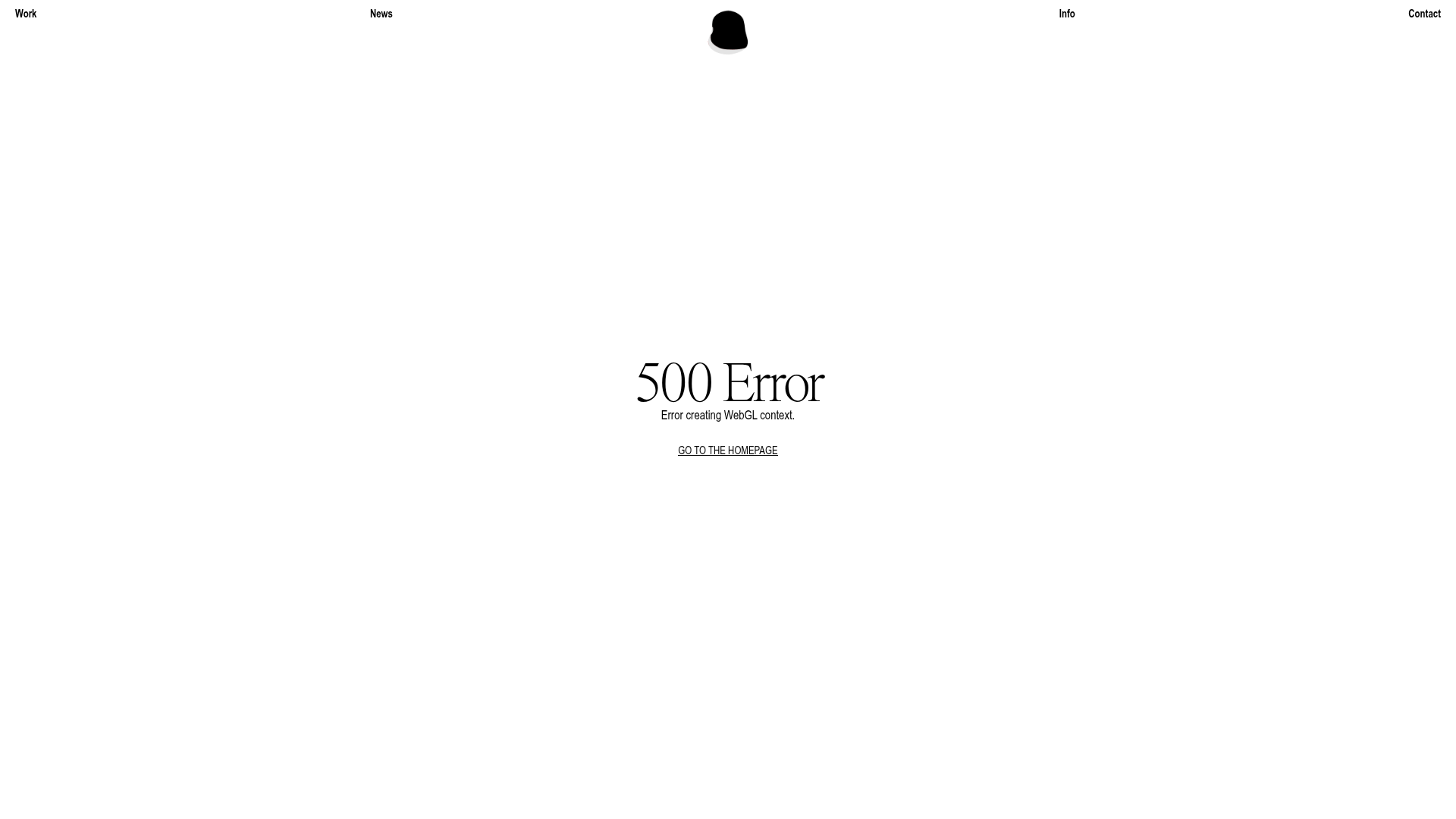
Little Troop Minimal WebGL Landing Page
A minimalist design studio layout featuring a centered brand logo, top-corner navigation links, and a clean, typography-focused 500 error page template.
Overview
This website features a high-end, minimalist studio landing page layout that emphasizes white space and refined typography. It serves as an excellent clone reference for creatives or small agencies looking to build a sophisticated, "less-is-more" digital presence that prioritizes brand identity over cluttered information.
Design System
- Color Palette & Visual Hierarchy: The design uses a high-contrast monochrome palette (pure white #FFFFFF background with black text/assets), creating an airy, editorial feel. The hierarchy is extremely focused, using centered alignment for primary messaging to draw immediate attention.
- Typography System: The system uses an elegant serif typeface for primary headlines (e.g., "500 Error") and a clean sans-serif for functional navigation and body text. The large serif type provides a sense of luxury, while the smaller sans-serif ensures utility and navigation clarity.
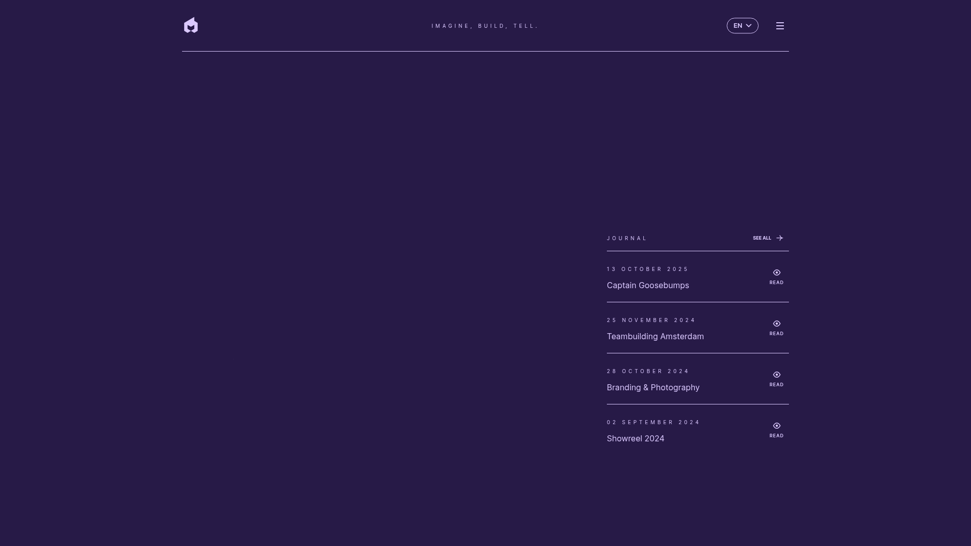
- Page Structure & Section Flow: The layout utilizes a fixed-position four-corner navigation architecture (Work, News, Info, Contact) which anchors the viewport. The central area is reserved for high-impact content, such as the animated brand logo and primary messaging.
- Reusable Components:
- Corner Navigation: A modular layout system for the header that distributes links to the extreme edges of the screen.
- Animated Brand Centerpiece: A centered
<img>container for a GIF or WebGL canvas that acts as the focal point. - Action Button: A simple, underlined text-link button (
text-uppercase link) for CTAs that maintains the minimalist aesthetic.
- Implementation Clues: The HTML reveals a Vue/Nuxt.js build (
id="__nuxt") utilizing scoped CSS classes. The core structure is a simple<main>container wrapped in a.containerclass that manages layout centering.
Use Cases
- Who should clone this pattern: Creative directors, boutique design studios, and freelance photographers who want an uncompromisingly minimalist portfolio.
- Effective Remixes: High-end architectural firms or luxury fashion brands could effectively remix this by replacing the error message with a full-screen image gallery or a single product showcase.
- Practical Remix Directions: Builders should swap the centered text for a rotating brand reel or a single high-resolution image while retaining the corner navigation. The 500-error page logic can be reused as a template for custom error boundaries in complex WebGL applications.
- Suggested Clone Scope: A full-page clone is recommended for a landing page to capture the specific spatial relationship between the corner navigation and the centered focus element.
Related Inspirations

Bravò Studio Creative Portfolio Gallery
A minimalist dark-themed portfolio featuring a 3D video carousel, WebGL canvas integration, and a searchable archival list layout for high-end creative work.
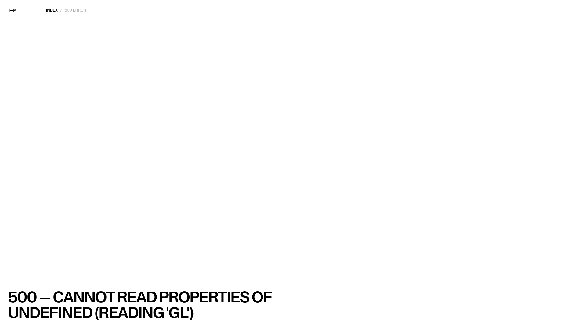
Thomas Monavon Portfolio Error Landing Page
A minimalist site error template using Nuxt featuring high-contrast typography and a breadcrumb navigation layout for unexpected server failures.
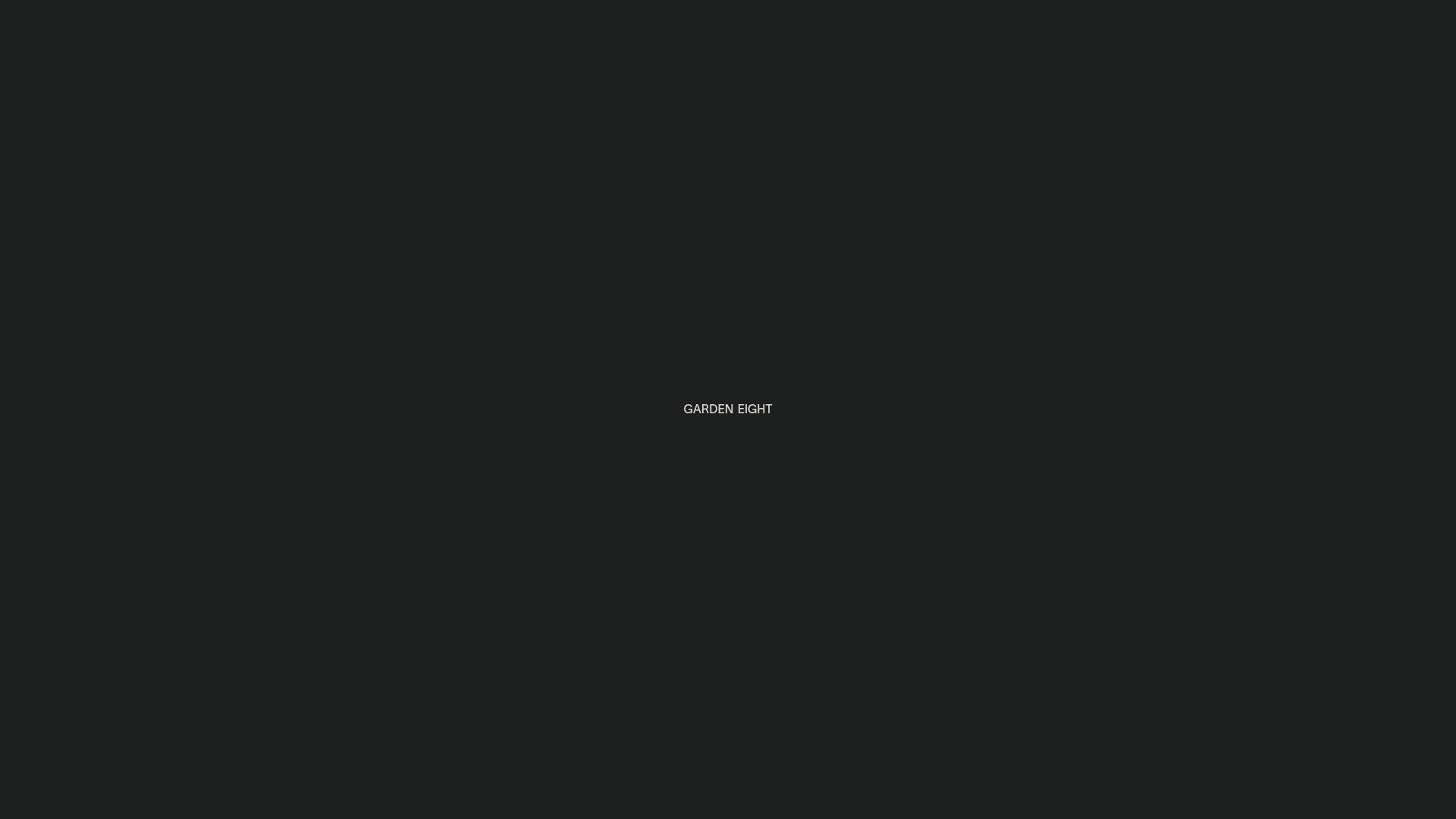
Garden Eight Portfolio Landing Page
A minimalist dark-themed studio site featuring scroll-triggered typography animations, a custom cursor, and dynamic case study previews with horizontal marquee transitions.

True Staging Immersive Hero Portfolio
An interactive WebGL landing page featuring large serif typography, custom CSS3D button animations, and a smooth asynchronous page transition system.
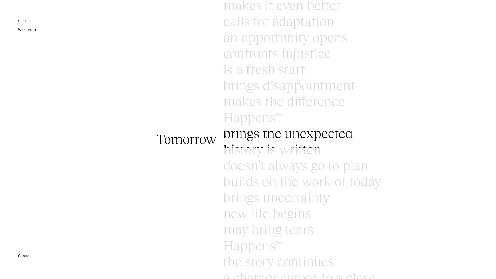
Tomorrow Happens Interactive Portolio
A minimalist design studio site featuring a vertical scrolling typography mask hero and accordion-based project navigation with video hover reveals.
EPIC Agency Minimalist Modern Portfolio
A high-end creative agency layout featuring Three.js canvas backgrounds, cinematic video embeds, and a clean typography-driven journal section with hover interactions.
