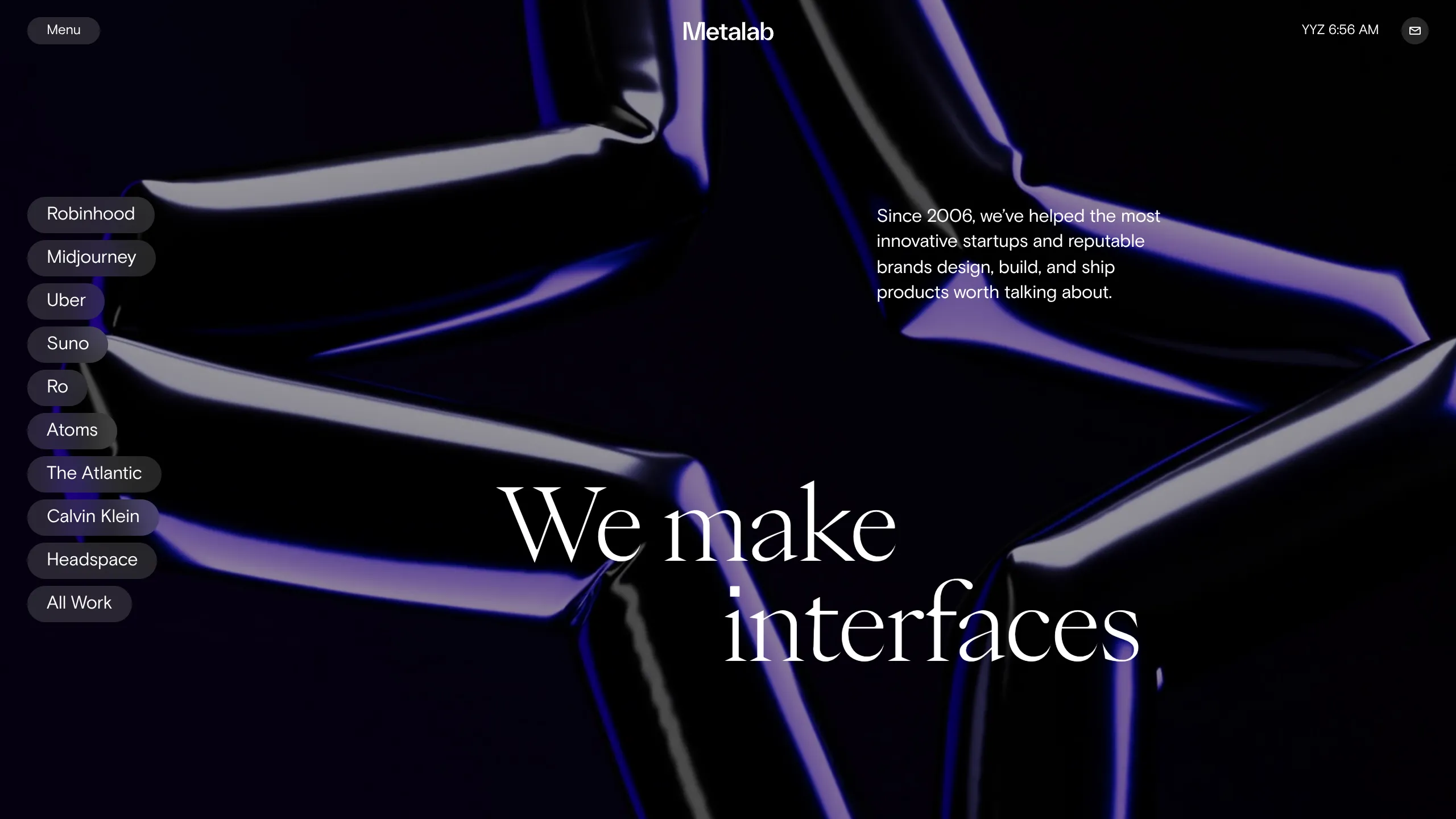
Metalab Agency Hero Landing Page
An immersive dark-mode hero section featuring high-contrast typography, a sidebar pill-navigation for case studies, and a fluid 3D-effect background.
Overview
This is a high-end, immersive agency hero landing page designed for Metalab. It showcases a sophisticated dark-mode aesthetic that blends minimalist high-contrast typography with fluid, cinematic 3D background elements to create an immediate sense of premium craft. It is an excellent clone reference for portfolios or studios wanting to prioritize visual storytelling and ease of navigation through case studies.
Design System
- Color Palette & Visual Hierarchy: The site utilizes a deep charcoal/black background with high-contrast white text for primary headlines. Accent colors include moody purples and blues provided by the background motion graphics, creating a "glassmorphism" effect in the UI components like the translucent navigation pills.
- Typography System: The design features a pairing of a sharp, elegant serif for the main hero headline ("We make interfaces") and a clean, high-legibility sans-serif for body copy and navigational elements. The hero text is oversized and centered to establish instant brand authority.
- Page Structure & Section Flow: The layout follows a non-traditional vertical flow where a persistent sidebar of navigation pills (Robinhood, Midjourney, Uber, etc.) allows users to jump across projects. The structure is built around a full-screen hero section followed by project-specific sections that trigger layout changes (e.g.,
layoutType1vslayoutType2in the HTML). - Reusable Components:
- Sidebar Pill Nav: A stacked list of rounded buttons (
CaseStudies_itemList) used for rapid project switching. - Dynamic Header: A horizontal bar housing a menu trigger, a rotating multi-city timezone component (
TimeComponent), and a compact contact button. - Animated Notifications: A slide-in list for news updates and awards located in the hidden menu layer.
- Sidebar Pill Nav: A stacked list of rounded buttons (
- Interaction and Motion Patterns: The implementation suggests heavy use of GSAP or Framer Motion, with
translate3dtransforms visible in the project list. Hovering over navigation pills likely triggers background image shifts, while the main menu uses a sophisticated "growing rectangle" portal transition (PageTransitionPortal). - Implementation Clues: The site is built with Next.js and uses CSS Modules for scoped styling. It leverages Sanity.io as a headless CMS for content delivery, indicated by the image source URLs.
Use Cases
- Who should clone this: Digital agencies, high-end product designers, and creative directors looking for a portfolio that feels like a software interface rather than a static document.
- Effective Remixes: SAAS products could adapt the sidebar navigation to showcase different features or tools; luxury brands could use the fluid background transitions for high-impact product launches.
- Remix Directions: Swap the 3D video background for high-resolution static imagery to improve performance; simplify the sidebar from ten items to three for a focused product landing page; reuse the timezone component for global remote-first companies.
- Clone Scope: A full-page clone is best to capture the synchronized interaction between the sidebar and the main content area, though the sidebar pill-nav is a powerful standalone component for any information-dense site.
Related Inspirations
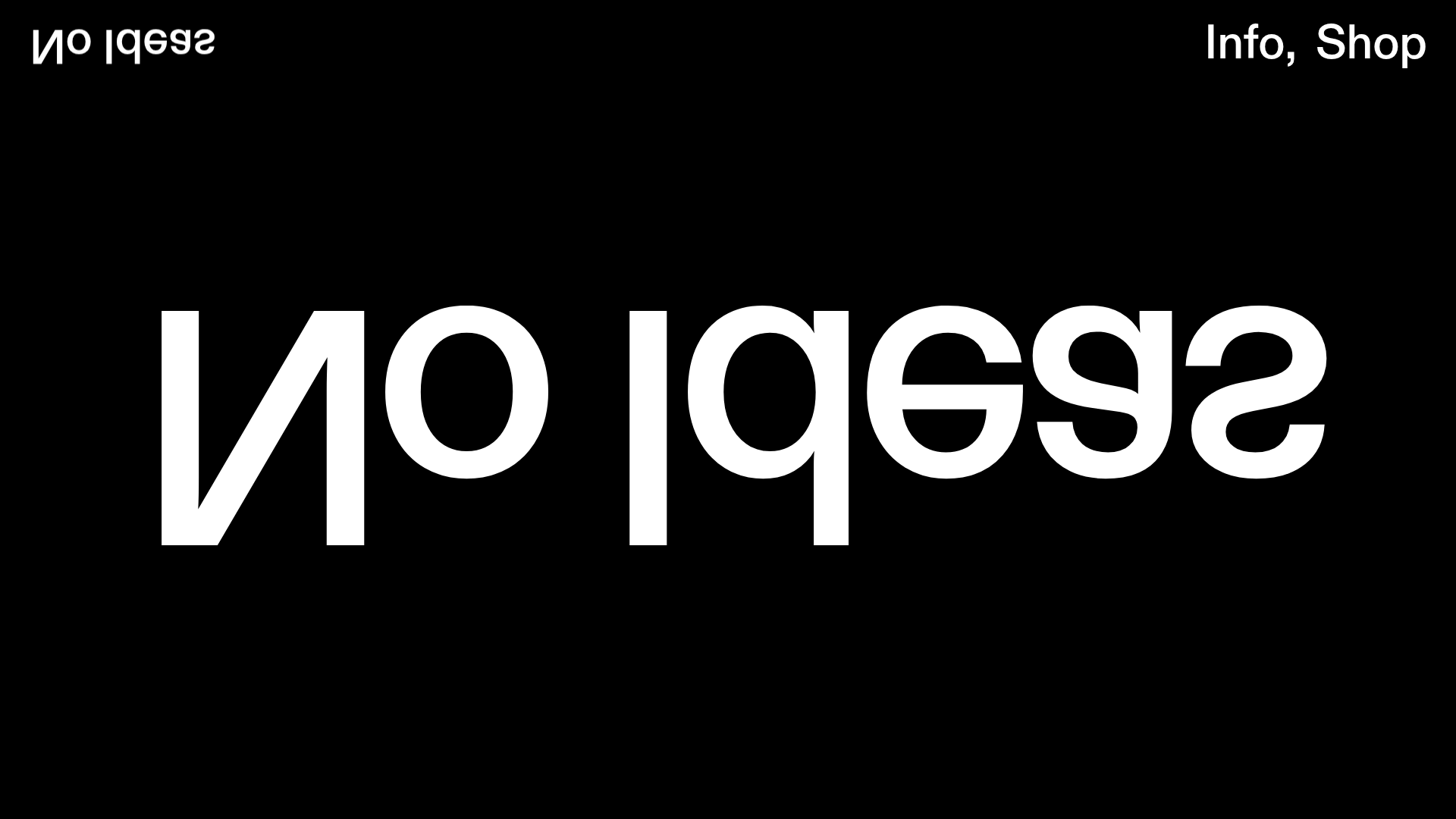
No Ideas Design Portfolio Carousel
A minimalist, full-screen portfolio featuring a high-impact typography hero and a large-scale Bootstrap carousel with video and image support.
PostNew Moving Image Portfolio Gallery
A minimalist dark-themed portfolio featuring a full-screen vertical scroll layout, video-based grid sections, and blur-effect navigation components.
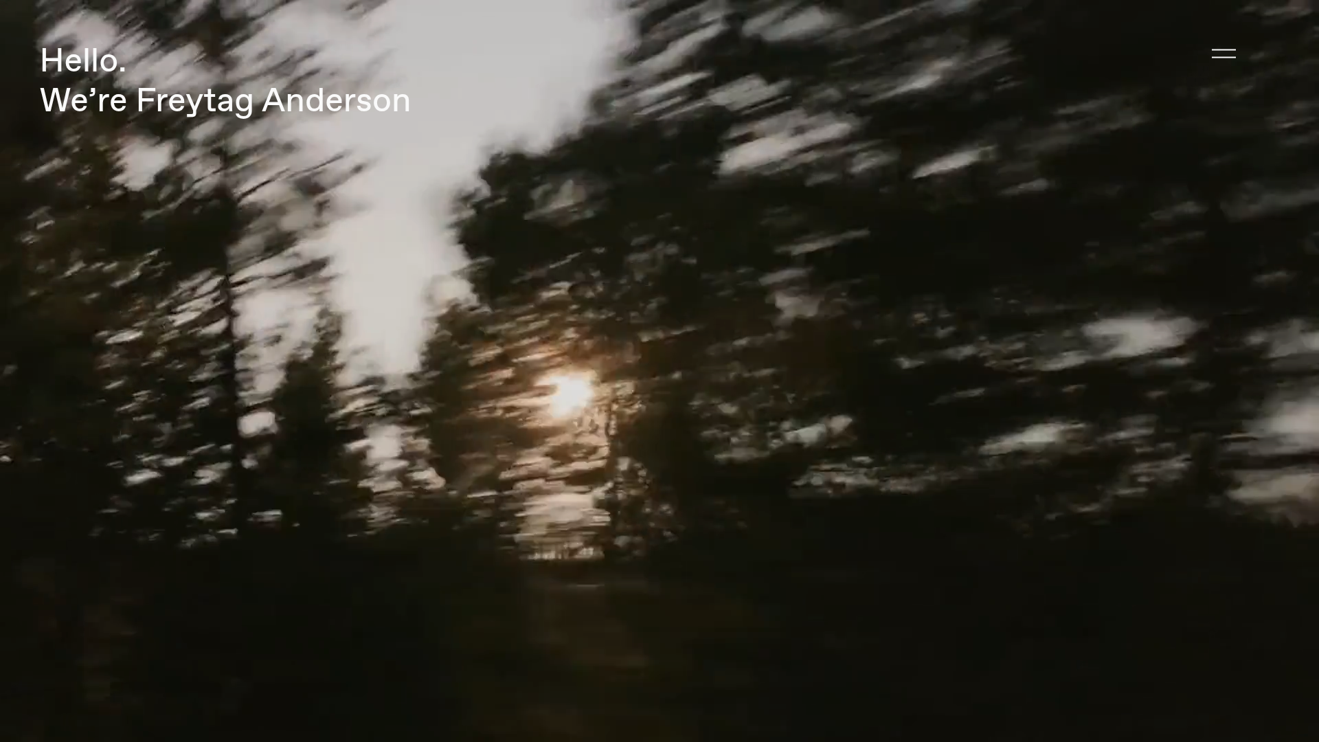
Freytag Anderson Portfolio Site
A minimalist design agency portfolio featuring full-bleed immersive video backgrounds, large typographic headers, and a vertical scrolling layout of case studies.
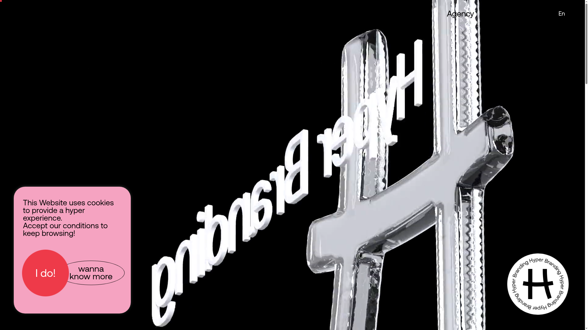
Hypertria Agency Portfolio Landing Page
A high-impact agency site featuring a full-bleed video hero, 3D animated typography, scroll-reveal project sections, and a marquee 'Dare to go Hyper' call-to-action.
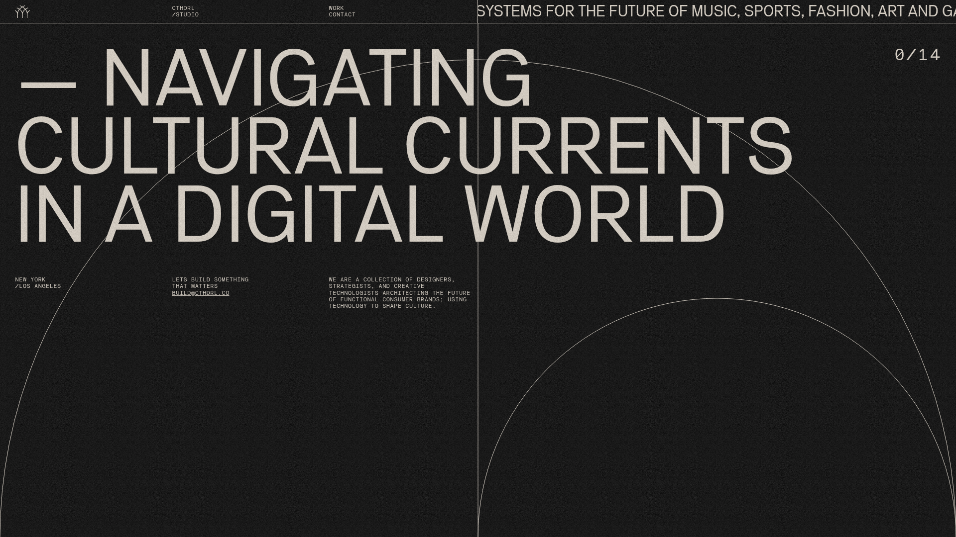
CTHDRL Digital Agency Portfolio Slider
A high-impact creative portfolio featuring a full-screen vertical navigation slider, SVG arc animations, grain-texture overlays, and a dynamic project counter.

OHZI Interactive Studio WebGL Showcase
A high-performance interactive portfolio featuring WebGL/Three.js environments, smooth section transitions, localized video case studies, and a progress-bar navigation system.
