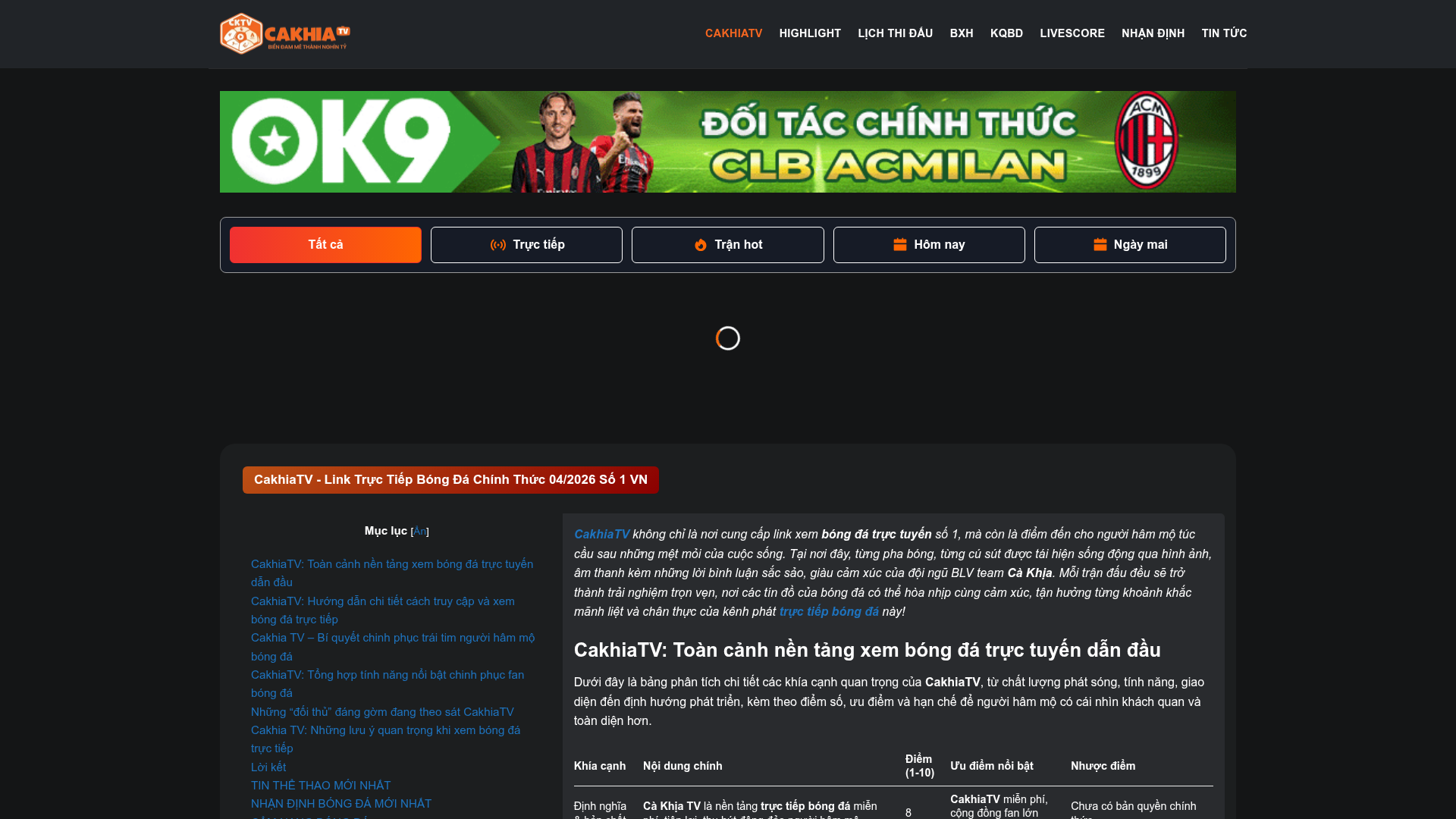
CakhiaTV Sports Streaming Portal
A dark-themed sports portal featuring a match filter tab bar, a sticky table of contents, structured data tables for analysis, and a responsive blog post slider.
Overview
CakhiaTV is a high-traffic sports streaming portal designed for real-time data delivery and content-heavy engagement. It serves as an excellent reference for cloning complex information architectures that combine live data filtering, sticky navigation, and SEO-optimized long-form content.
Design System
- Color Palette & Visual Hierarchy: The site uses a deep "Dark Mode" foundation (
rgb(22, 27, 38)) to reduce eye strain during night viewing. It employs a vibrant red-to-orange gradient (#F03131to#FF6601) for primary calls-to-action and active states, creating a high-contrast focal point against the dark background. - Typography: The system relies on a clean sans-serif stack with a clear scale of emphasis. Section titles use bold, centered spans often set at
51%relative size for stylized headers, while body text usestext-muted-foreground(gray) or white for high readability. - Page Structure: The layout follows a logical flow: a global navigation header, a high-impact promotional banner, a functional match-filter tab bar, a split-column main section (33/66) containing a sticky Table of Contents and analytical data tables, and finally, multiple horizontal post sliders for auxiliary news.
- Reusable Components:
- Filter Tab Bar: A horizontal scrolling container with pill-shaped buttons using Tailwind-style utility classes for active/inactive states.
- Analytical Data Tables: Structured
<table>elements with alternating row highlights and point-based ranking columns. - Blog Sliders: Flickity-based carousels with hover-effect cards featuring image covers and centered text blocks on a dark gray background (
rgb(55, 55, 55)).
- Interaction & Motion: The matching filter system uses
transition-colorsfor smooth state changes. The blog items usebox-blog-post has-hoverclasses, suggesting a subtle scale or shadow lift on transition. - Implementation Clues: The HTML reveals a WordPress core customized with the UX Builder/Flatsome framework, utilizing utility classes for layout (e.g.,
flex,gap-3,grid-cols-1).
Use Cases
- Who should clone this pattern: Developers building real-time dashboards, betting portals, or community-driven news sites that require a balance between dense data tables and long-form editorial content.
- Effective Remixes: This pattern can be effectively remixed for e-sports tournament trackers, crypto-currency price portals with integrated news, or technical documentation sites that need a robust TOC and feature comparison tables.
- Practical Directions: Builders should reuse the sticky sidebar TOC logic and the responsive table structure. The brand style can be easily swapped by updating the primary gradient colors, while the match filters can be adapted into product categories or price tiers.
- Suggested Scope: A full-page clone is ideal for those needing a comprehensive content hub; however, the match-filter tab bar and the analytical table styles are the most valuable individual components for isolated reuse.
Related Inspirations
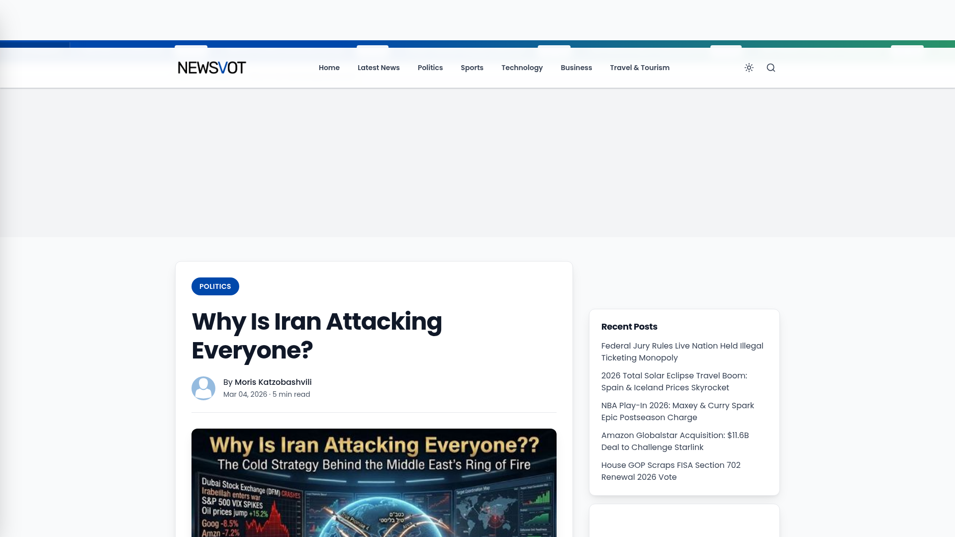
Newsvot Article View Template
A clean news article layout featuring a custom AI audio player, a live Polymarket ticker, an emoji reaction bar, and a sidebar for recent posts.
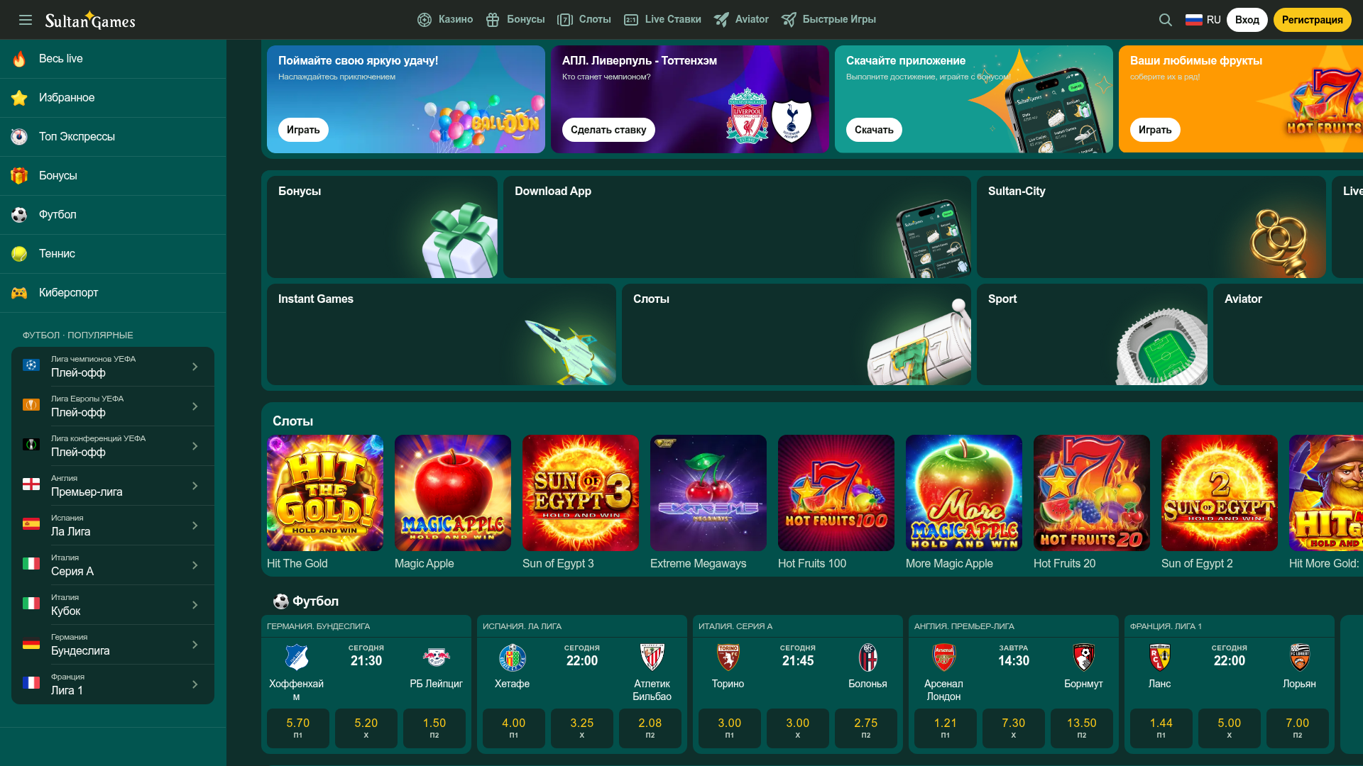
SultanGames Betting and Casino Dashboard
A dark-themed gambling UI featuring a multi-track sidebar, bento-style promotional grid, game tile horizontal scrollers, and compact sports betting card layouts.
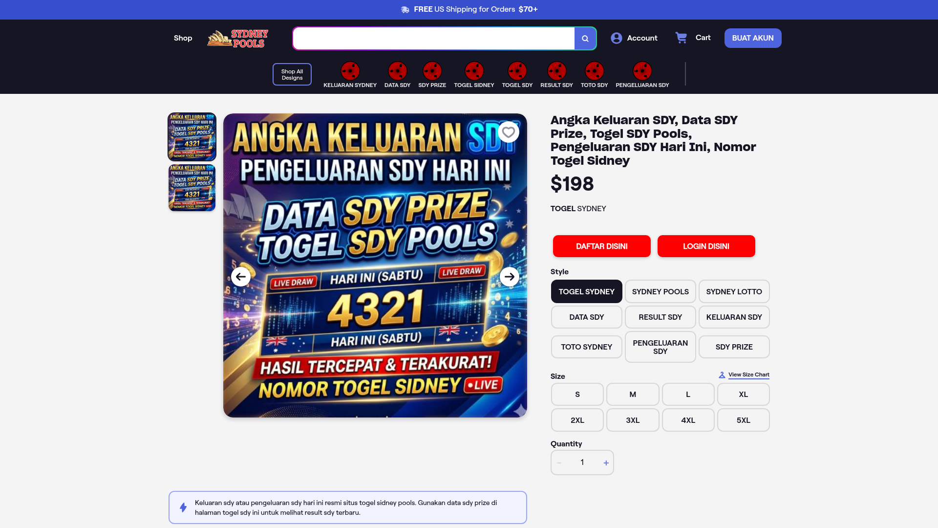
E-Commerce Product Detail Page Template
A feature-rich retail layout featuring a multi-image carousel, customizable product options with size/style selectors, tiered pricing displays, and an accordion-style FAQ section.
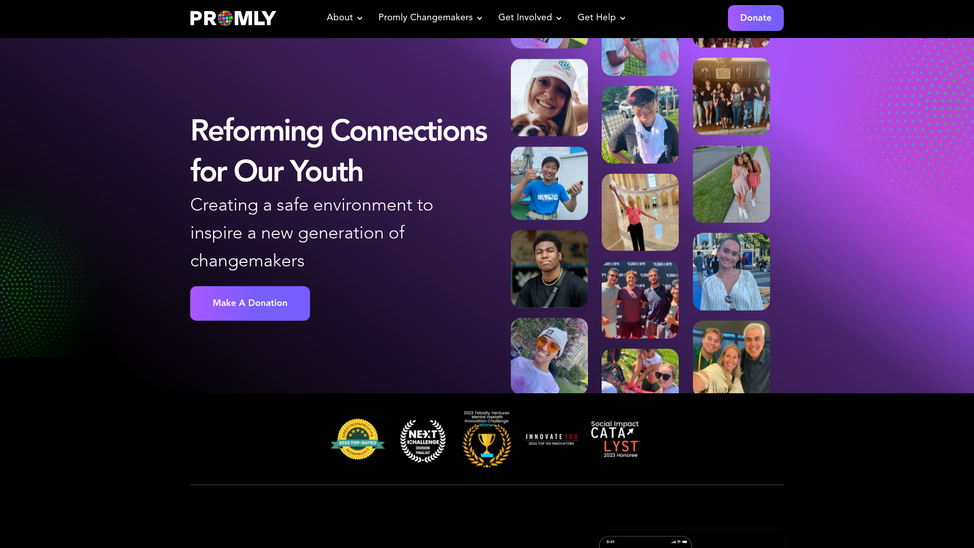
Promly Youth Platform Landing Page
A vibrant dark-mode layout featuring a vertical image marquee, bento-style reward cards, and a press-worthy horizontal slider for community-focused organizations.
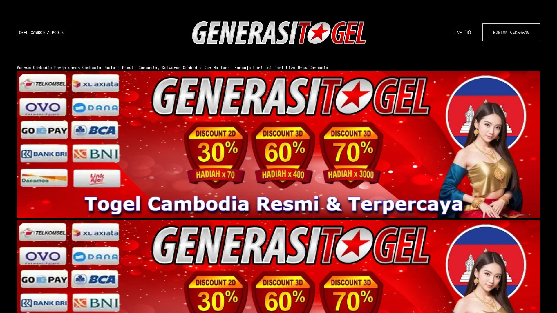
Gambling Landing Page with Promotional Banners
A dark-themed landing page featuring structured promotional banners, a grid of payment provider logos, and a basic e-commerce product layout with quantity selection and checkout buttons.
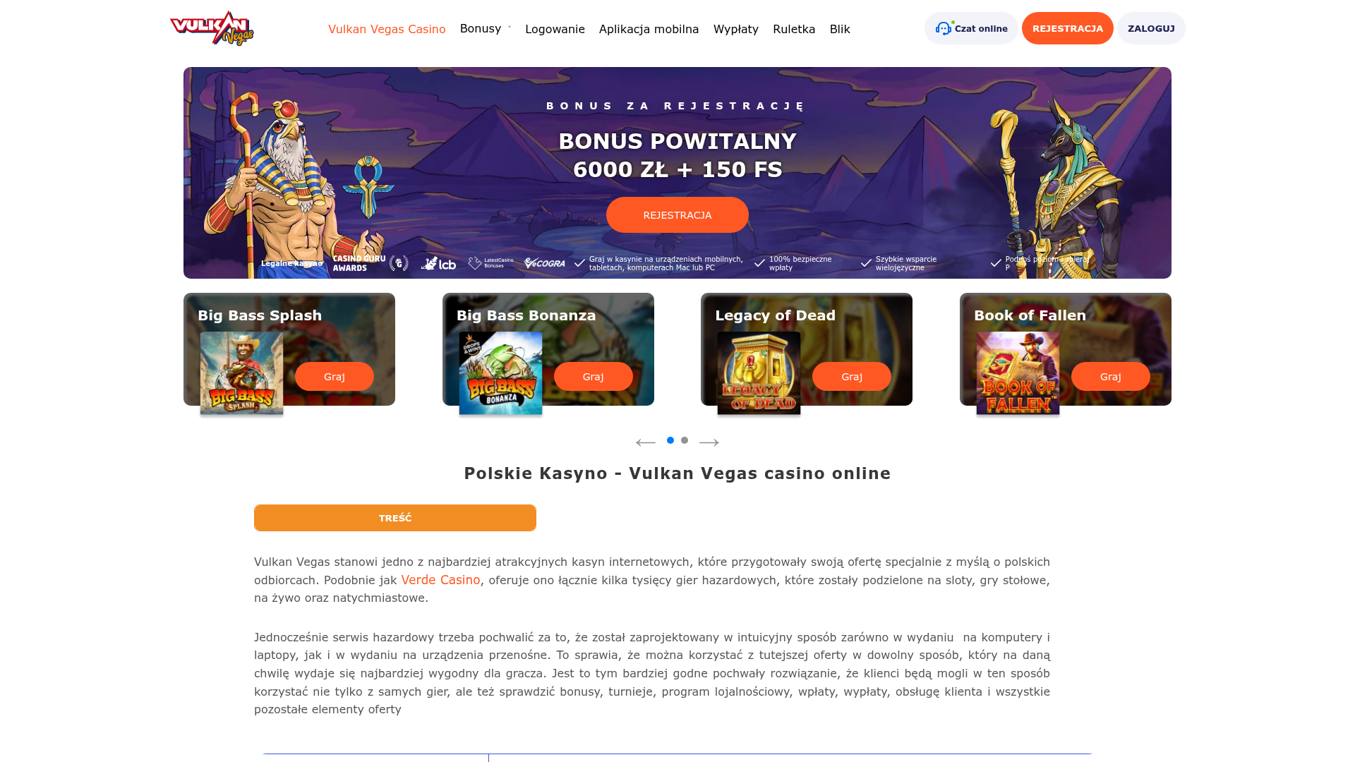
Vulkan Vegas Casino Landing Page
A gaming-focused landing page featuring a central hero carousel, a tabbed slot game preview grid, detailed data tables, and an accordion-style FAQ section for high-content layouts.
