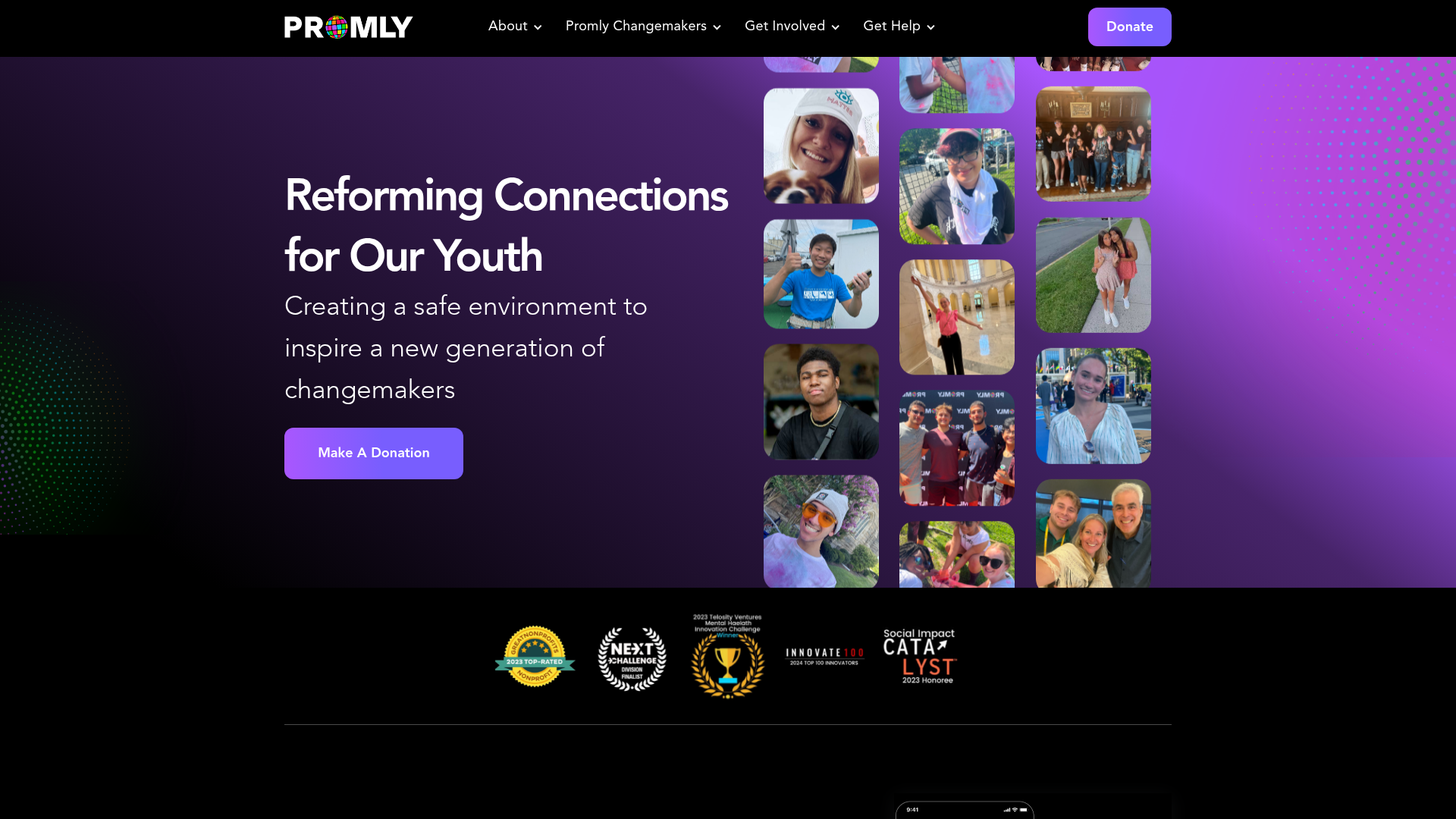
Promly Youth Platform Landing Page
A vibrant dark-mode layout featuring a vertical image marquee, bento-style reward cards, and a press-worthy horizontal slider for community-focused organizations.
Overview
This website for Promly is a vibrant, community-focused platform designed to connect Gen Z with mental health resources and social impact opportunities. It is a strong clone reference for its effective use of high-energy dark mode aesthetics, dynamic vertical marquees, and a structured layout that balances media-rich storytelling with technical social proof.
Design System
- Color Palette & Visual Hierarchy: The design uses a deep purple and black gradient background common in modern dark-mode apps. High-contrast accent colors like vibrant violet (#9b7cff), emerald green, and white are used for buttons and headings to guide user attention through the dark interface.
- Typography: The system relies on bold, sans-serif fonts with a focus on readability and personality. Primary headings use a significant scale (h1/h2) to establish impact, while subheads use a slightly lighter weight to create a clear informational hierarchy.
- Page Structure: The flow begins with a high-impact hero section containing a vertical image marquee, followed by a horizontal logo strip for trust-building. The core content follows a modular pattern of staggered "bento-style" cards, a dedicated festival/event section, and a horizontal press slider.
- Reusable Components:
- Vertical Marquee: A CSS/JS-driven vertical scrolling grid of student photos that provides immediate social proof.
- Interactive Cards: Horizontal cards with internal padding and rounded corners that house images and call-to-action buttons.
- Logo Bar: A clean horizontal container for award badges and partner organizations.
- Press Slider: An implementation of the Splide.js library to showcase dynamic CMS content (press clips) in a horizontal carousel.
- Interaction & Motion: The layout utilizes Webflow-driven interactions, including opacity fades on scroll and a continuous looping marquee that adds a sense of constant activity to the site.
- Implementation Clues: The HTML reveals a container-based layout built using Webflow (classes like
w-layout-blockcontainerandw-dyn-list). The carousel is powered bySplide, making it a highly modular and extensible component for clone projects.
Use Cases
- Who should clone this: Non-profits, community-driven social apps, or educational platforms targeting a younger demographic that requires a balance of "cool" aesthetics and institutional trust.
- Effective Remixes: This pattern works well for portfolio sites or event landing pages where visual storytelling through photography is more important than long-form text.
- Practical Directions:
- Brand Swap: Exchange the purple/green palette for a high-contrast monochromatic or neon-on-dark theme to suit tech-focused brands.
- Architecture Adaptation: Reuse the "Press Worthy" slider for worker testimonials or product feature showcases.
- Component Extraction: Clone the vertical marquee independently to add life to an otherwise static "About Us" or "Team" page.
- Clone Scope: A quick section clone of the marquee or the press slider is excellent for adding modern flair to an existing site; a full-page clone is best for organizations launching a new community initiative from scratch.
Related Inspirations
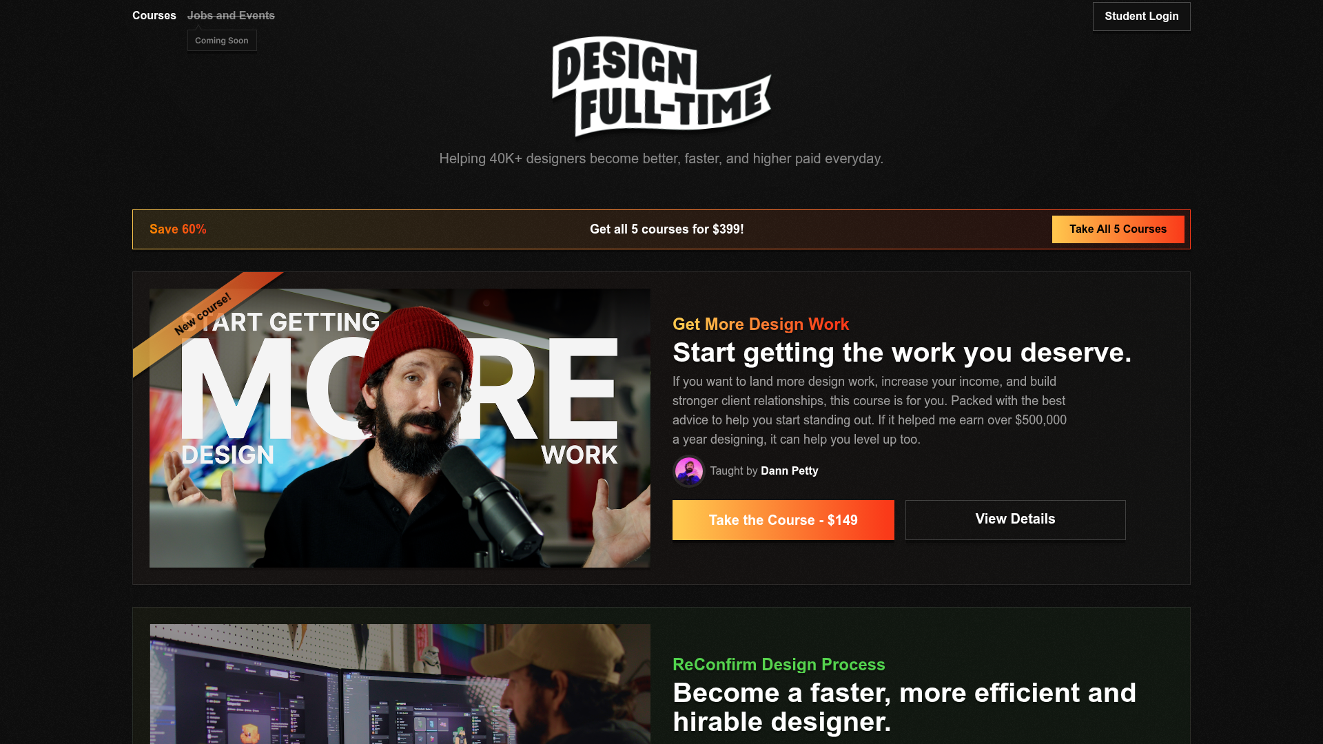
Design Full-Time Course Landing Page
A dark-themed educational site featuring a promotional banner, vertically stacked course cards with gradient borders, a video lesson grid, and integrated pricing buttons.
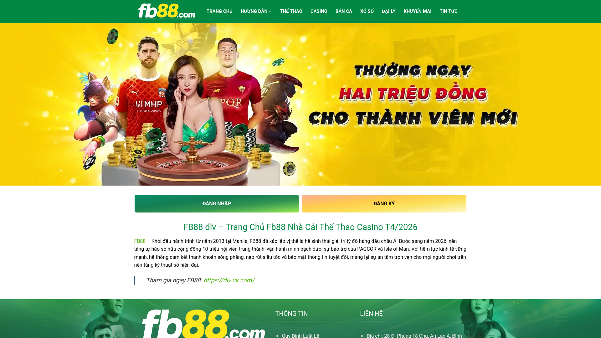
FB88 Betting Portal Homepage
A gaming-focused layout featuring an high-impact hero slider, dual-action CTAs, a structured SEO content section with data tables, and an accordion-style FAQ.

Vercel AI Cloud Landing Page
A modern landing page featuring a minimalist dark-themed navbar, a grid-overlay hero section with radial color gradients, and high-contrast typography for customer success stories.
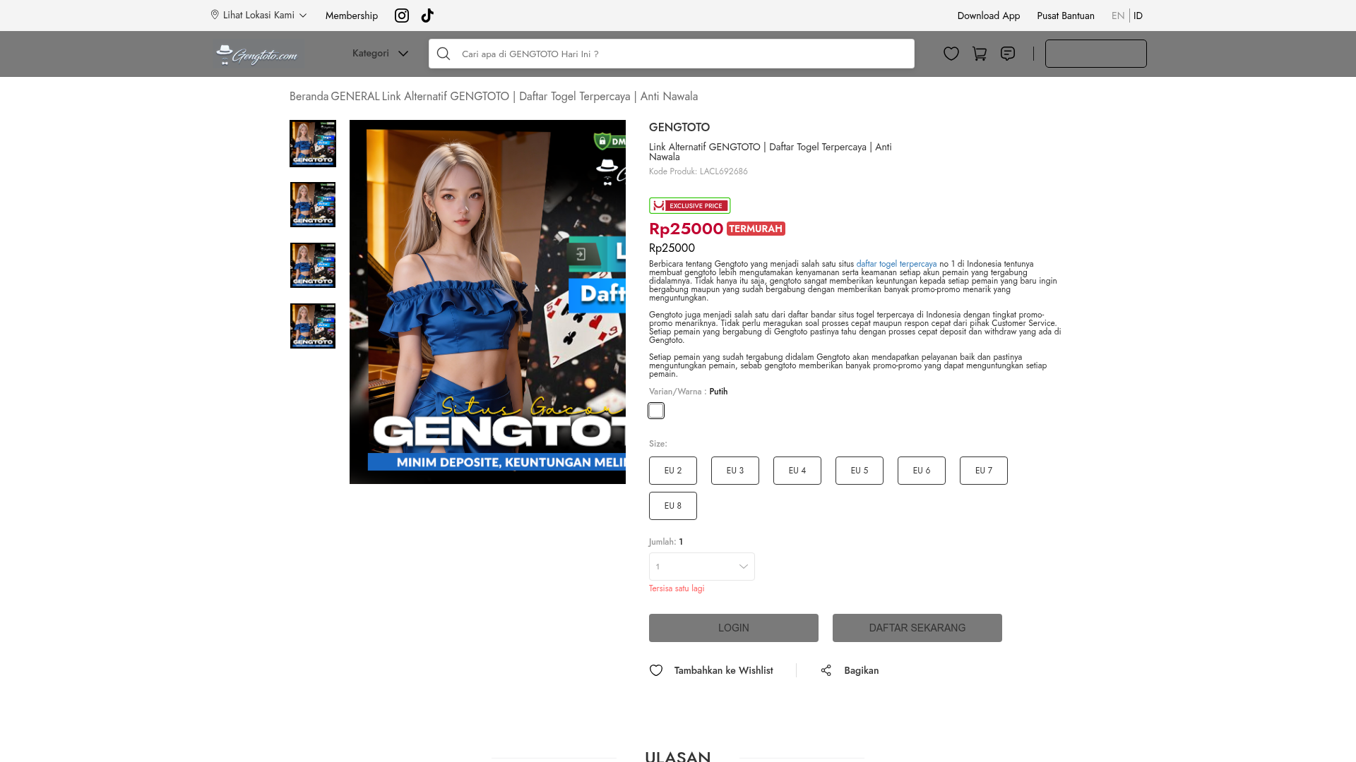
GENGTOTO Product Detail E-commerce Layout
A comprehensive product page featuring a vertical image gallery, detailed item specifications, color/size selection modules, and integrated user review and FAQ components.
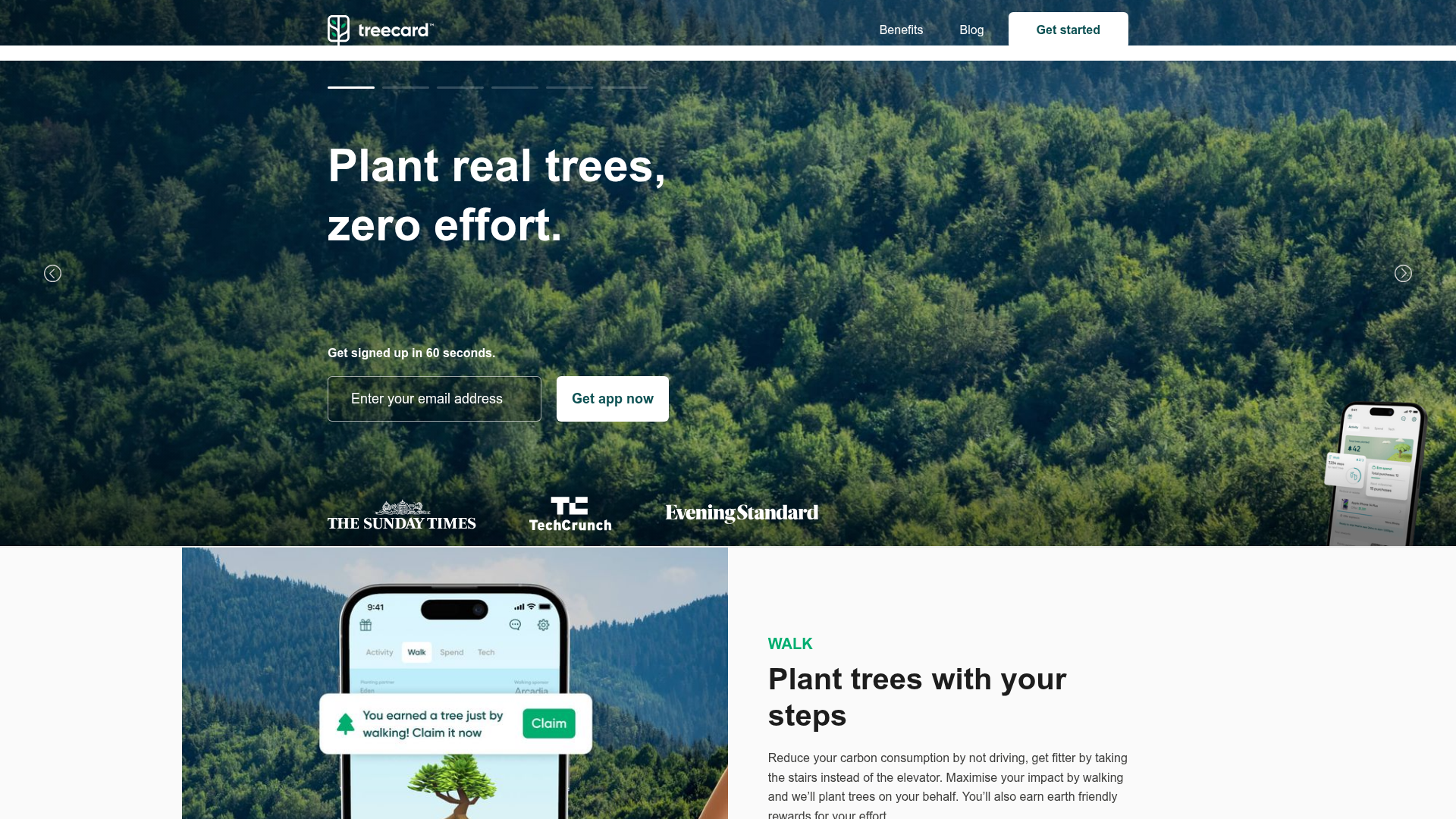
Treecard Eco-App Landing Page
An eco-friendly fintech landing page featuring an animated hero slider with progress bars, alternating content sections with mobile mockups, and a multi-form footer.
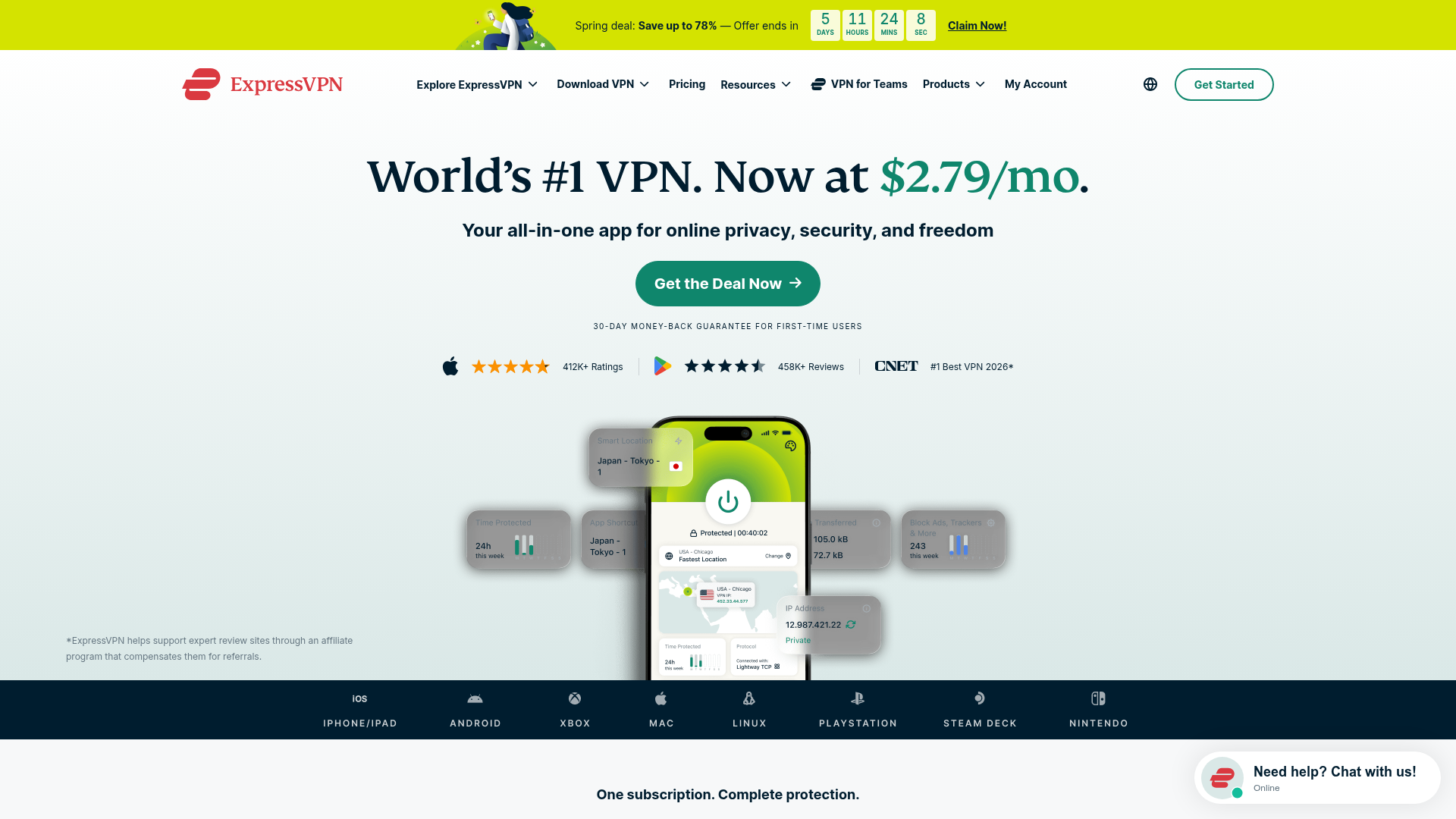
ExpressVPN SaaS Landing Page
Features a high-conversion layout with a sticky countdown banner, icon-driven feature grid, flag-based server directory, FAQ accordion, and floating chat widget.
