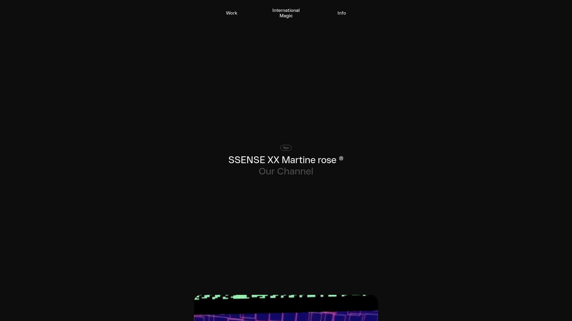
International Magic Immersive Portfolio Feed
A minimalist, dark-mode portfolio featuring a scroll-triggered grid layout with sticky video teasers and badge-categorized project headers.
Overview
This site is a high-end immersive portfolio for International Magic, a creative studio. It utilizes a sophisticated dark-mode aesthetic with a scroll-driven grid that feels both experimental and structured, making it an excellent reference for creators needing a high-impact, non-linear way to showcase visual media and case studies.
Design System
- Color Palette & Visual Hierarchy: A strict dark-mode color story using a deep black background (
#000000) with high-contrast white text for headers and muted grey (text-grey-500) for secondary subtitles. Visual hierarchy is driven by absolute scale and vertical spacing rather than color. - Typography: The system uses a clean, modernist sans-serif. Headers (
type-h1) are large and impactful with tight leading (-short). Badges use a smaller uppercasetype-captionstyle for information density. - Structure & Flow: The page is built as a vertical "feed" of projects. Each project consists of a sticky title block followed by a custom CSS grid (
x-grid) where media elements are placed using specific column/row spans (e.g.,--w: 8; --h: 24). - Reusable Components:
- Sticky Media Teaser: A central video/image box that remains fixed as the user scrolls through the project's secondary assets.
- Categorization Badges: Rounded, outlined secondary buttons (
-outline -rounded) used to tag project types (e.g., "App", "Ecom", "Show"). - Floating Menu: A minimal overhead navigation bar with a centered logo and ghost-style buttons for "Work" and "Info".
- Interaction & Motion: The HTML reveals heavy use of CSS variables for motion (
--motion-translateY,--motion-scale). Elements appear to scale and fade based on scroll progress, creating a parallax-like entry as users move down the feed. - Implementation Clues: The site is built with Nuxt.js and uses Headroom.js for the sticky navigation. It utilizes a custom grid layout system defined by inline style variables for positioning elements on a 24-column grid.
Use Cases
- Creative Portfolios: Digital artists, photographers, and motion designers can clone the
x-gridstructure to showcase varied media aspect ratios without the rigidity of a standard Pinterest grid. - Fashion Lookbooks: High-end brands looking to present collections through immersive video and high-quality photography can remix the sticky media blocks for a cinematic experience.
- Technical Case Studies: Agencies can reuse the header/badge system to clearly categorize diverse project types while maintaining a unified brand voice.
- Remix Directions: Swap the dark background for a high-key white aesthetic for a clinical, gallery look; adapt the 24-column grid into a 12-column variant for simpler content management.
- Clone Scope: The sticky header and the individual
index-feed-itemgrid are the most valuable components for quick section cloning.
Related Inspirations
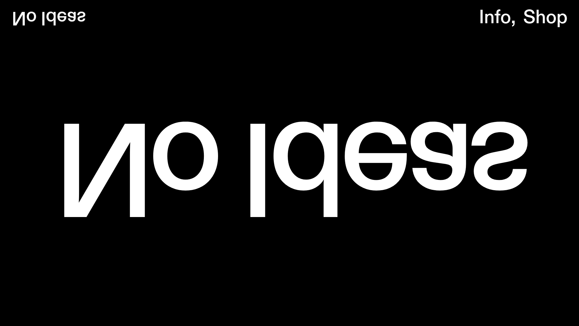
No Ideas Design Portfolio Carousel
A minimalist, full-screen portfolio featuring a high-impact typography hero and a large-scale Bootstrap carousel with video and image support.
PostNew Moving Image Portfolio Gallery
A minimalist dark-themed portfolio featuring a full-screen vertical scroll layout, video-based grid sections, and blur-effect navigation components.
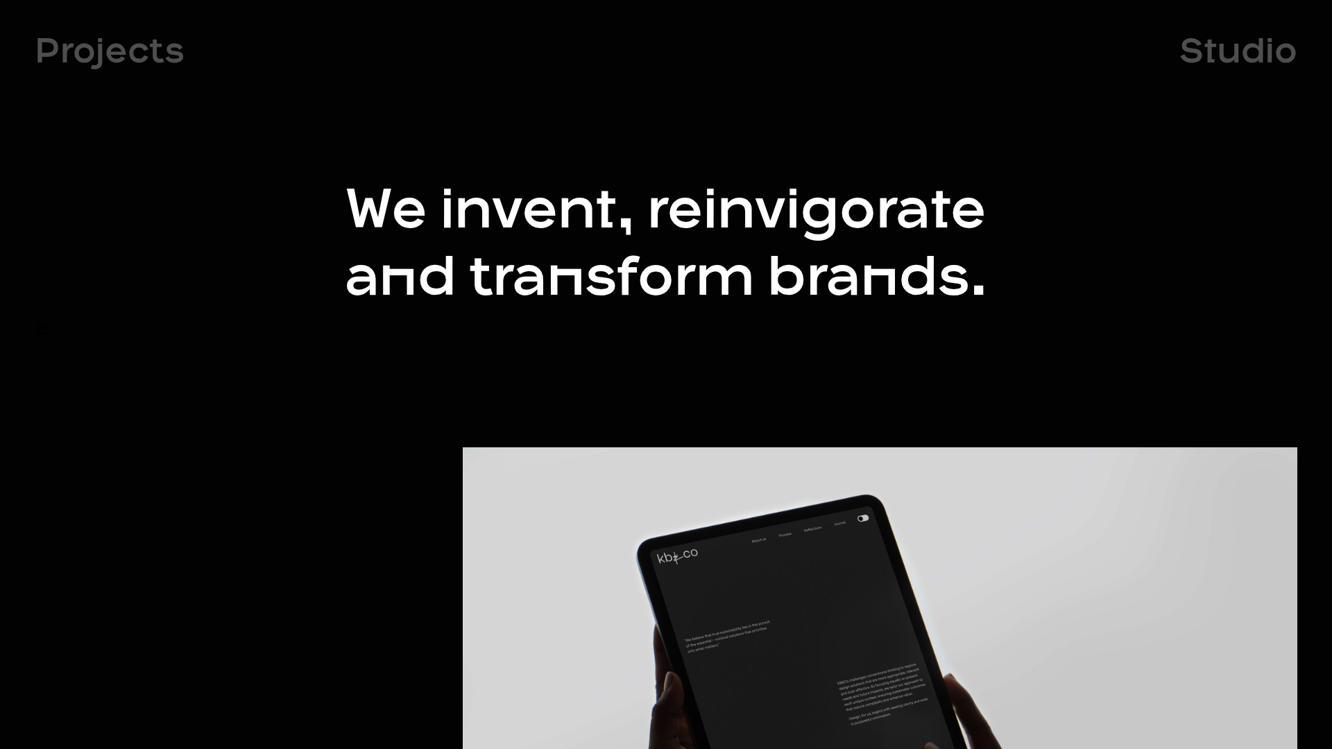
OPX Studio Agency Portfolio
A minimalist dark-themed portfolio featuring a staggered masonry project grid, cinematic video embeds, and a responsive oversized typography hero section.

Freytag Anderson Portfolio Site
A minimalist design agency portfolio featuring full-bleed immersive video backgrounds, large typographic headers, and a vertical scrolling layout of case studies.

Seksy Planety Interactive Brand Portfolio
A Nuxt-based project featuring a dynamic preloader and draggable, floating social media tags using absolute coordinate positioning for a playful, interactive UI.
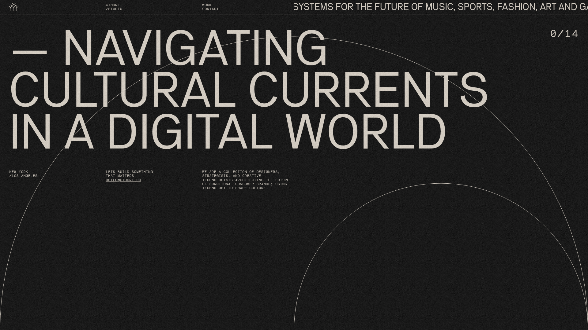
CTHDRL Digital Agency Portfolio Slider
A high-impact creative portfolio featuring a full-screen vertical navigation slider, SVG arc animations, grain-texture overlays, and a dynamic project counter.
