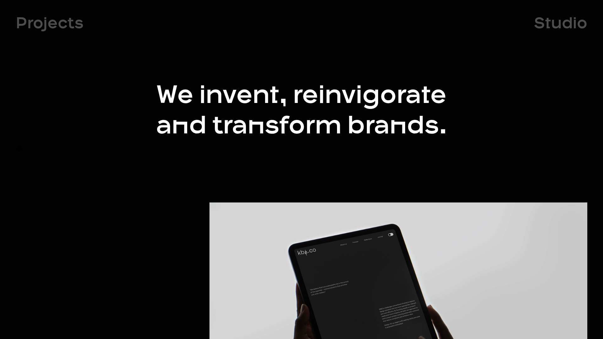
OPX Studio Agency Portfolio
A minimalist dark-themed portfolio featuring a staggered masonry project grid, cinematic video embeds, and a responsive oversized typography hero section.
Overview
This portfolio serves as a premium reference for high-end design agencies, utilizing a bold, dark-mode aesthetic to prioritize visual work. It excels as a clone target due to its sophisticated use of asymmetrical layouts, oversized typography, and integrated cinematic video backgrounds that create a high-production feeling with minimal assets.
Design System
- Color Palette & Visual Hierarchy: A strict high-contrast dark theme utilizing a solid black background (#000000) with white (#ffffff) primary text and muted grey (#9b9b9b) for secondary metadata. The hierarchy is driven by scale rather than color, using massive font sizes to anchor the viewer's attention.
- Typography System: The site uses a heavy-weight Geometric Sans-Serif font. The hero typography is set at a massive scale (approx. 4.44rem or 71px) with tight line heights. Navigation and labels use smaller, tracking-wide uppercase versions of the same face for clear distinction.
- Page Structure & Flow: The flow is unconventional and rhythmic. It starts with a centered hero statement, followed by a staggered masonry grid where project blocks occupy varying widths (e.g.,
data-xl-width="8"vsdata-xl-width="5"). This creates a "scrolling discovery" experience rather than a standard card list. Interstitial sections feature large-scale text links (e.g., "Create great podcasts 1—18") to break up visual media. - Reusable Components:
- Offset Project Blocks: Image/Video container with adjacent text and a "View case study" button.
- Sticky Navigation: Minimalist top-corner links ("Projects", "Studio").
- Responsive Three-Column Footer: Modular layout containing address, contact info, and socials.
- Interaction & Motion: The HTML indicates integrated Vimeo background players and Masonry-style column modes (
data-column-mode-sm="single"). Evidence suggests a focus on silent, looping video previews to add life to static imagery. - Implementation Clues: The site is built using the Semplice/WordPress framework, evident from classes like
ce-image,content-block, andcolumn. It utilizes a 12-column grid system where items are manually positioned using column-width attributes.
Use Cases
- Who should clone this: Creative directors, independent designers, and video production houses looking for a "gallery-first" presentation that feels like a physical art exhibition.
- Remix Directions:
- Brand Swap: Change the black background to a deep navy or dark forest green while maintaining the white oversized type for a different personality.
- Information Architecture: Adapt the staggered grid for an architectural portfolio or a high-fashion lookbook where image aspect ratios vary significantly.
- Selective Reuse: Clone only the "Oversized Hero" and the "Staggered Video/Image Grid" sections for a landing page while using a more standard layout for sub-pages.
- Suggested Scope: A full-page clone is recommended to capture the specific pacing and rhythm created by the varied column widths and spacer components.
Related Inspirations
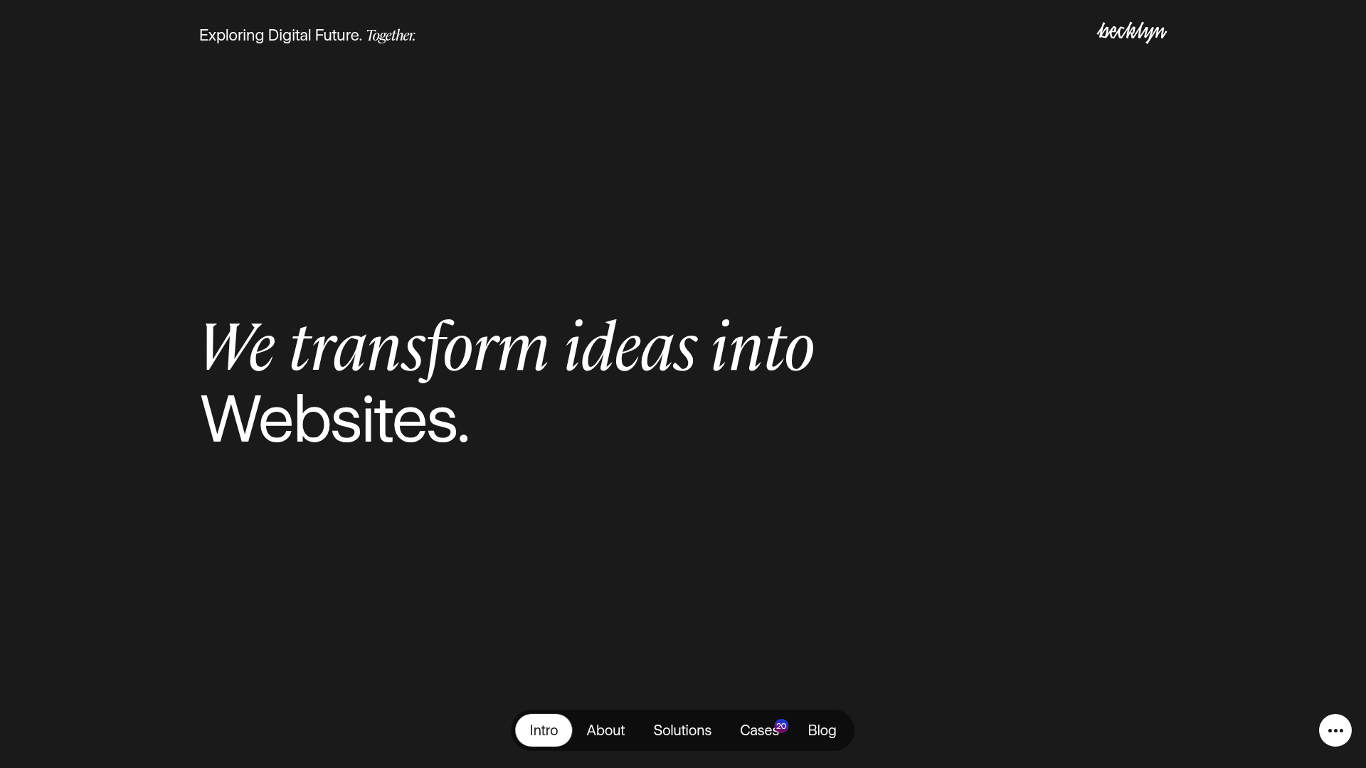
Becklyn Agency Dark Mode Portfolio
A high-end dark-themed agency site with a floating capsule navigation, staggered case study layouts, text-reveal animations, and horizontal team sliders.

Niklas Rosén Designer Portfolio Index
A minimalist, responsive grid-based portfolio index featuring a clean 16-column layout, typographic list components, and a custom dark mode transition.
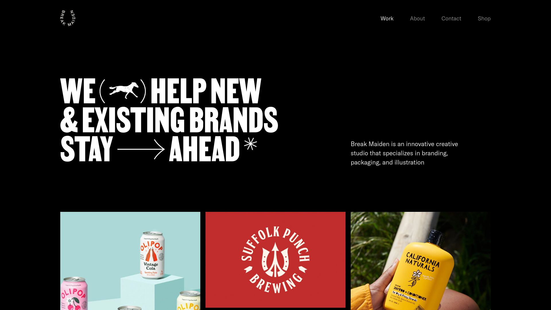
Break Maiden Agency Portfolio Hero
A high-impact dark mode hero section featuring oversized typography with inline GIF icons and a responsive grid for display-heavy case studies.
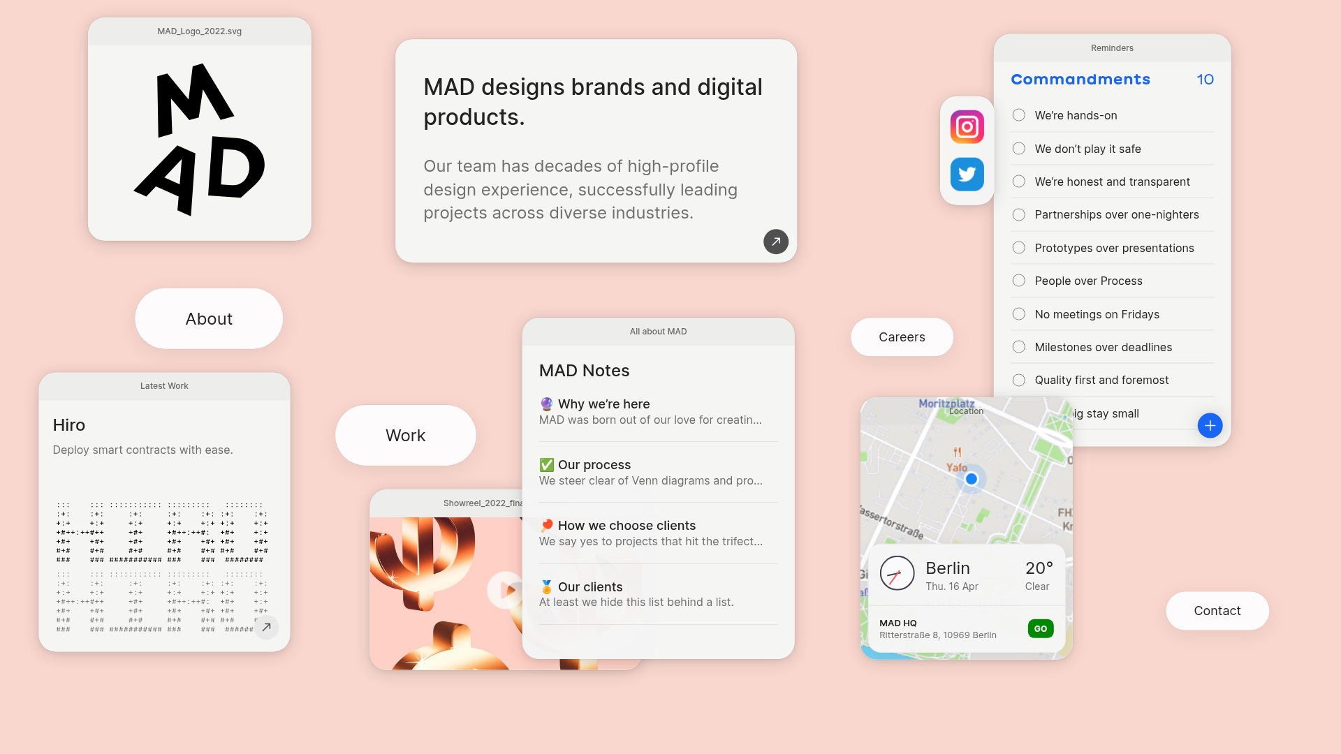
MAD Agency Interactive Dashboard Portfolio
A creative workspace-style layout featuring draggable OS-like applets, including interactive notes, a map widget with live weather, and a custom task checklist.
Catherine Peacock Designer Portfolio Home
A minimalist portfolio layout featuring a vertically stacked masonry project grid, sticky navigation with animated icons, and offset typography.

Dries Bos Creative Developer Portfolio
A high-interaction dark-mode portfolio featuring a grain-textured bento grid, marquee headers, theme switching, and a dynamic project list with hover-triggered image previews.
