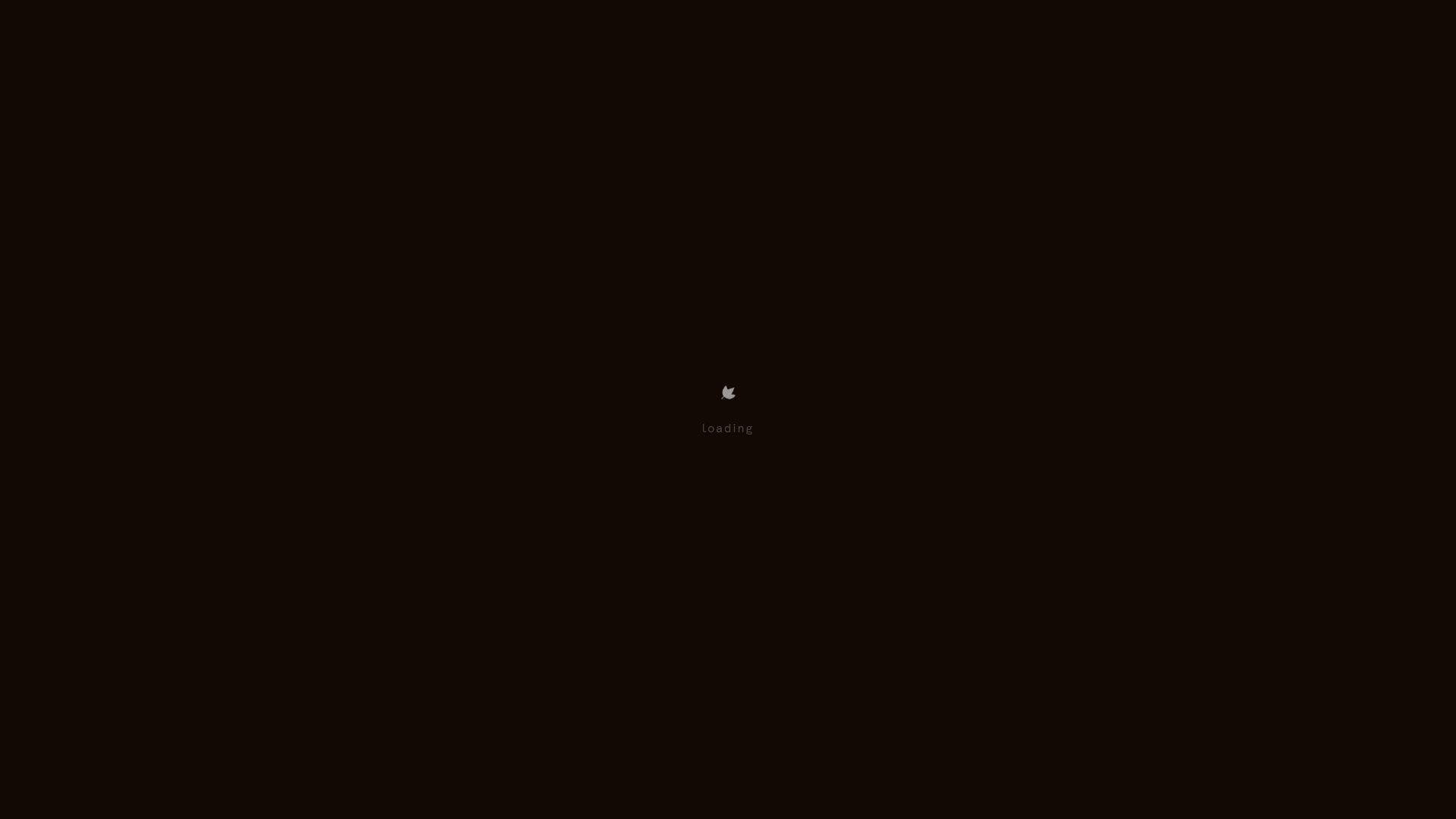
Wayfinder Minimalist Loading Screen
A clean, dark-themed loading state featuring a centered CSS logo animation and subtle typography for use in high-contrast immersive web experiences.
Overview
This project features a minimalist, dark-themed loading screen designed for the interactive experience ‘Wayfinder’. It serves as an excellent clone reference for developers needing a robust full-screen loading state that maintains brand identity while assets load in the background. The design is highly effective at reducing perceived wait times through symmetry and subtle visual feedback.
Design System
- Color Palette & Visual Hierarchy: The system utilizes a deep, near-black background (#0A0A0A) to create a void-like immersion. The primary focal point is a low-opacity, light grey icon and text centered precisely in the viewport, ensuring maximum visual focus on the brand asset.
- Typography system: The loader uses a tiny, wide-tracked serif font for the "loading" text. The scale is intentionally small (approximately 10px-12px) to emphasize the minimalist aesthetic and allow the icon to lead the hierarchy.
- Page Structure: The layout uses a fixed-position container (
.loader) that overlays the main content area (.content). This ensures that the user is isolated from unfinished layout shifts during the initial site bootstrap. - Reusable Components: The central
loader-textandimgpairing is the primary component for cloning. It follows a vertical stack pattern within a flexbox or CSS grid container to achieve absolute centering. - Interaction & Motion: Based on the HTML class structure (
visible), the loading screen is designed to toggle visibility via state changes. It likely employs a CSS opacity transition or a fade-out animation when the.visibleclass is removed. - Implementation Clues: The HTML reveals a simple, semantic structure where the loader is sibling to the main content. The use of a small PNG (
ico_about.56b312e6.png) as a loader suggests a performance-focused approach where the loading indicator itself has a negligible footprint.
Use Cases
- Who should clone this pattern: Developers building immersive storytelling websites, experimental high-res portfolios, or data-heavy web applications that require a transitional state before the UI becomes interactive.
- Effective Remixes: This pattern can be effortlessly remixed by swapping the PNG icon for a SVG animation or a Lottie file. The typography can be shifted to a monospace font for a technical/brutalist look or a bold sans-serif for a modern corporate feel.
- Practical Directions: Remix the color palette to match brand identity while maintaining the centering logic. Builders can reuse the
.loaderCSS to handle background-loading logic for images or WebGL canvases. - Suggested Clone Scope: A quick component-level clone is recommended. You only need the loader container and the centering CSS to integrate this functionality into any existing modern web framework.
Related Inspirations
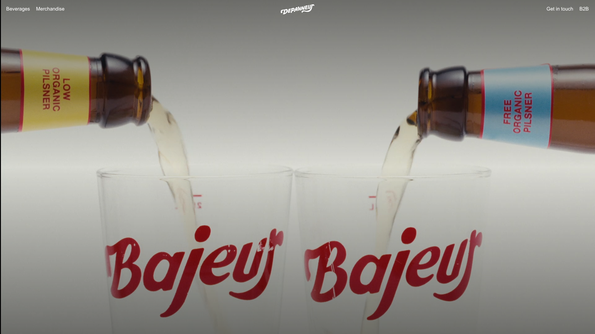
Depanneur Beverage E-commerce Hero
A minimalist Shopify storefront featuring a full-screen background video hero, sticky translucent navigation, and integrated mobile menu components.
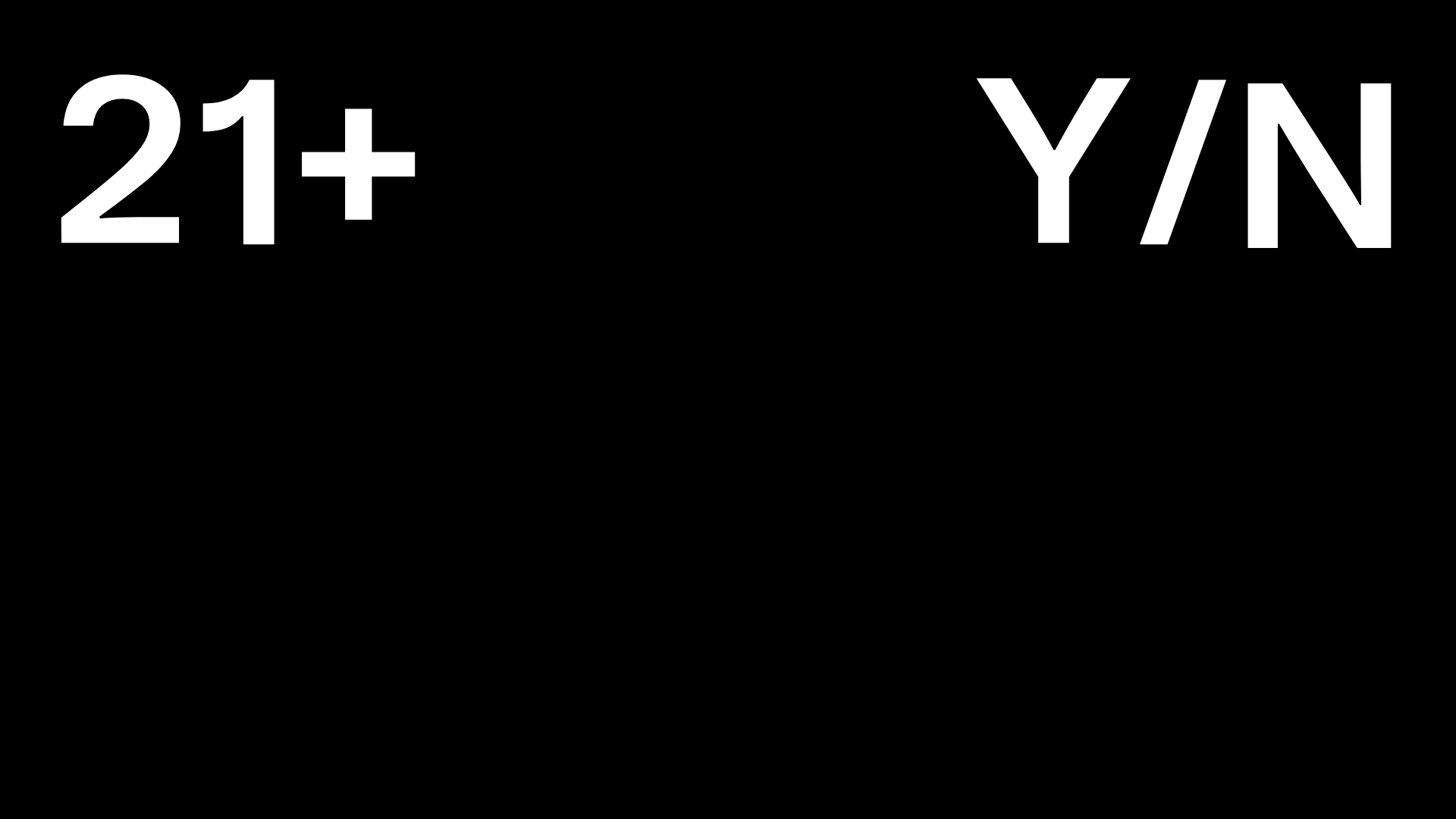
Post Familiar Minimalist Winery Storefront
An experimental e-commerce layout featuring a high-contrast age verification screen, bold typography grids, and a horizontal scrollable product showcase.
PostNew Moving Image Portfolio Gallery
A minimalist dark-themed portfolio featuring a full-screen vertical scroll layout, video-based grid sections, and blur-effect navigation components.
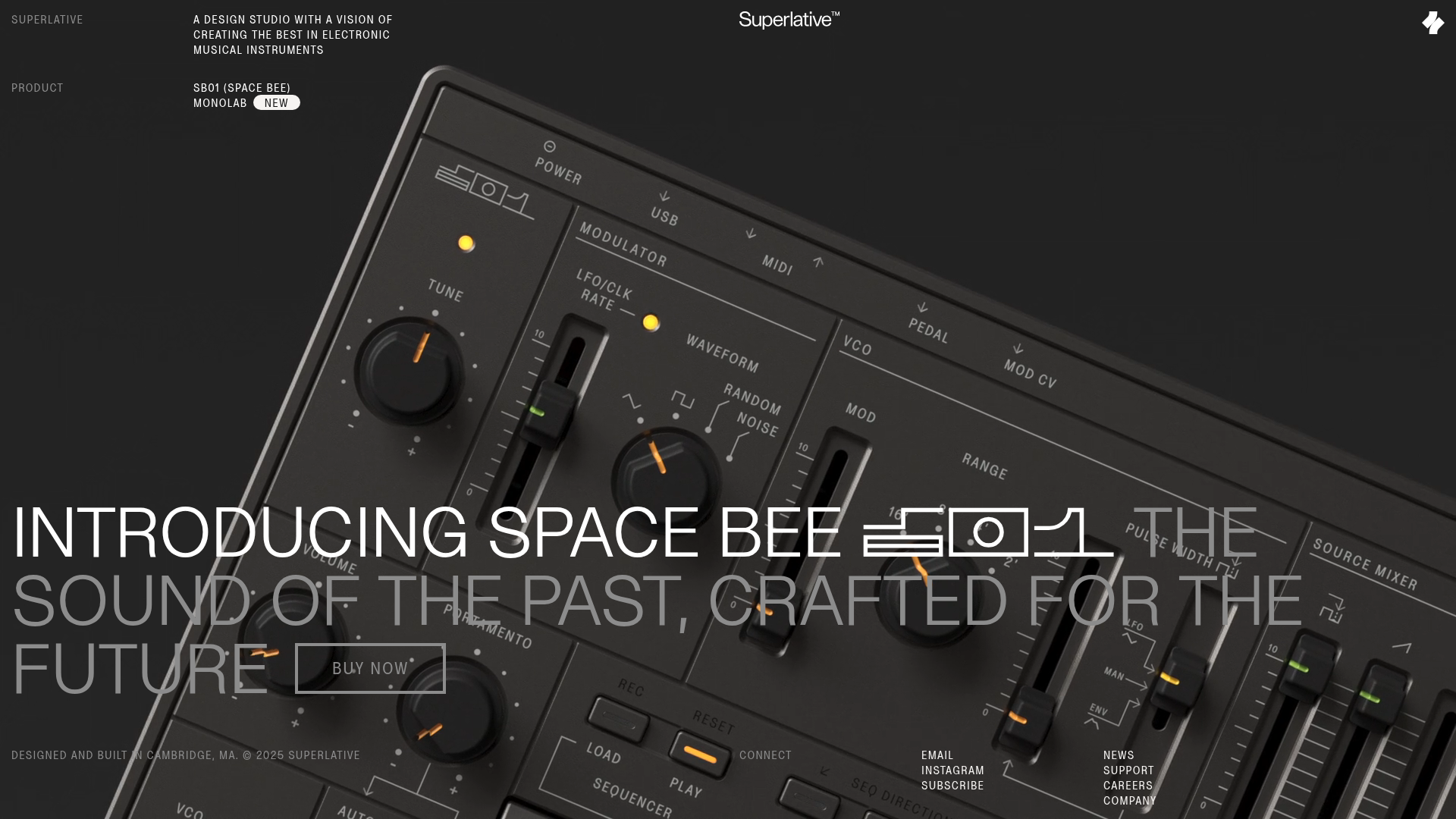
Superlative SB01 Product Landing Page
An elegant dark-themed product site featuring a full-screen video hero, sticky technical specification sidebar, an animated exploded-view diagram, and a layered product details grid.
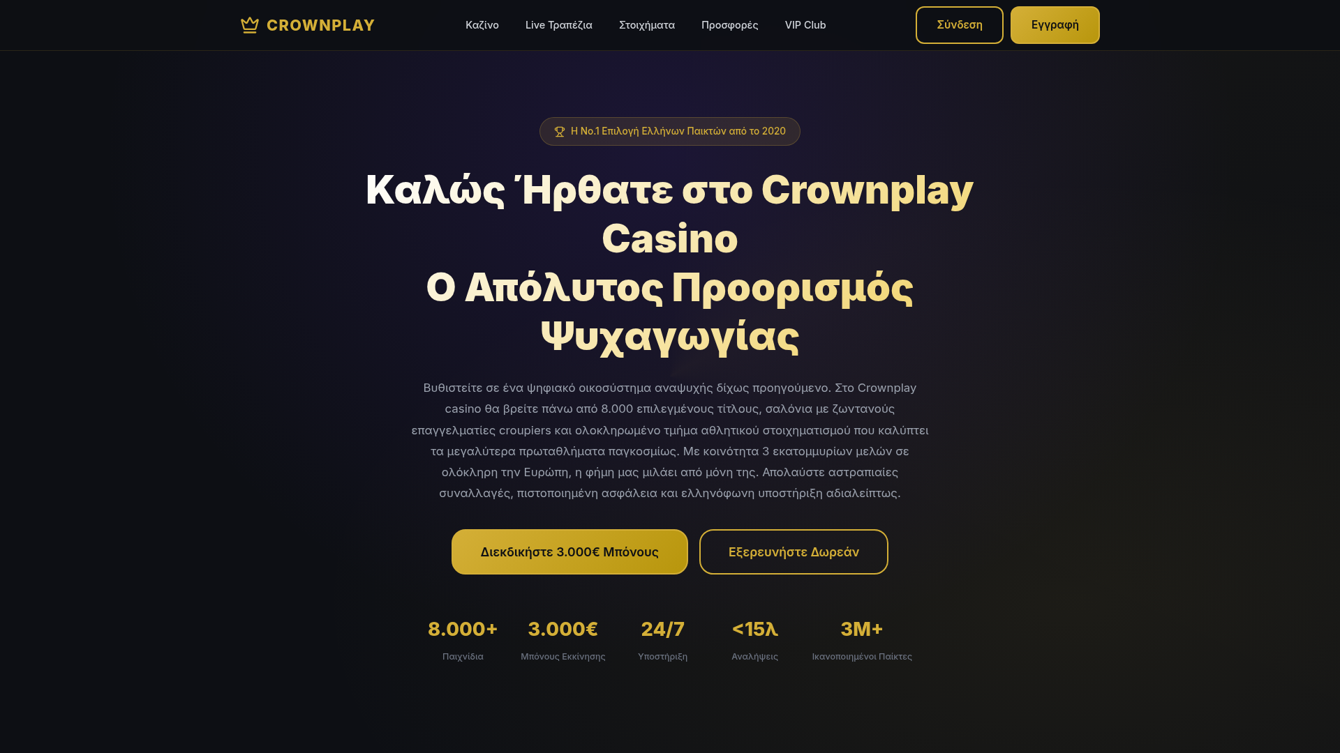
Crownplay Casino Landing Page
A luxury-themed dark mode landing page featuring a center-aligned hero section, value proposition counters, and a high-contrast call-to-action button layout.
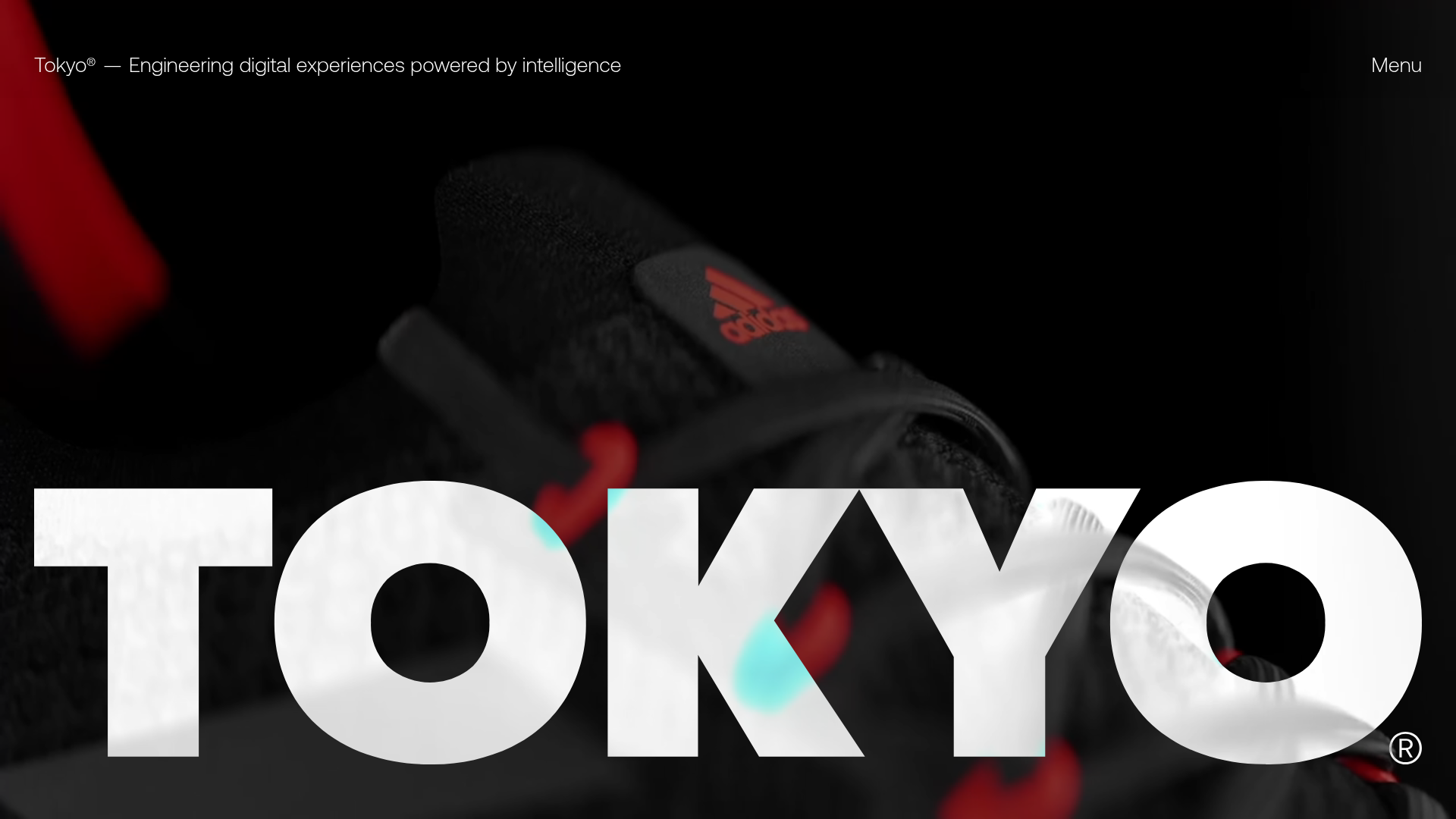
Tokyo Digital Agency Showcase Site
A high-impact agency landing page featuring an animated video hero with oversized typography, logo ticker, and a multi-column project grid with integrated media sliders.
