Tokyo Digital Agency Showcase Site
A high-impact agency landing page featuring an animated video hero with oversized typography, logo ticker, and a multi-column project grid with integrated media sliders.

Overview
This website for Tokyo Digital Agency is a masterclass in high-impact minimalism, using oversized typography and cinematic video to create an immediate sense of scale. It serves as a strong reference for builders looking to implement complex media layouts, such as nested image/video sliders inside a multi-column grid, while maintaining a clean, professional aesthetic.
Design System
- Color Palette & Visual Hierarchy: A strictly monochromatic base (pure black #000 and white #FFF) is used to let colorful brand media stand out. Hierarchy is established through extreme contrast in font sizing rather than color.
- Typography: The design relies on a bold, geometric sans-serif for hero elements (oversized "TOKYO" logo) and smaller, high-readability sans-serif for body text and navigation labels. The "strapline" uses a secondary, lighter weight to distinguish it from the core brand mark.
- Page Structure: The site follows a logical flow: an immersive full-screen Video Hero, a text-heavy "About" section featuring a horizontally scrolling Logo Ticker, a "Work" section with a 4-column project grid, and a dark-mode "Contact/Footer" section.
- Reusable Components:
- Hero Video Wrapper: A robust container for background video with overlaid SVG brand marks.
- Logo Ticker: A continuous marquee for client social proof (e.g., Adidas, BBC, Google).
- Work Card Sliders: A unique component that embeds a functional touch-slider (with navigation dots) inside a grid cell to showcase multiple angles of a single project.
- Two-Column Form: A clean, minimalist layout for business inquiries.
- Interactions & Motion: The HTML indicates the use of
will-changeproperties on hero elements and sliders, suggesting hardware-accelerated transforms and smooth opacity fades. Arrows on the project sliders are hidden by default (opacity: 0) and presumably reveal on hover. - Implementation Clues: The site uses a utility-first approach with classes like
fs-styleguide_4-colandpadding-global. The project cards are structured using a standard mask-and-slide carousel integrated into a CSS Grid layout.
Use Cases
- Who should clone this: Creative agencies, freelance portfolios, or high-end architectural firms that need to showcase visually dominant projects without distracting UI.
- Effective Remixes: This layout is perfect for luxury brands; swapping the tech-focused video for fashion or real estate reels would instantly change the industry vibe without requiring structural edits.
- Remix Directions: Replace the heavy black background with a soft cream or deep navy to soften the brand voice. The "Work Card Slider" component can be easily isolated and reused in any standard project gallery to increase information density.
- Suggested Clone Scope: For a fast win, clone the Hero section for a splash page. For a comprehensive build, clone the Work grid structure to learn how to manage multiple sliders on a single page efficiently.
Related Inspirations
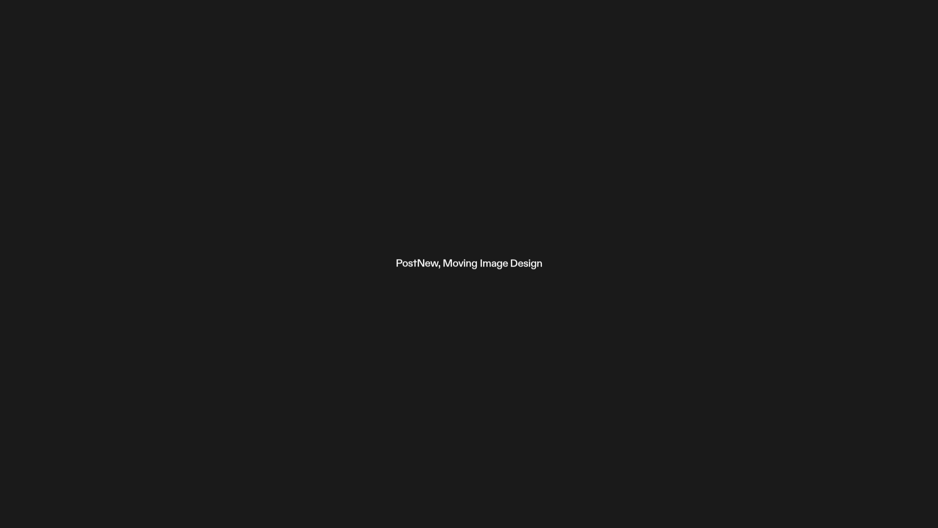
PostNew Moving Image Portfolio Gallery
A minimalist dark-themed portfolio featuring a full-screen vertical scroll layout, video-based grid sections, and blur-effect navigation components.
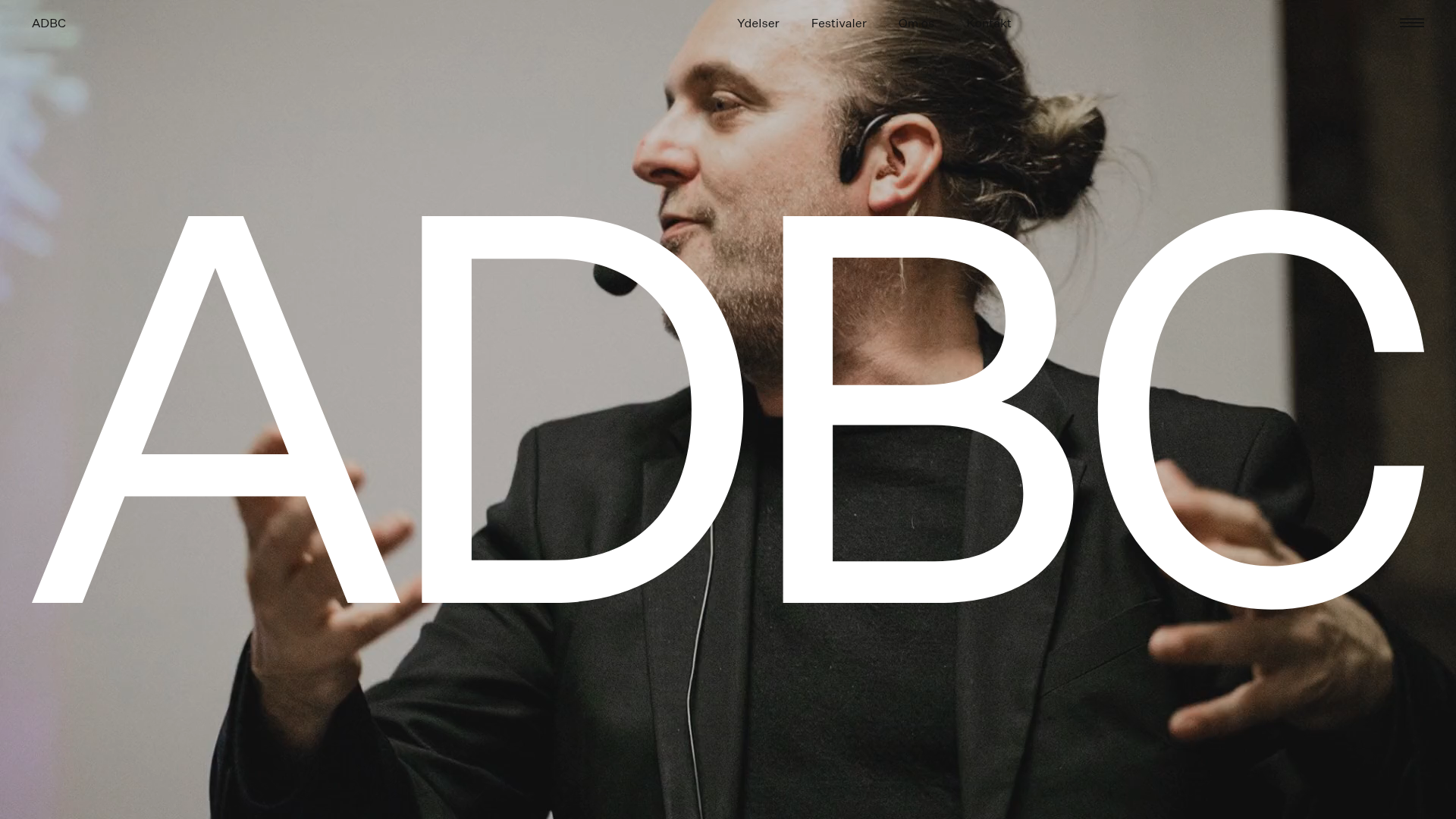
ADBC Studio Agency Landing Page
A high-impact agency site featuring a full-bleed video hero with centered typography, large image-based service cards, and an immersive dark-themed editorial layout.
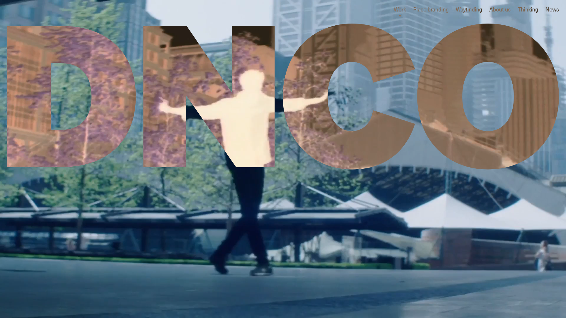
DNCO Agency Portfolio Case Studies
A high-impact portfolio featuring an animated full-screen hero video, a multi-category filtering menu, and a clean grid of project tiles with hover-state transitions.
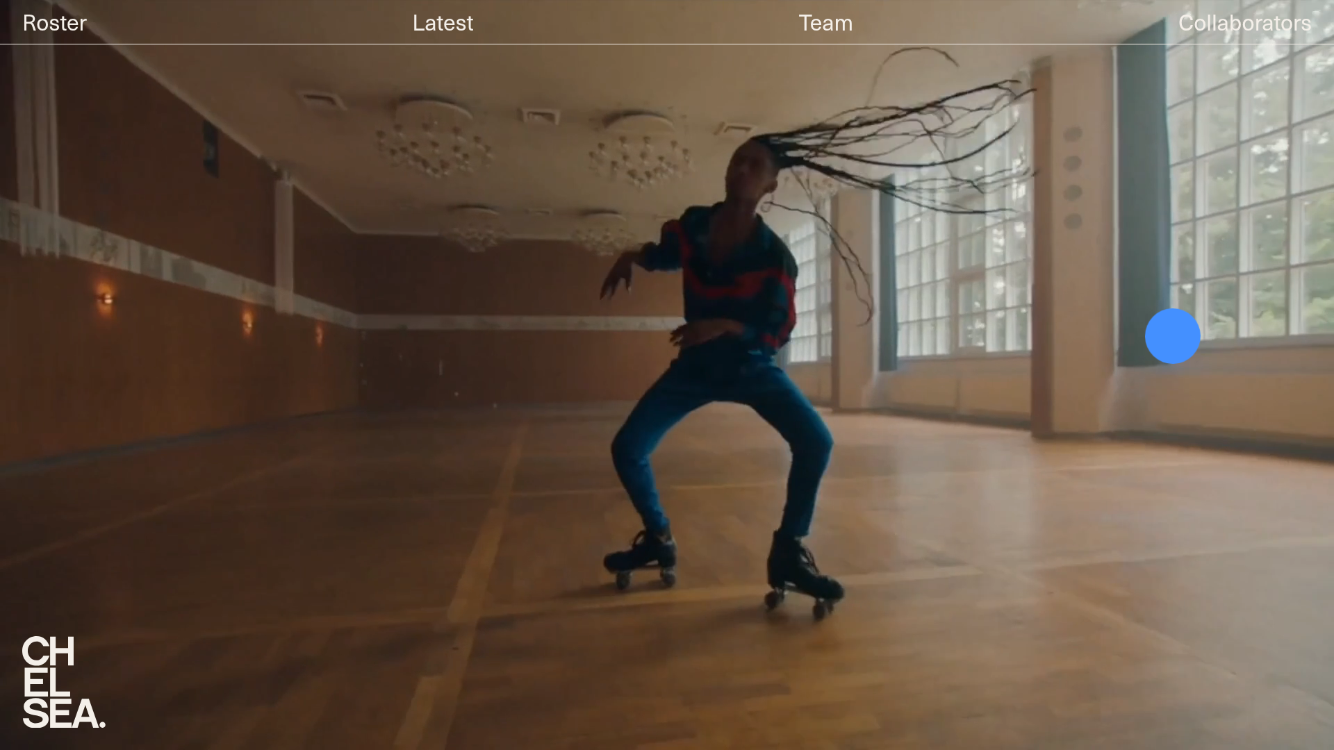
Chelsea Creative Production Agency Portfolio
A minimalist creative agency site featuring an immersive video hero background, sticky navigation, and a filtered list of directors for talent portfolios.

Niklas Rosén Designer Portfolio Index
A minimalist, responsive grid-based portfolio index featuring a clean 16-column layout, typographic list components, and a custom dark mode transition.

Christopher Doyle Agency Portfolio Layout
A minimalist, typography-led portfolio featuring a wide-margin grid system, smooth fade-in animations, and simple image-focused project cards.
