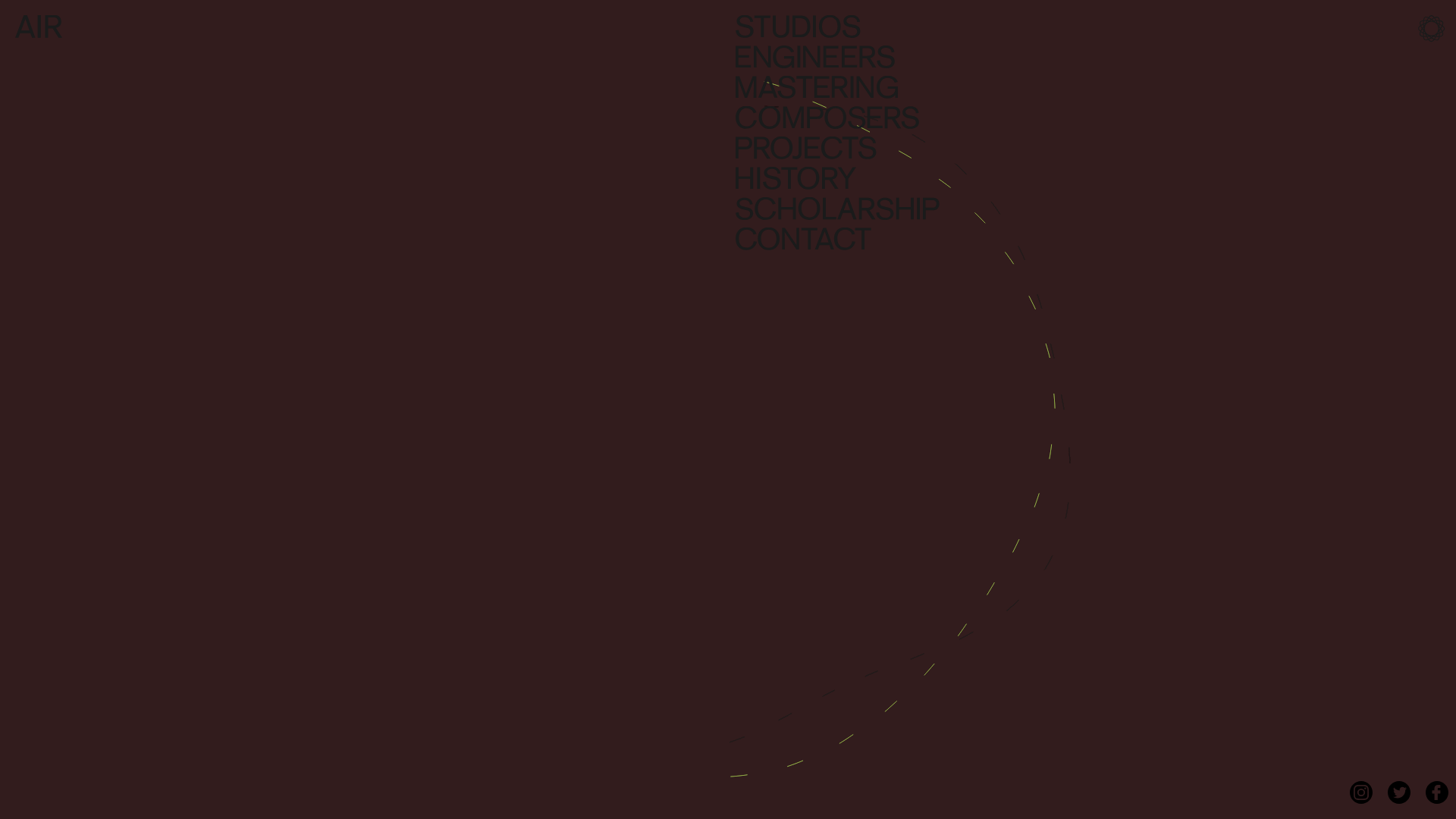
AIR Studios Minimalist Navigation Landing
A dark, minimalist layout featuring a vertical text-based navigation menu, a full-screen background video wrapper, and a dynamic canvas-based interactive drawing layer.
Overview
This landing page is a masterclass in minimalist aesthetic, utilizing a full-screen video background layered with a canvas-based interactive drawing field to create an immersive digital experience. It is a strong clone reference for developers looking to implement high-impact, low-clutter navigation systems that prioritize atmosphere and branding over information density.
Design System
- Color Palette & Visual Hierarchy: The site uses a deep, dark auburn/brown monochromatic base with very low contrast for the UI elements. This creates a sophisticated, atmospheric "understated" look where the brand name "AIR" and navigation items are visible but non-intrusive. High-contrast interactive elements, such as the lime-green dashed brush strokes on the canvas, provide the primary focal points.
- Typography System: A bold, heavyweight Sans-Serif font (likely Helvetica or similar) is used for the navigation menu. The scale is large and vertically stacked to fill the right quadrant of the screen. All-caps lettering adds to the architectural feel of the text block.
- Page Structure: The layout is essentially a full-screen
vimeo-wrapperthat acts as a stage. The structure is depth-oriented rather than scroll-oriented: Background Video -> Canvas Drawing Layer -> Navigation/UI Layer. - Reusable Components:
- Vertical Navigation Menu: A right-aligned list of large text links that serves as the site's primary interface.
- Interactive Canvas Overlay: A
<canvas>element that tracks mouse movement to create generative art (dashed lines) over the video. - Branded Social Hub: A fixed bottom-right list of circular icons for Instagram, Twitter, and Facebook.
- Interaction Patterns: The primary interaction is the mouse-follow script that draws dashed trails across the screen. The navigation items likely contain subtle hover states (color shifts) while maintaining the minimalist aesthetic.
- Implementation Clues: The HTML reveals a concentrated ID-based structure (
#wrapper,#drawing_container) and a fixed-height layout (1080px) designed to lock the user into a specific viewport ratio.
Use Cases
- Who should clone this: Creative agencies, music production studios, architectural firms, and high-end fashion brands who want a "vibe-first" landing page.
- What products can remix it: Portfolio sites where the work is cinematic (directors, cinematographers) or digital product reveals where high-quality rendering is the main selling point.
- Practical remix directions:
- Brand Swap: Replace the dark auburn with a vibrant brand gradient or a clean "white-cube" gallery aesthetic.
- Architecture Shift: Adapt the canvas script to draw solid geometric lines or particle effects instead of dashed arcs.
- Information Density: Use the left side of the screen (currently empty) to add a small secondary content block or a "Now Booking" status indicator.
- Suggested clone scope: A single-page clone of the interactive video wrapper and the stacked navigation block is sufficient to capture the site's core value proposition.
Related Inspirations
NuxtLabs Company Announcement Landing Page
A dark-themed typography layout featuring a starry background effect, grain texture gradients, and a centered long-form text section ideal for letters or press releases.

Artisans d'idées Interactive Narrative Landing
An experimental creative agency landing page featuring canvas-based background animations, particle-effect cursor interactions, and text-reveal scroll sequences.
Channel Studio Innovation Agency Portfolio
A minimalist agency site featuring full-bleed video backgrounds, large-scale typography, and a structured project list with high-contrast hover effects.

Niklas Rosén Designer Portfolio Index
A minimalist, responsive grid-based portfolio index featuring a clean 16-column layout, typographic list components, and a custom dark mode transition.

NewTab Studio Minimalist Portfolio Landing Page
A clean, typography-focused landing page featuring an oversized SVG/canvas hero title, a top-aligned navigation bar, and a minimalist footer layout.

Play Studio Minimalist Portfolio Landing
A high-impact agency layout featuring a oversized typography header, a full-width integrated Vimeo video background, and a unique expandable accordion list for industry showcases.
