Niklas Rosén Designer Portfolio Index
A minimalist, responsive grid-based portfolio index featuring a clean 16-column layout, typographic list components, and a custom dark mode transition.
Overview
This portfolio index is a masterclass in minimalist, information-dense design, utilizing a precise 16-column grid to organize a career's worth of work. It serves as an excellent reference for builders looking to create highly structured, typography-first directories or archives that remain legible and elegant across all screen sizes. The design excises visual clutter, focusing entirely on the metadata of project experience.
Design System
- Grid and Hierarchy: The layout is built on a custom
grid-cols-[repeat(16,minmax(0,1fr))]configuration. The desktop view uses specific column spans (e.g., 2 columns for 'Year', 4 for 'Client', 5 for 'Type') to create a rhythmic, scan-able horizontal flow. - Typography: A clean, sans-serif font system is used with sharp visual hierarchy. Headers use
text-prettyfor optimal line breaks, while the utility text is kept small and high-contrast. Interaction states are signaled through subtle shifts, such ashover:text-nr-text-secondary. - Color Palette: The UI is primarily monochromatic with a high-contrast base. The HTML reveals a sophisticated dark mode implementation using custom utility classes (e.g.,
dark:divide-nr-border-primary-dark), allowing for seamless theme transitions. - Reusable Components:
- The Index Row: A
<li>based component that uses flex and grid to swap between a vertical stack on mobile and a horizontal row on desktop. - Header Block: A
col-span-9text block that provides context without breaking the grid's alignment.
- The Index Row: A
- Interaction Design: Links use a
transition-colorsclass for smooth hover states. The grid also usesgroupclasses to manage styling across the entire row when a user interacts with a single entry. - Responsive Behavior: On mobile, the 16-column grid collapses to
col-span-full, and themd:order-xutility is used to reorder metadata (e.g., putting the client name before the year) to prioritize information for smaller viewports.
Use Cases
- Who should clone this: Designers, developers, and researchers with extensive project histories who want an "at-a-glance" archive rather than a traditional image-heavy gallery.
- Effective Remixes: This pattern is perfect for agency "Project Lists," resource directories, CSV-to-web databases, or even a simplified changelog for a software product.
- Remix Directions: Builders can easily swap the neutral palette for a high-energy brand color, or replace text-only rows with small thumbnail hovers. The information architecture can be adapted by simply adjusting the
col-spanvalues to accommodate different data points like "Platform" or "Duration." - Clone Scope: A full-page clone is recommended to capture the responsive grid logic, though the specific
ligrid-row component is a high-value snippet for anyone needing to build a custom accessible data table.
Related Inspirations
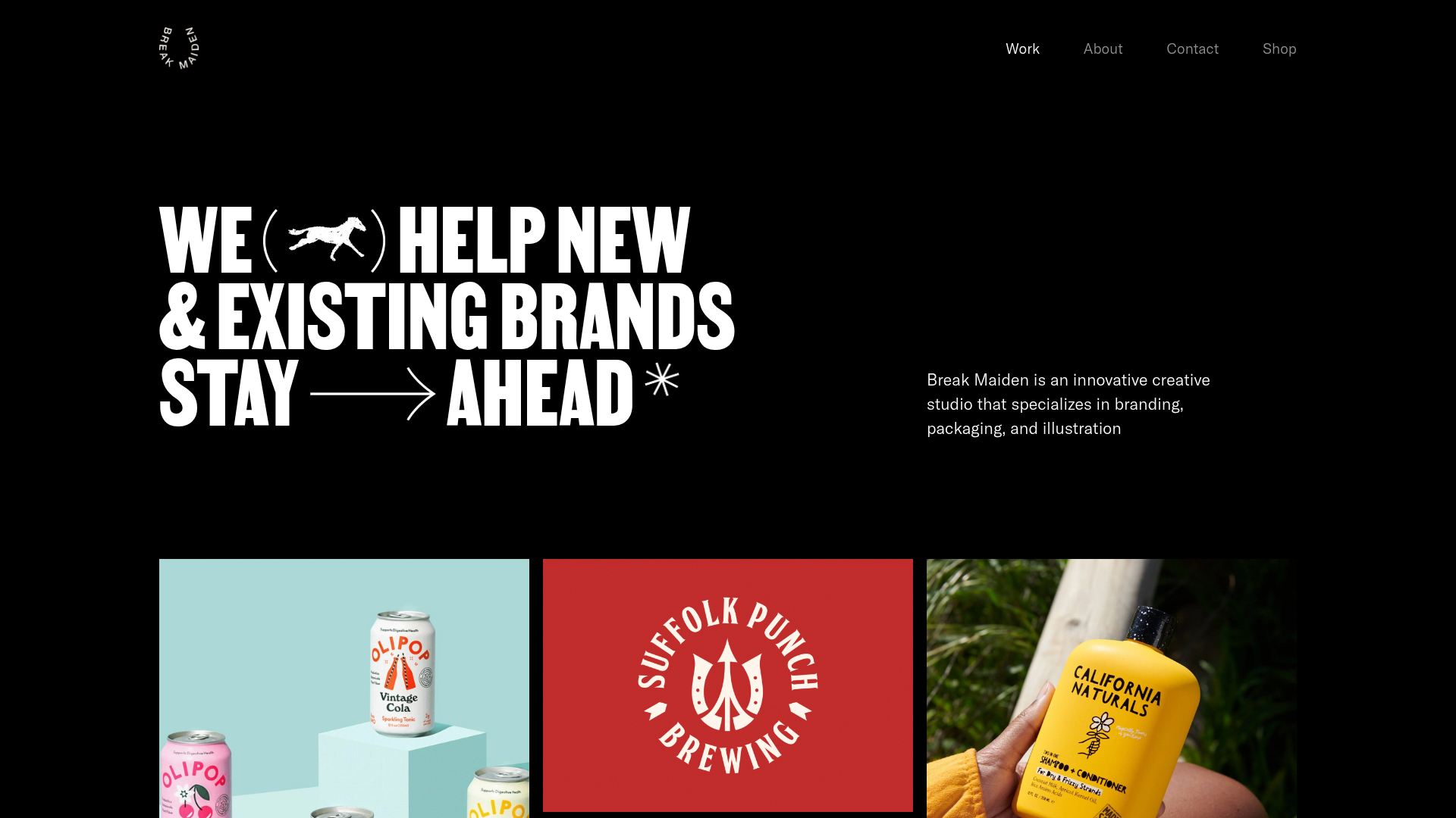
Break Maiden Agency Portfolio Hero
A high-impact dark mode hero section featuring oversized typography with inline GIF icons and a responsive grid for display-heavy case studies.
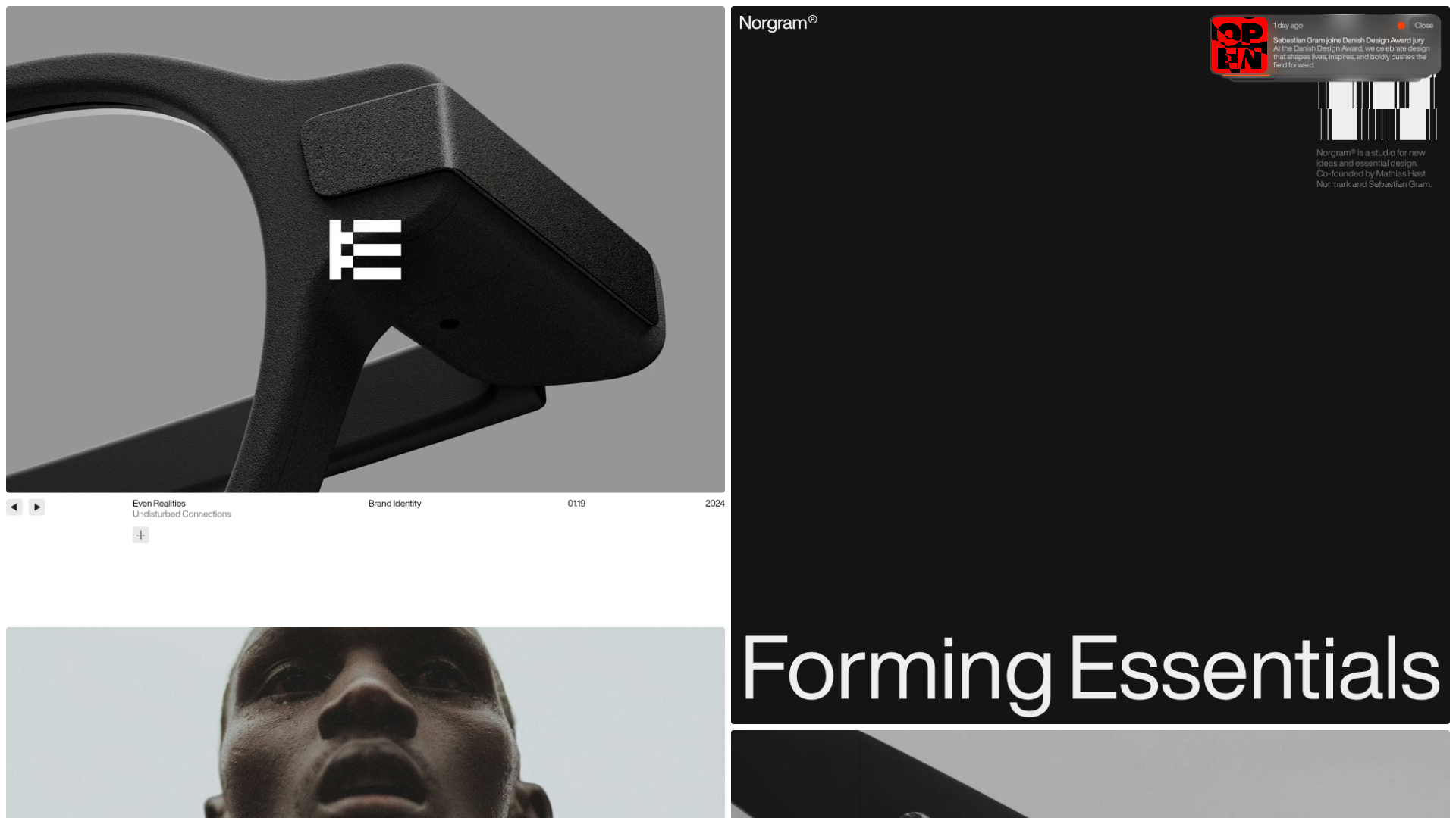
Norgram Minimalist Design Portfolio
A high-end, monochrome studio portfolio featuring a brutalist typography-led hero section, a clean asymmetrical masonry grid, and minimalist project navigation.

Marx Design Minimal Portfolio Grid
A high-end design portfolio featuring a synchronized image-hover grid layout, GSAP-powered transitions, and a hidden fullscreen menu with portrait image links.
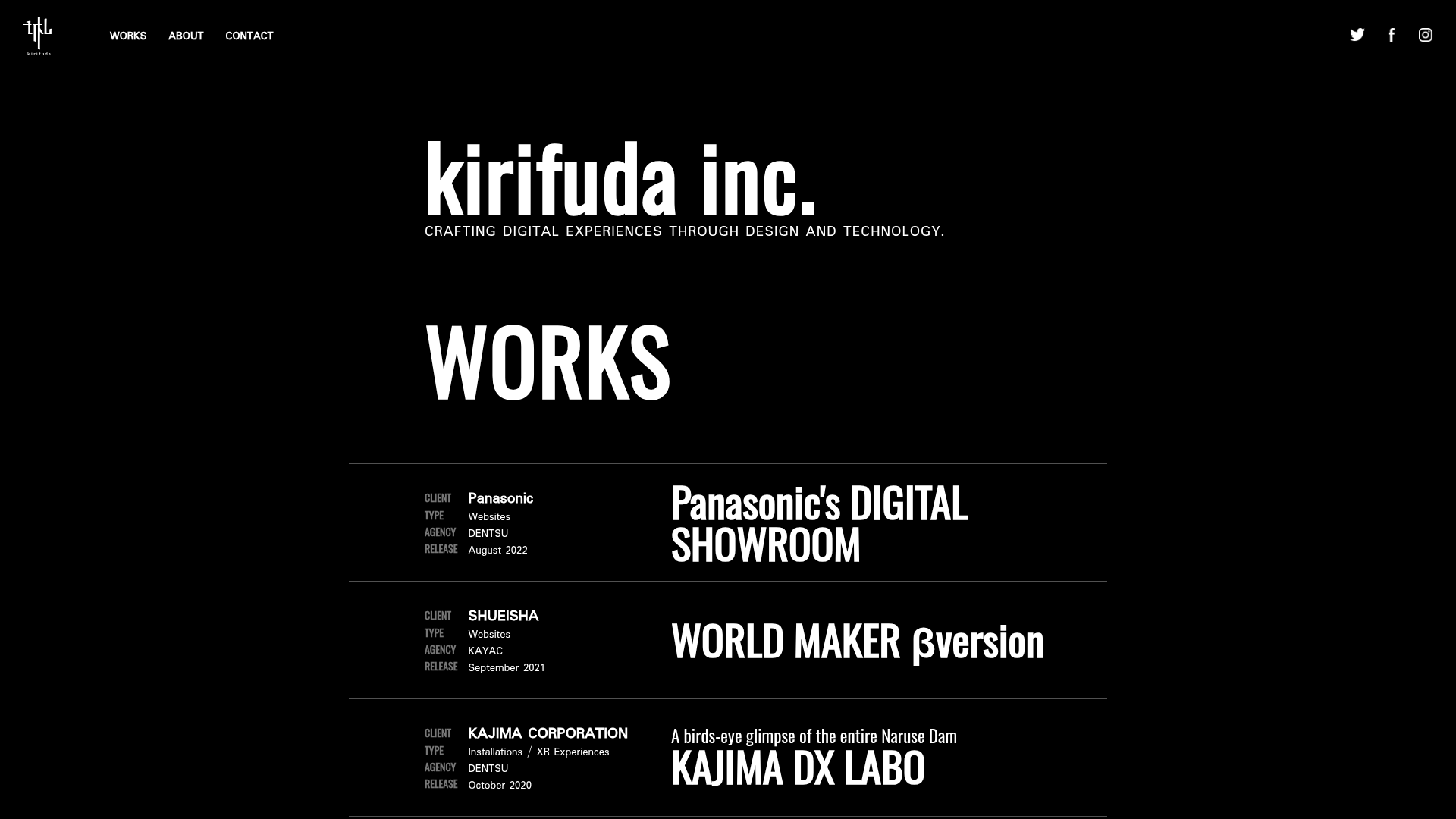
Kirifuda Inc. Minimal Portfolio Showcase
A clean, dark-mode agency portfolio featuring a typographic hero section, a high-contrast list-based works gallery with metadata, and a segmented multi-column footer for company details.
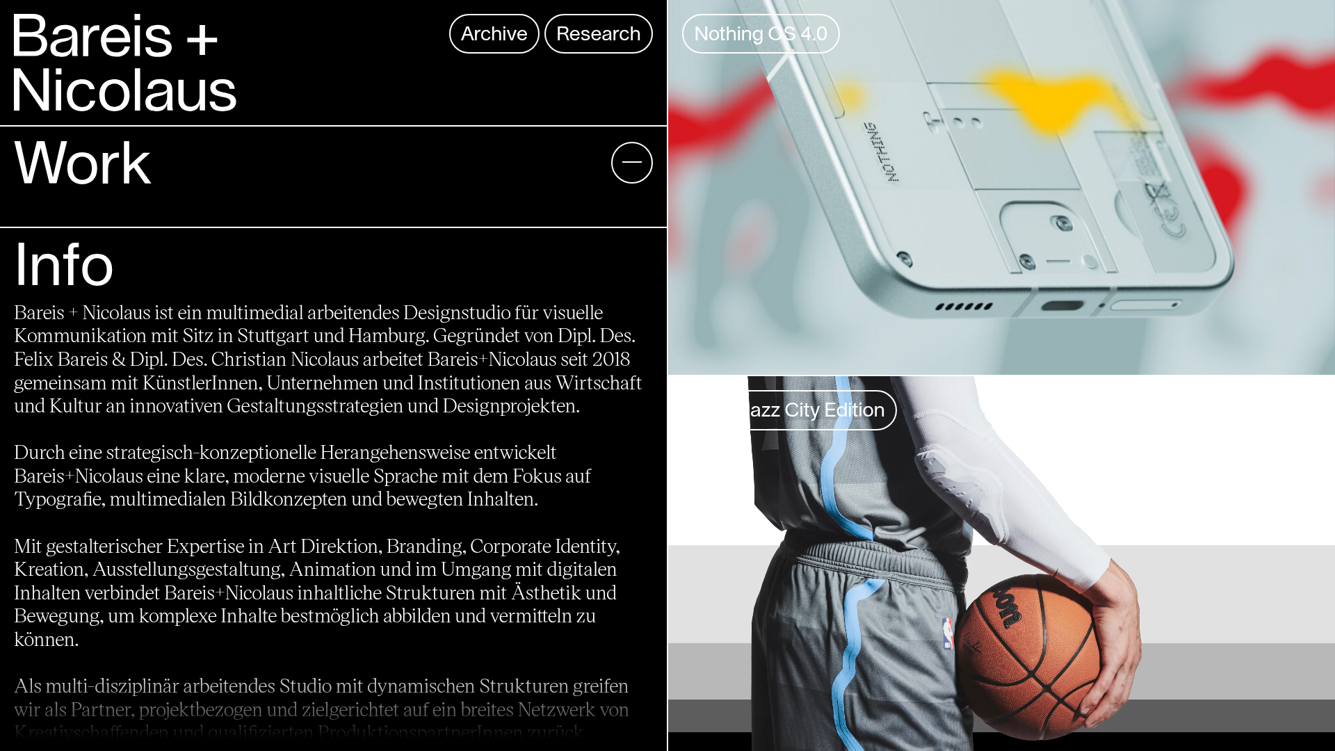
Bareis + Nicolaus Design Portfolio
A split-screen portfolio featuring a fixed text-based sidebar alongside an edge-to-edge scrollable gallery of video and image project components.
Two Create Studio Minimalist Portfolio
A high-contrast, text-centric agency landing page featuring a bold typographic header and a dark-mode minimalist layout suitable for creative portfolios.
