NewTab Studio Minimalist Portfolio Landing Page
A clean, typography-focused landing page featuring an oversized SVG/canvas hero title, a top-aligned navigation bar, and a minimalist footer layout.
Overview
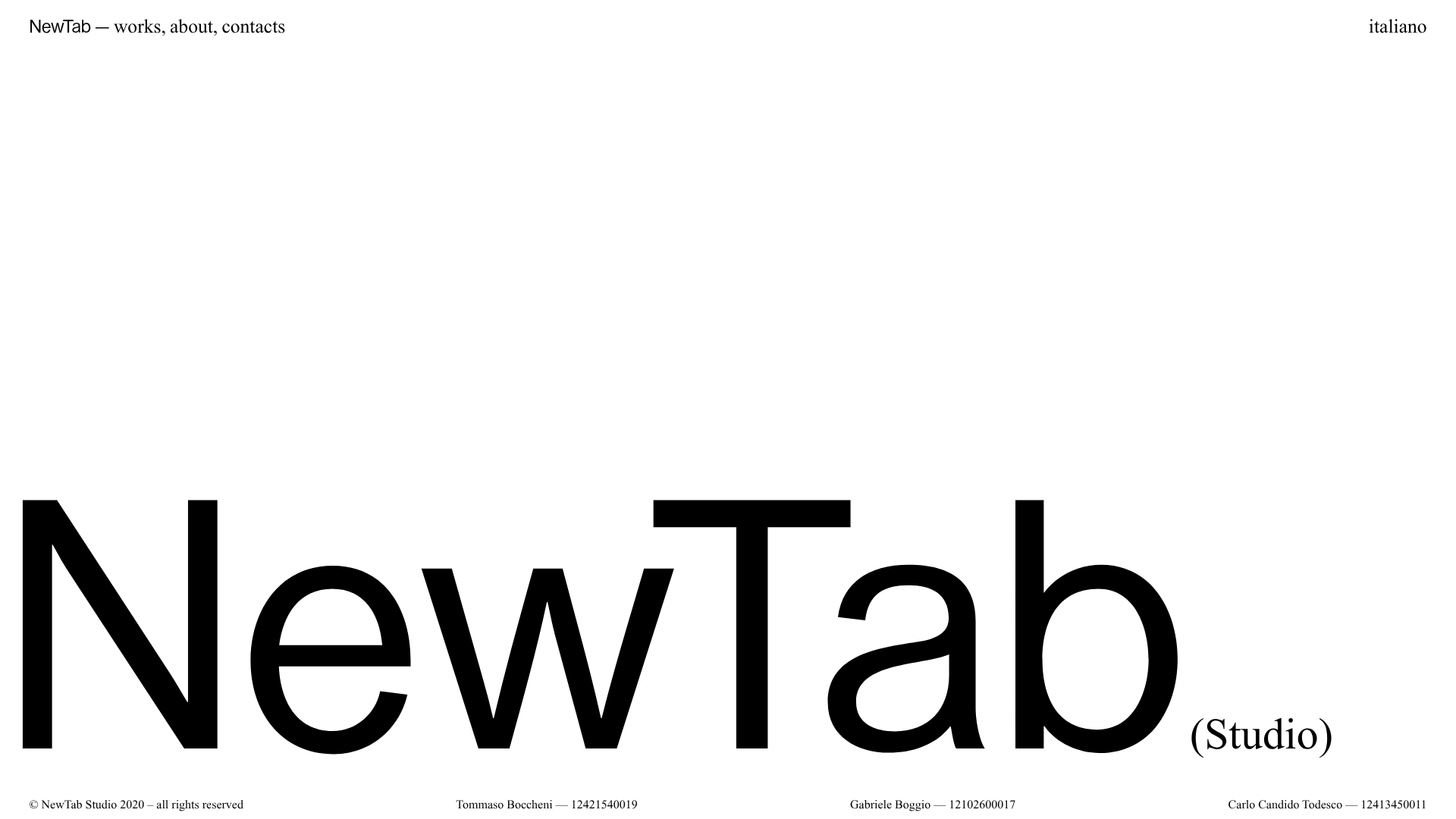
NewTab Studio’s landing page is an exercise in extreme minimalism and typographic impact. It serves as a high-end reference for portfolios or creative agencies that want to prioritize brand presence and whitespace over traditional content dense layouts, using an oversized canvas-based hero title for immediate visual recognition.
Design System
- Color Palette & Visual Hierarchy: The design uses a high-contrast monochrome palette (pure white background and deep black text). Visual hierarchy is driven almost exclusively by scale, with the massive "NewTab" hero title occupying the lower two-thirds of the viewport to anchor the layout.
- Typography System: The site relies on a clean, humanist sans-serif. The hero title uses a massive font size (approximating 20vw+), while the navigation and footer data use small, monospace-influenced proportions for a technical, precise feel. The parenthetical "(Studio)" provides a secondary typographic accent in a serif style.
- Page Structure & Section Flow: The layout follows a strict "frame" structure. Navigation elements are pinned to the top corners, while a global footer contains copyright information and credits pinned to the bottom. The central content area is reserved for the
homepage_wrappercontaining the hero graphic and canvas element. - Reusable Components:
- The Frame Nav: The top-left corner brand/navigation string ("NewTab — works, about, contacts") is a great pattern for high-end creative sites.
- Data-Grid Footer: The bottom layout, which distributes credits across four columns using a small font size, is highly reusable for professional services.
- Interaction & Motion Patterns: The presence of
<canvas id="homeCanvas">and multiple.safariimage assets suggests that the large hero title is likely interactive or animated (e.g., following cursor movement or responding to scroll events) rather than a static tag. - Responsive Behavior: The HTML includes a
.homepage_mobilesection containing a specificlogo-center.svg, indicating that the layout shifts from the asymmetrical desktop "frame" to a more traditional centered vertical stack for mobile devices.
Use Cases
- Who should clone this pattern: Graphic designers, independent architects, and boutique digital agencies looking for a "less is more" aesthetic that emphasizes their studio name as a brand.
- What products can remix it effectively: Personal portfolios, digital galleries, or event landing pages where the primary goal is a bold first impression rather than immediate feature-listing.
- Practical remix directions: Swap the black-and-white theme for a high-saturation two-tone palette (e.g., cobalt blue and white). Adapt the canvas-based hero to use a different font or a dynamic SVG shape. Remix the four-column footer to display current project status or location data.
- Suggested clone scope: A full-page clone is recommended to maintain the precise spatial relationships between the corner-pinned navigation and the oversized center-point. The canvas/SVG hero logic is the most valuable technical piece to replicate.
Related Inspirations

Egstad Minimalist Design Portfolio
A refined Nuxt.js portfolio featuring bold variable typography, interactive canvas elements, and a clean grid-based layout for showcasing design work.

Christopher Doyle Agency Portfolio Layout
A minimalist, typography-led portfolio featuring a wide-margin grid system, smooth fade-in animations, and simple image-focused project cards.

Play Studio Minimalist Portfolio Landing
A high-impact agency layout featuring a oversized typography header, a full-width integrated Vimeo video background, and a unique expandable accordion list for industry showcases.

Baubauwerk Minimal Agency Portfolio Homepage
A clean studio site featuring a centered text hero, scatter-plot filterable project gallery, and full-bleed image sections for case studies.
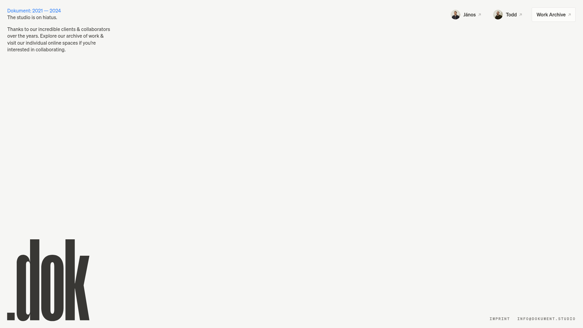
Dokument Studio Minimalist Portfolio Landing
A clean, high-contrast landing page featuring a bottom-aligned oversized logo, top-right profile links, and a minimalist typography-focused layout.
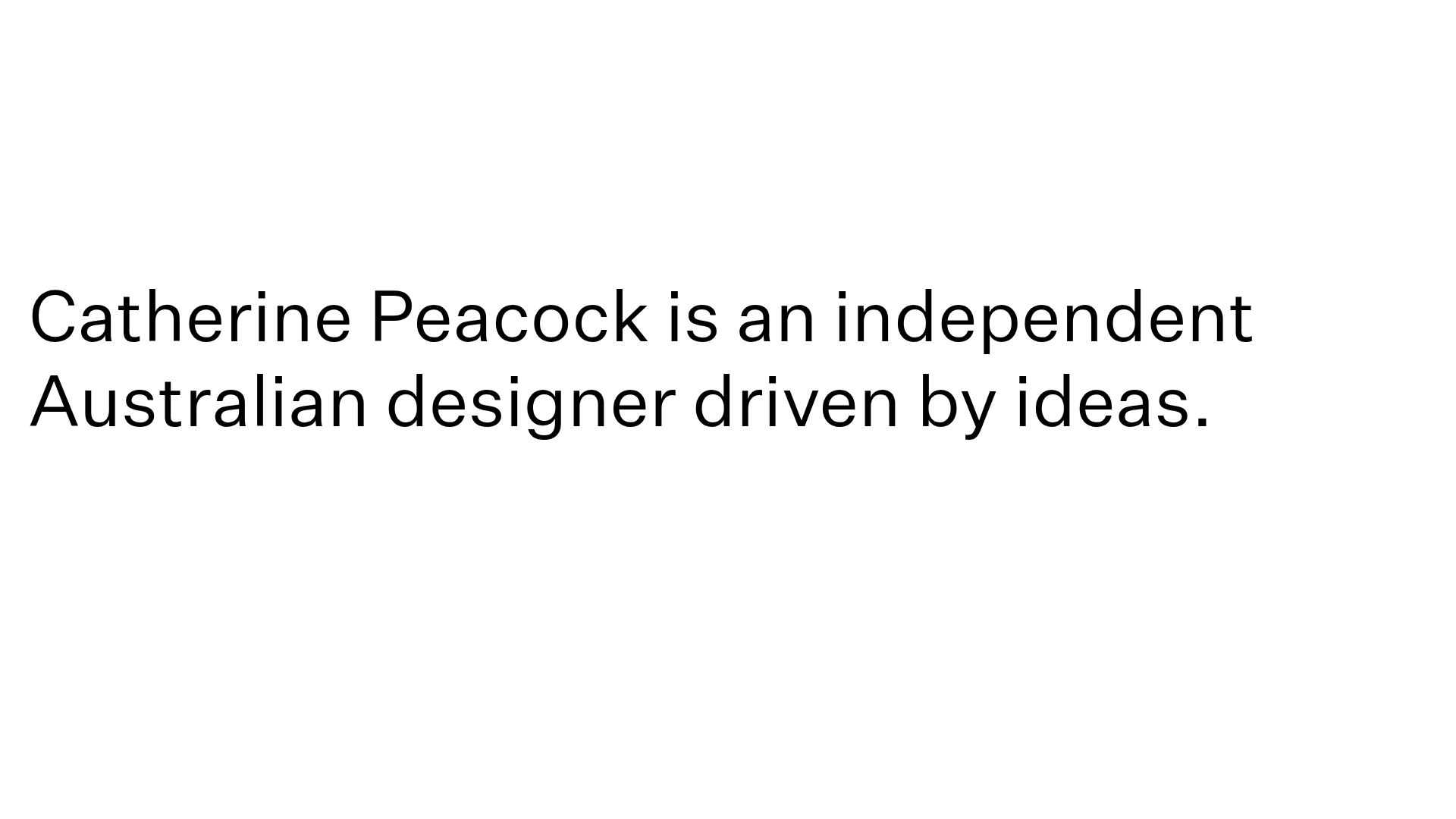
Catherine Peacock Designer Portfolio Home
A minimalist portfolio layout featuring a vertically stacked masonry project grid, sticky navigation with animated icons, and offset typography.
