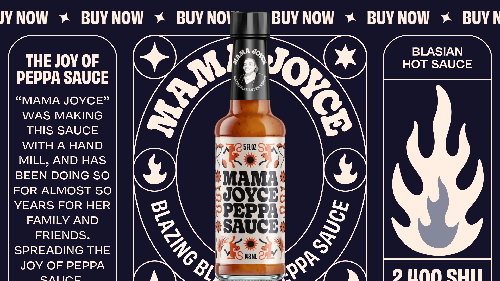
Mama Joyce Hot Sauce Landing Page
A high-impact single-page site featuring scrolling text marquees, sticky product sections, and CSS-driven Lottie animations for a dynamic, brand-first e-commerce experience.
Overview
This single-page site for Mama Joyce Hot Sauce is a masterclass in high-energy, brand-first e-commerce. It uses a bold "Blasian" aesthetic, combining sticker-inspired graphics with fluid Lottie animations and scroll-triggered transitions to create a visceral, immersive sales funnel. It is an excellent reference for builders wanting to move beyond clean minimalism into expressive, high-impact storytelling.
Design System
- Color Palette & Visual Hierarchy: The design uses a high-contrast palette of deep navy backgrounds with bone-white text and vibrant accent graphics (red flames, orange suns). Hierarchy is established through oversized display typography and a central "sticky" product bottle that remains a focal point as the user scrolls.
- Typography: The system relies on heavy, condensed sans-serif fonts (e.g., "THE JOY OF PEPPA SAUCE"). It uses a mix of vertical orientation, arc-warped text containers, and uppercase styling to create a "poster-like" feel. Scale varies from massive display titles to compact, high-legibility body blocks within rounded-corner containers.
- Page Structure & Flow: The layout is divided into distinct thematic vertical sections. It starts with the core product value proposition, moves into heritage and "how to use" sections (featuring animated food icons), and ends with a strong purchase-oriented CTA section.
- Reusable Components:
- Text Marquees: Continuous "BUY NOW" and "WTF IS GUYANA" scrolling horizontal bars used as section dividers.
- Rounded Frame Containers: White-bordered boxes with heavy radius corners that house copy and secondary illustrations.
- Interactive Cursor: Lottie-driven custom cursors that change state based on section context (e.g., "Check Out" or "Learn More").
- Pricing Modal: A clean, bottom-anchored subtotal block with a large Shopify-linked checkout button.
- Interaction & Motion: The site is heavily driven by scroll-based interactions (
data-w-idtriggers). Key features include rotating star icons, parallax text movements (translate3d), and Lottie animations that play on scroll (the hand mill and flame icon). - Responsive Behavior: The HTML reveals a dedicated mobile-class system (e.g.,
bottle-section-mobile,top-section-left mobile). On smaller screens, the layout shifts from side-by-side columns to a stacked vertical sequence, maintaining the circular text and oversized headings for legibility.
Use Cases
- Who should clone this: Brands in the CPG (Consumer Packaged Goods), fashion, or streetwear space that thrive on personality and movement rather than traditional grid-based layouts.
- Effective remixes: This pattern works best for single-SKU brands or niche hero products (like hot sauce, craft spirits, or limited-edition apparel) where storytelling is the primary conversion driver.
- Practical directions: Builders can reuse the scrolling marquee and sticky bottle interaction while swapping the assets for a different industry. The "A Taste of Guyana" section can be adapted into a "Made in [Location]" or "Meet the Maker" feature.
- Clone scope: A full-page clone is recommended to capture the complex scroll-trigger relationships, but the scrolling text marquees and rounded-corner content cards are excellent for quick, standalone section reuse.
Related Inspirations
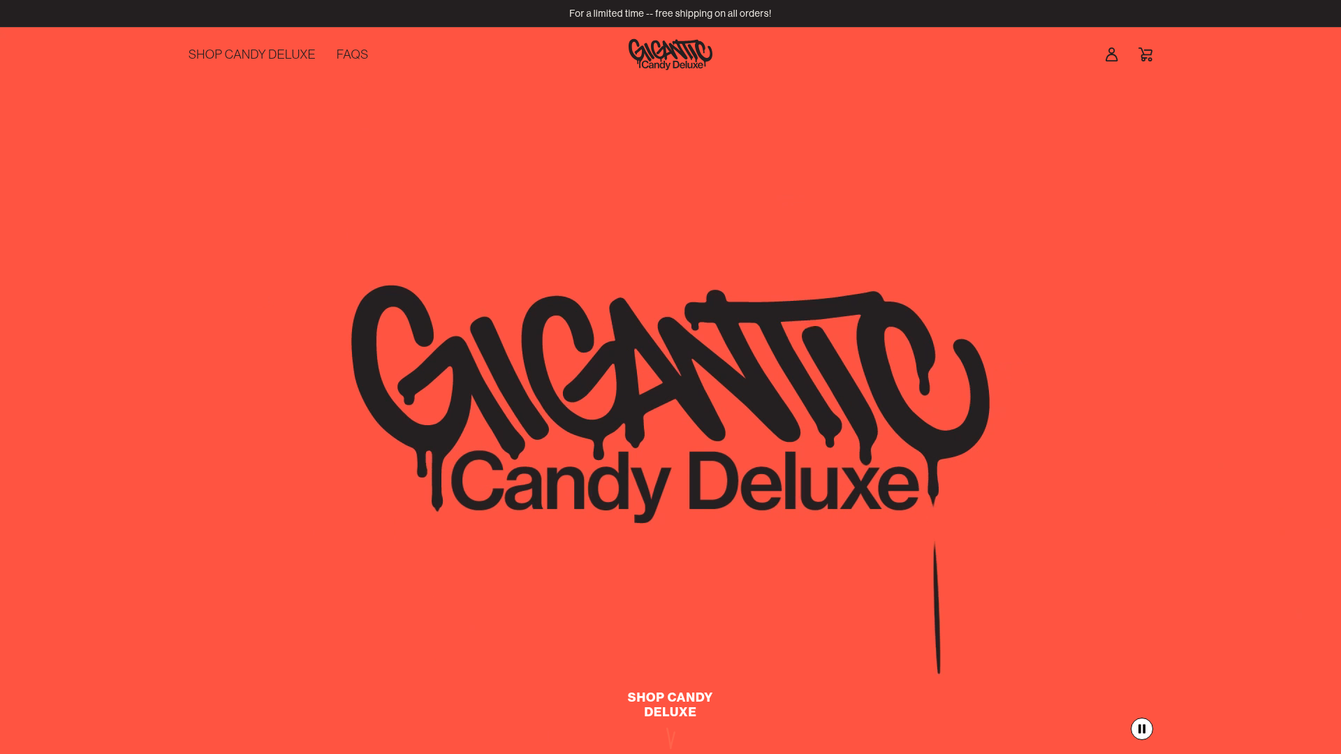
Gigantic Candy E-commerce Landing Page
A high-impact Shopify storefront featuring a full-screen video hero, marquee scrolling text, and animated product hover effects in a bold streetwear-inspired aesthetic.
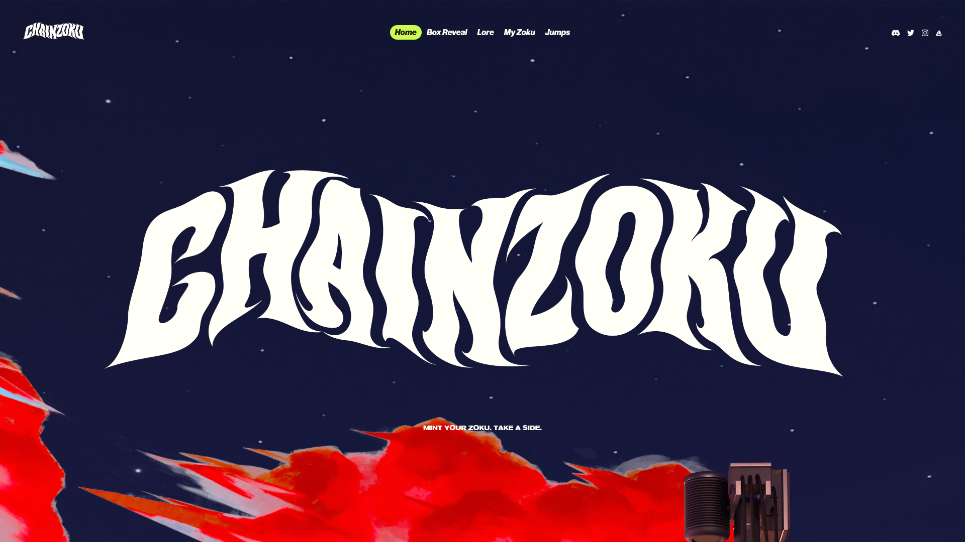
Chainzoku Gaming and NFT Landing Page
A high-impact landing page featuring a wobbly marquee hero logo, parallax cloud layers, sticky background-reveal sections, and a horizontal character faction switcher.
Minimalist Dark Mode Loading Screen
A clean, dark-themed redirection page featuring a centered typography layout and a CSS circular loading spinner for asynchronous processing states.

Vercel AI Cloud Landing Page
A modern landing page featuring a minimalist dark-themed navbar, a grid-overlay hero section with radial color gradients, and high-contrast typography for customer success stories.

Google Holiday 100 Curator Landing Page
A minimalist e-commerce showcase featuring a wide hero section, clean search integration, and a bold typography-driven header designed for trending product collections.

Finn Pet Supplements Landing Page
An e-commerce landing page featuring high-contrast typography, a sticky brand logo banner, parallax scroll effects on product headers, and a clean product grid.
