Vercel AI Cloud Landing Page
A modern landing page featuring a minimalist dark-themed navbar, a grid-overlay hero section with radial color gradients, and high-contrast typography for customer success stories.
Overview
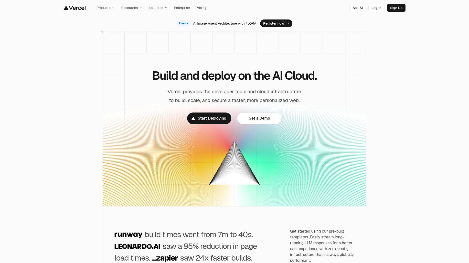
This is the landing page for Vercel, a leading platform for frontend cloud hosting. It is an exceptional clone reference for SaaS and AI products due to its sophisticated use of CSS grid layouts, mathematical/geometric hero illustrations, and high-impact typography that emphasizes performance metrics.
Design System
- Color Palette & Visual Hierarchy: The site uses a monochrome base (white background, black text) punctuated by a vibrant radial color spectrum in the hero section. This creates a high-contrast environment where the call-to-action (CTA) buttons and product logos stand out clearly.
- Typography System: The design utilizes a bold sans-serif typeface (Geist Sans/Inter style). It employs a tight tracking and large font-weight for headers to establish authority, with a clear hierarchical drop in scale for body copy and sub-headers.
- Page Structure:
- Top Navigation: A minimalist fixed navbar with dropdown menus and distinctive "Sign Up"/"Ask AI" actions.
- Announcement Bar: A rounded pill-shaped notification for events.
- Hero Section: Centered text content over a faint grid background, featuring a prismatic geometric focal point.
- Social Proof Section: A vertical stack of brand testimonials featuring large-scale logos paired with specific performance statistics.
- Reusable Components:
- The "Start Deploying" Button: A pill-shaped black button with a small integrated brand icon.
- Grid Background: A subtle, mathematically precise CSS/SVG grid overlay that adds depth without clutter.
- Prism/Gradient Graphic: A sophisticated visual asset that combines linear gradients with radial transparency.
- Interaction Design: Hover states on navigation links use subtle background shifts. The structural layout suggests a mobile-first approach where the multi-column testimonial section likely stacks vertically on smaller viewports.
Use Cases
- Who should clone this: Developers launching developer tools, AI infrastructure, or B2B SaaS platforms that need to convey high performance and technical reliability.
- Effective Remixes:
- Brand Swapping: Replace the prism graphic with a 3D product render while keeping the grid background and typography scale.
- Data-Driven Sections: Use the testimonial section layout to highlight specific ROI metrics for your own product (e.g., "24x faster builds").
- Suggested Clone Scope: A partial clone focusing on the Hero Section and Testimonial Block is recommended for those wanting a "premium tech" aesthetic without redesigning an entire site. For a complete brand overhaul, cloning the navigation and global footer structure provides a professional-grade scaffolding for modern web apps.
Related Inspirations
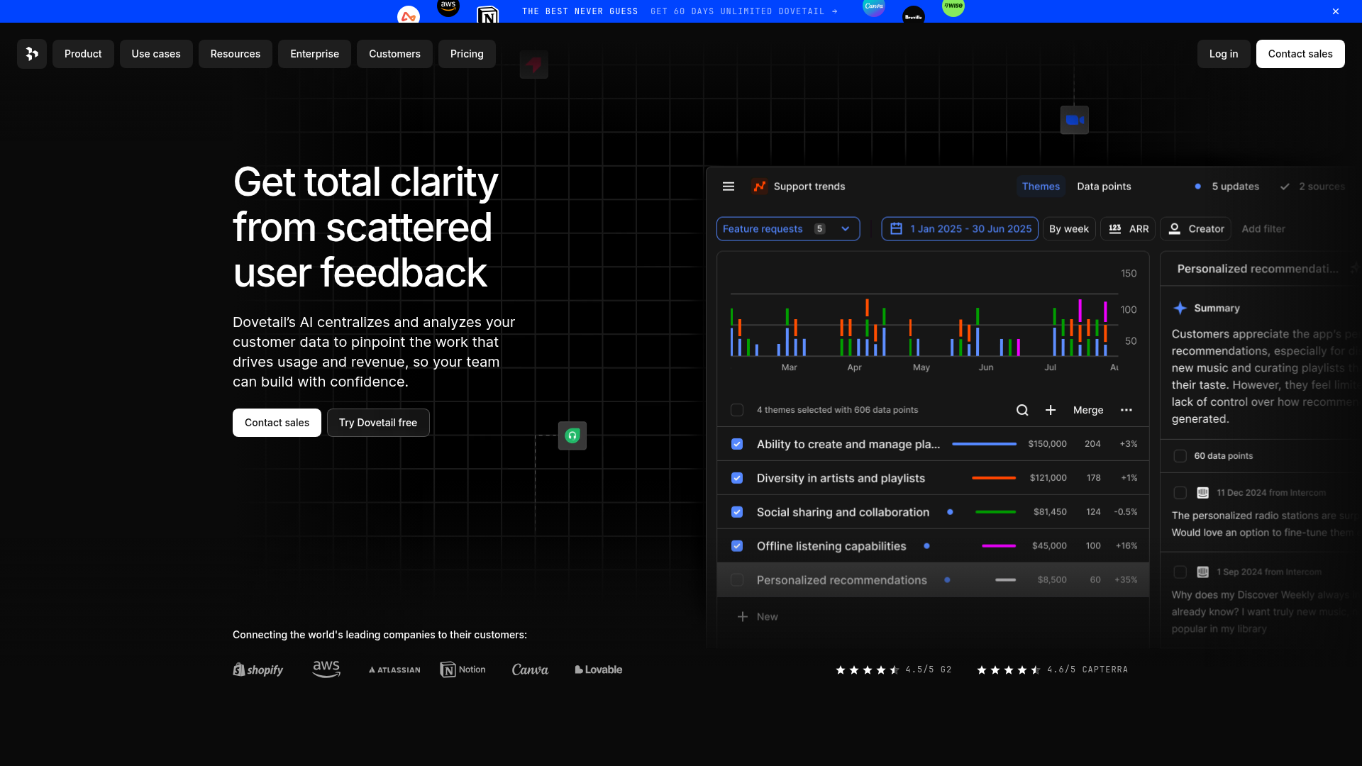
Dovetail AI SaaS Landing Page
A dark-themed landing page featuring a grid-pattern hero, layered product dashboard previews, feature walkthroughs with sticky scrolling, and integrated logo carousels.
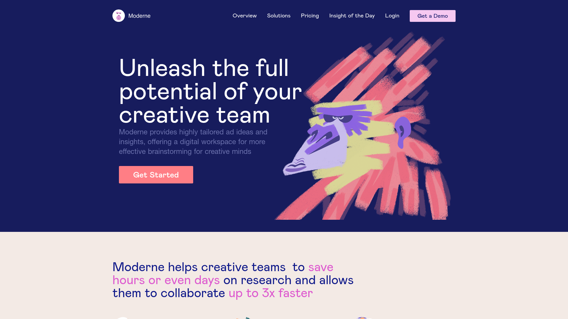
Moderne Creative Landing Page
A high-contrast landing page featuring a dark hero section with an artistic illustration overlay, distinct alternating content blocks, and a visual comparison bar chart component.
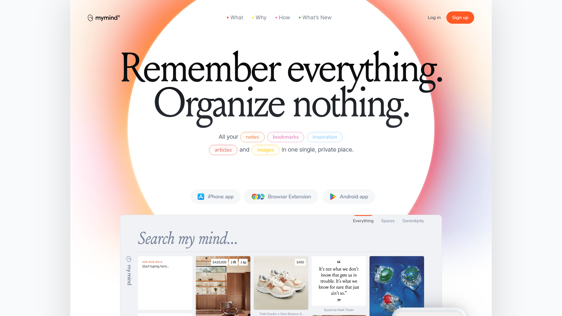
Mymind AI Tool Landing Page
A minimalist SaaS landing page featuring a soft-gradient hero section, custom pill-shaped text badges, and a dynamic bento-style search result preview grid.
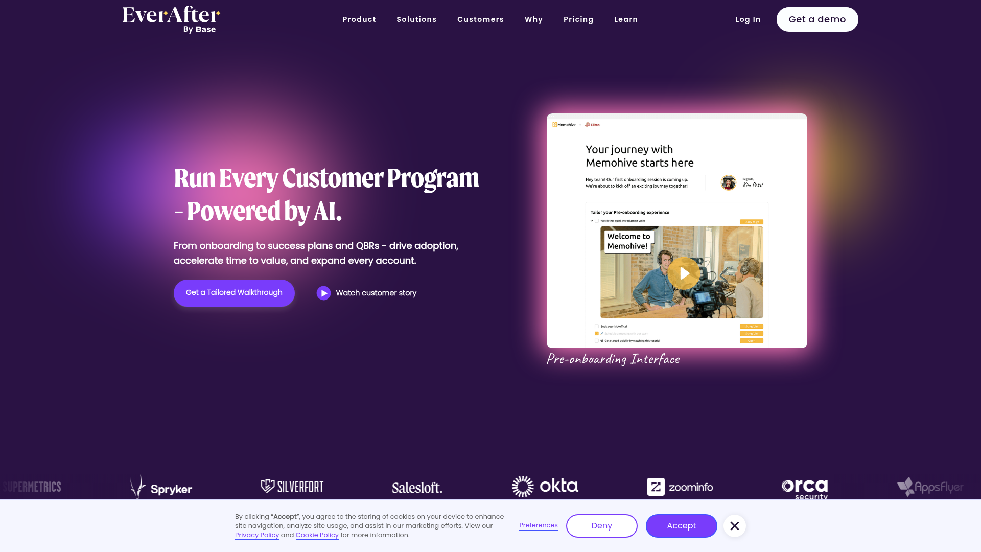
EverAfter AI Customer Portal Hero
A SaaS landing page template featuring a glowing product carousel, auto-scrolling logo marquee, accordion-based feature reveals, and an embedded scheduling widget.
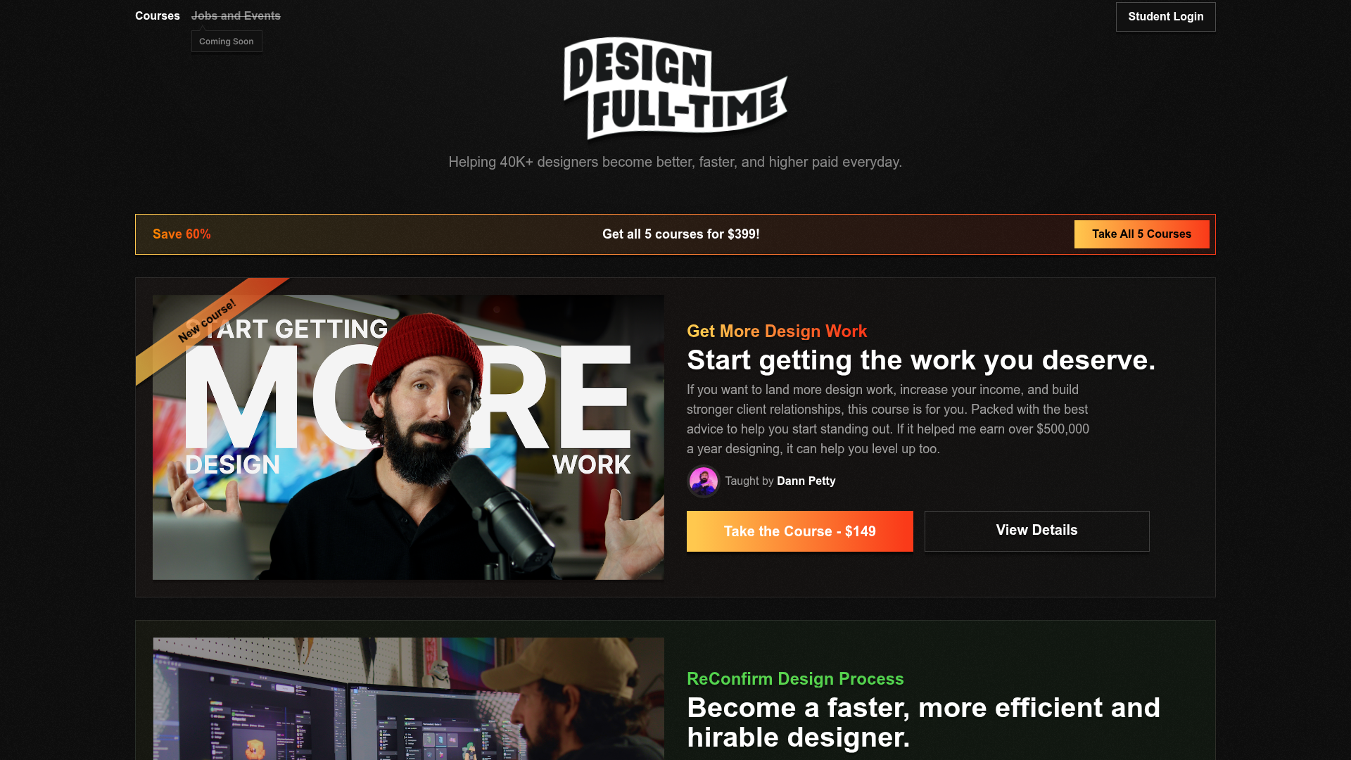
Design Full-Time Course Landing Page
A dark-themed educational site featuring a promotional banner, vertically stacked course cards with gradient borders, a video lesson grid, and integrated pricing buttons.
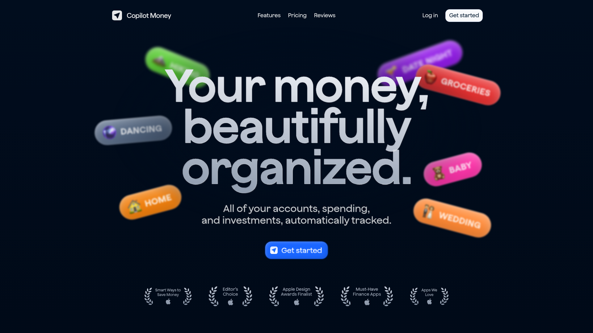
Copilot Money Finance Landing Page
A dark-themed finance landing page featuring a centered animated hero section with floating category badges, integrated trust badges, and a clean minimalist navigation bar.
