Finn Pet Supplements Landing Page
An e-commerce landing page featuring high-contrast typography, a sticky brand logo banner, parallax scroll effects on product headers, and a clean product grid.
Overview
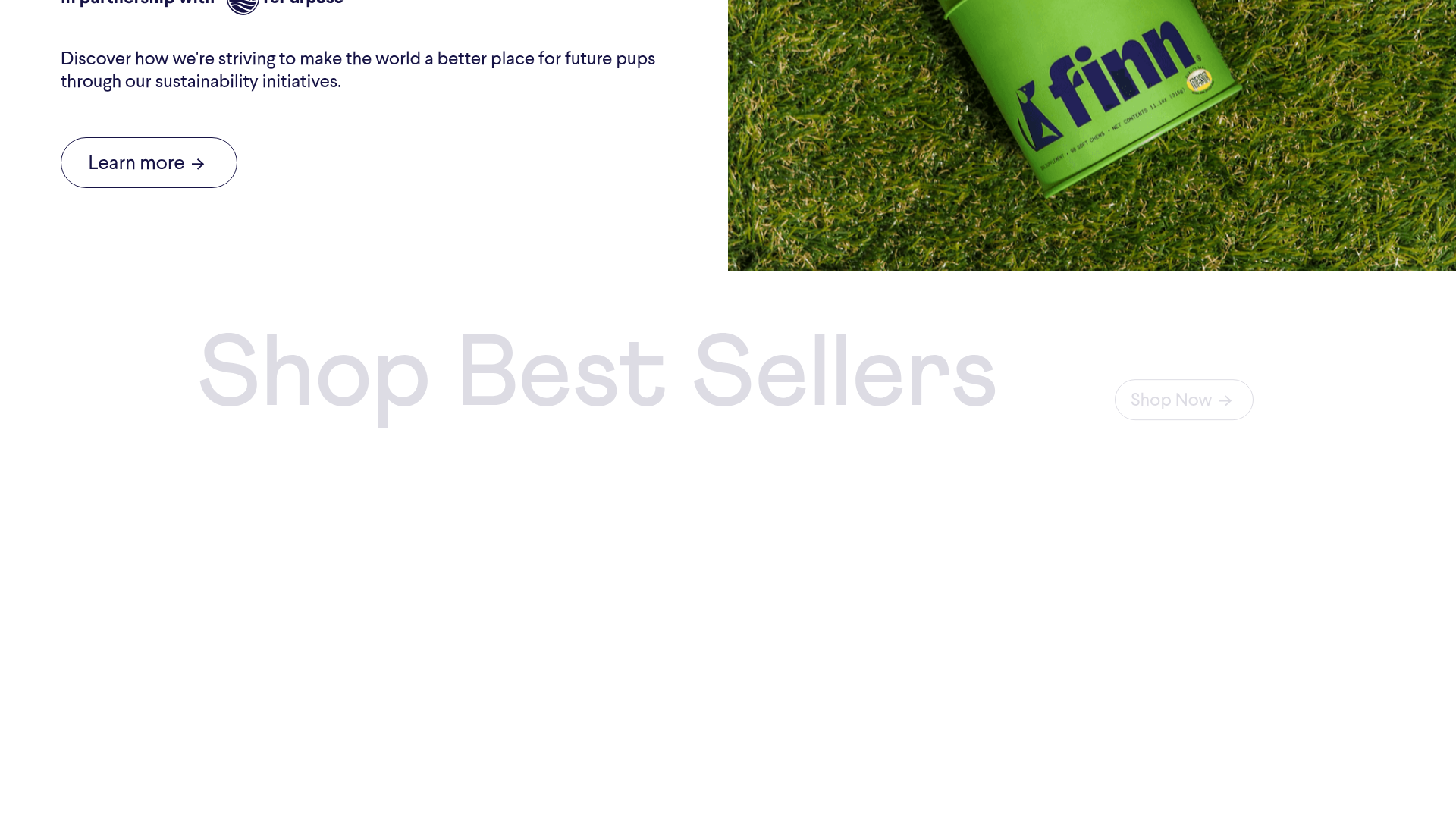
Finn Pet Supplements is a premium D2C e-commerce landing page that expertly balances playful brand identity with scientific credibility. It serves as an excellent clone reference for its sophisticated use of parallax typography, high-impact product photography, and a clean, conversion-focused layout that remains airy despite heavy content.
Design System
- Color Palette & Visual Hierarchy: The site uses a high-contrast foundation of 'Finn Navy' (#1F1646) for deep readability, set against a soft, off-white background (#EBEBEB). Accents like 'Sustain Green' and 'Safety Orange' are used sparingly for CTA buttons and labels, creating a clear hierarchy that directs the eye toward purchase actions.
- Typography: The system utilizes bold, oversized sans-serif headings (
text__H1-sc-4vc7pu-0) for section intros, often with high tracking and low opacity to act as textural backgrounds. Body copy uses a clean, legible sans-serif with ample line height. A monospaced font is used for metadata like reviewer names to provide a technical, trust-worthy feel. - Page Structure: The flow begins with a lifestyle-heavy jumbotron, followed by a high-speed logo ticker. It then transitions into category sections (Supplements, Best Sellers, Bundles) separated by large 'DropHeader' titles. The latter half focuses on trust-building through veterinary endorsements and customer reviews.
- Reusable Components:
- Marquee/Ticker: A smooth, CSS-translated logo element for social proof.
- Product Cards: Minimalist containers featuring a product image, title, price, and primary 'Shop Now' button.
- DropHeaders: Large, atmospheric text blocks designed for parallax scroll effects.
- Tertiary Grid: A layout pattern for bundles that uses varying image aspect ratios to maintain visual interest.
- Interaction & Motion: The site relies heavily on scroll-triggered transforms. Product headers (
DropHeader__Container) usetranslate3dto move at a slower rate than the scroll (parallax), and product group containers reveal themselves with opacity fades (Singles__Grid). - Implementation Clues: Built with Gatsby (React) as indicated by the
___gatsbyandgatsby-image-wrapperIDs and classes. Styling is handled via Styled Components, evidenced by the hashed class names (e.g.,Jumbotron__Section-sc-wnnthn-0).
Use Cases
- Who should clone this pattern: Developers building modern D2C health, wellness, or pet-care brands that need to look both fun and professional.
- Remix Directions: Swap the pet imagery for organic beauty products or high-end supplements. The 'Fetch the Right Solution' quiz section can be adapted for any diagnostic sales funnel (e.g., skincare routine finders or subscription box curators).
- Practical Adaptations: The logo ticker and veterinary endorsement sections are highly modular and can be extracted for use on existing landing pages that lack social proof.
- Suggested Clone Scope: A full-page clone is ideal for those wanting to master advanced parallax and intersection observer effects in React/Gatsby. For a quicker win, clone the 'Best Sellers' grid and the 'DropHeader' system to elevate a standard Shopify-style layout.
Related Inspirations

Isla Beauty Skincare E-commerce Store
A clean Shopify-based storefront featuring a split-hero landing page, a step-by-step product system carousel, and a split-screen testimonial section with localized product image sidebars.

Google Holiday 100 Curator Landing Page
A minimalist e-commerce showcase featuring a wide hero section, clean search integration, and a bold typography-driven header designed for trending product collections.
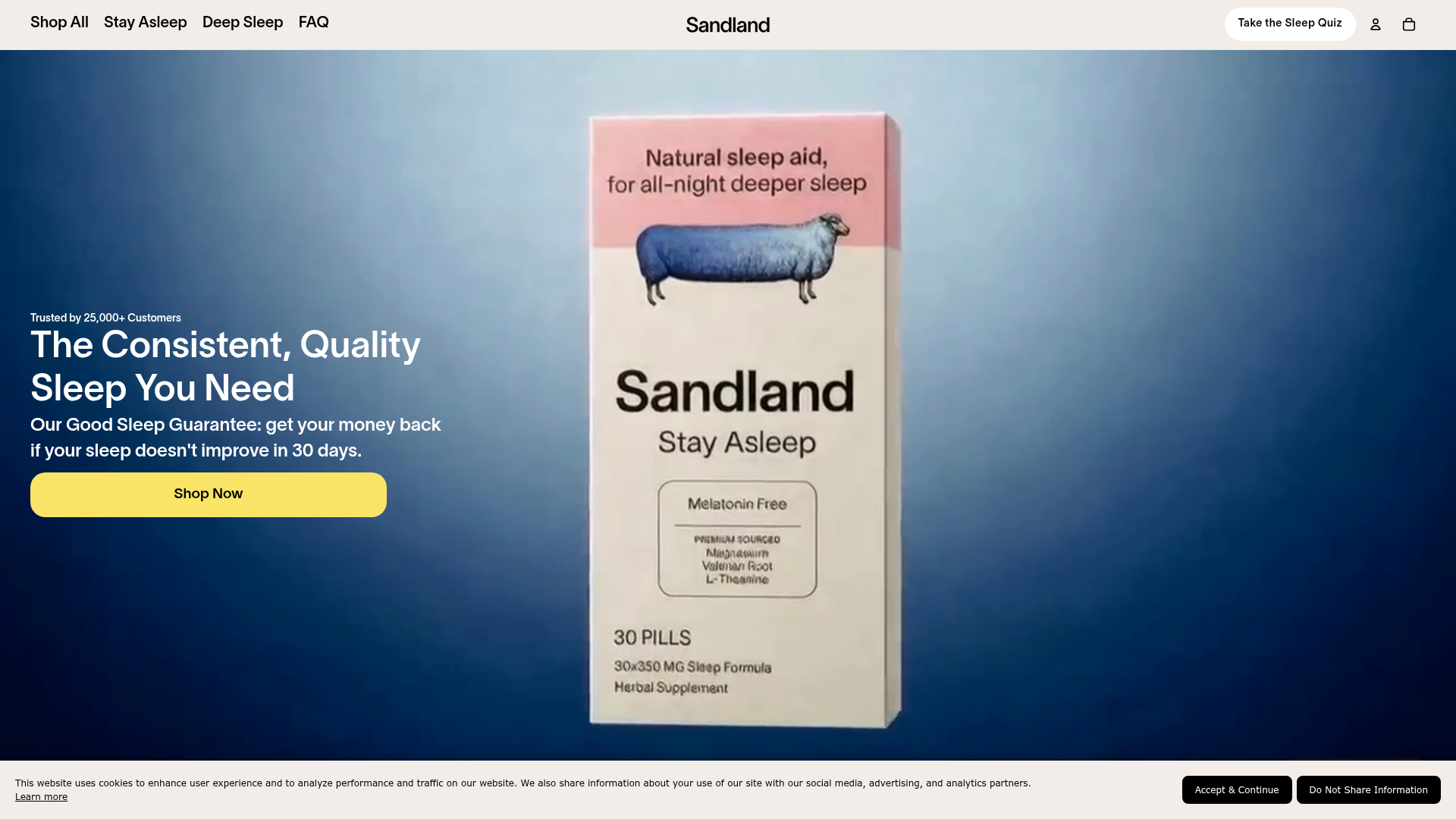
Sandland Sleep Product Landing Page
A high-conversion Shopify layout featuring split-video hero sections, logo-based social proof ribbons, and a testimonial slider integrated with biometric sleep tracker results.
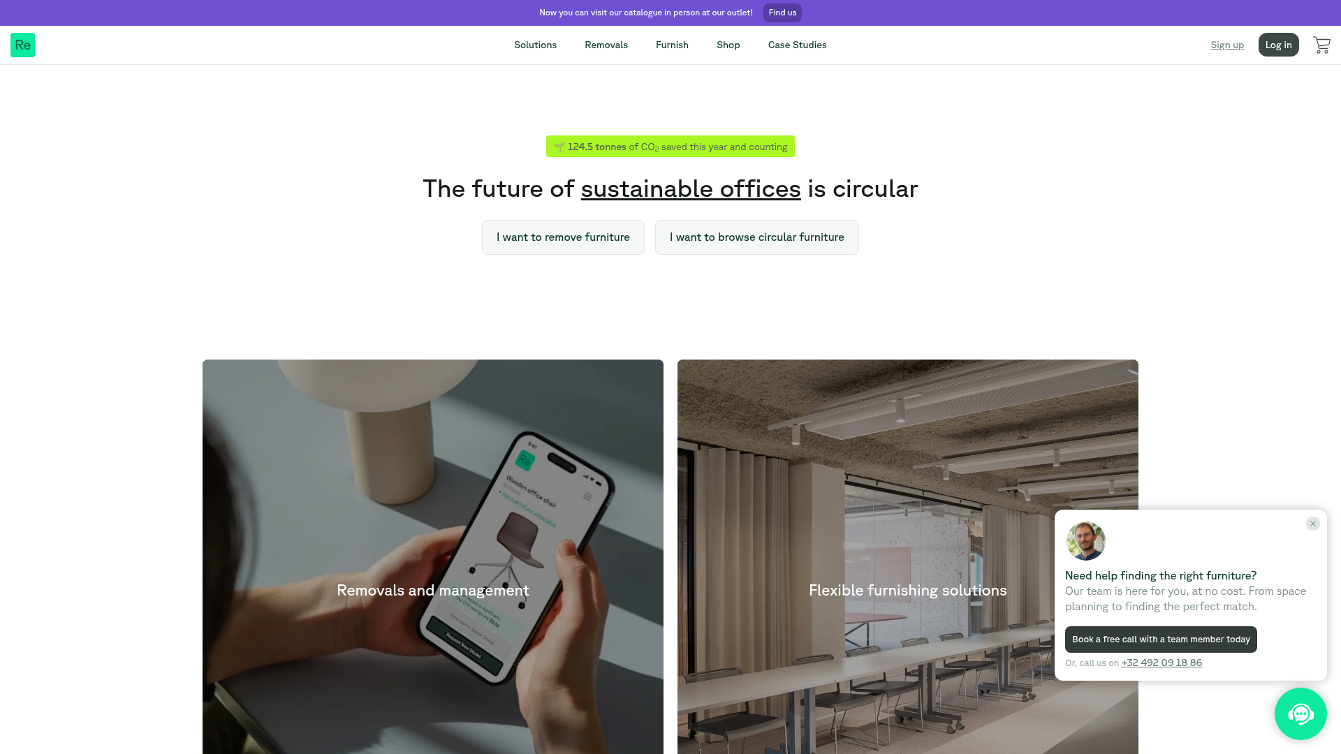
Relieve Furniture Sustainable Marketplace Landing Page
A clean sustainability-focused landing page featuring a hero with environmental impact stats, two-column visual category grid, horizontal logo slider, and a testimonial carousel.

Vibrants Wellbeing E-commerce Landing Page
A clean Shopify-style landing page featuring a full-width hero with overlaid product cards, a horizontal product slider, and interactive cart drawer with utility progress bars.
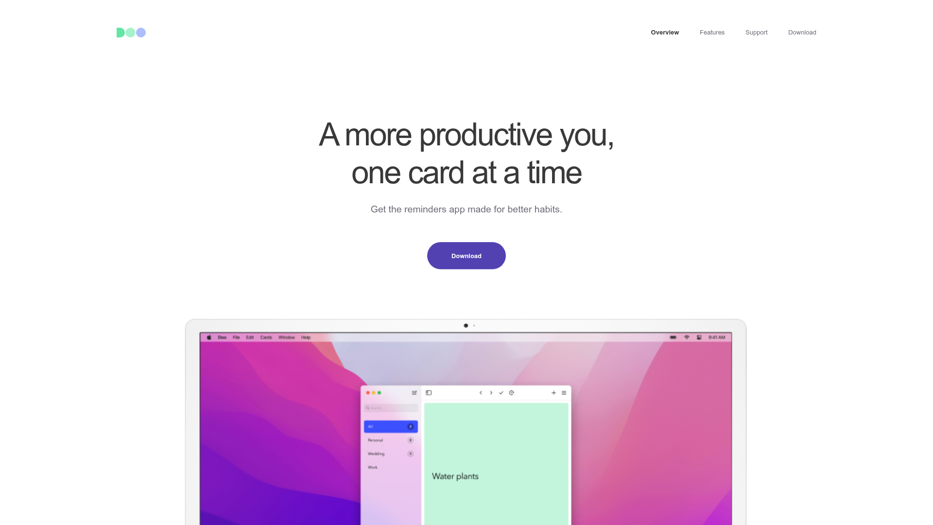
Doo App Minimalist Product Landing Page
A clean, centered product showcase featuring a parallax hero image, icon-based feature checklists, horizontal gesture illustrations, and stacked section layouts with ample whitespace.
