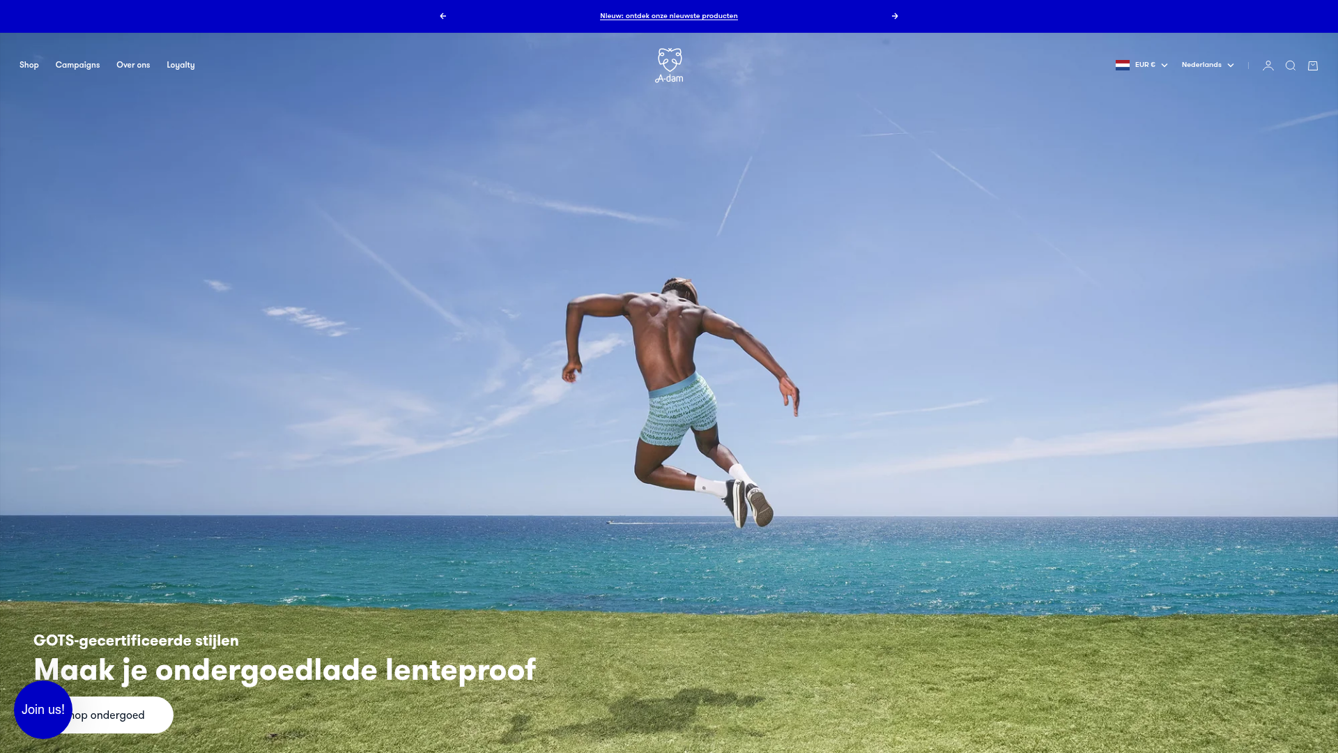
A-dam E-commerce Apparel Storefront
A clean Shopify-based layout featuring a high-impact responsive slideshow, horizontal product carousels with size-selection hover effects, and distinct collection grid sections.
Overview
A-dam is a vibrant, Shopify-powered e-commerce storefront for apparel that uses high-impact lifestyle photography and cinematic video to drive brand storytelling. It is an excellent clone reference for modern D2C brands that need to balance playful personality with high-utility features like quick-add size selectors and smooth carousel interactions.
Design System
- Color Palette & Visual Hierarchy: The site uses a clean white base supplemented by high-contrast blue and red accents for calls to action. It effectively uses "color-scheme" classes in the HTML to toggle between various schemes (light/dark/accent) across sections to maintain visual interest.
- Typography System: A bold, rounded sans-serif font family is used for headings (
h1throughh7classes), providing an approachable and friendly brand voice. Body text is kept small and functional to prioritize imagery. - Page Structure: The flow begins with a full-bleed hero slideshow using 'curtain' transitions, followed by a 'Must-haves' featured product carousel, rich text brand statements, a 3-column collection grid, and alternating 'Text with Media' blocks. It concludes with an immersive full-screen newsletter capture.
- Reusable Components:
- Floating Size Selector: Product cards feature a unique hover-state
product-card__floating-size-selectorthat allows users to select sizes and add to cart without leaving the home page. - Transparent Header: The navigation (
allow-transparent-header) floats over the hero section for a premium look. - Iconography-Integrated Tabs: Featured collections use horizontal scrolling tabs for quick category switching.
- Floating Size Selector: Product cards feature a unique hover-state
- Interaction & Motion: The site utilizes
slideshow-carouselfor heroes andscroll-areawithsnap-xfor smooth horizontal swiping on product lists. Hover effects include image swaps (primary to secondary) on product cards and a subtle zoom effect on collection images. - Implementation Details: Built on Shopify with custom elements (e.g.,
<product-card>,<video-media>). Layout logic relies heavily on a custom flex/grid utility system (classes likev-stack,h-stack, andgap-X).
Use Cases
- Target Builders: Fashion and lifestyle brands that want an immersive, high-end feel without sacrificing conversion features like speed-to-cart.
- Effective Product Remixes: Ideal for accessory brands (watches, eyewear), home goods, or single-category niche retailers where product variations (sizes/colors) need to be visible quickly.
- Practical Remix Directions: Swap the playful, rounded typography for a strict serif to pivot toward luxury; adapt the 'Text with Media' blocks to feature manufacturing sustainability stories; or isolate and reuse the
product-cardcomponent for a fast-shop grid on any landing page. - Clone Scope: A full-page clone is recommended to capture the sophisticated section transitions and responsive stack logic, but the horizontal product carousel with size selection is the most valuable individual component to remix.
Related Inspirations
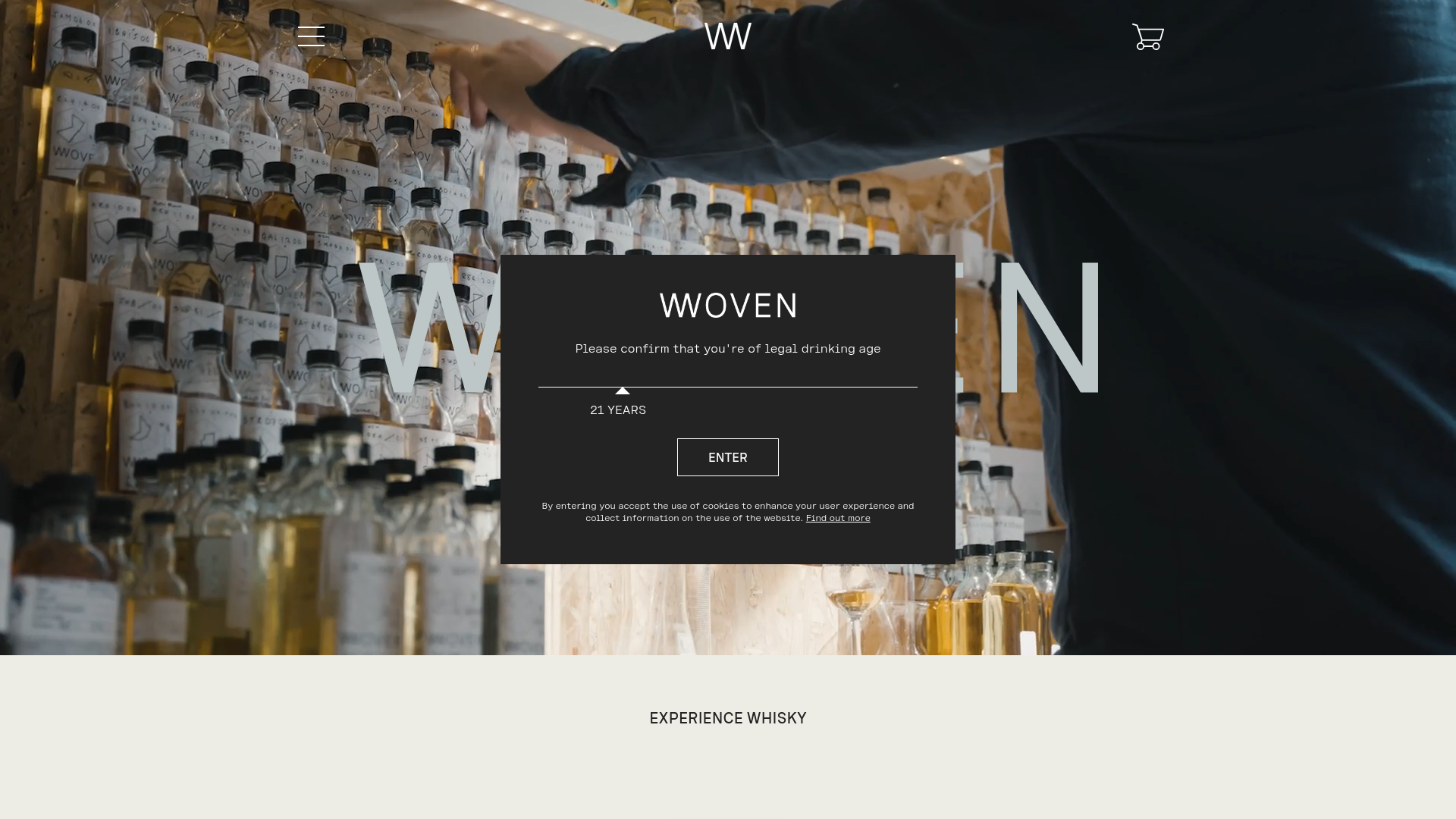
Woven Whisky Beverage Shop Landing
A refined e-commerce template featuring an age-gate slider, transparent sticky navigation, video-background hero section, and a minimalist product grid for high-end spirits.
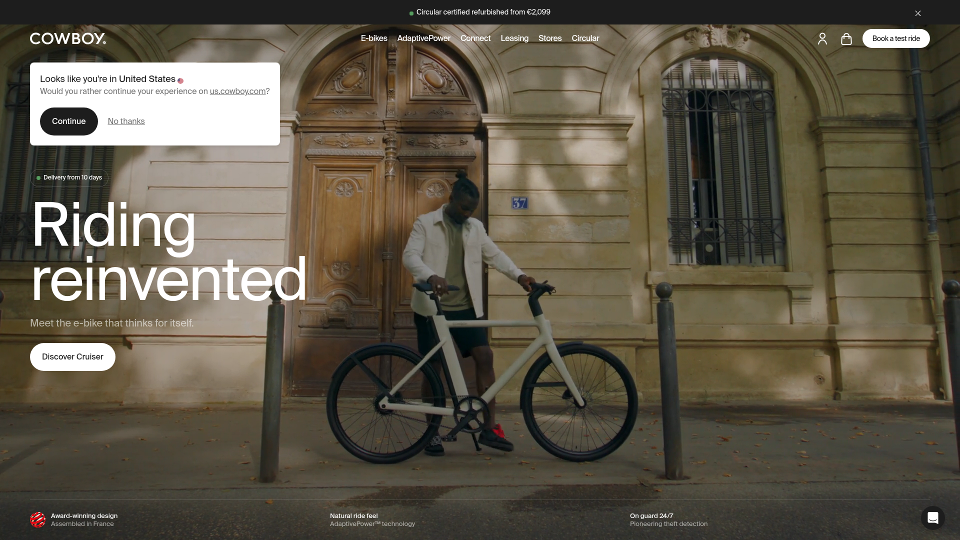
Cowboy E-bikes Landing Page
A minimalist e-commerce showcase featuring a full-screen hero image, integrated notification banners, navigation for test rides, and a technical feature footer.
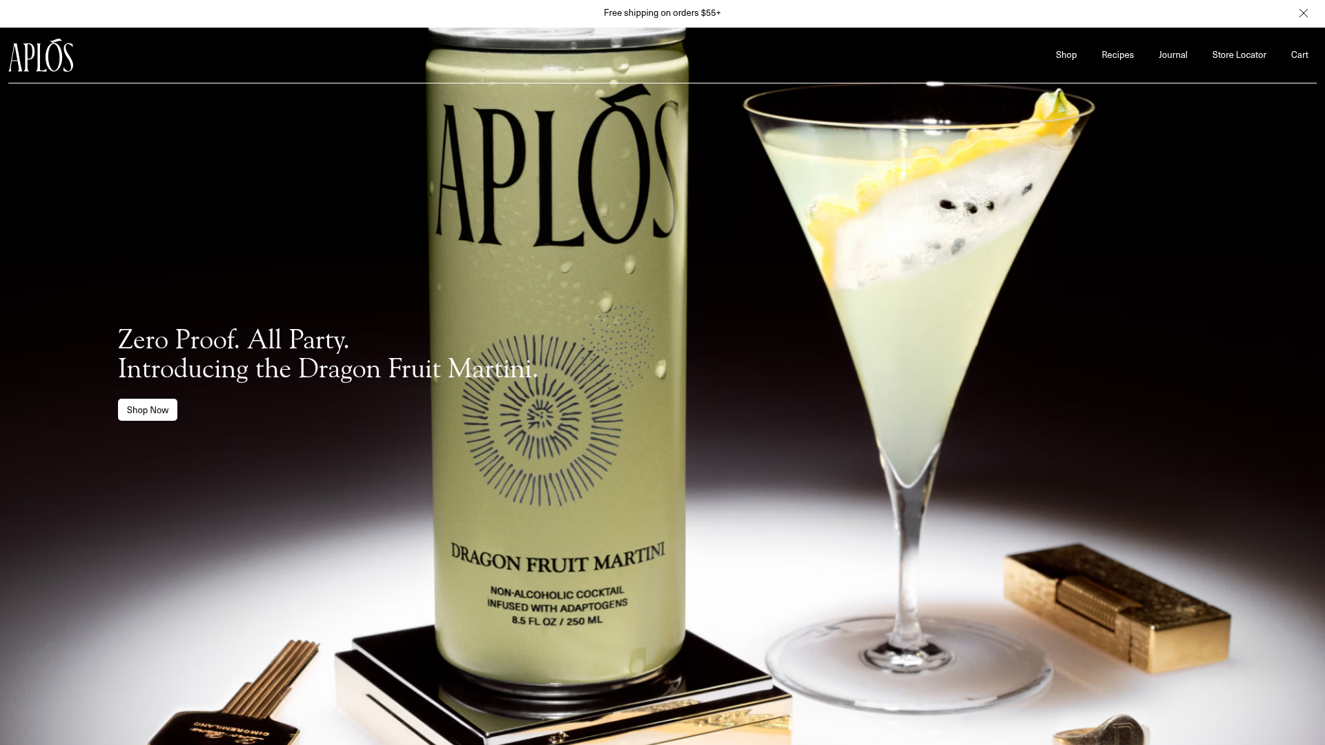
Aplós E-commerce Product Landing Page
A high-fidelity landing page featuring multiple full-height sticky hero sections, horizontal scroll sliders for reviews and lifestyle stories, and transparent product cards.
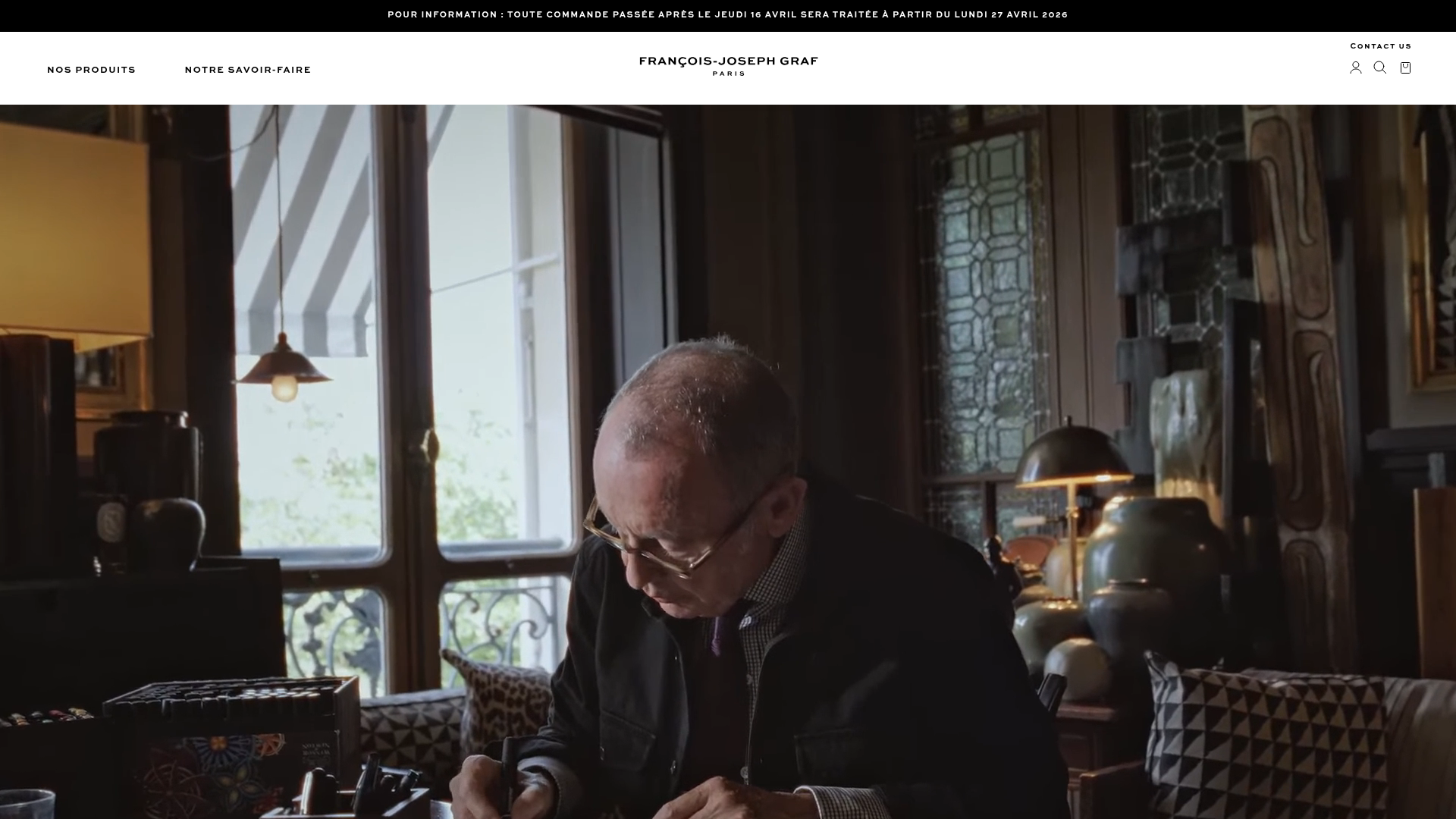
Graf Paris Luxury Product Showcase
A high-end e-commerce layout featuring an auto-playing video hero, asymmetric image-text modules, and a stylized product carousel for showcasing unique artisanal goods.
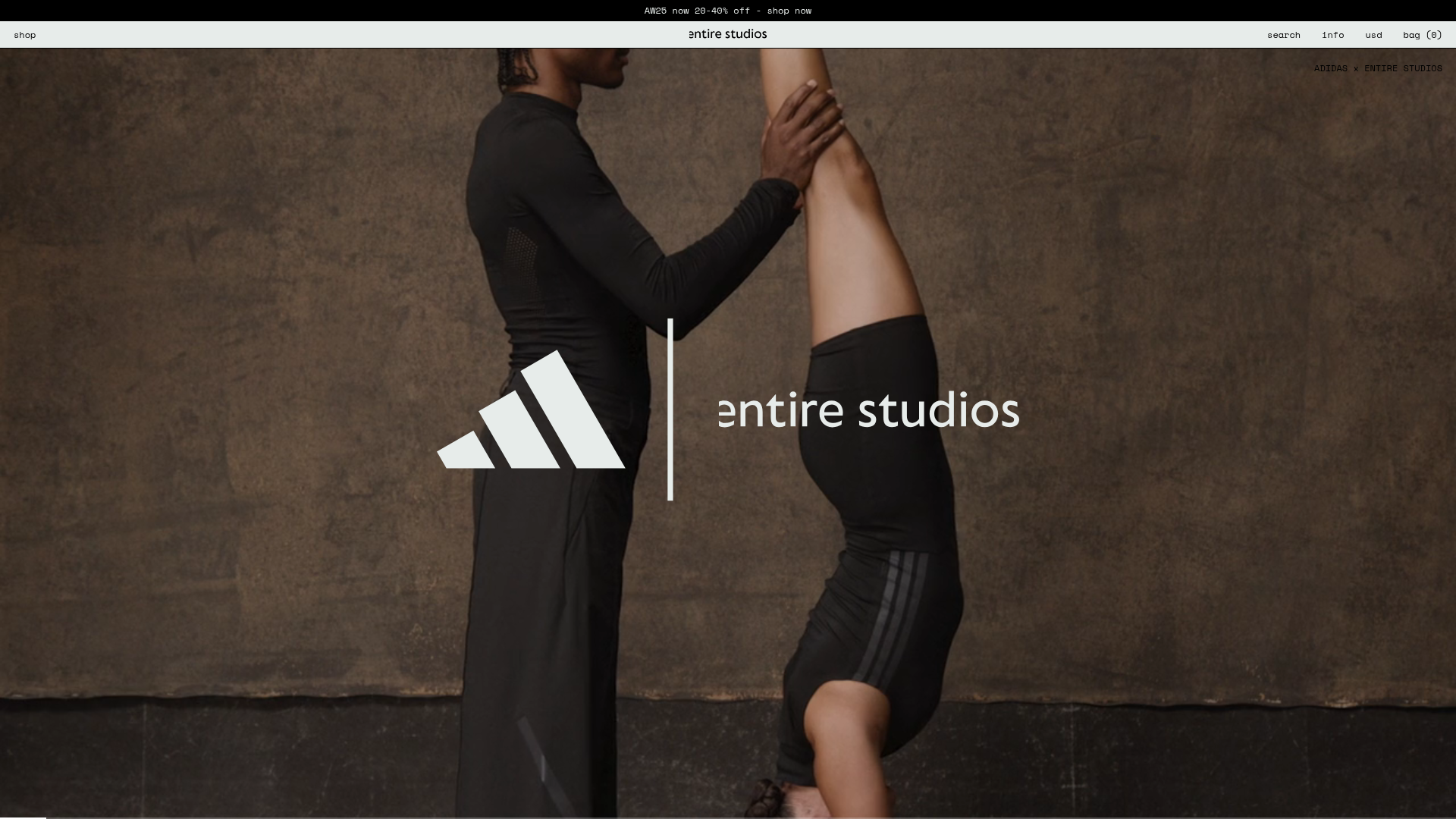
Entire Studios Minimalist Full-Screen E-commerce
A high-impact landing page featuring a full-bleed vertical Swiper scroll, sticky navigation with hidden overlays, and a bottom progress bar for video transitions.
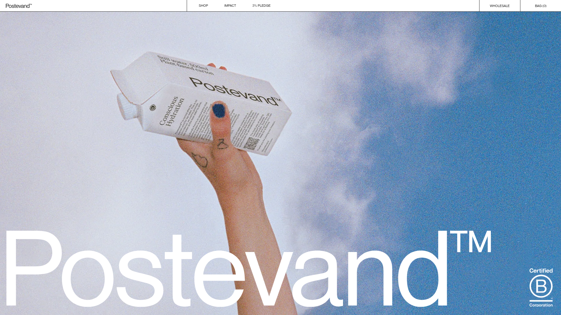
Postevand Sustainable E-commerce Landing Page
A scroll-driven Shopify landing page featuring full-width media sections, interactive product cross-sections, a minimalist grid layout, and horizontal scrolling image galleries.
