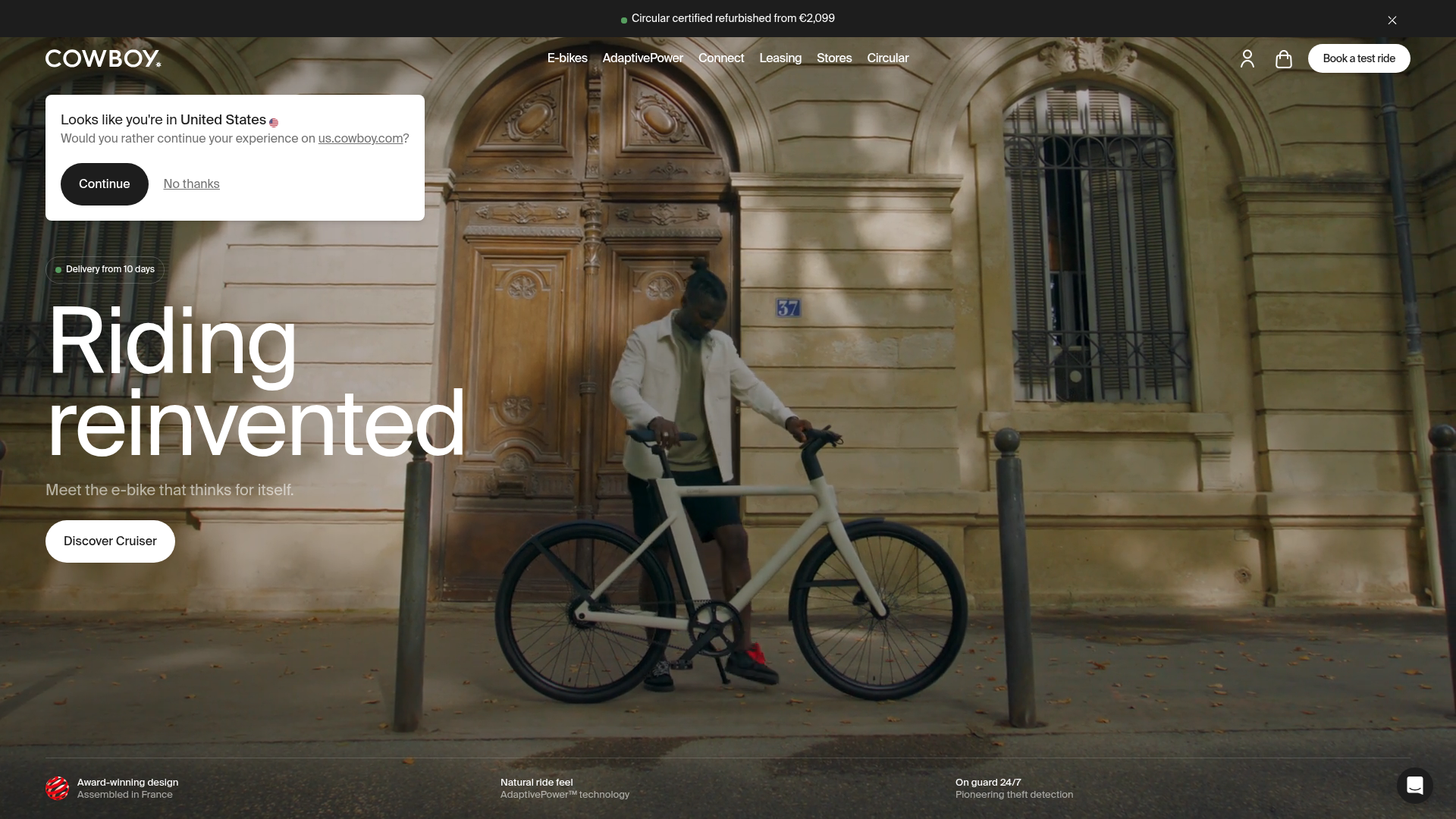
Cowboy E-bikes Landing Page
A minimalist e-commerce showcase featuring a full-screen hero image, integrated notification banners, navigation for test rides, and a technical feature footer.
Overview
This is a premium e-commerce landing page for Cowboy, an electric bike brand, focusing on high-impact visual storytelling and a minimalist user interface. It is a strong clone reference for brands needing to balance immersive photography with functional utility features like geolocation modals, status banners, and feature-rich footers.
Design System
- Color Palette & Visual Hierarchy: The site uses a high-contrast theme featuring stark white typography (
#FFFFFF) layered over dark, saturated photography. Accents include a functional green for status badges (e.g., "Circular certified refurbished") and deep black for high-priority CTA buttons. - Typography: A clean, wide-set sans-serif font is used throughout. The hierarchy is established through a massive display headline for the hero section ("Riding reinvented") and smaller, uppercase utility text for navigation and technical specs.
- Page Structure: The layout follows a layered approach: a global top banner for promotions, a transparent sticky navigation bar, a centered modal for location services, and a bottom horizontal bar detailing core value propositions (e.g., "Award-winning design").
- Reusable Components:
- Navigation Bar: A sparse header with centered links and right-aligned icons (user profile, cart) and a pill-shaped "Book a test ride" CTA.
- Interactive Modal: A simple white card with a US flag icon, primary black button, and secondary ghost link for localized redirection.
- Primary CTA: A large white pill-shaped button ("Discover Cruiser") with significant padding and rounded corners.
- Feature Footer: Three-column layout on a semi-transparent black overlay, combining small icons with concise text and sub-text.
- Responsive Behavior: The HTML structure suggests a mobile-first approach with flexbox-based layouts. The navigation and top banners use
flexandjustify-betweenproperties to maintain alignment across screen sizes.
Use Cases
- Who should clone this: Small-to-medium luxury hardware startups, high-end lifestyle brands, or tech companies launching a single flagship product.
- Effective Remixes: Can be adapted for architectural services, minimalist fashion drops, or premium consumer electronics.
- Remix Directions: Swap the full-screen background image for a background video to increase dynamism; replace the geolocation modal with an email signup pop-up; or adapt the three-column feature footer into a product benefit section for a different industry.
- Clone Scope: The hero section (headline, primary button, and navigation) is the most valuable part to clone for a quick landing page setup. The background-image layering with floating utility modules offers a robust framework for high-conversion entrance pages.
Related Inspirations
Aplós E-commerce Product Landing Page
A high-fidelity landing page featuring multiple full-height sticky hero sections, horizontal scroll sliders for reviews and lifestyle stories, and transparent product cards.

Finn Pet Supplements Landing Page
An e-commerce landing page featuring high-contrast typography, a sticky brand logo banner, parallax scroll effects on product headers, and a clean product grid.
Sandland Sleep Product Landing Page
A high-conversion Shopify layout featuring split-video hero sections, logo-based social proof ribbons, and a testimonial slider integrated with biometric sleep tracker results.
Vibrants Wellbeing E-commerce Landing Page
A clean Shopify-style landing page featuring a full-width hero with overlaid product cards, a horizontal product slider, and interactive cart drawer with utility progress bars.
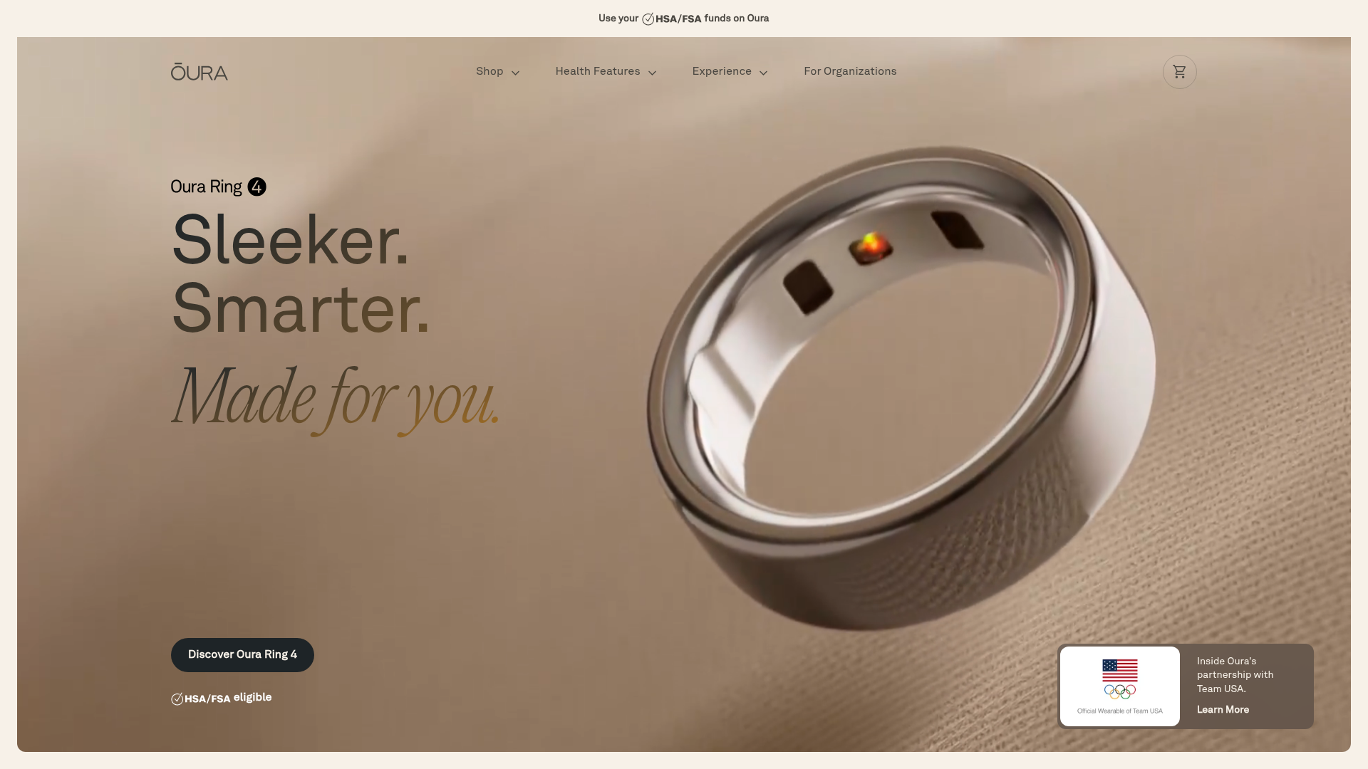
Oura Ring Minimalist Product Splash
A high-end hardware hero section featuring an oversized floating 3D product asset, serif typography, and a subtle top bar for HSA/FSA eligibility notifications.
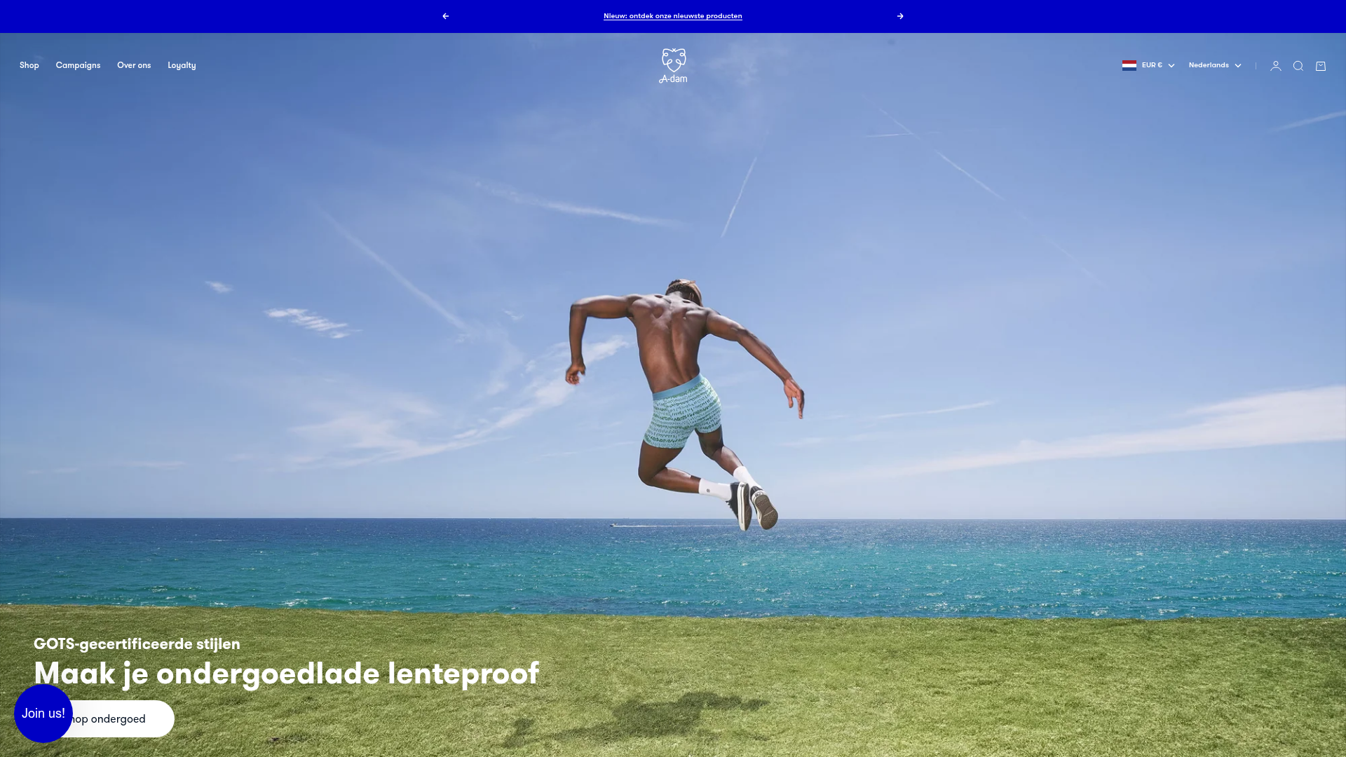
A-dam E-commerce Apparel Storefront
A clean Shopify-based layout featuring a high-impact responsive slideshow, horizontal product carousels with size-selection hover effects, and distinct collection grid sections.
