Entire Studios Minimalist Full-Screen E-commerce
A high-impact landing page featuring a full-bleed vertical Swiper scroll, sticky navigation with hidden overlays, and a bottom progress bar for video transitions.
Overview
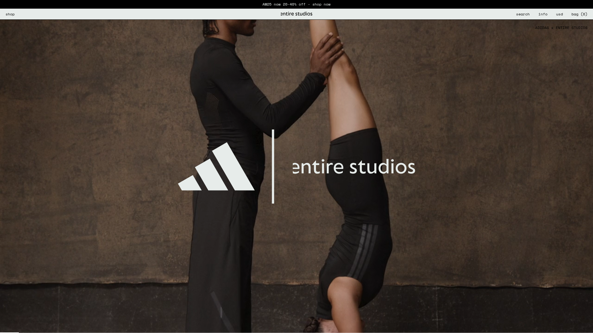
Entire Studios features a brutalist, high-performance e-commerce landing page that prioritizes immersive visual storytelling over traditional grid layouts. It is an exceptional clone reference for developers looking to master full-screen vertical navigation, video-centric backgrounds, and minimalist sticky overlays.
Design System
- Color Palette & Visual Hierarchy: A high-contrast monochrome base (
var(--color-light)background with black text) allows full-bleed photography and video to dominate. The hierarchy is extremely flat, using thin borders (0.5px) and small text to keep the focus on brand imagery. - Typography: The system uses a clean, sans-serif font (appearing to be a custom typeface or high-end grotesque) at very small scales (
text-xsor12px). Hierarchy is established via uppercase transformations for emphasize and specific tracking rather than font weight. - Page Structure: The site follows a vertical stack: a top persistent announcement bar, a thin sticky header with 'shop/search/bag' utilities, and a centered vertical slider containing full-screen media slides.
- Reusable Components:
- Sticky Nav Strips: Precision-engineered utility bars with flexbox distributions (
justify-between) and subtle hover underlines. - Full-Screen Media Slider: A Swiper.js vertical component that transitions between
videoandimgelements. - Progress Bar: A bottom-aligned fixed
divwith a width transition linked to video duration or scroll progress.
- Sticky Nav Strips: Precision-engineered utility bars with flexbox distributions (
- Interaction & Motion: The core interaction is the vertical scroll/swipe. The HTML indicates a vertical
swiper-initializedcontainer. Subtle hover-underlines on text links are the primary feedback for interaction. - Responsive Behavior: On mobile, the multi-link nav collapses into a single 'menu' button that triggers a full-screen vertical overlay, while the logo remains centered. The full-bleed video logic maintains aspect ratio coverage (
object-cover). - Implementation Clues: Built using Tailwind CSS for utility classes (
fixed,z-50,flex,items-center) and Swiper.js for the vertical carousel functionality.
Use Cases
- Who should clone this: Fashion labels, creative agencies, and luxury product designers who rely on high-quality videography to sell a lifestyle rather than individual SKUs.
- Effective Remixes: Portfolio sites can remix this by replacing products with case study videos. Luxury real estate sites can use the vertical swiper to showcase different properties with atmospheric footage.
- Remix Directions: Swap the minimalist top-nav for a more traditional e-commerce mega-menu if the catalog is larger, or adapt the bottom progress bar to act as a navigation indicator for a multi-step storytelling page.
- Suggested Scope: Start with the Full-Screen Media Slider and the Bottom Progress Bar for a high-impact section clone, or clone the full page to capture the specific brutalist e-commerce aesthetic.
Related Inspirations

Context Gallery High-End Furniture Landing Page
A minimal editorial layout featuring a multi-column product carousel, designer biographies with image-text pairings, and a magazine-style content grid for curated design stories.

Glein Minimalistic Bento Grid eCommerce
A clean, modular layout using a bento-style responsive grid of text teasers and large-scale product imagery for lookbooks and collection browsing.

Isla Beauty Skincare E-commerce Store
A clean Shopify-based storefront featuring a split-hero landing page, a step-by-step product system carousel, and a split-screen testimonial section with localized product image sidebars.

Stojo Collapsible E-commerce Storefront
A Shopify layout featuring a prominent discount modal, mosaic grid hero sections, and clean product cards with integrated color swatches and quick-buy functionality.

Basic.Space E-commerce Gallery Clone
A minimalist product marketplace featuring a clean sticky navigation bar, nested flyout menus, and a horizontally scrollable product carousel with hover-state image switching.

Ashley & Co Lifestyle E-commerce
An elegant Shopify-based storefront featuring a split-screen animated hero, horizontal ticker-tape collection carousel, and dynamic mega-menus with scent-specific color switching and image previews.
