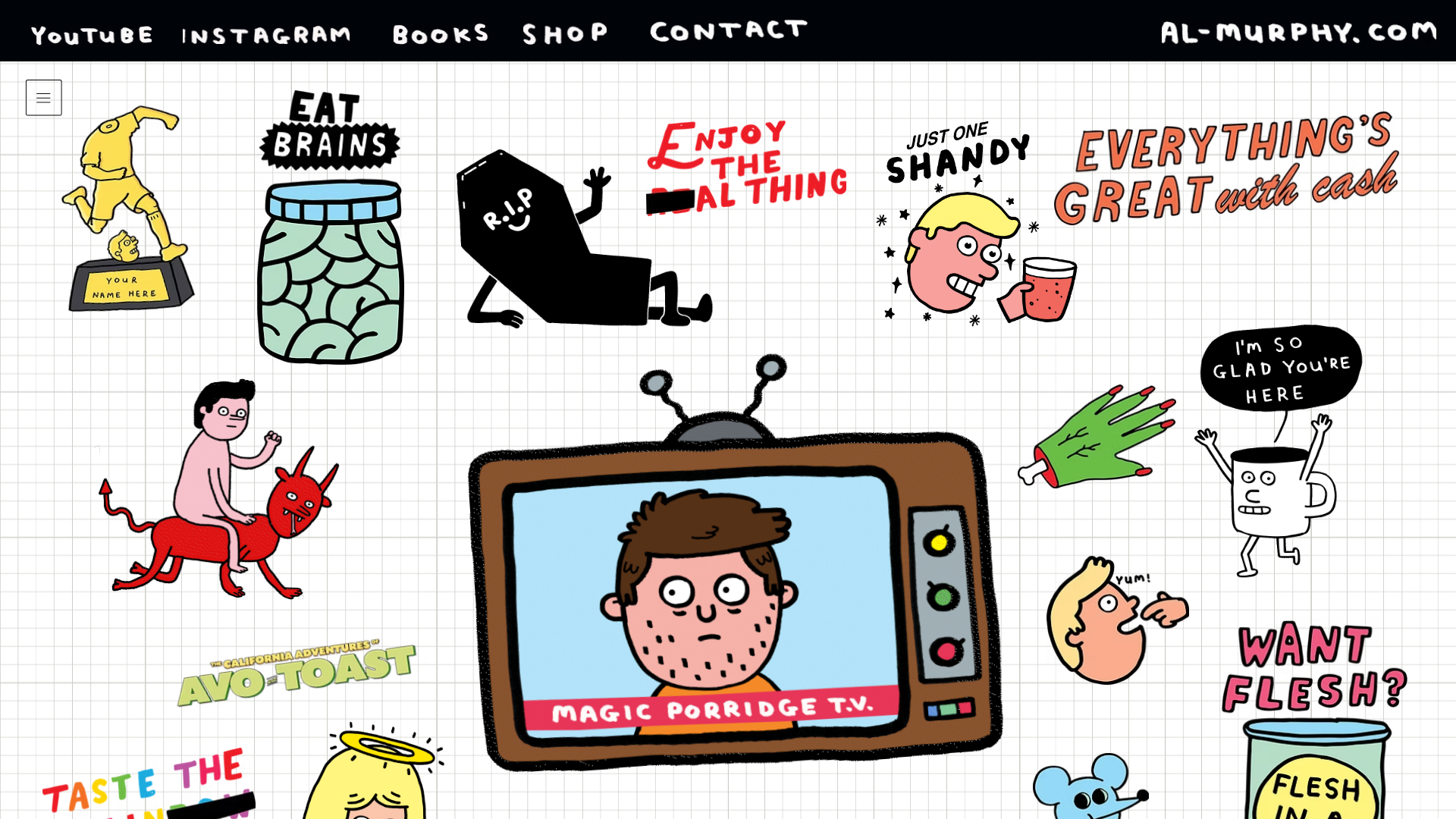
Al Murphy Illustrator Portfolio Grid
An unconventional, collage-style portfolio layout using a fixed grid background with scattered interactive stickers, gifs, and a centerpiece animated TV frame.
Overview
This website is a highly creative, illustrative portfolio for Al Murphy that breaks away from traditional linear layouts in favor of an interactive "sticker sheet" experience. It is a powerful reference for builders looking to implement a non-traditional grid-based UI where individual assets behave as navigation touchpoints on a common canvas.
Design System
- Color Palette and Visual Hierarchy: The base is a high-contrast white background with thin grey grid lines (graph paper style). Visual hierarchy is driven by size and color density of scattered illustrations, with a large wood-textured television set serving as the central focal point.
- Typography system: A bold, hand-drawn sans-serif font is used for the header navigation and site logo. Typography within the illustrations varies significantly, mimicking custom lettering which adds to the collage aesthetic. Headers use a underline style for emphasis, as seen in the "AL-MURPHY.COM" logo in the HTML.
- Page Structure and Section Flow: The layout is a fixed or semi-fluid single-page section (
PAGE_SECTIONSc1dmp) that avoids standard columns. Navigation links (YouTube, Instagram, Books, Shop, Contact) are fixed at the top in a black bar. The main content is a single container holding a multitude of absolute-positionedwow-imagecomponents. - Reusable Components: The most valuable component to clone is the "Sticker Link"—an image or GIF wrapper with a hover-active link layer (
_linkLayer_1soo6_43). The top navigation bar and its specific hand-drawn font styling are also prime candidates for re-use. - Interaction and Motion: The site utilizes a mix of static PNGs and animated GIFs to create a living environment. The code reveals
data-motion-partattributes, indicating that elements are likely integrated with a motion library for entrance or hover effects. - Responsive Behavior: The site uses a
max-width-containerandresponsive-container-overflowwrapper. On smaller screens, the layout likely shifts from a wide collage to a more vertical stack or allows horizontal panning across the grid. - Implementation Clues: The HTML confirms this is a Wix-built site using the Thunderbolt platform. It relies heavily on
wow-imagefor asset delivery and custom ID-mapped containers (e.g.,comp-mli0pzfm) to position illustrations relative to the grid background.
Use Cases
- Who should clone this: Illustrators, game designers, and creative agencies wanting to showcase a high volume of visual assets without using a sterile, repetitive grid.
- Effective Remixes: It can be adapted as a highly interactive "About Us" page where each sticker represents a team member or a company milestone, rather than a full portfolio.
- Practical Directions: To remix, swap the graph paper background for a different texture (like corkboard or desk surface) and replace the illustrative stickers with rounded UI cards or polaroid-style photos.
- Suggested Scope: A full-page clone is best for those wanting to maintain the immersive experience. Alternatively, cloning just the "Navigation Bar + Grid Background + Absolute Asset" pattern is sufficient for a unique landing page hero section.
Related Inspirations
Good Glyphs Font Showcase Landing Page
A single-page layout featuring an interactive type tester, donation form with custom amount logic, and a contributor gallery using swiper-based glyph previews.
Julia Johnson Photography Portfolio Website
A creative portfolio featuring a masonry-style image grid, overlapping oversized typography, and a minimalist full-screen navigation overlay.
Jonas Mosesson Illustrator Portfolio Layout
A playful portfolio featuring a custom-animated logo header, a responsive multi-column project grid with hover-revealed details, and a distinct minimalist sectioned about page.
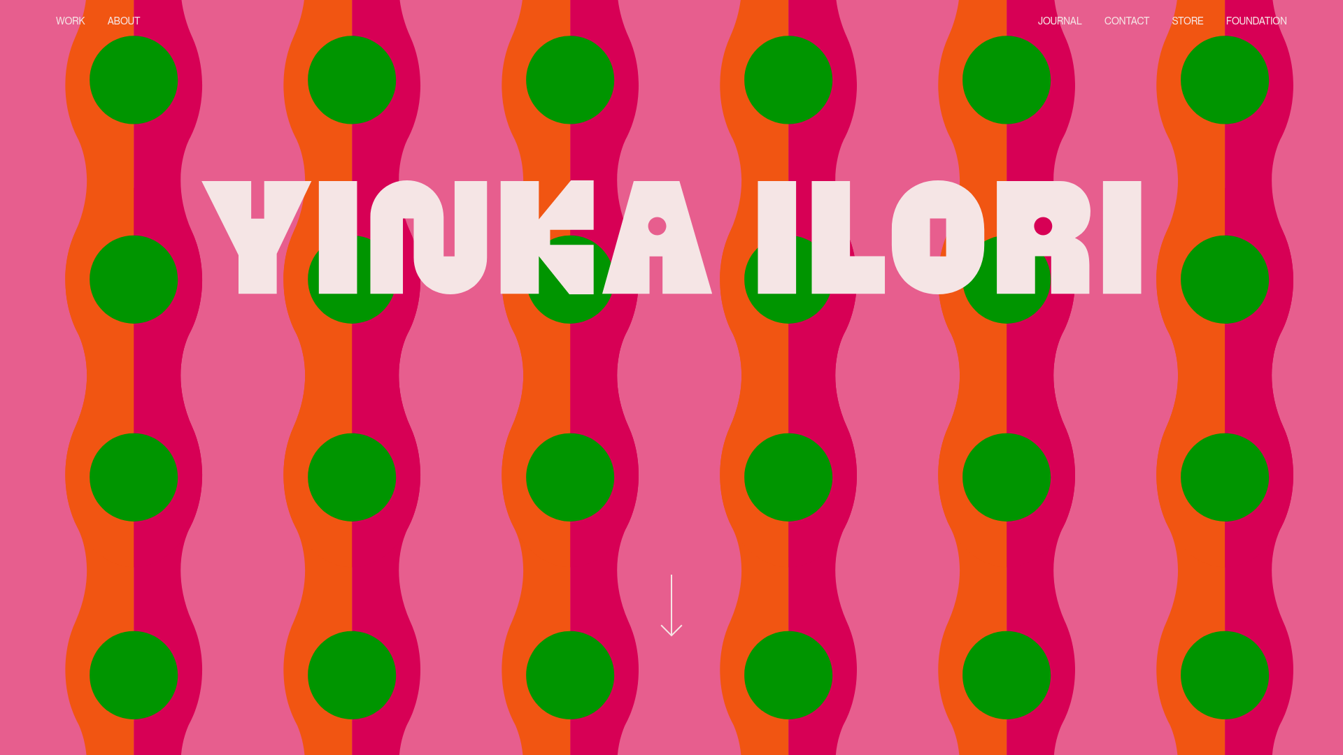
Yinka Ilori Portfolio Mosaic Grid
A vibrant portfolio featuring a scroll-activated parallax hero, bold typography, and a staggered mosaic image grid with asymmetric layouts and fade-in animations.
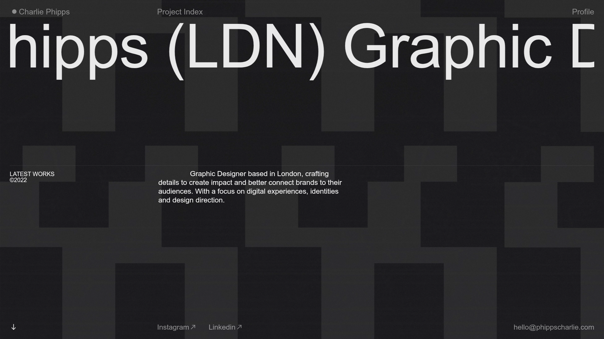
Charlie Phipps Portfolio Hero Layout
A dark-themed portfolio featuring a large horizontal scrolling marquee header, full-bleed video backgrounds, and a clean typography-focused grid for case studies.
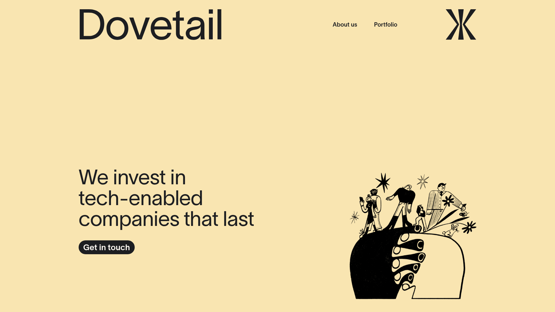
Dovetail Venture Portfolio Landing Page
A minimalist investment site featuring a warm pastel palette, distinctive hand-drawn illustrations, horizontal carousel for project cases, and a clean typography-focused grid layout.
