Yinka Ilori Portfolio Mosaic Grid
A vibrant portfolio featuring a scroll-activated parallax hero, bold typography, and a staggered mosaic image grid with asymmetric layouts and fade-in animations.
Overview
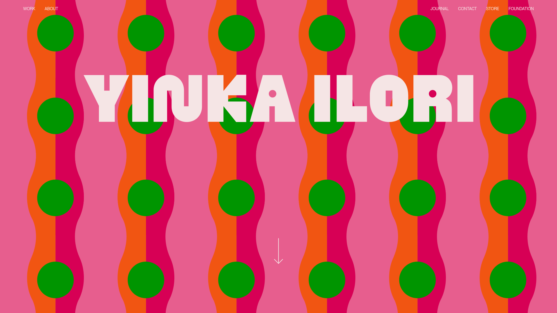
This portfolio for artist Yinka Ilori is a masterclass in high-impact visual storytelling, centered around a bold, patterned hero section and a sophisticated mosaic grid. It serves as an excellent reference for builders wanting to balance loud, maximalist aesthetics with a clean, functional navigation and layout system. Its strength lies in using asymmetrical grids to create rhythm and interest in a project gallery without sacrificing readability.
Design System
- Color Palette & Visual Hierarchy: The site uses a vibrant, high-contrast palette of pink, orange, magenta, and green, primarily driven by a decorative SVG background motif (
ripples-of-stiffness.svg). Text is strictly white or black to maintain legibility against complex backgrounds, while the white, blocky logo dominates the visual hierarchy of the hero section. - Typography System: The brand uses a heavyweight, rounded Slab-Serif/Display font for main headings (visible in the "YINKA ILORI" logo) and a clean, utilitarian Sans-Serif for navigation and project meta-data. Project titles use
h4tags followed byptags for client/description text, prioritizing a clear 1-2 punch of information. - Page Structure & Section Flow: The layout begins with a full-height
header-imageacting as a parallax hero. This is followed by amaincontent area containing agrid-mosaic. The grid is meticulously structured into rows where project links alternate between wide bleed-aligned images and smaller, vertically centered text blocks. - Reusable Components:
- Mosaic Grid: A flexible 9-column system (
grid-desktop-9) that usescol-spanclasses to create intentional white space and asymmetry. - Image Hover Containers: Links wrapped in
image-hoverclasses that likely handle opacity or scaling effects. - Fader Wrapper: A utility class (
fader hidden) applied to grid items to handle scroll-triggered entry animations.
- Mosaic Grid: A flexible 9-column system (
- Interaction & Motion: The hero section uses
rellaxfor parallax scrolling effects. Portfolio items utilize a fade-in-on-scroll pattern. The arrow at the bottom of the hero indicates a transition to the content-heavy grid below. - Responsive Behavior: The HTML reveals a mobile-first column shift, moving from 9 columns to 6 (
grid-mobile-6). It usesmobile-orderclasses (e.g.,mobile-order-11,mobile-order-13) to re-sequence the layout, ensuring that text labels appear correctly relative to images on smaller screens.
Use Cases
- Who should clone this: Artists, design studios, and luxury brands that need a portfolio that feels as curated and high-energy as the physical work they produce.
- Effective Remixes: Creative agencies can swap the loud floral/geometric patterns for minimalist textures or architectural photography while keeping the staggered grid logic for a "boutique" feel.
- Remix Directions:
- E-commerce: Adapt the mosaic grid for a "Lookbook" page where images link to product categories.
- Editorial: Use the asymmetrical layout for a digital magazine feature where pull-quotes and photography overlap or stagger.
- Suggested Clone Scope: The
grid-mosaicis the most valuable section to clone for its responsive ordering logic and white-space management. The hero section is ideal for those needing a high-fidelity visual entry point for a single-page landing site.
Related Inspirations
MA Quilts Textile Portfolio Site
A vibrant portfolio layout featuring a two-column animated hero, horizontal marquee text, and dynamic CMS-driven grid galleries for showcasing artistic products and blog posts.
Julia Johnson Photography Portfolio Website
A creative portfolio featuring a masonry-style image grid, overlapping oversized typography, and a minimalist full-screen navigation overlay.
Infringe Hair Culture Portfolio Gallery
A minimalist, high-impact portfolio featuring a vertical sticky marquee sidebar and full-screen image scrolls that toggle between desktop and mobile assets.
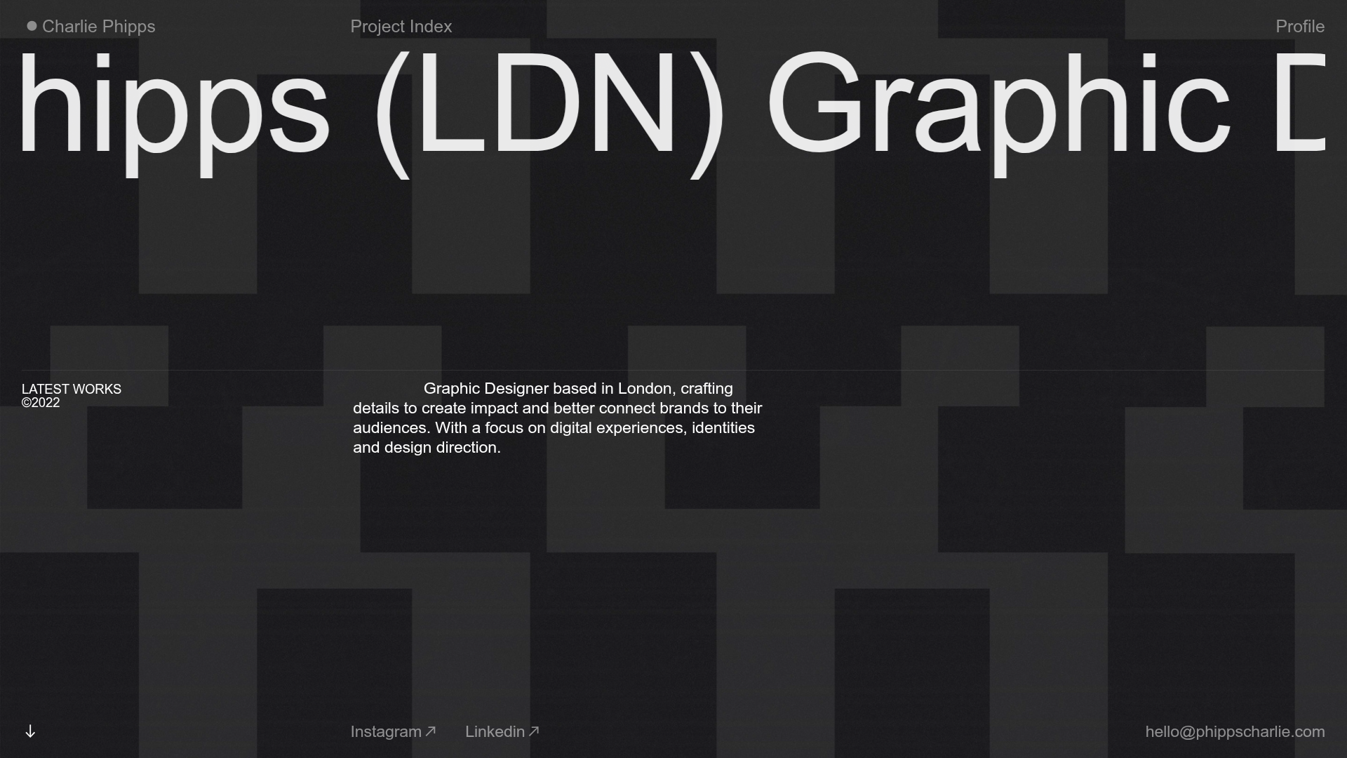
Charlie Phipps Portfolio Hero Layout
A dark-themed portfolio featuring a large horizontal scrolling marquee header, full-bleed video backgrounds, and a clean typography-focused grid for case studies.
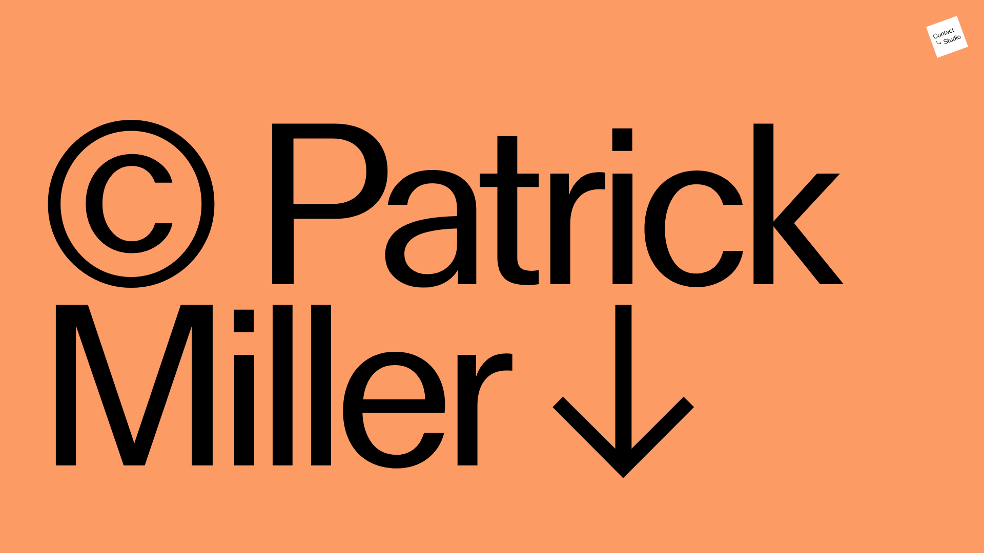
Patrick Miller Photography Portfolio Template
A minimalist, full-bleed photography portfolio featuring a split-screen grid, scroll-triggered section transitions, and integrated Swiper.js image carousels for project galleries.
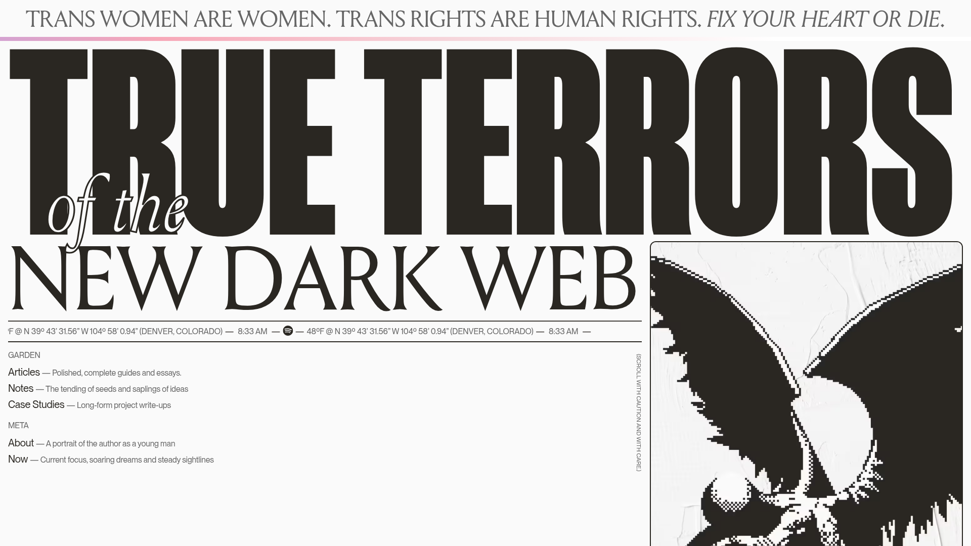
True Terrors Creative Developer Portfolio
A high-impact typography-driven portfolio featuring marquee animations, custom grid overlays, horizontal scroll case study rows, and a brutalist digital garden layout.
