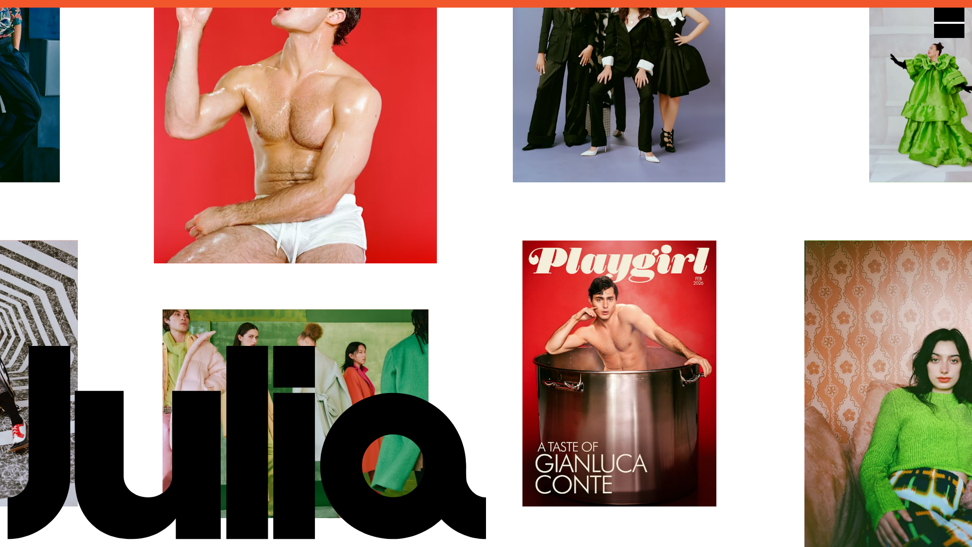
Julia Johnson Photography Portfolio Website
A creative portfolio featuring a masonry-style image grid, overlapping oversized typography, and a minimalist full-screen navigation overlay.
Overview
This website is a highly creative, motion-centric photography portfolio defined by an infinite, non-linear masonry grid and bold overlapping typography. It serves as an excellent reference for builders wanting to move beyond standard layouts into immersive, interactive canvas-style experiences. The site uses a unique layering strategy where large-scale brand text (the name "Julia") sits behind a dynamic, draggable or auto-scrolling field of media.
Design System
- Color Palette and Visual Hierarchy: The base is a clean white, but the hierarchy is driven by the vibrant, saturated colors of the photography itself. The HTML reveals a system of CSS variables (e.g.,
--newColor: #FBFFC0,--personalColor: #FFC3D5) used to provide contextual background colors for different work categories. - Typography System: Features oversized, black, high-contrast serif and sans-serif typography. The primary branding ("Julia") is rendered in a massive scale that anchors the page, while the navigational elements and image captions (like "Playgirl" or "Gianluca Conte") use vintage-inspired display fonts with tight tracking.
- Page Structure and Section Flow: Instead of a traditional vertical scroll, the page is structured as a
c-home__items-containercontaining a grid of absolute-positioned (transform: translate) image wrappers. Ac-loaderhandles the initial entry, followed by a persistent image field that functions as a single-page interactive environment. - Reusable Components: The core component is the
c-home__item-grid, a responsive image card that supports both<img>and<video>tags with specific aspect ratios maintained viaaspect-ratioCSS properties. The navigation is a minimalist overlay triggered by a simple icon (visible in the top right). - Interaction and Motion: The site utilizes a "lenis" smooth scroll or custom dragging behavior (
data-lenis-prevent) to move the image grid. Images use "fancybox" for lightbox enlargement. Items have a hover-state hint where specific media becomesis-visible, often accompanied by color-coordinated background heights. - Implementation Clues: Built using Astro (seen in
data-astro-cid-uezc7xer) and Swup for smooth page transitions (transition-fade,swup-announcer). The media is served via DatoCMS, indicating a headless architecture, and uses Mux for video streaming.
Use Cases
- Who should clone this: Creative directors, fashion photographers, and digital artists who need a high-impact visual landing page that feels like an art installation.
- What products can remix it: Brand lookbooks, architectural portfolios, or boutique agency sites that value mood and aesthetic over information density.
- Practical remix directions: Swap the background "Julia" typography for a brand-specific logo or mission statement; limit the grid to a fixed number of high-resolution project covers; or adapt the masonry logic for a "press kit" page where clippings are scattered and draggable.
- Suggested clone scope: The infinite masonry grid (
c-home__item-grid) is the most valuable logic to clone for a quick project; for a more cohesive experience, clone the full-page Astro structure including the loader and transition animations.
Related Inspirations
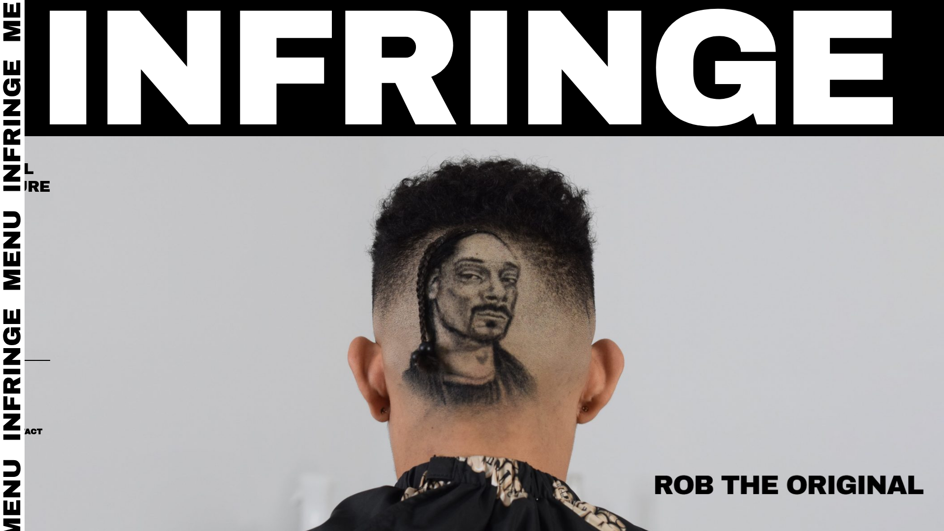
Infringe Hair Culture Portfolio Gallery
A minimalist, high-impact portfolio featuring a vertical sticky marquee sidebar and full-screen image scrolls that toggle between desktop and mobile assets.
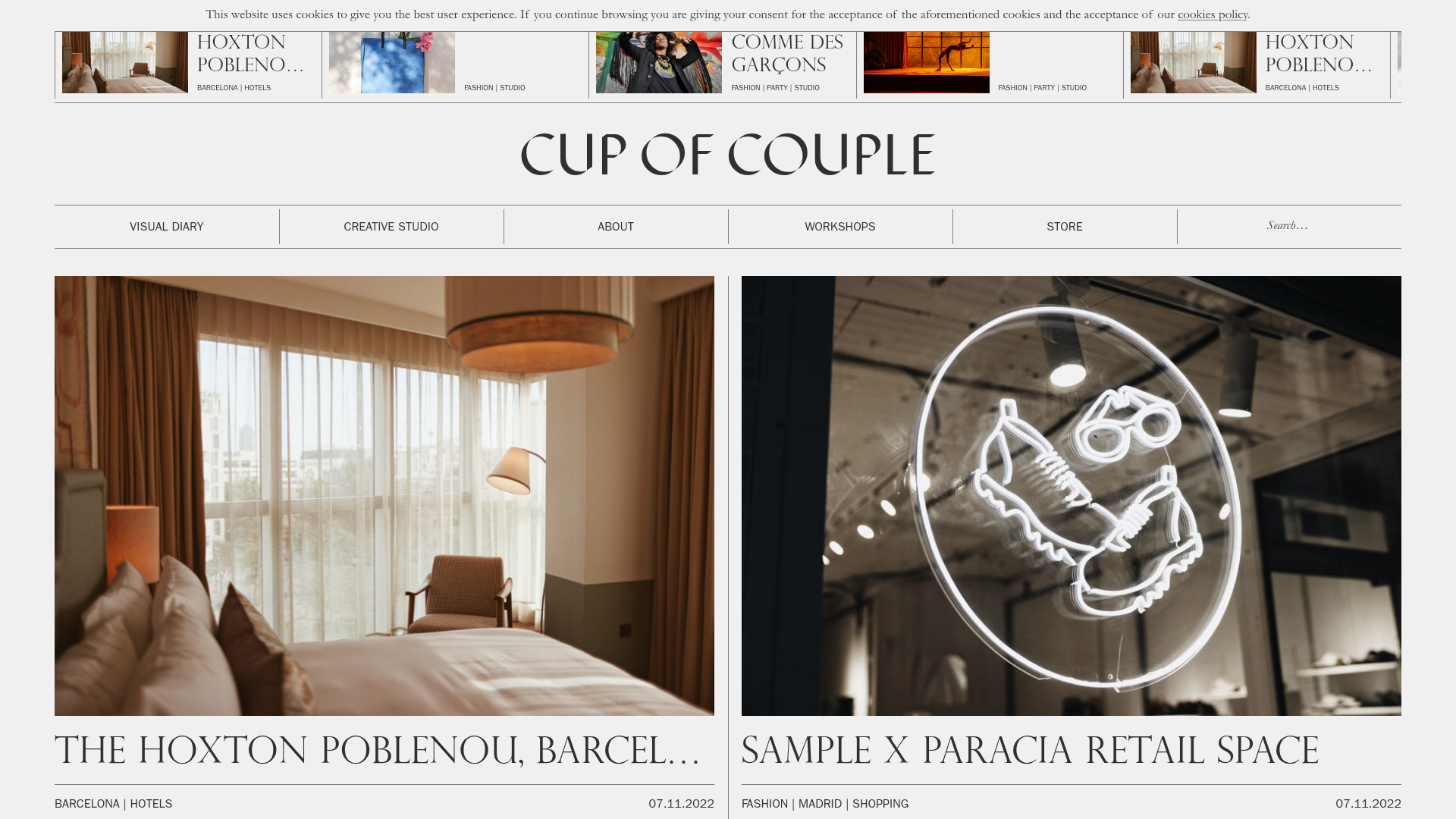
Cup of Couple Editorial Portfolio
A high-fashion editorial layout featuring a sticky compartmentalized header, a horizontal marquee carousel, and a mixed-width masonry grid with marquee typography effects.
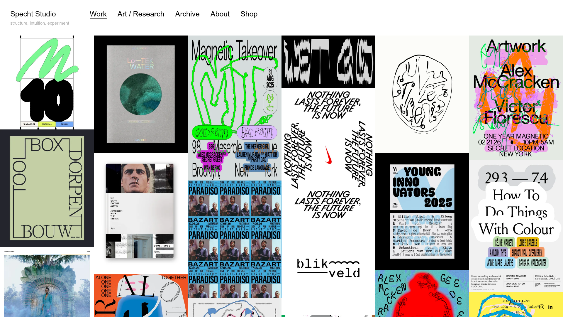
Specht Studio Portfolio Masonry Grid
A minimalist graphic design portfolio featuring an irregular masonry image gallery with high-contrast typography, hidden project details, and a top-aligned persistent navigation bar.
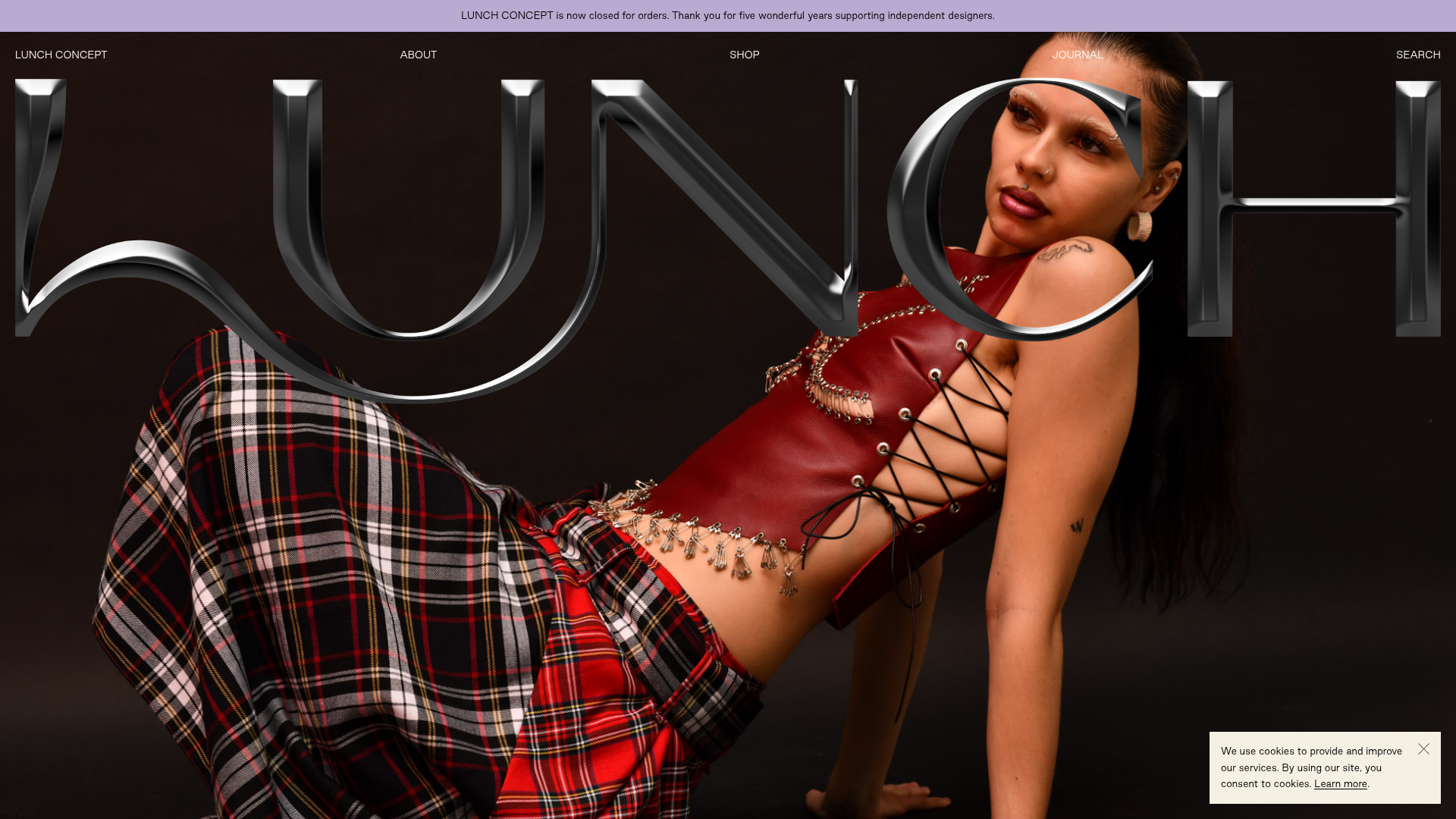
Lunch Concept Fashion E-commerce Showcase
A minimalist fashion store featuring a full-width chrome-effect typography overlay, high-impact hero imagery, and a clean product grid with hover-state image swapping.
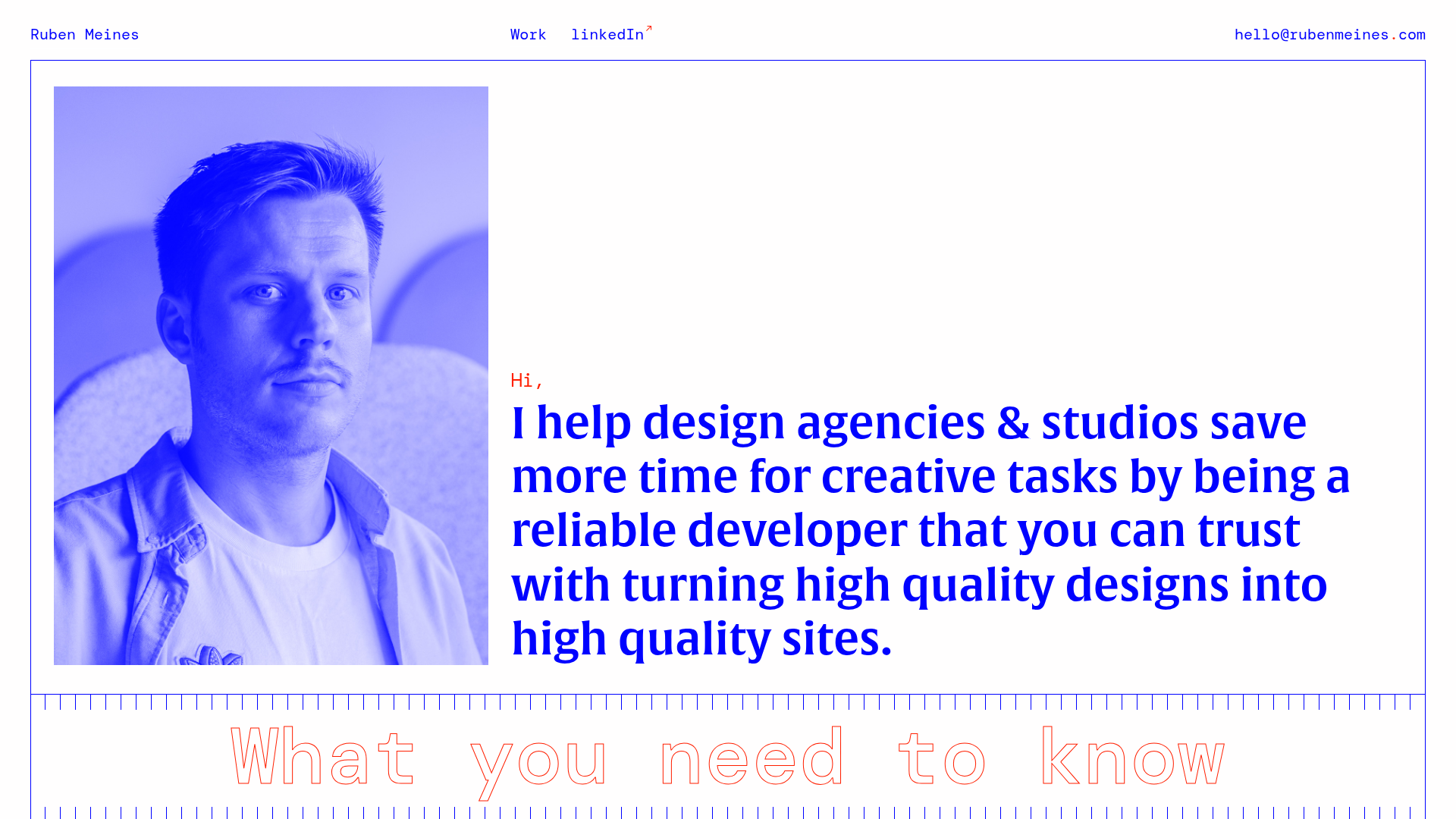
Ruben Meines Minimalist Developer Portfolio
A clean typography-focused layout featuring a duotone hero image, a decorative CSS grid border system, and a structured service list with outlined custom typography.
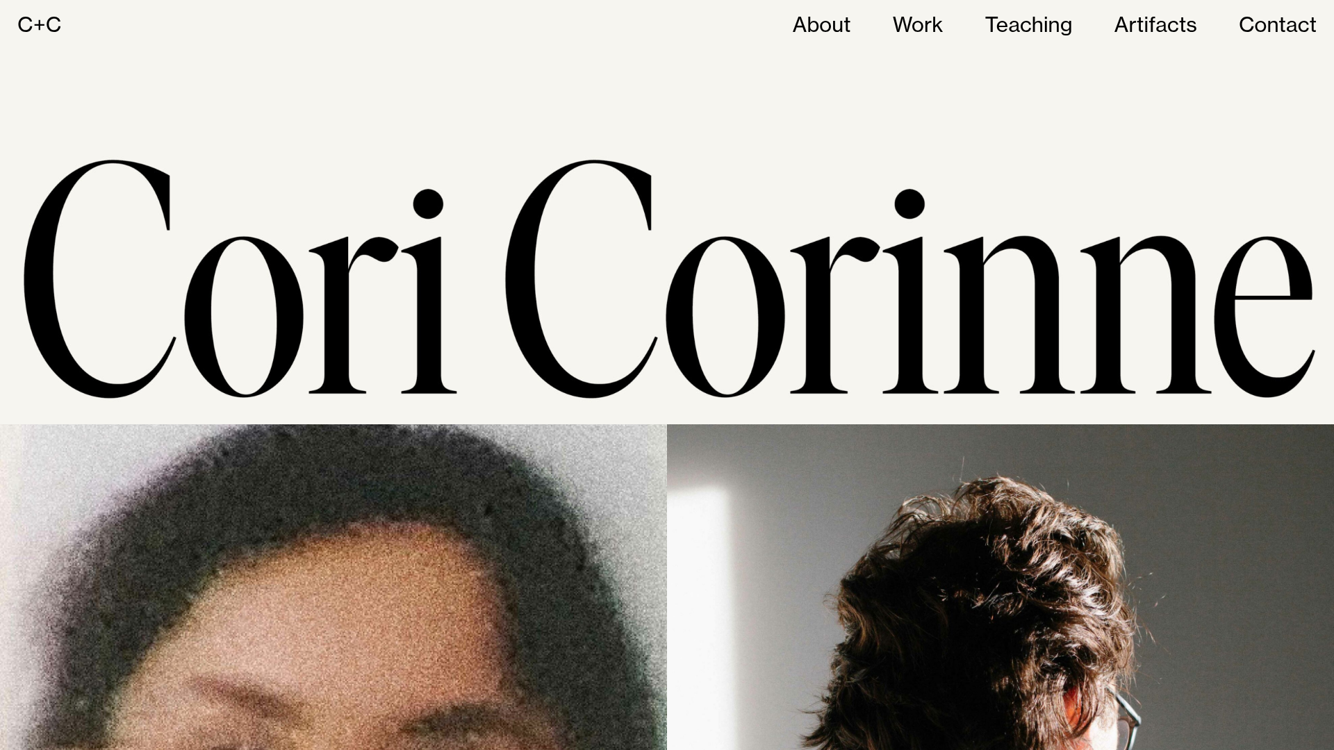
Cori Corinne Minimalist Portfolio Home
A clean, typography-focused layout featuring a massive serif hero header, two-column image grid, and text-based navigation for a high-end editorial feel.
