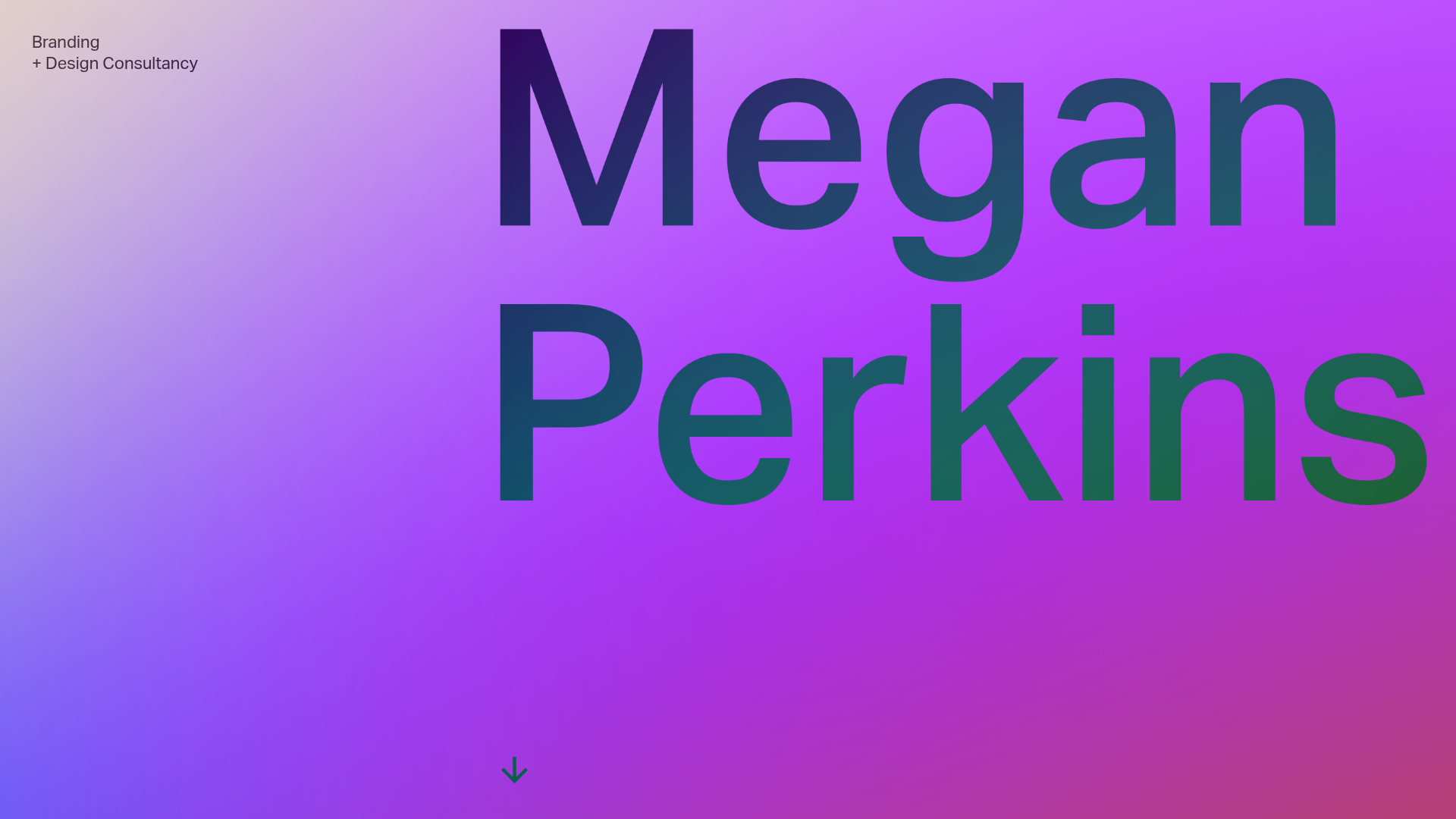
Megan Perkins Branding Portfolio Hero
A minimalist, typography-focused landing page featuring a full-screen vertical scroll interaction with a vibrant color gradient background and a high-contrast text overlay.
Overview
This hero section for Megan Perkins’ branding consultancy is a masterclass in minimalist, high-impact typography and color-driven storytelling. It serves as a strong reference for builders because it uses a simple vertical scroll mechanic to transition between a bold, oversized nameplate and a detailed text-based "About" section, prioritizing brand personality over complex componentry.
Design System
- Color Palette & Visual Hierarchy: The design uses a vibrant, diagonal linear gradient ranging from light lavender to deep magenta and forest green. The visual hierarchy is extremely flat; the primary focus is the giant typography that spans the width of the viewport, using a color-inverted "difference" blending mode that allows the text to shift and contrast dynamically against the background.
- Typography System: A bold, geometric sans-serif (similar to Inter or Helvetica) is used at a massive scale for the hero text. Body text follows a clean, single-column layout on the right side of the screen, utilizing a smaller scale with ample line height for readability against the complex background.
- Page Structure & Section Flow: The layout consists of a fixed-position background scroller. The initial view is a minimalist hero title; as the user scrolls, a detailed narrative block (contained within the
maintag) shifts into view, followed by a simple footer with "Scroll up" functionality. - Reusable Components: The core component to clone is the global
#scrollercontainer which manages the vertical displacement. The "Scroll up" button (#scroll-up) at the end of the text block is a functional utility designed to return the user to the top of the oversized nameplate. - Interaction & Motion: The site relies on a linear vertical scroll interaction. The HTML indicates a manual scroll-to-top trigger for desktop and mobile, ensuring the user can easily reset the experience after reading the dense consultancy description.
- Responsive Behavior: The HTML includes
mobile-onlyanddesktop-onlyclasses, suggesting a layout shift where the text column likely becomes full-width on smaller screens, and the "Scroll up" button adapts its styling for touch interactivity.
Use Cases
- Who should clone this pattern: Creative agencies, independent designers, and consultants who want to present a bold visual identity immediately without the clutter of a standard image gallery.
- Effective Remixes: Portfolio homepages for architects or copywriters could adapt this by swapping the nameplate for a core mission statement or a primary service offering.
- Practical Remix Directions:
- Brand Swap: Replace the purple/green gradient with a brand-specific CSS mesh gradient or a subtle video background.
- IA Adaptation: Use the secondary text block as a "Services" or "Experience" section while keeping the massive header for brand recognition.
- Interactive Layering: Implement a hover-triggered color change on the large text to add a level of micro-interaction to the static hero.
- Suggested Clone Scope: A quick section clone is ideal for those needing an impactful landing hero, while a full-page clone is best for professionals seeking a minimal "one-pager" that leads directly to a call-to-action.
Related Inspirations
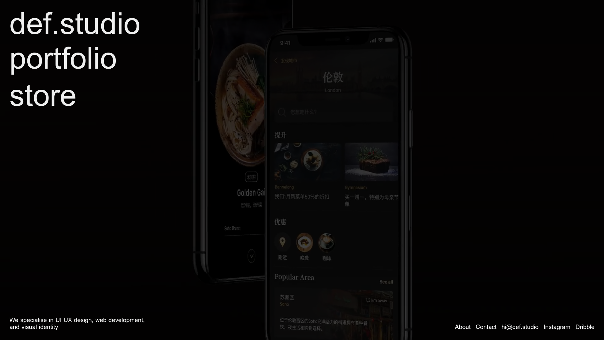
Def.studio Design Agency Portfolio
A dark-themed portfolio featuring a full-screen video background, smooth scroll transitions, and a vertical list of large-scale media-driven project cards with lazy-loaded video previews.
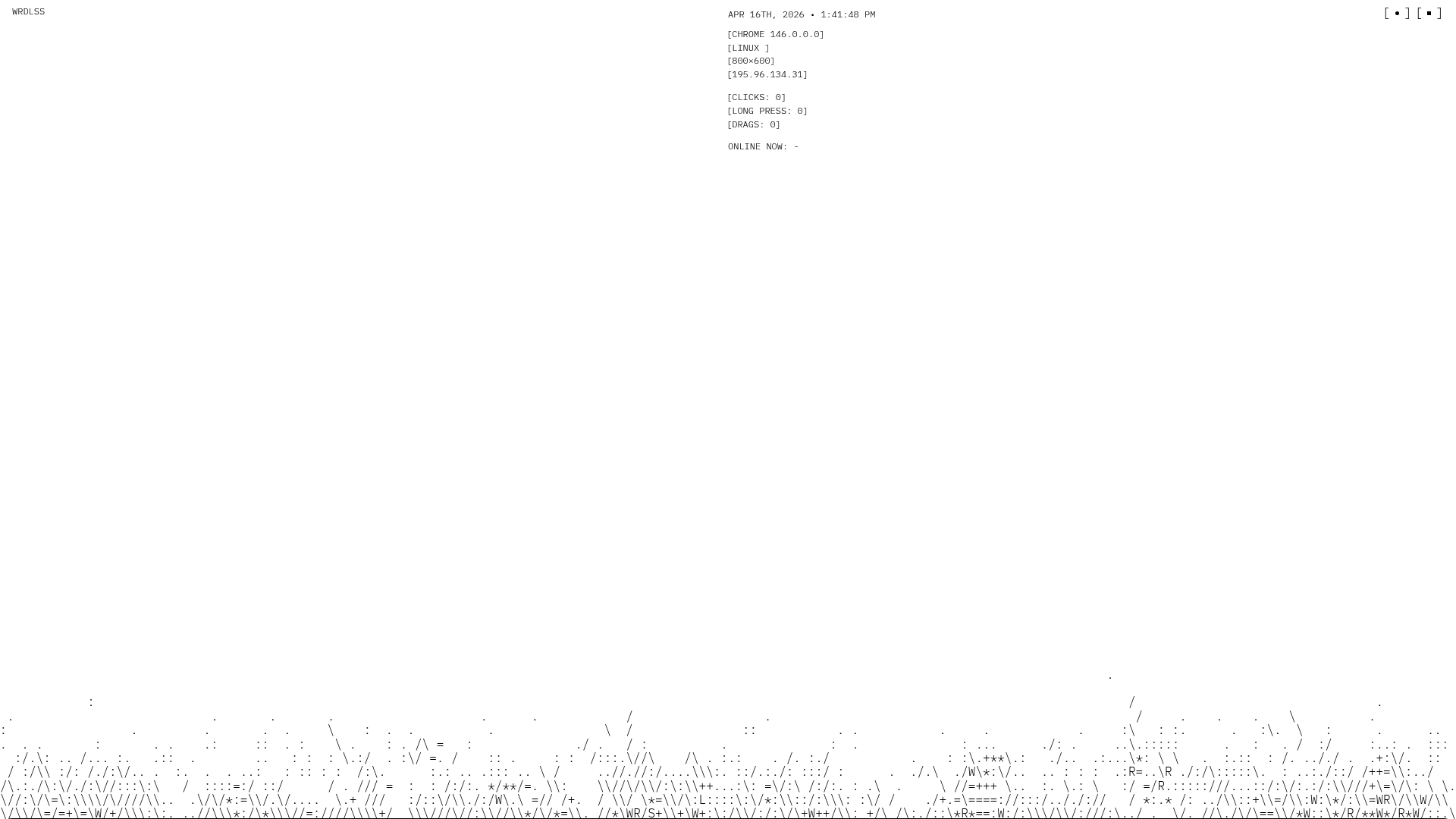
WRDLSS ASCII Aesthetic Portfolio Site
A minimalist portfolio layout featuring a full-width ASCII art hero section, scroll-based text fade-ins, and a multi-column services grid built with Nuxt.
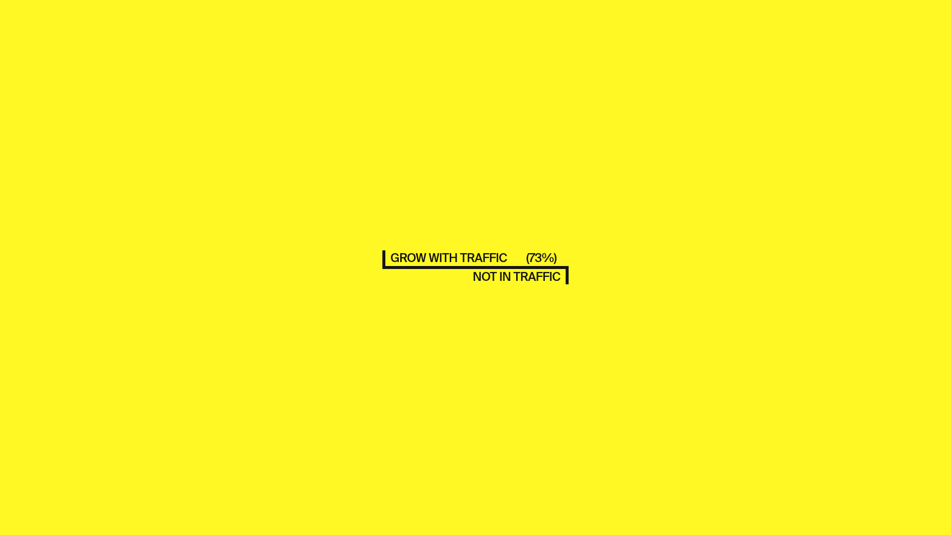
Traffic Productions Minimalist Creative Portfolio
A high-contrast, minimalist agency site feature text-masking reveal animations, vertical line dividers, and a project list with dynamic image hover effects.

Maëlan Graphic Design Portfolio Boutique
A scroll-heavy artisan portfolio featuring interactive logo shape animations, marquee-style horizontal text rails, and high-performance image slider accordions for project details.
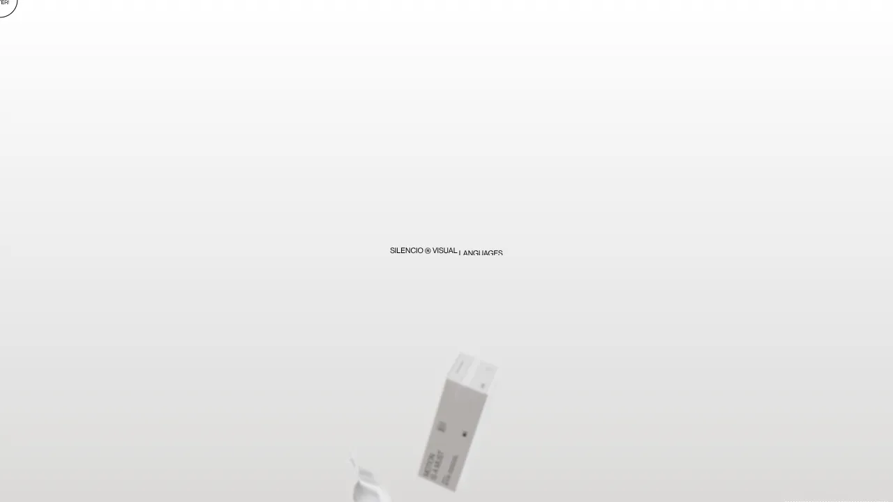
Silencio Studio Minimalist Design Portfolio
A clean, high-concept portfolio featuring a centered text hero, dynamic falling 3D elements, and a high-contrast monochromatic layout for creative brand showcases.
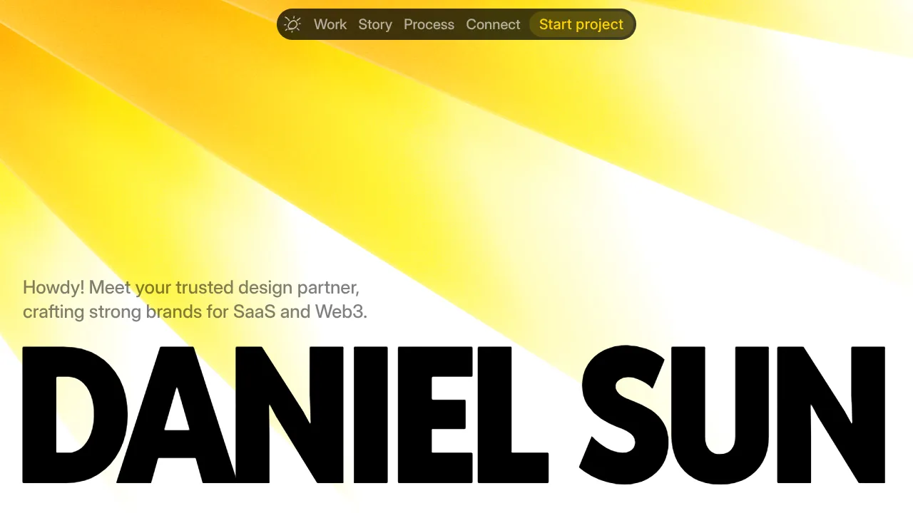
Daniel Sun Portfolio Landing Page
A high-impact portfolio featuring a bold typography hero, sticky pill-shaped navigation, and a vibrant yellow-to-white gradient aesthetic for branding and design agencies.
