Silencio Studio Minimalist Design Portfolio
A clean, high-concept portfolio featuring a centered text hero, dynamic falling 3D elements, and a high-contrast monochromatic layout for creative brand showcases.
Overview
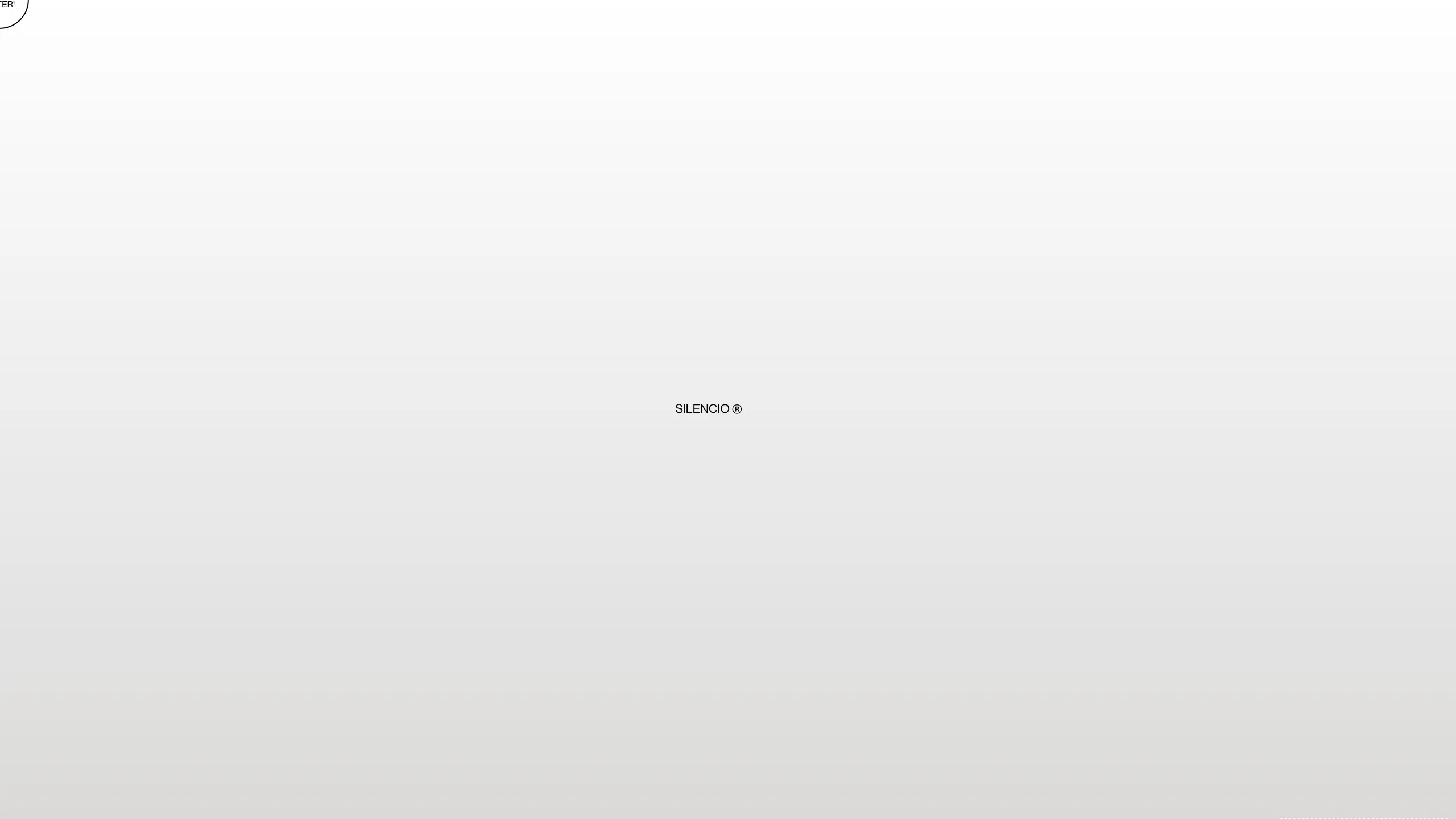
This website is a high-concept, minimalist portfolio for Silencio Studio that utilizes a "digital store" metaphor to showcase creative services. It is an exceptional reference for builders looking to master brutalist aesthetics, scroll-triggered 3D animations (Three.js), and innovative typography-heavy layouts.
Design System
- Color Palette & Visual Hierarchy: A strict monochromatic (black and white) theme that relies on high-contrast and negative space. Gray tones are used primarily for the 3D falling objects and "ticket" backgrounds to separate them from the stark white canvas.
- Typography System: The design uses a mix of bold sans-serif headers for impact and a specialized monospace font for the "technical" data blocks (like the receipt and barcode sections). Large-scale typography often serves as the primary visual element, replacing traditional imagery.
- Page Structure & Flow: The site follows a vertical storytelling flow divided into themed chapters: Branding (#01), Aesthetics (#02), Interactive (#03), and Disruptive (#04). Each section transition is marked by a "product label" or "ingredient list" component.
- Reusable Components:
- The Sticky Ticket: A sidebar component that acts as a summary/navigation tool.
- Product Labels: Data tables styled as nutrition facts or warehouse labels (visible in the
#marco1,#marco2divs) which can be reused for pricing or service features. - Floating Hero: A centered text section that interacts with 3D canvas elements (
#canvasmov).
- Interaction & Motion: The site is heavily reliant on GSAP/ScrollTrigger for parallax text effects and Three.js for the dynamic falling boxes. Elements like barcodes and "Purchased" progress bars animate based on scroll depth.
- Responsive Behavior: The HTML includes specific mobile-optimized classes (
#worksmov,#pantallas) and a "Click to Enter" preloader, indicating a focus on a controlled, app-like experience on smaller screens. - Implementation Clues: The site uses
three.js r149for the 3D environment and GSAP for the intricate pin-spacing and scroll-driven transformations visible in thepin-spacerandlineindivs.
Use Cases
- Who Should Clone: Design agencies, 3D artists, and creative developers who want a portfolio that functions as a technical demonstration of their skills.
- Effective Remixes: High-end streetwear brands, digital product studios, or experimental software landing pages that want to lean into the "Self Service Store" or "Warehouse" aesthetic.
- Practical Directions: Builders can swap the 3D box models for their own products (e.g., sneaker models, tech gadgets) while keeping the typography and "receipt" UI intact. The horizontal scrolling sections or the vertical product labels can be extracted as standalone components.
- Clone Scope: A full-page clone is recommended for those wanting to maintain the narrative flow, but the "Product Labels" (
.etiqueta) and the "Canvas Hero" are the most valuable individual sections for quick extraction.
Related Inspirations

Christopher Doyle Agency Portfolio Layout
A minimalist, typography-led portfolio featuring a wide-margin grid system, smooth fade-in animations, and simple image-focused project cards.

NewTab Studio Minimalist Portfolio Landing Page
A clean, typography-focused landing page featuring an oversized SVG/canvas hero title, a top-aligned navigation bar, and a minimalist footer layout.

Play Studio Minimalist Portfolio Landing
A high-impact agency layout featuring a oversized typography header, a full-width integrated Vimeo video background, and a unique expandable accordion list for industry showcases.

Baubauwerk Minimal Agency Portfolio Homepage
A clean studio site featuring a centered text hero, scatter-plot filterable project gallery, and full-bleed image sections for case studies.
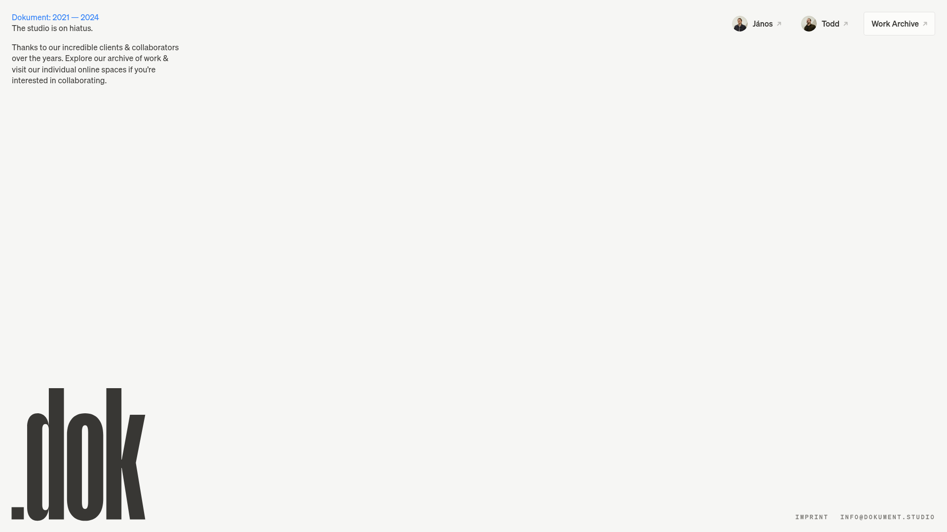
Dokument Studio Minimalist Portfolio Landing
A clean, high-contrast landing page featuring a bottom-aligned oversized logo, top-right profile links, and a minimalist typography-focused layout.
Catherine Peacock Designer Portfolio Home
A minimalist portfolio layout featuring a vertically stacked masonry project grid, sticky navigation with animated icons, and offset typography.
