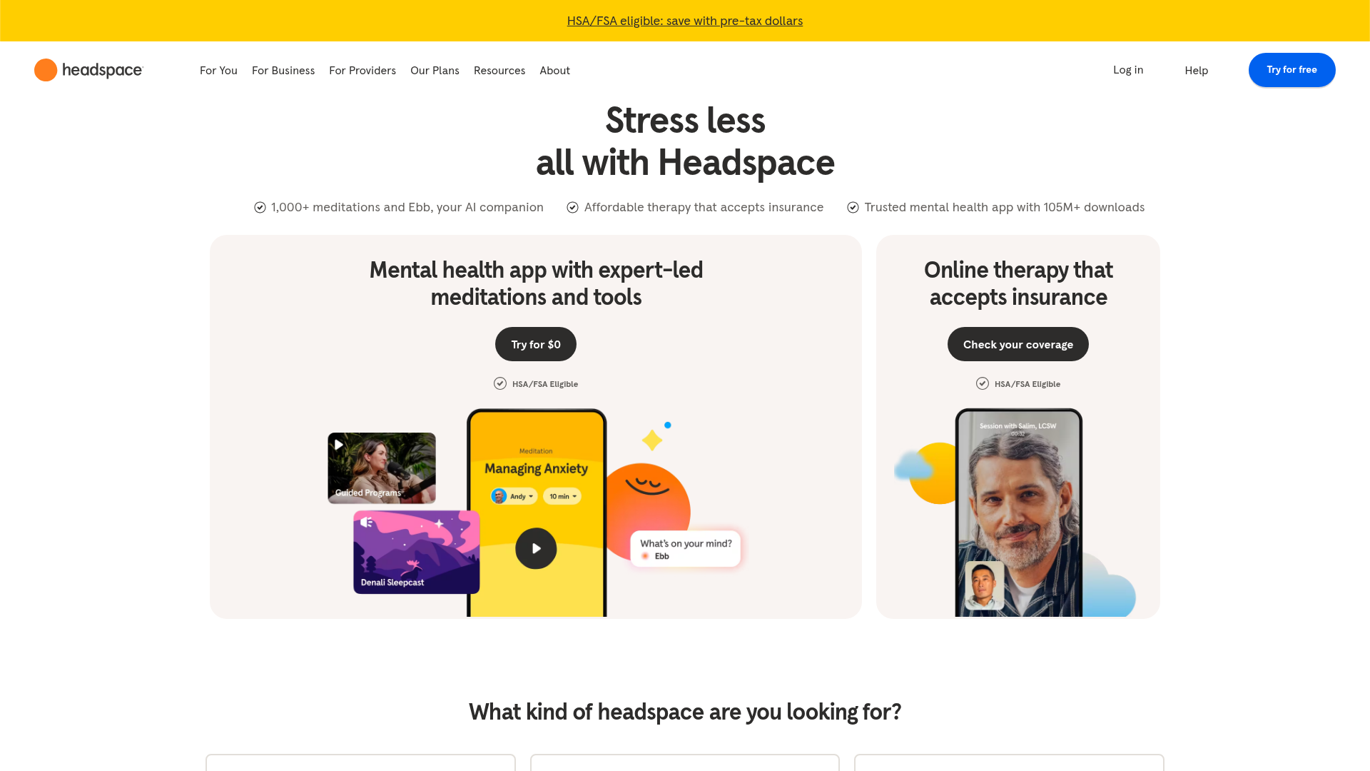
Headspace Mental Health Landing Page
A clean health-tech landing page featuring split hero cards, a tabbed service switcher with built-in audio players, and an auto-scrolling brand logo carousel.
Overview
This landing page for Headspace is a premier example of a modern, service-oriented health-tech site that balances content-heavy educational sections with high-conversion entry points. Its layout effectively handles two distinct user journeys—self-guided wellness and professional therapy—through a clever split-hero design and a tabbed "Deeper Dive" component. Builders should reference this for its excellent use of whitespace, rounded UI elements, and integrated multimedia players.
Design System
- Color Palette & Visual Hierarchy: The primary palette uses a high-energy yellow (
#FFC500) for top-level banners and a core meditation orange for the logo. Backgrounds use soft, off-white neutrals (#F7F5F2) to reduce eye strain, while CTA buttons utilize a high-contrast deep blue and monochromatic charcoal to distinguish between different service paths. - Typography: The system relies on a clean, geometric sans-serif (Headspace's custom font, similar to Circular). Headlines are bold and tightly tracked for impact, while value propositions use smaller, lighter weights for readability against bulleted icons.
- Page Structure & Flow: The flow starts with a high-level split-card hero, transitions into a "Need State" selector (categorical filtering), followed by a tabbed feature carousel with embedded audio previews, and concludes with a social proof section and a FAQ accordion.
- Reusable Components:
- Split Hero Cards: Two wide-radius cards with organic background illustrations and centered CTAs.
- Audio-Tabbed Carousel: A modular section where clicking a tab (e.g., "Sleep Resources") updates a media slide featuring a functional HTML5 audio player.
- Auto-Scrolling Logo Carousel: A brand-trust ribbon showcasing corporate partners.
- Vertical FAQ Accordion: Clean, borderless list items using the
<details>and<summary>HTML tags for native browser behavior.
- Implementation Details: The site is built with Next.js and uses Emotion/Styled Components (indicated by
css-prefixed classes). Images are served via Contentful and Imgix for responsive optimization across desktop and mobile.
Use Cases
- Who should clone this: SaaS companies offering multiple distinct product tiers (e.g., B2B vs B2C) that need to be presented side-by-side immediately.
- Effective Remixes: Fitness apps can swap meditations for workout previews; Ed-tech platforms can use the tabbed audio section to showcase course samples; Professional services can adapt the "Need State" grid to help users self-identify their industry or problem.
- Practical Remix Directions: Retain the layout's structural accessibility (like the sticky HSA/FSA bar) but swap the soft, organic illustrations for crisp technical screenshots or photography to shift the brand tone from "relaxation" to "productivity."
- Clone Scope: For a fast implementation, the Split Hero Cards and the Auto-Scrolling Logo Ribbon provide the highest immediate value. A full-page clone is recommended for developers looking to build a comprehensive, multi-section marketing site that requires complex state management across tabs and carousels.
Related Inspirations
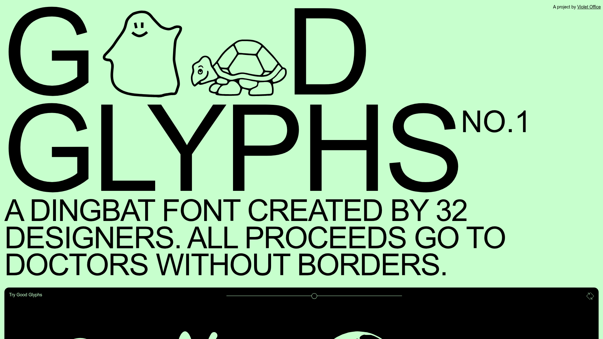
Good Glyphs Font Showcase Landing Page
A single-page layout featuring an interactive type tester, donation form with custom amount logic, and a contributor gallery using swiper-based glyph previews.
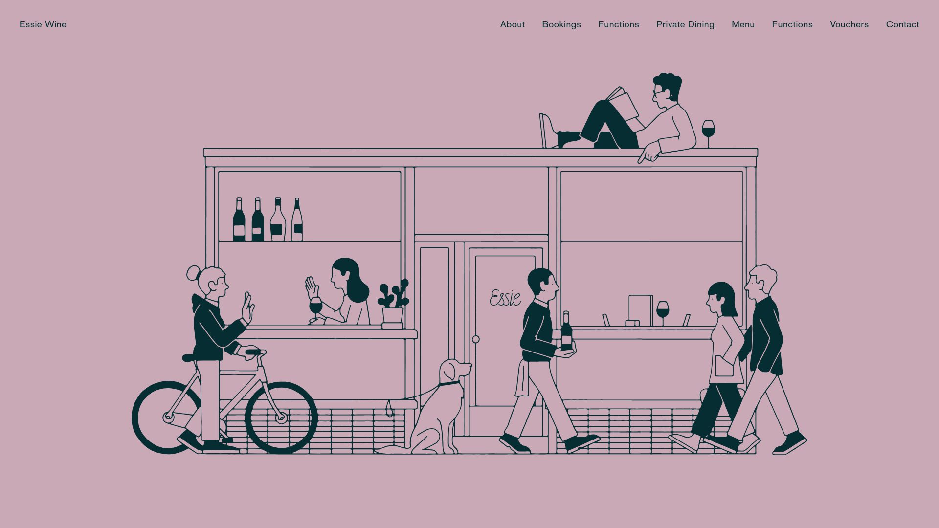
Essie Wine Illustration-Led Landing Page
A minimalist hospitality site featuring an SVG illustration hero, bento-style image grid, tabbed menu downloads, and a clean booking form integrated with SevenRooms.
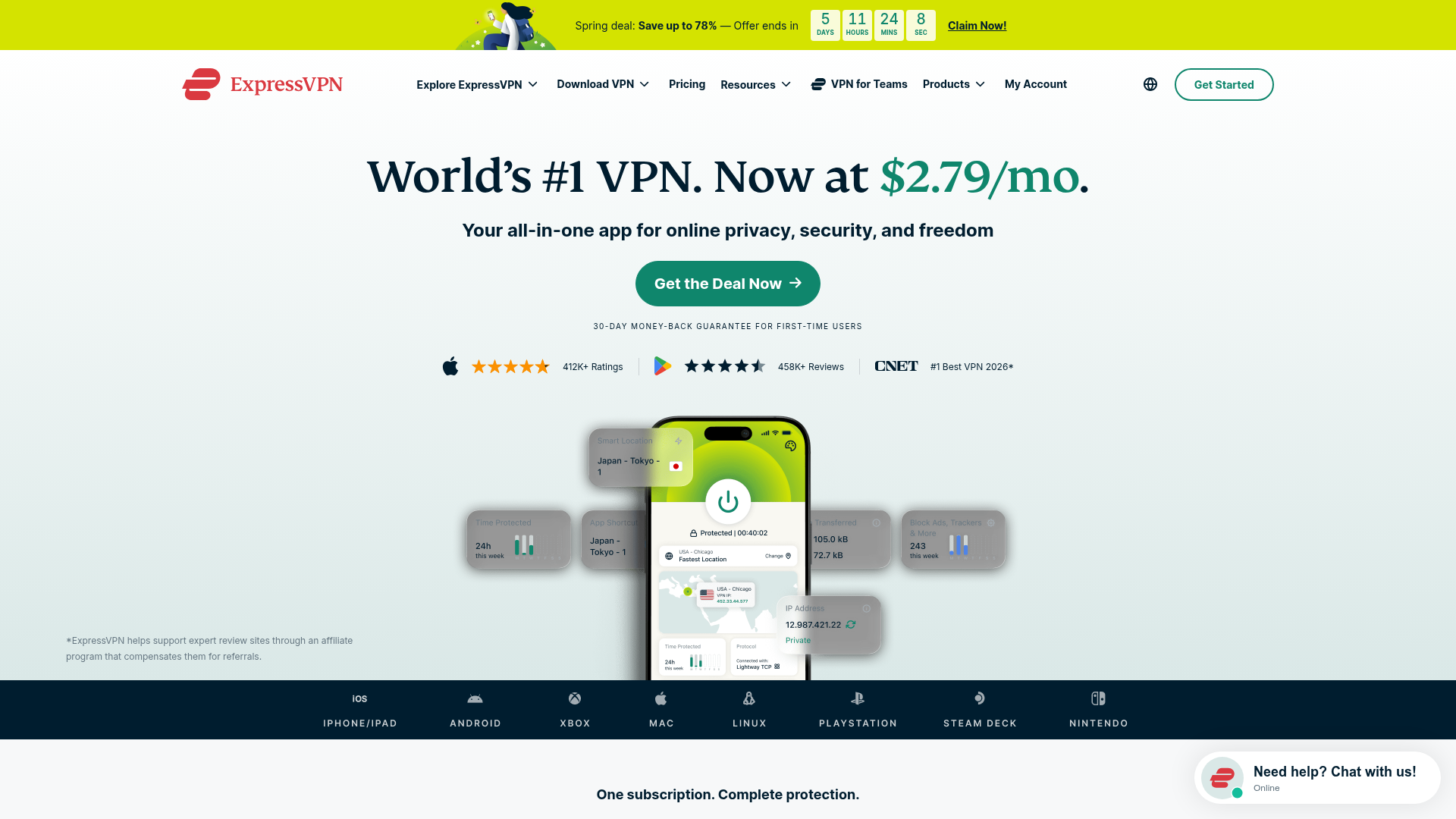
ExpressVPN SaaS Landing Page
Features a high-conversion layout with a sticky countdown banner, icon-driven feature grid, flag-based server directory, FAQ accordion, and floating chat widget.
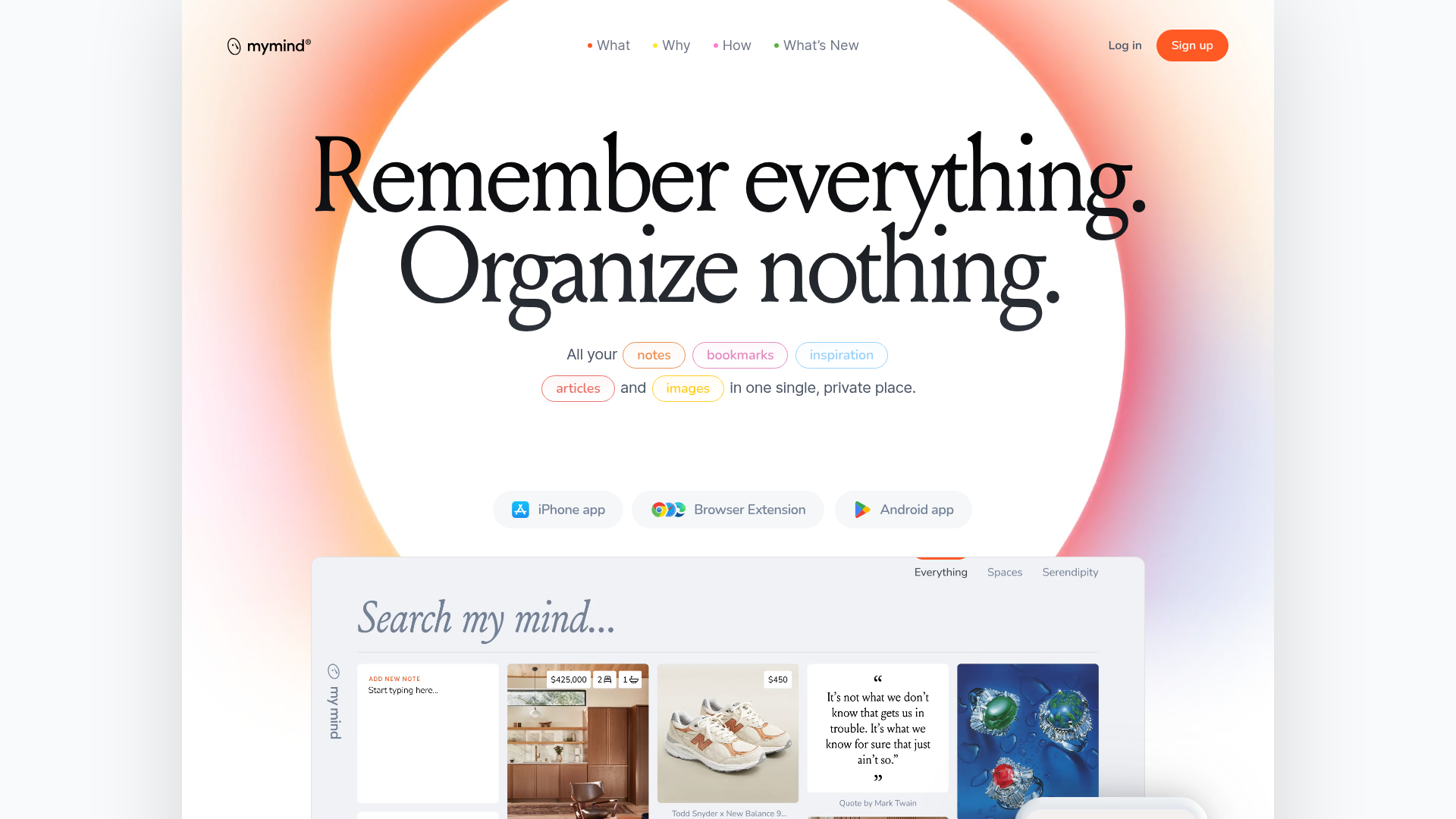
Mymind AI Tool Landing Page
A minimalist SaaS landing page featuring a soft-gradient hero section, custom pill-shaped text badges, and a dynamic bento-style search result preview grid.
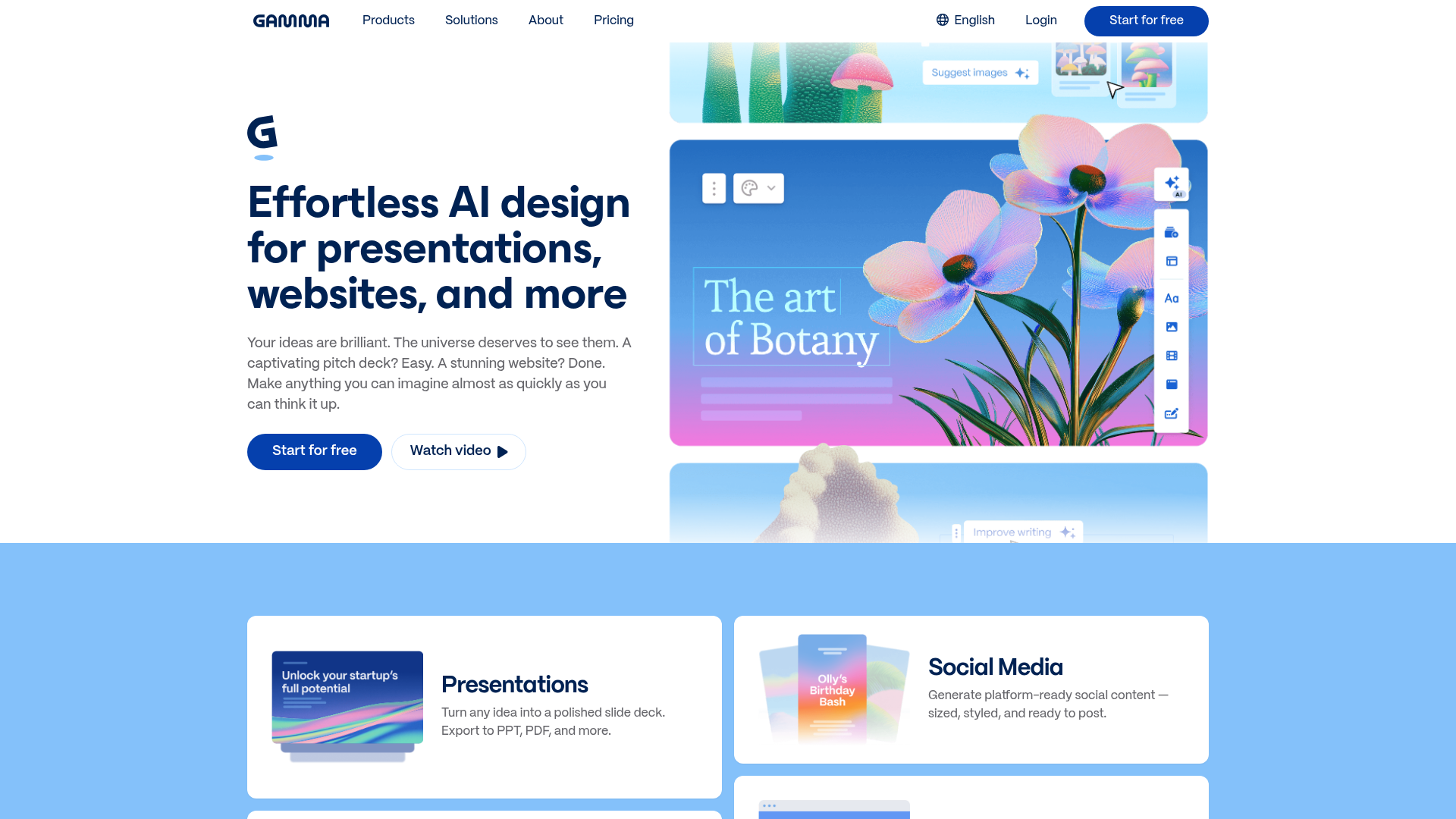
Gamma AI SaaS Landing Page
A modern software landing page featuring a split-hero section, alternating feature blocks with embedded video, card-based product grids, and a high-density customer testimonial carousel.
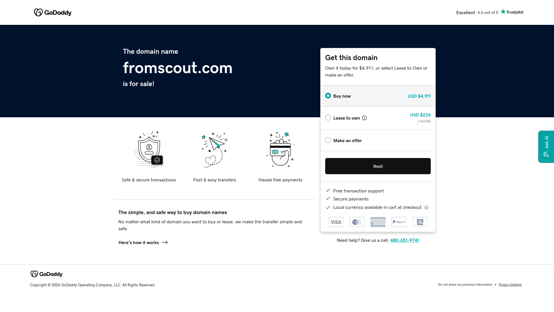
GoDaddy Domain Sales Landing Page
A clean, functional landing page layout featuring a split-hero section with a multi-option pricing card, payment method icons, and custom SVG benefit modules.
