Mymind AI Tool Landing Page
A minimalist SaaS landing page featuring a soft-gradient hero section, custom pill-shaped text badges, and a dynamic bento-style search result preview grid.
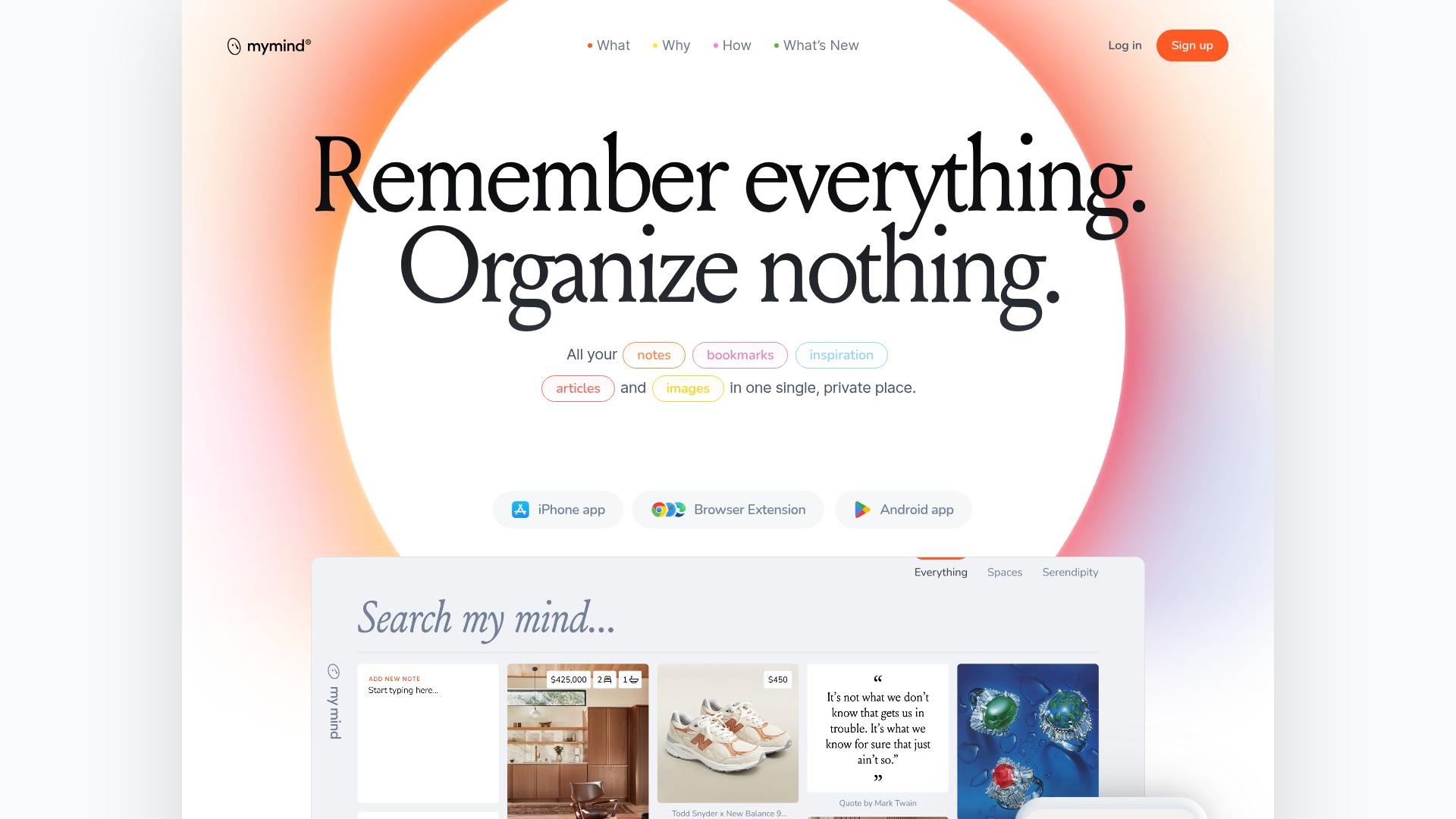
Overview
Mymind is a minimalist SaaS landing page for an AI-powered note-taking and bookmarking tool. It is a premier reference for builders due to its sophisticated use of mesh gradients, high-end serif typography, and a clean, non-traditional bento grid that previews product functionality.
Design System
- Color Palette & Visual Hierarchy: The site uses a soft, organic mesh gradient in the hero section (oranges, pinks, and purples) against a clean white and light-grey background. High visual hierarchy is achieved through a massive, centered hero title in dark charcoal, contrasted with vibrant, color-coded badge accents.
- Typography: A dual-font system is employed. A high-contrast, elegant serif (likely Louize) is used for expressive headlines and manifestos, while a clean, geometric sans-serif (Inter) handles UI labels and body copy. Scale is extreme, with hero titles reaching over 7rem, creating a bold, editorial feel.
- Page Structure: The layout follows a narrative flow: a centered hero with dynamic badges, an immersive video demo, a text-heavy 'Manifesto' section, a detailed feature grid with large-scale iconography, and a community social proof section using floating tweet-style images.
- Reusable Components:
- Dynamic Pill Badges: Color-coded
<span class="bubble">elements used to categorize content types. - App Download Buttons: Rounded, translucent pill buttons with SVG icons for platforms (iOS, Android, Browser).
- Bento Feature Grid: Large, varied-width columns (using
data-xl-widthfrom 5 to 12) that mix high-quality renders with descriptive text.
- Dynamic Pill Badges: Color-coded
- Interactions & Motion: The HTML indicates extensive use of video backgrounds and specific hover states (
data-effect="colorfade"andicon-move). The manifesto uses a list-based 'promise' animation to cycle through value propositions. - Responsive Behavior: The system uses a granular breakpoint strategy (visible in
data-font-size-xsandhide-below-543attributes), specifically repositioning buttons and scaling down massive typography for mobile devices while maintaining the centered alignment.
Use Cases
- Who should clone this: Designers and developers building "Second Brain" apps, creative portfolios, or AI tools that prioritize privacy and aesthetic minimalism over dense data tables.
- Effective Remixes: This pattern is ideal for luxury lifestyle brands or high-end productivity tools where the user experience is marketed as a "calm" environment.
- Remix Directions: Swap the organic mesh gradient for brand-specific colors; replace the bento grid images with dashboard screenshots; or adapt the 'Manifesto' section for any mission-driven startup.
- Clone Scope: The hero section (gradient + large serif title) is a perfect one-section clone for impact. For a complete brand overhaul, cloning the entire page provides a robust, responsive framework for a sophisticated marketing site.
Related Inspirations
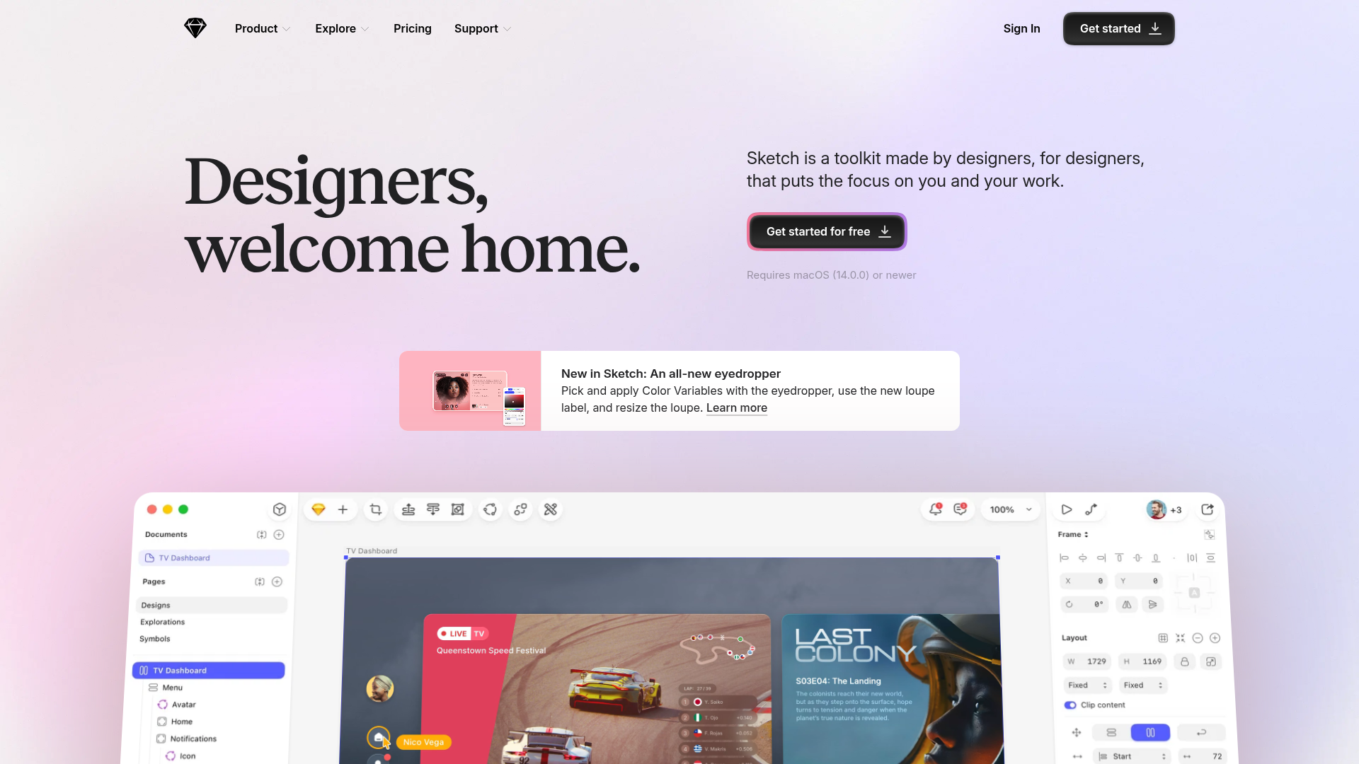
Sketch Design Tool Landing Page
A refined marketing layout featuring a soft gradient hero, modern bento grid sections with video embeds, a testimonial carousel, and an auto-scrolling customer logo marquee.

Vercel AI Cloud Landing Page
A modern landing page featuring a minimalist dark-themed navbar, a grid-overlay hero section with radial color gradients, and high-contrast typography for customer success stories.
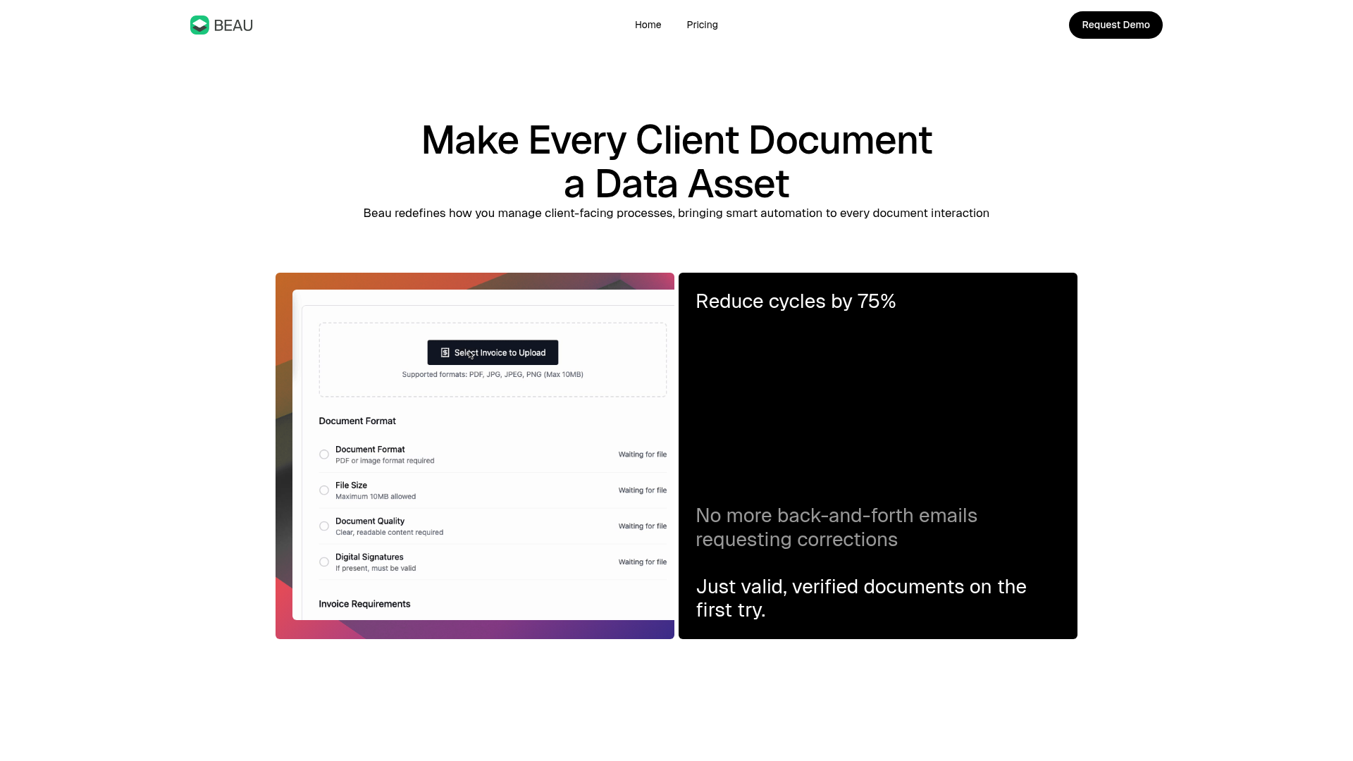
Beau Document Automation Landing Page
A modern software landing page featuring a bento-grid layout, split-screen hero assets with animated checkmarks, a step-by-step process guide, and a clean two-tier pricing table.
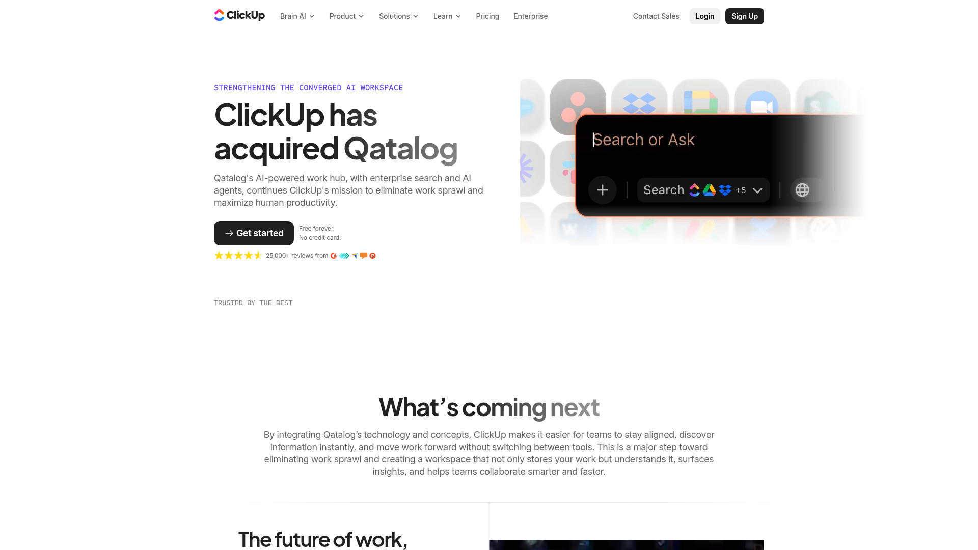
ClickUp Acquisition Hero Landing Page
Features a modern dark-themed hero section with a search UI graphic, bento-style feature grid, and a high-contrast CTA section with decorative gradients.
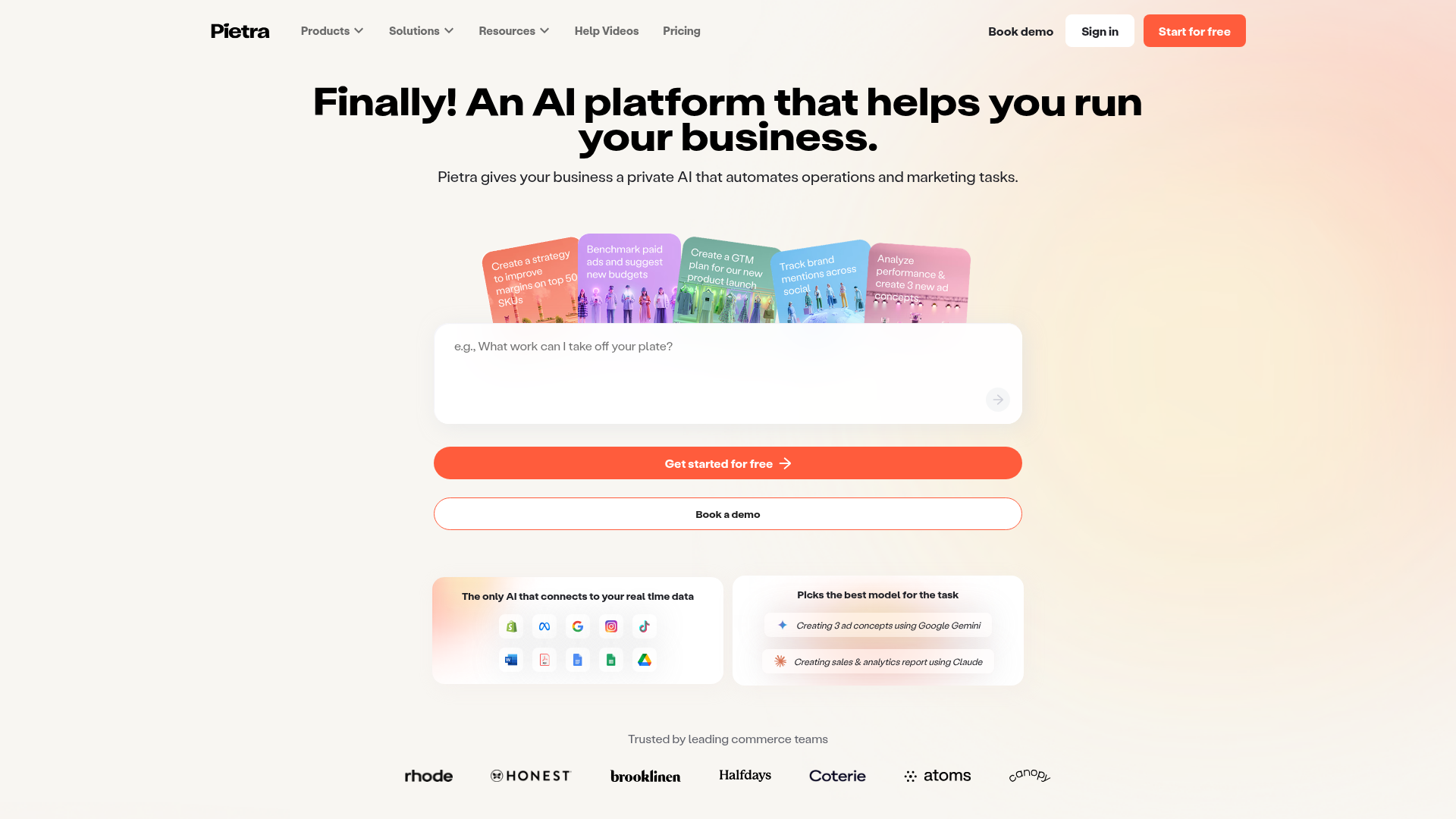
Pietra AI Platform Landing Page
A commerce-focused landing page featuring a centralized AI input hero, colorful floating value-prop cards, a bento-style integration showcase, and tabbed feature sections with side-by-side comparisons.

Koa Health Mental Care Landing Page
A clean healthcare landing page featuring a centered hero section, scroll-based fade-in animations, overlapping mobile mockups, and a multi-column feature grid with accent borders.
