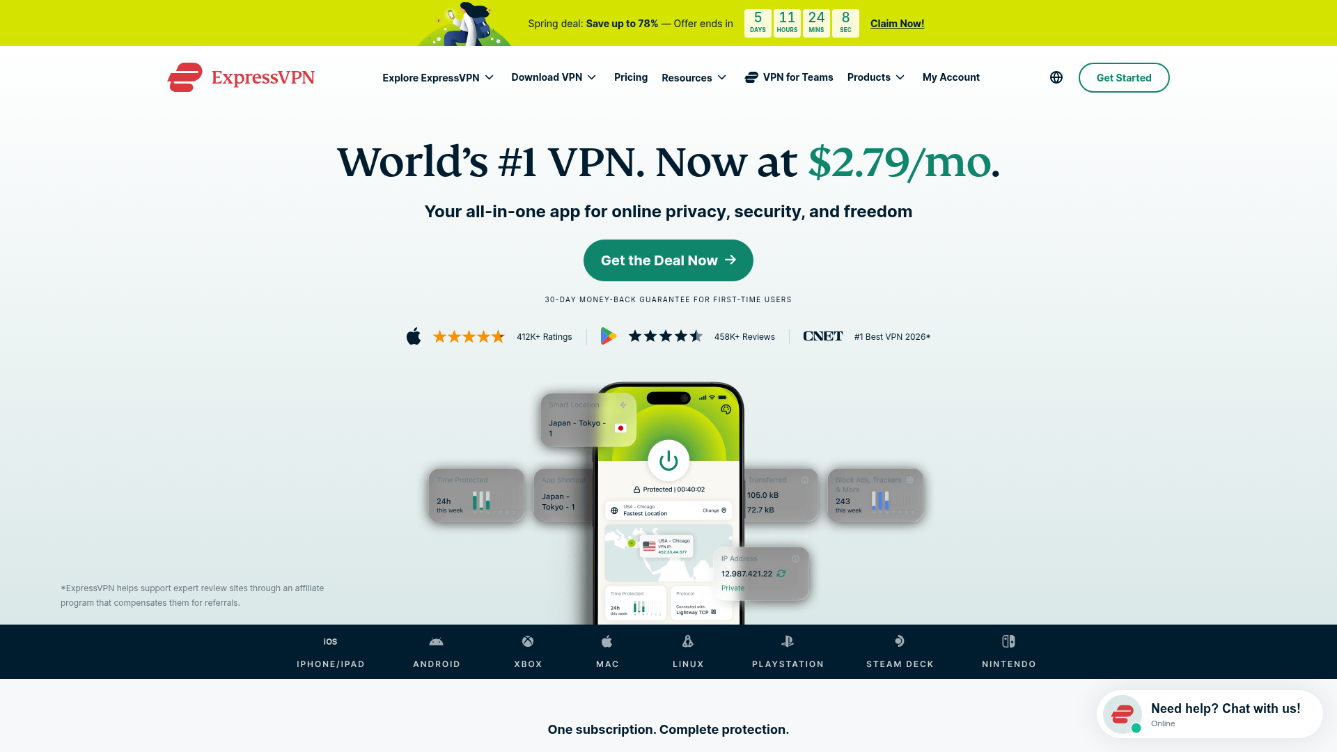
ExpressVPN SaaS Landing Page
Features a high-conversion layout with a sticky countdown banner, icon-driven feature grid, flag-based server directory, FAQ accordion, and floating chat widget.
Overview
ExpressVPN’s landing page is a masterclass in high-conversion direct response design for SaaS products. It utilizes a persuasive "inverted pyramid" structure that starts with a high-urgency offer and transitions into deep educational content, making it an excellent reference for services requiring both trust-building and immediate action.
Design System
- Color Palette & Visual Hierarchy: The primary brand color is a bold red for the logo, contrasted against a lush forest green (
#0f866c) used for primary CTAs and price highlights. The background uses a soft vertical gradient (#FFFFFFto#DAE8E7), providing a clean, premium feel that avoids harsh pure whites. Critical deal information is highlighted with a high-visibility yellow banner. - Typography & Scale: The system uses a mix of serif headings for an authoritative, "established" feel and sans-serif body text for readability. H1 headings are large and centered, with specific price points color-coded for emphasis. Footnotes and legal disclaimers use a smaller, greyed-out scale to maintain a clean layout while meeting compliance.
- Page Structure:
- Sticky Urgency: Countdown timer banner at the very top.
- Hero: Heavy-duty H1, Green CTA, and social proof (app ratings).
- Device Social Proof: A dark-themed horizontal logo bar showing platform compatibility (Xbox, PlayStation, etc.).
- Educational Interaction: "What is a VPN?" video section followed by alternating side-by-side feature explainers.
- Grid UI: A 3-column "Organic Cards" layout for secondary value propositions.
- Directory & Social: Flag-based server list and a masonry-style testimonial slider.
- Trust & Closure: Comprehensive FAQ accordion and 2-column support/guarantee cards.
- Reusable Components:
- Sticky Countdown Banner: A mobile-responsive timer with distinct desktop/mobile view logic (
show-md-upvsshow-md-down). - The "Device Bar": A horizontal scroller for cross-platform logos.
- Floating Chat Widget: A persistent bottom-right CTA that shows online status.
- Flag Directory: A clean list component for global service presence.
- Sticky Countdown Banner: A mobile-responsive timer with distinct desktop/mobile view logic (
- Implementation Clues: The HTML reveals a utility-heavy structure with clear class naming conventions (
reasons--row-reverse,container--xl,button--green). It usesSwiper.jsfor testimonial carousels and basic<details>tags for an accessible FAQ accordion.
Use Cases
- Who should clone this: Developers building subscription-based utilities (antivirus, cloud storage, password managers) or any SaaS product where cross-platform compatibility is a major selling point.
- Effective Remixes: Fintech apps can adapt the "Flag Directory" to show supported currencies/countries. EdTech platforms can reuse the side-by-side "Reason" sections to explain complex course curriculum features.
- Practical Directions:
- Quick Scope: Clone the Hero and the Device Compatibility bar for an immediate trust boost to any landing page.
- Full Scope: Replicate the entire flow to move users from "Awareness" (Hero) to "Interest" (Features) to "Evaluation" (FAQ) and finally "Action" (Sticky Footer CTA).
- Remix Strategy: Swap the serif headers for a modern geometric sans-serif to pivot the brand from "Reliable/Authoritative" to "Fast/Modern Startup."
Related Inspirations
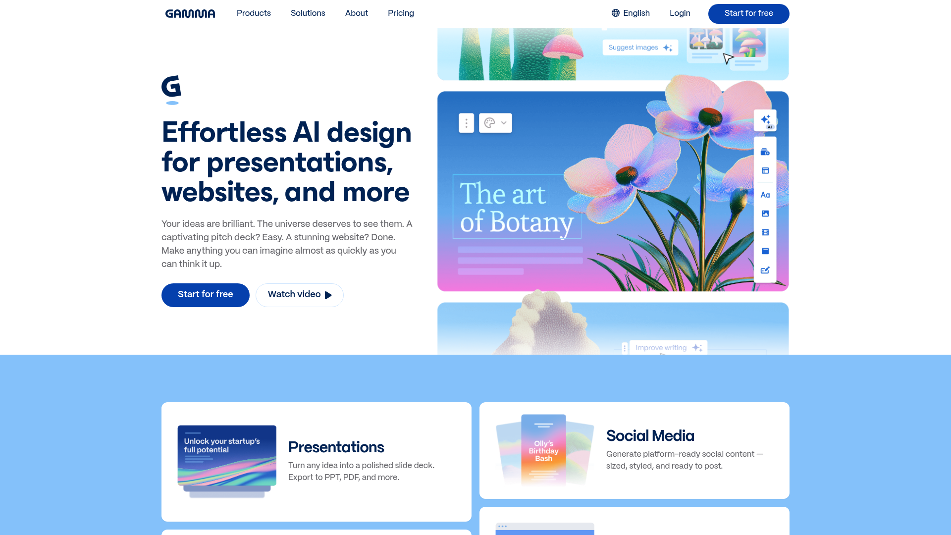
Gamma AI SaaS Landing Page
A modern software landing page featuring a split-hero section, alternating feature blocks with embedded video, card-based product grids, and a high-density customer testimonial carousel.

Vercel AI Cloud Landing Page
A modern landing page featuring a minimalist dark-themed navbar, a grid-overlay hero section with radial color gradients, and high-contrast typography for customer success stories.
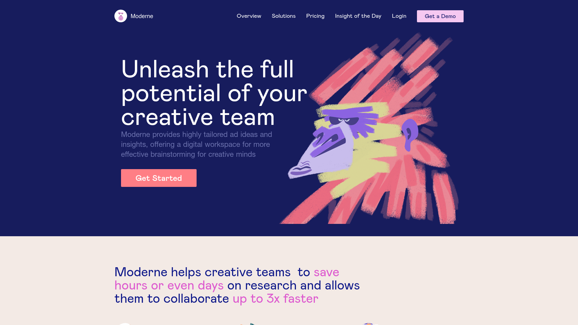
Moderne Creative Landing Page
A high-contrast landing page featuring a dark hero section with an artistic illustration overlay, distinct alternating content blocks, and a visual comparison bar chart component.
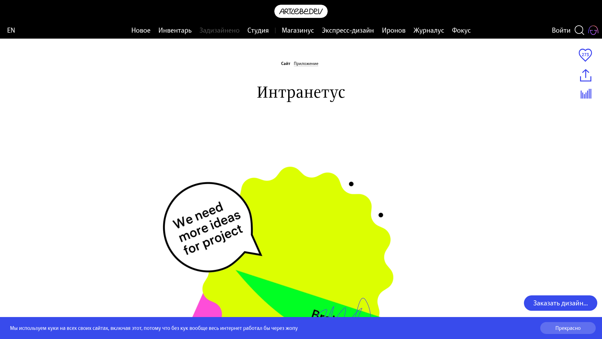
Intranetus Project Showcase Landing Page
A high-concept portfolio page featuring a large-scale video hero, Lottie animations, layered parallax transition effects, and a vertical grid of browser-mockup feature cards.
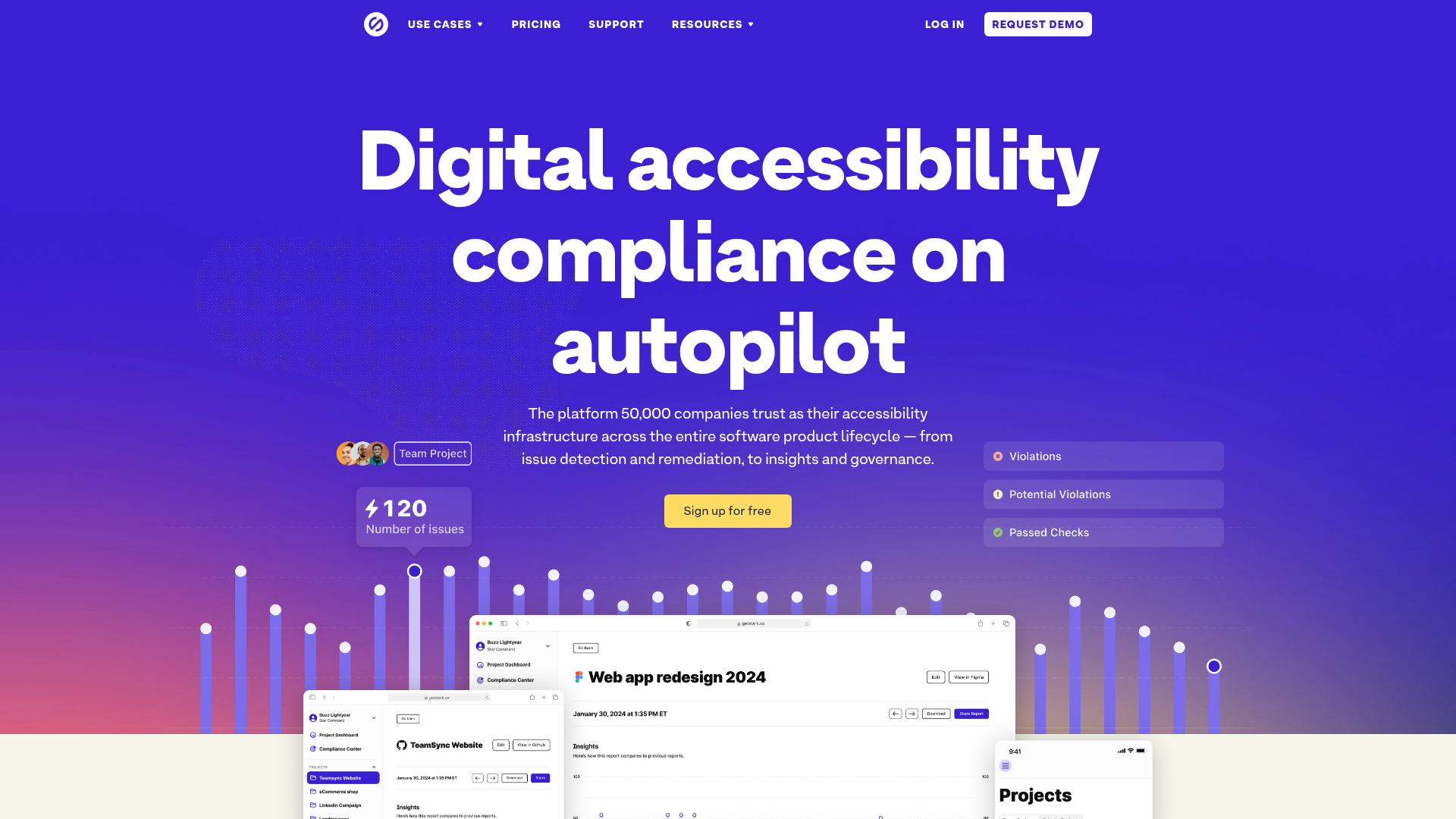
Stark Accessibility Software SaaS Landing Page
A vibrant SaaS landing page featuring a purple gradient hero, layered dashboard mockups, grid-based feature highlights, and segmented user-persona navigation.
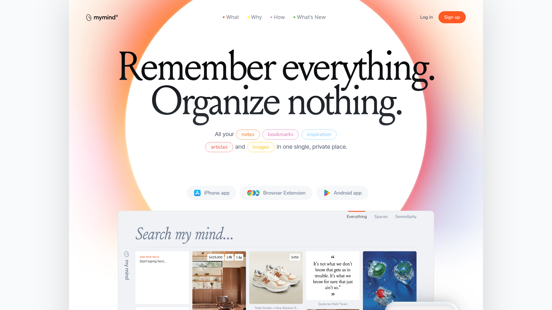
Mymind AI Tool Landing Page
A minimalist SaaS landing page featuring a soft-gradient hero section, custom pill-shaped text badges, and a dynamic bento-style search result preview grid.
