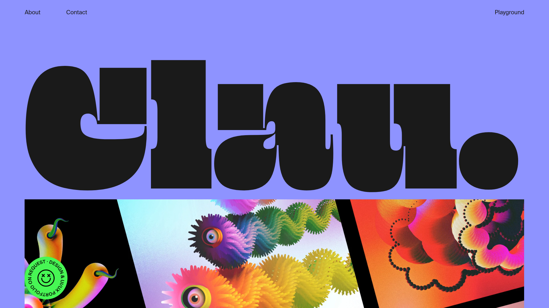
Clau Portfolio With Bold Typography
Artistic portfolio featuring ultra-bold oversized hero typography, parallax-scrolling image columns, sticky floating CTAs, and a high-contrast per-section color palette.
Overview
This portfolio website is a high-impact reference for designers wanting to leverage ultra-bold typography and immersive scroll mechanics. It serves as a masterclass in using type-as-interface, where massive letterforms frame the content across a multi-layered, visually rich user experience.
Design System
- Color Palette & Visual Hierarchy: The site uses a dynamic, per-section background color strategy (e.g., Periwinkle blue, black, and deep grey). High-contrast pairings ensure that the oversized black typography remains the primary focal point, while saturated, grain-textured content blocks provide secondary visual interest.
- Typography System: The brand uses a custom, ultra-bold, heavy-weight display face for hero sections (e.g., "Clau."). The scale is massive, often spanning the full width of the viewport. Supporting copy and navigation use a clean, geometric sans-serif (Inter or similar) to provide legibility against the heavy display titles.
- Page Structure & Section Flow: A linear vertical flow starts with a massive Hero/Intro title, followed by an "About" section with horizontally scrolling skill sets (marquee style), a three-column "Get in Touch" section with categorical lists, a "Playground" grid for projects, and a final "Email Me" footer.
- Reusable Components:
- Parallax Image Columns: A dual-column layout where left and right columns scroll at different speeds.
- Floating Sticky CTA: A circular "Request Portfolio" badge that persists in the bottom corner with rotating text and SVG icons.
- Letter-Wrapped Animation: Titles are structured with each letter in an individual
div(class="letter"), allowing for sequential staggered animations.
- Interaction & Motion: The site utilizes parallax scrolling, letter-by-letter entrance animations, and a custom "dot cursor" that changes color based on the section background. Experience transitions are defined by CSS classes like
.animate-inand.page-transitionvisible in the DOM. - Implementation Clues: The HTML indicates a Vue.js application (
data-v-app,data-v-4ce0ff53) using GSAP or similar for complex transforms (translate: none; rotate: none; scale: none;).
Use Cases
- Who Should Clone This: Creative directors, illustrators, and agency developers who need a "brand-first" portfolio that prioritizes visual impact over text-heavy explanations.
- Effective Remixes: This pattern works exceptionally well for font foundries showcasing a single typeface, fashion lookbooks, or event landing pages where a single word or date needs to dominate the hero view.
- Practical Remix Directions: Simplify the multi-column playground to a single-column gallery for mobile-first content, or swap the "dot cursor" for a more standard interaction to improve accessibility while keeping the bold hero type.
- Suggested Clone Scope: A full-page clone is ideal to capture the background color transition logic, but cloning just the hero section provides an immediate, high-converting splash page for any creative project.
Related Inspirations
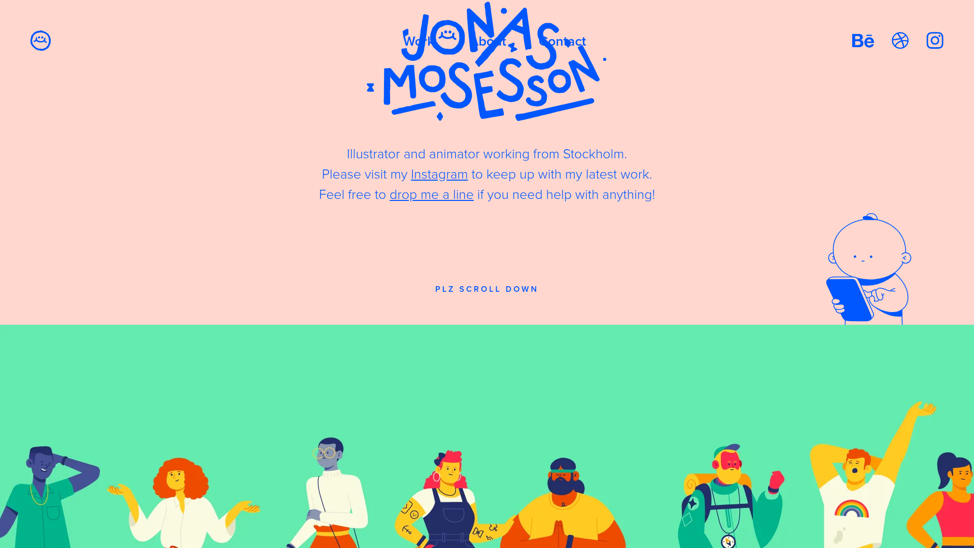
Jonas Mosesson Illustrator Portfolio Layout
A playful portfolio featuring a custom-animated logo header, a responsive multi-column project grid with hover-revealed details, and a distinct minimalist sectioned about page.

Monopo Saigon Creative Agency Portfolio
A high-end studio portfolio featuring an interactive lens artwork hero, smooth locomotive scroll animations, a rotated image tile grid, and expandable team member cards.
Ruben Wyttenbach Photography Portfolio
A minimalist photography showcase featuring a custom magnetic cursor with a numerical counter, smooth parallax scrolling, and an asymmetrical responsive image grid.

Elva Agency Portfolio Landing Page
Features a typography-heavy hero with inline icons, horizontal scroll work gallery, sticky text transitions, and a scroll-triggered sprite animation section.
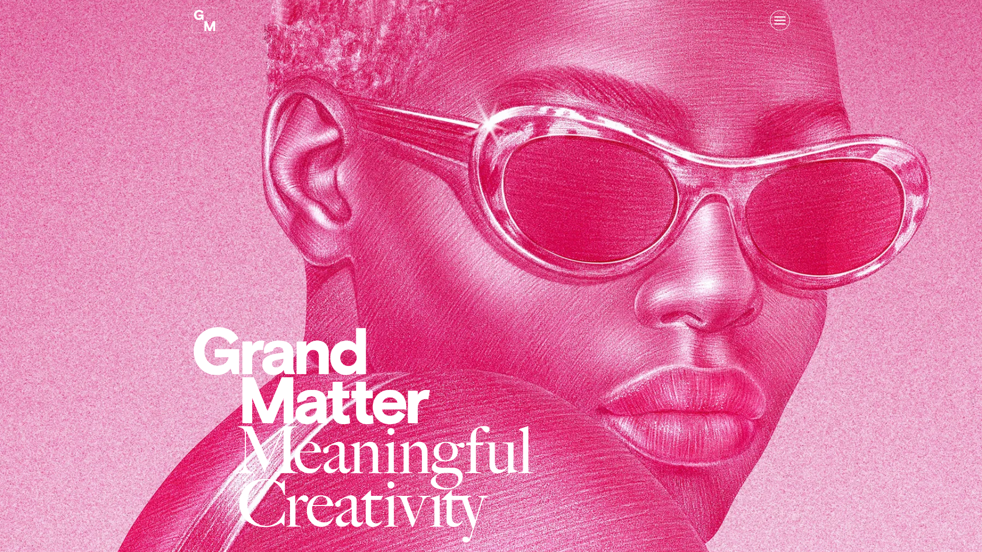
Grand Matter Agency Portfolio Layout
A creative agency site featuring a full-screen image hero, asymmetrical masonry work grids, and bold typography sections across a clean responsive layout.
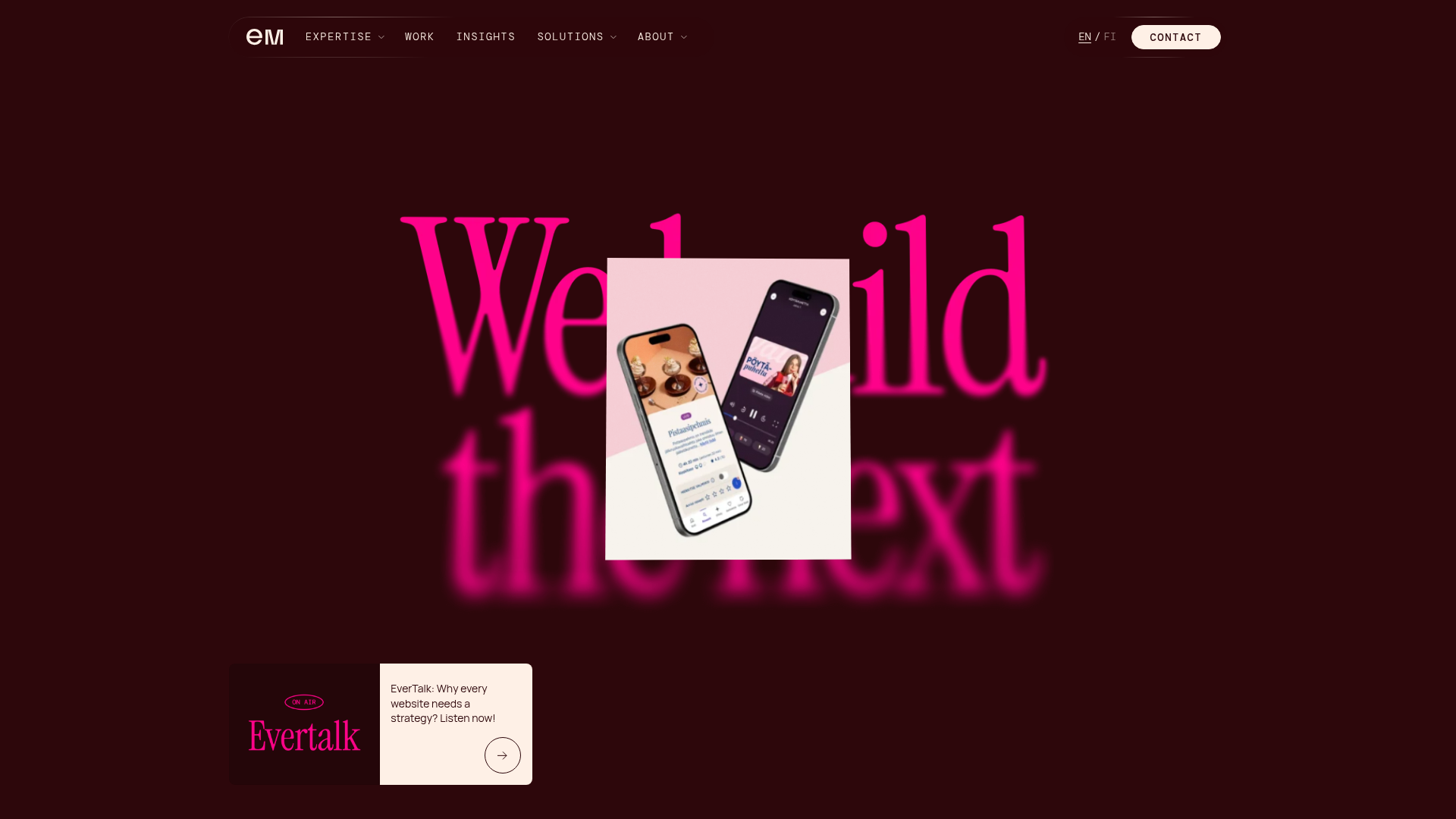
Evermade Agency Site Showcase
A high-performance agency site featuring a luxury dark aesthetic, interactive 3D hero tilt effects, custom slider components, and a unique 'text-reveal-on-hover' service section.
