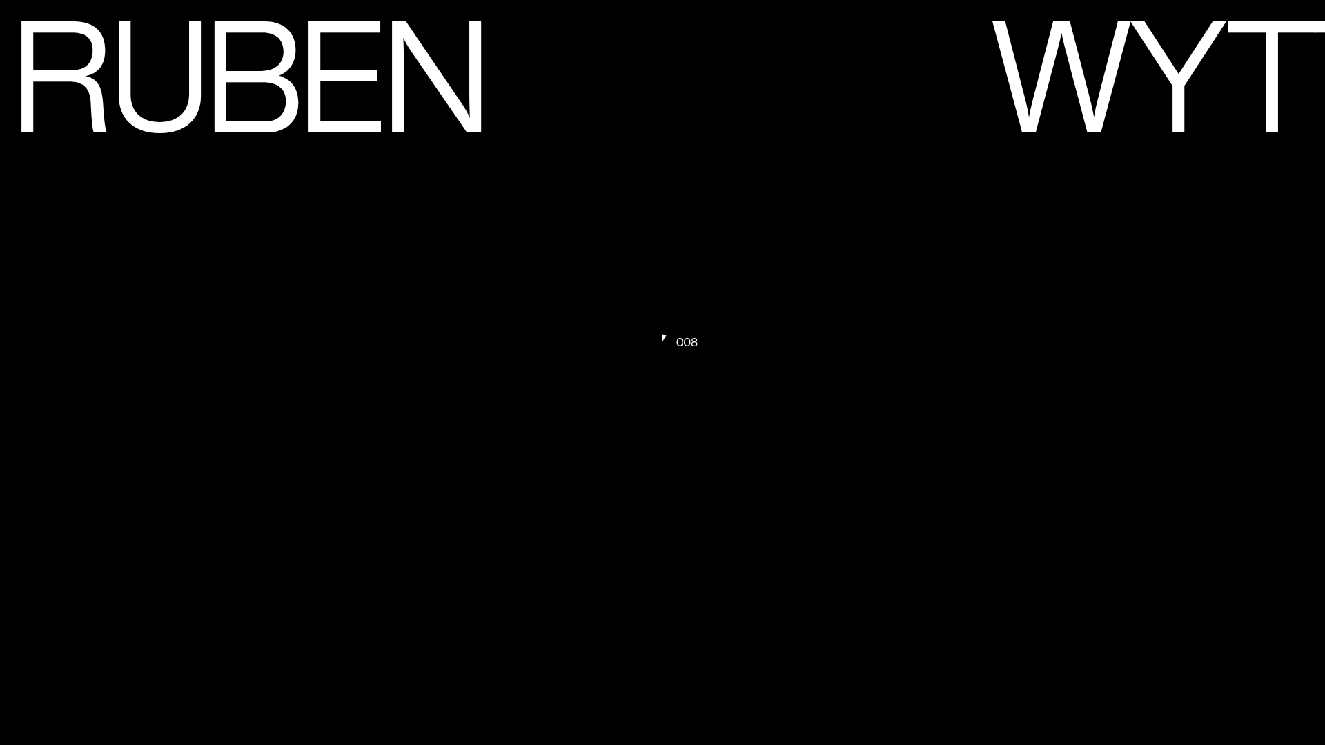
Ruben Wyttenbach Photography Portfolio
A minimalist photography showcase featuring a custom magnetic cursor with a numerical counter, smooth parallax scrolling, and an asymmetrical responsive image grid.
Overview
This portfolio for Ruben Wyttenbach is a masterclass in minimalist, high-impact photography showcases. It leverages a sophisticated mix of custom typography, heavy-weight visual branding, and a dynamic numerical cursor to create an immersive, gallery-like digital experience. Builders should clone this to study its integration of smooth parallax scrolling with an unconventional, asymmetrical grid layout.
Design System
- Color Palette & Visual Hierarchy: A strict monochromatic scheme (Black #0a0a0a, White #ffffff). Contrast is the primary driver of hierarchy; the site opens with a high-contrast black screen and white display text, transitioning into a white gallery space with black accents.
- Typography System: Features high-impact, large-scale sans-serif capitals for titles. The HTML reveals a class-based system (
l5for large letters) anddata-splittingfor granular character control. Smaller text blocks use a secondary scale for labels like "Photography" and categories (Artwork, Editorial). - Page Structure: The layout follows a non-linear flow. It starts with a hero brand reveal, followed by a dense, asymmetrical project grid (
project-grid row) that utilizes varying vertical offsets to create rhythm. - Reusable Components:
- Magnetic Cursor: A complex
cursor-innerandcursor-outersystem featuring a real-time numerical counter (e.g., "008") that follows mouse movements. - Asymmetrical Image Cards:
project__thumbcontainers that handle disparate aspect ratios (landscape vs. portrait) within a CSS grid/flexbox system. - Sticky Navigation: A minimal
navcomponent with ahas-attractionbutton effect.
- Magnetic Cursor: A complex
- Interaction & Motion: Extensive use of
data-scrollattributes (Locomotive Scroll or similar) to controldata-scroll-speedanddata-scroll-position. This allows individual images to move at different rates during scrolling. Image transitions feature a "zoom" class for hover effects. - Implementation Clues: The HTML points to a stack involving Barba.js for smooth page transitions (
data-barba="wrapper"), Splitting.js for text animation, and a custom scroll library to handle parallax offsets on specificdivelements.
Use Cases
- Who should clone this: Photographers, architects, and high-end fashion brands looking for a cinematic, high-performance portfolio that moves away from standard template layouts.
- Product Remixes: This pattern is effective for luxury e-commerce lookbooks, digital art galleries, or agency landing pages where visual storytelling precedes information density.
- Remix Directions: Swap the numerical counter in the cursor for a progress ring or text labels; adapt the asymmetrical grid logic to display case studies with differing importance; or reuse the high-contrast typography system for a bold personal brand.
- Suggested Clone Scope: For a quick win, clone the hero transition and the magnetic cursor. For a full-scale project, clone the complete scroll-based grid system to master the parallax offsets on mobile and desktop.
Related Inspirations

Palazzo Monti Minimalist Artist Residency Portfolio
A high-end editorial layout featuring scroll-triggered text animations, smooth preloader transitions, image-reveal hover effects on list items, and a draggable bubble-based press section.
Theodore Ellison Artisan Portfolio Website
A high-end artisan portfolio featuring a full-bleed parallax video hero, color-themed scroll sections, and a mega-menu with dynamic image previews.

Aikawa Kenichi Photography Portfolio
Minimalist photography showcase featuring letter-by-letter text animations, a custom mouse pointer interaction system, and a canvas-based image gallery.

Christopher Doyle Agency Portfolio Layout
A minimalist, typography-led portfolio featuring a wide-margin grid system, smooth fade-in animations, and simple image-focused project cards.
HNST Circular Fashion eCommerce Gallery
A minimalist apparel site featuring a full-screen image slider with parallax effects, grid-based product sections, and a clean typography-focused header for sustainable brand storytelling.

Clase Agency Branding Portfolio
A minimalist design agency portfolio featuring a typographic hero section, full-width image articles, sticky title bars, and integrated scrolling text marquees for a clean editorial layout.
