Grand Matter Agency Portfolio Layout
A creative agency site featuring a full-screen image hero, asymmetrical masonry work grids, and bold typography sections across a clean responsive layout.

Overview
This portfolio layout for Grand Matter Agency is a masterclass in high-impact visual storytelling, centered around a full-bleed hero section and asymmetrical masonry grids. It serves as an excellent reference for creatives and agencies needing to balance large-scale media with minimalist navigation and sophisticated typography.
Design System
- Color Palette & Visual Hierarchy: The design features a bold, monochromatic pink-on-pink hero image that sets a high-energy tone. The secondary palette is clean and functional, utilizing off-white/gray backgrounds for project grids and dark teal or black text for deep contrast. Bold headers create a clear hierarchy against smaller, lighter body copy.
- Typography: The system mixes a heavy, modern sans-serif for impact (likely for branding and headers) with a more delicate, high-contrast serif for secondary headings and body copy. Emphasis is achieved through underlining and varying font sizes (e.g., 3.111rem for 'Bring your ideas to life' vs 1.333rem for descriptions).
- Page Structure: The layout follows a linear narrative: a full-screen image cover (
semplice-cover), followed by a mission statement, a work grid (portfoliogrid), specialized news sections, and a detailed footer with office locations and a newsletter form. - Reusable Components:
- Asymmetrical Masonry Grid: The
portfoliogriduses variable image heights and absolute positioning to create a dynamic, editorial feel. - Directional Links: Minimalist arrow icons (
arrow_black-02.png) are used as directional anchors for "Learn More" actions. - Stacked Footer: A structured three-column layout for global presence (London, NY, and Newsletter).
- Asymmetrical Masonry Grid: The
- Interactions & Motion: The HTML indicates the use of
parallaxcover effects andvideo-hoveron masonry items. Hover states on project thumbnails reveal secondary meta-information (titles and categories) utilizing a fade effect. - Implementation Clues: Built using the Semplice portfolio system, the site relies on a custom grid-based structure (
smp-container,smp-row) with specific responsive data attributes (e.g.,data-xl-width="12") for layout control across breakpoints.
Use Cases
- Who should clone this: Independent artists, boutique design agencies, and high-end illustrators who want an "image-first" digital presence.
- Remix Products: Creative studios, architectural firms, and fashion lookbooks can effectively remix this by swapping the monochromatic hero imagery for high-resolution video or minimalist product photography.
- Practical Remix Directions:
- Brand Swap: Retain the text-heavy footer and masonry work grid but replace the pink hero with a high-contrast dark mode aesthetic.
- Architecture: Move the "About" text directly under the hero to prioritize copy before visual work.
- Scope: A full-page clone is ideal for those needing a robust site, while a quick section clone of the
smp-sectionportfolio grid provides a versatile component for any landing page.
Related Inspirations
Evermade Agency Site Showcase
A high-performance agency site featuring a luxury dark aesthetic, interactive 3D hero tilt effects, custom slider components, and a unique 'text-reveal-on-hover' service section.
Sing-Sing Creative Portfolio Landing Page
A minimalist studio portfolio featuring high-contrast typography, a horizontal line-grid hero section, and responsive image components with custom cursor interactions.

Monopo London Creative Agency Portfolio
Features a PixiJS WebGL gradient hero, a vertical ruler scroll-progress indicator, and sticky project sections with dynamic scaling transitions and custom cursor interactions.
Hugo & Marie Agency Landing Page
Features a full-screen auto-playing media carousel with elegant serif typography overlays and a cleanly structured three-column services layout.
Domaine Agency E-commerce Portfolio Landing
A high-end agency site featuring a full-screen video hero, glassmorphism cookie-notices, and a project gallery with hover-triggered image states and metadata tags.
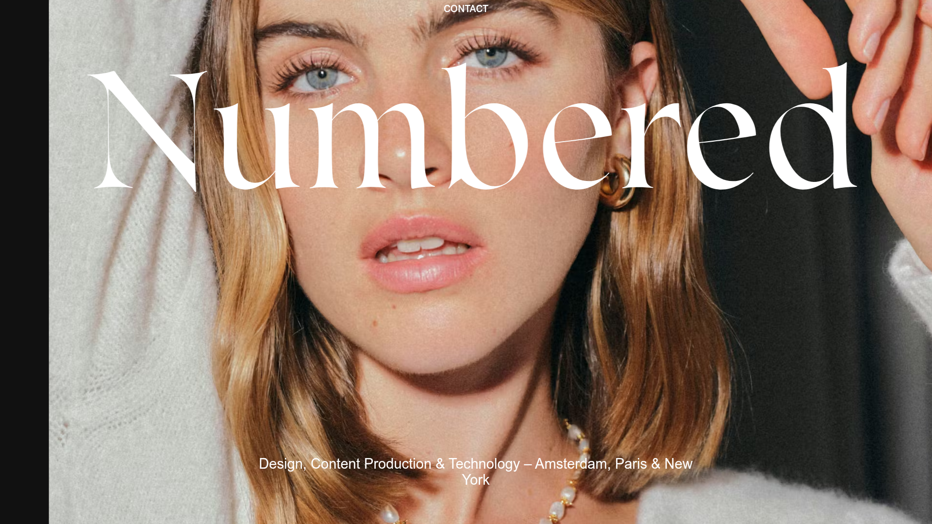
Numbered Studio Creative Portfolio Landing
A high-fashion agency landing page featuring a full-screen hero image with big serif typography, smooth scroll animations, and a varied-grid case study layout.
