North Kingdom Minimalist Agency Landing
A dark-themed design agency layout featuring a top-aligned navigation bar, a logo mark, and a smooth scroll implementation using the Lenis library.
Overview
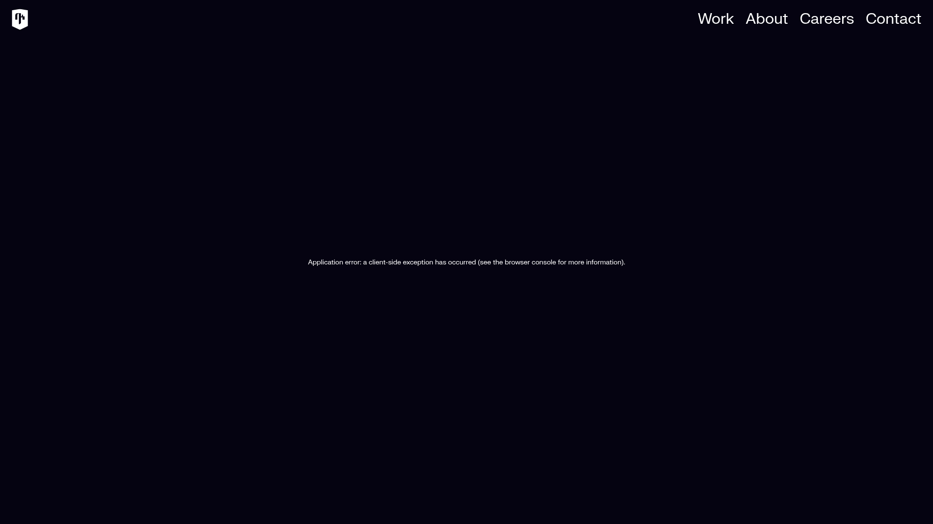
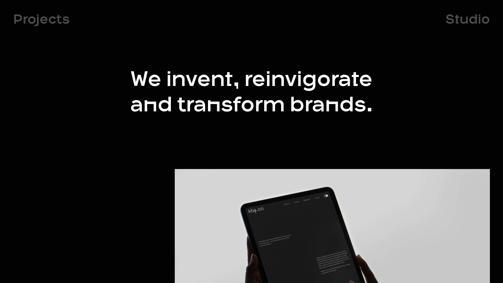
This project showcases a minimalist, high-end agency landing page template characterized by a "dark mode" aesthetic and a spacious, top-heavy navigation layout. It is a strong reference for builders seeking to implement a ultra-clean professional site that utilizes modern smooth-scrolling techniques, specifically featuring the Lenis library for refined motion.
Design System
- Color Palette & Visual Hierarchy: The design uses a deep monochromatic palette with a near-black background (
#000000or deep navy) and high-contrast white text. The hierarchy is extremely flat, emphasizing the top-level navigation and brand identity at the corners to create a framing effect for central content. - Typography: The system relies on a clean, sans-serif font family. The navigation items use a larger scale with generous letter spacing, while auxiliary text (like the error message in the center) utilizes a smaller, utilitarian font size (14px) and high line-height (49px) to maintain readability against the dark background.
- Page Structure: The layout follows a classic agency structure with a fixed or absolute positioned top header containing the logo on the left and primary links (Work, About, Careers, Contact) on the right. The HTML structure reveals a main container (
Layout_main) wrapping a content area designed to fill the full viewport (height: 100vh). - Reusable Components: The primary component to clone is the navigation bar, which features a responsive
Modalmenu. TheMenuNavItemcomponents are built to be reusable, containing nested structures for arrows and text, suggesting a sophisticated hover state or transition capability. - Interaction & Motion: The site is built with
lenis-smoothintegration, signifying that smooth, momentum-based scrolling is a core part of the user experience. The HTML highlights a specificModalstate for the menu, indicating an overlay transition for mobile or expanded navigation views. - Implementation Clues: The code is built using Next.js (evidenced by the
__nextID andnext-route-announcer). It uses CSS Modules (e.g.,Layout_content__nbzEe) for scoped styling and the Lenis library for layout-wide smooth scroll management.
Use Cases
- Who should clone this: Creative agencies, design portfolios, and architectural firms looking for a "less is more" digital presence that prioritizes imagery and smooth motion over dense text.
- Effective Remixes: This pattern works well for luxury product landing pages or high-end service providers (e.g., consultancy groups) where the visual experience is meant to convey prestige and attention to detail.
- Remix Directions: Builders can swap the minimalist dark background for a high-resolution video background or a grain-textured canvas. The information architecture can be adapted by transforming the right-aligned nav links into a hamburger menu for a more "app-like" feel.
- Clone Scope: A full-page clone is recommended to capture the spatial relationships between the header and the main content area, particularly the integration of the smooth scroll wrapper with the React/Next.js layout.
Related Inspirations

Niklas Rosén Designer Portfolio Index
A minimalist, responsive grid-based portfolio index featuring a clean 16-column layout, typographic list components, and a custom dark mode transition.
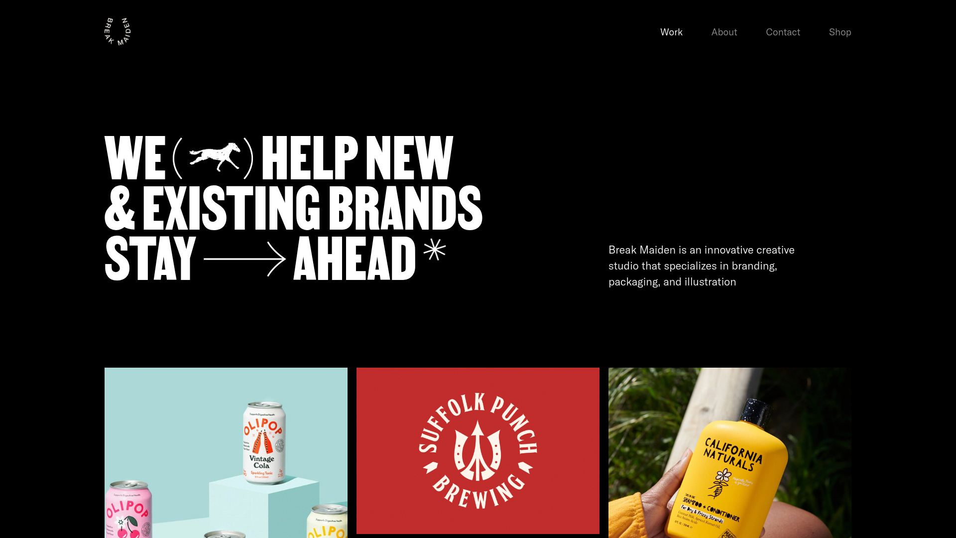
Break Maiden Agency Portfolio Hero
A high-impact dark mode hero section featuring oversized typography with inline GIF icons and a responsive grid for display-heavy case studies.
PostNew Moving Image Portfolio Gallery
A minimalist dark-themed portfolio featuring a full-screen vertical scroll layout, video-based grid sections, and blur-effect navigation components.
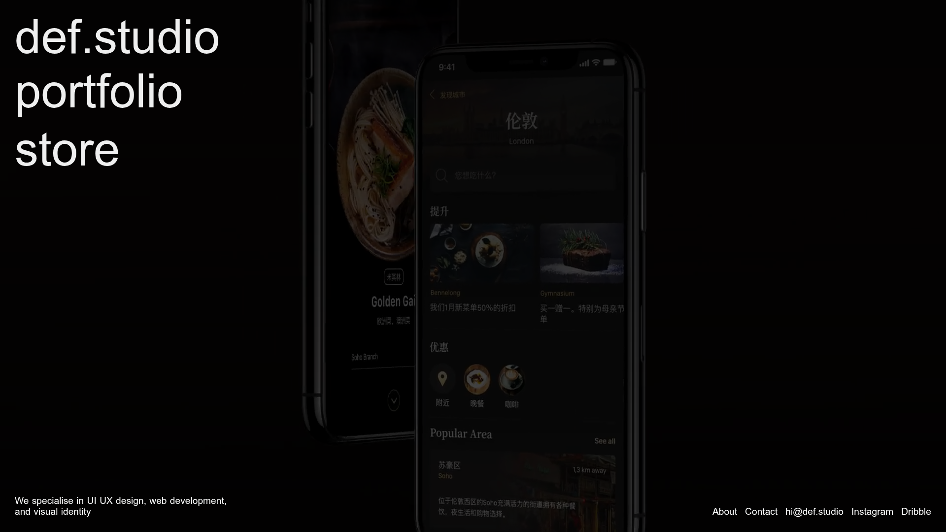
Def.studio Design Agency Portfolio
A dark-themed portfolio featuring a full-screen video background, smooth scroll transitions, and a vertical list of large-scale media-driven project cards with lazy-loaded video previews.
OPX Studio Agency Portfolio
A minimalist dark-themed portfolio featuring a staggered masonry project grid, cinematic video embeds, and a responsive oversized typography hero section.
Bravò Studio Creative Portfolio Gallery
A minimalist dark-themed portfolio featuring a 3D video carousel, WebGL canvas integration, and a searchable archival list layout for high-end creative work.
