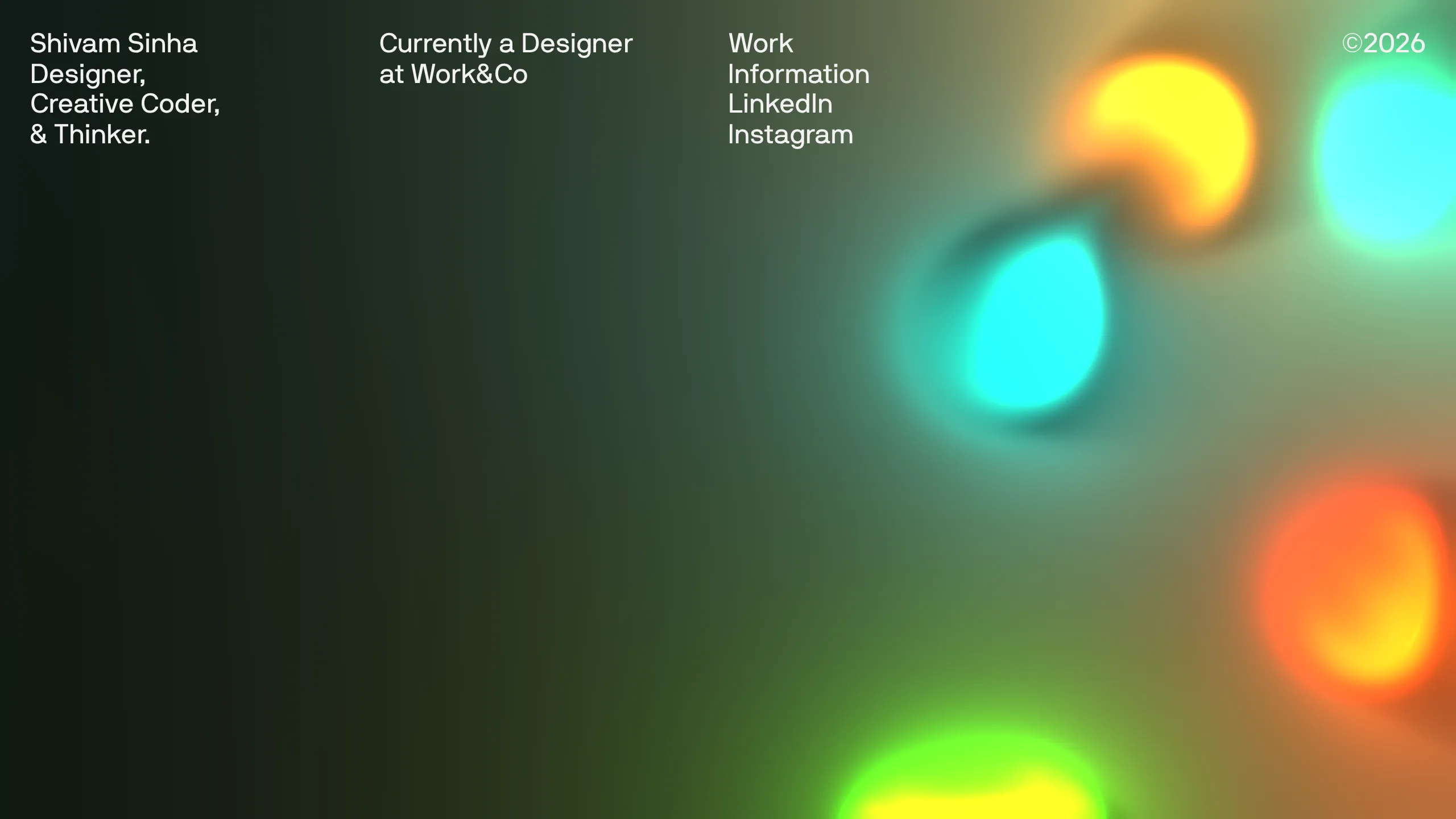
Shivam Sinha Portfolio Hero Landing
A minimalist portfolio layout featuring a full-screen interactive fluid-simulation canvas, clean typographic header, and a responsive navigation grid.
Overview
This portfolio landing page features a high-impact, full-screen interactive fluid simulation as the background, paired with a minimalist typographic overlay. It is a standout reference for builders looking to implement creative-coding elements (WebGL/Canvas) into a modern, grid-based layout that prioritizes whitespace and legibility.
Design System
- Color Palette & Visual Hierarchy: The visual hierarchy is heavily weighted toward the interactive canvas on the right, which features vibrant, neon glows (cyan, orange, green) against a dark, moody background. The UI elements use a stark grayscale scheme (white text on dark backgrounds) to ensure readability without competing with the dynamic background.
- Typography System: A clean, sans-serif font (inter-style) is used in a multi-column grid. The hierarchy utilizes line breaks and bold weights for the brand name ("Shivam Sinha") while maintaining a consistent small scale for navigational links and metadata.
- Page Structure: The layout follows a top-down horizontal split in a 4-column-like grid. The header is fixed or absolute, containing the bio/title on the left, current status in the center-left, and navigation/copyright on the right. A
<canvas>element spans the entire viewport behind this text layer. - Reusable Components:
- Typography Grid: The multi-column header structure is a great reusable pattern for minimalist homepages.
- Interactive Canvas Layer: The full-screen canvas implementation with z-index management.
- Two-Column Navigation: A clean list-based menu next to a copyright timestamp at the far edge.
- Interaction & Motion: The primary interaction is the fluid simulation that likely reacts to mouse movement or touch. The HTML reveals the use of
gatsby-plugin-transition-link(via classtl-wrapper), suggesting smooth page transitions between "Work" and "Information" sections. - Responsive Behavior: The code includes
hide-mobileclasses for the secondary bio information and social links (LinkedIn/Instagram), indicating a collapse strategy where only the primary title and core navigation links remain visible on smaller screens. - Implementation Clues: Developed using Gatsby, showcasing a component-based structure. The presence of a
<canvas>element indicates the use of WebGL or specialized JS libraries for the fluid dynamics.
Use Cases
- Who should clone this pattern: Creative developers, UI/UX designers, and digital artists who want their personal site to double as a tech demo.
- Effective Remixes: Experiential agency landing pages, high-end product launches, or digital art gallery interfaces where the background visuals change based on current exhibits.
- Practical Remix Directions: Swap the fluid simulation for a 3D model viewer (Three.js), replace the dark theme with a light/high-contrast palette for a strictly architectural look, or adapt the 4-column header into a mega-menu for more content-heavy sites.
- Suggested Clone Scope: A full-page clone is recommended to capture the interplay between the underlying canvas and the overlaying grid system, as the layout depends on the transparency and positioning of the text over the visual effect.
Related Inspirations

Leonid Kostetskyi Creative Portfolio Template
A high-end portfolio featuring an interactive multi-step contact form, reward tables, a project grid with WebGL image effects, and a marquee skill ticker.

Bravò Studio Creative Portfolio Gallery
A minimalist dark-themed portfolio featuring a 3D video carousel, WebGL canvas integration, and a searchable archival list layout for high-end creative work.
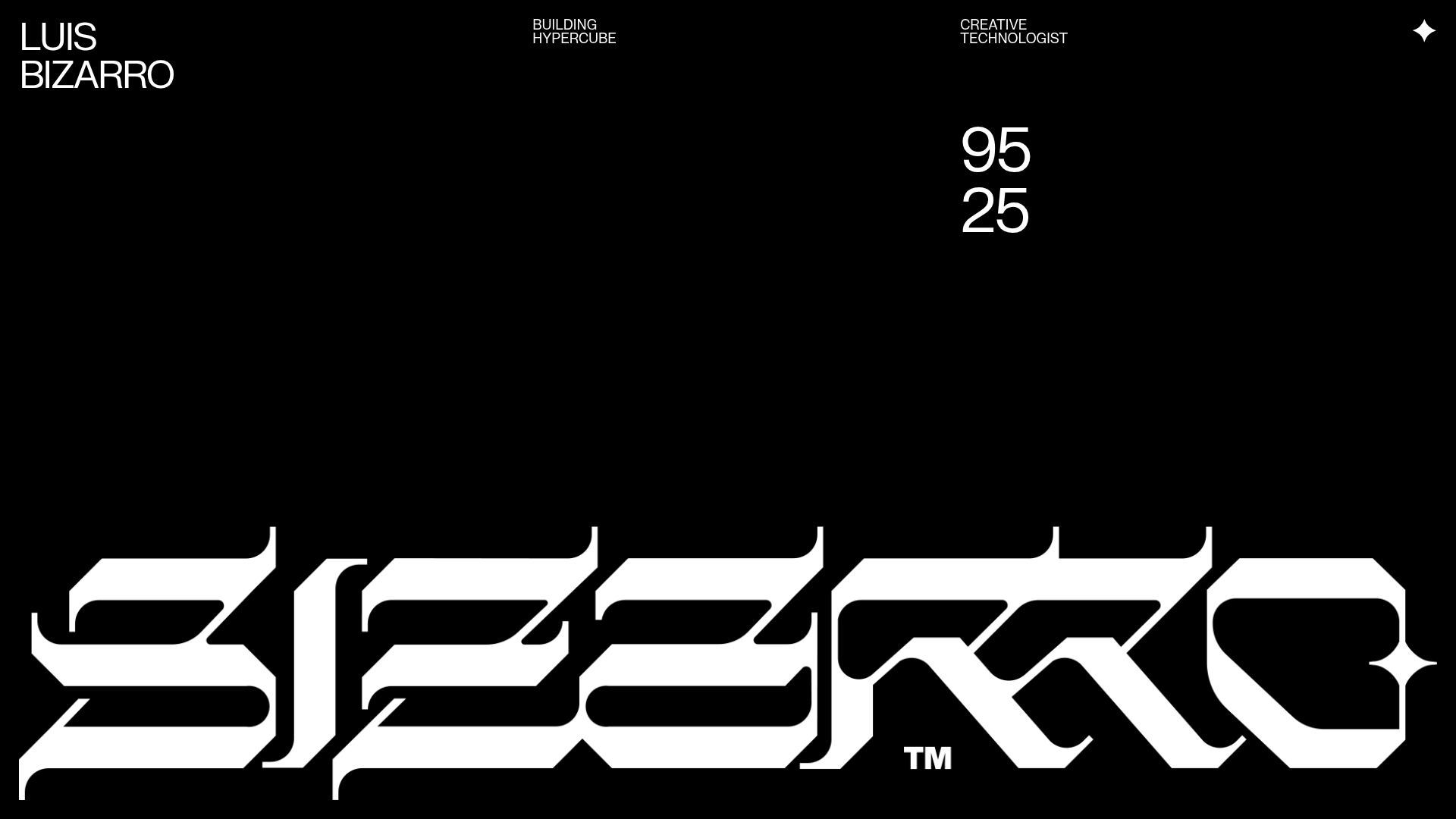
Luis Bizarro Creative Technologist Portfolio
A high-contrast dark mode portfolio featuring a custom blackletter logotype, minimal typography grid, and a video-heavy project showcase using WebGL-based content transitions.
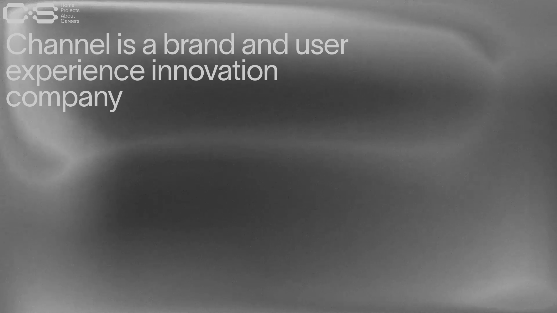
Channel Studio Innovation Agency Portfolio
A minimalist agency site featuring full-bleed video backgrounds, large-scale typography, and a structured project list with high-contrast hover effects.

Camille Mormal Interactive Design Portfolio
A minimalist WebGL-based portfolio featuring high-end typography, smooth page transitions, and a custom interactive canvas list with a centered fractional paginator.

Philipp Antoni Minimal Portfolio Template
A minimalist personal portfolio featuring a clean typography header and an interactive full-screen Three.js 3D background canvas for creative coding displays.
