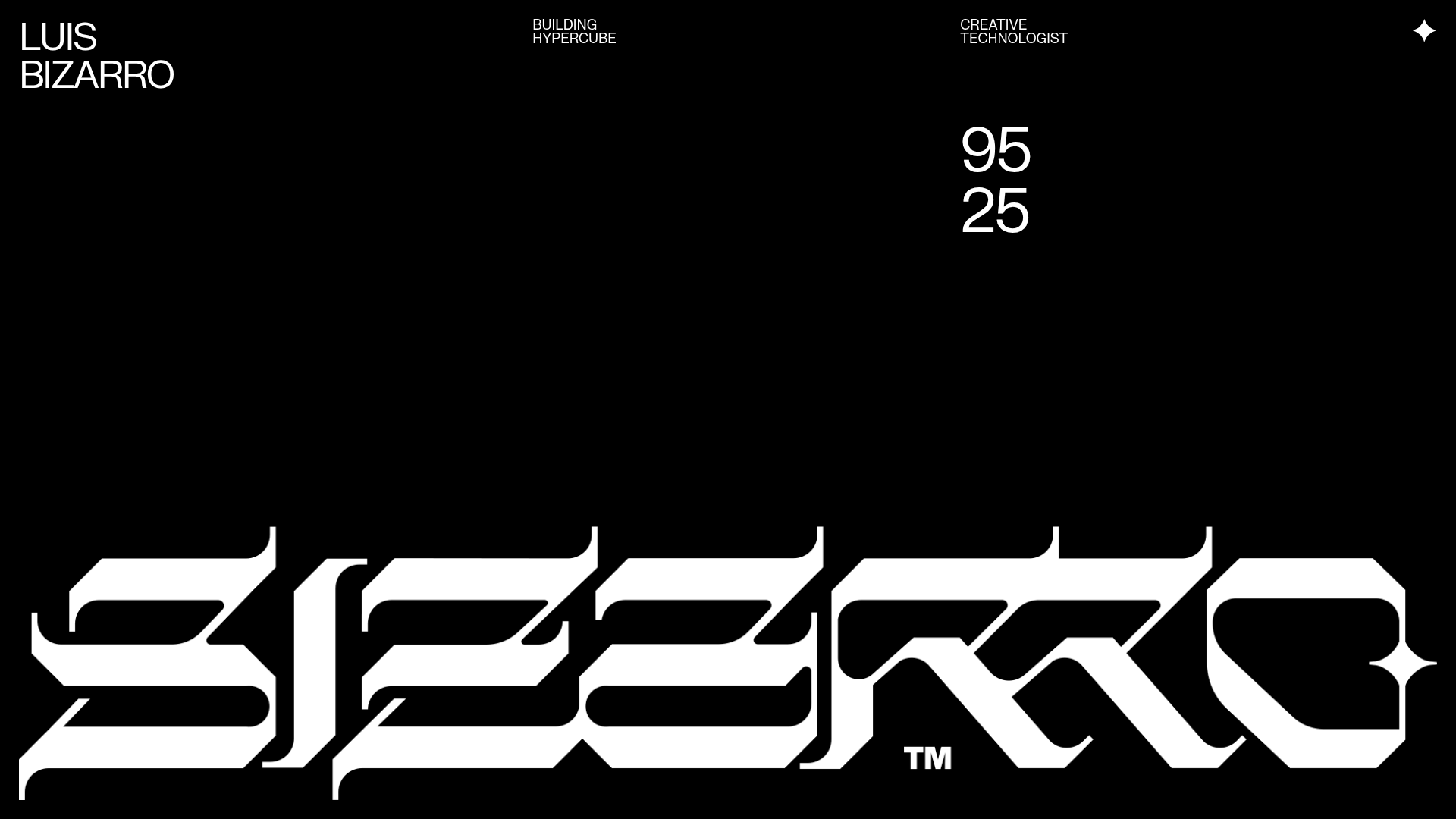
Luis Bizarro Creative Technologist Portfolio
A high-contrast dark mode portfolio featuring a custom blackletter logotype, minimal typography grid, and a video-heavy project showcase using WebGL-based content transitions.
Overview
This portfolio for Luis Bizarro is a masterclass in high-contrast, brutalist-inspired creative development showcases. It utilizes a sparse, dark-mode aesthetic to prioritize high-fidelity WebGL and video content, making it an ideal reference for builders looking to create punchy, media-centric portfolios with a strong typographic identity.
Design System
- Color Palette & Visual Hierarchy: The site uses a strict monochromatic scheme (Pure Black #000000 and White #FFFFFF). Hierarchy is established through extreme scale: the massive custom blackletter logotype at the bottom acts as a structural anchor, while fine-line sans-serif text handles information delivery.
- Typography: The system features a stark contrast between a minimalist, high-legibility sans-serif for body text and descriptive headers (using a grid-based alignment) and a large-scale, stylized blackletter for the wordmark. Metadata like coordinates and dates are used as decorative yet functional elements.
- Page Structure: The layout follows a modular vertical flow. It begins with an intro section containing a textual overview and contact links, followed by a dense project grid. The Projects section is organized into distinct
<section class="project">blocks, each containing a collection of<figure>elements for media. - Reusable Components:
- Information Grid: The
about__informationblock uses a multi-column flex/grid pattern for clean categorization of links (GitHub, Instagram, etc.). - Media Figures: The project showcases use generic containers (
project__media) that can house either static images or auto-playing, muted videos (videotag withplaysinline). - Custom Logotype: The bottom-fixed, oversized 'BIZARRO' text is a standout element for brand presence.
- Information Grid: The
- Interaction & Motion: The presence of
data-gl-textanddata-gl-mediaattributes in the HTML indicates that content is piped into a WebGL renderer. This suggests custom shader transitions and smooth, non-native scrolling behaviors typical of high-end creative technologist sites. - Responsive Behavior: The HTML structure uses flex columns (
about__content__column) and percentage-based widths (project__media--50), suggesting a layout that stacks vertically on smaller viewports while maintaining its grid integrity.
Use Cases
- Who should clone this: Creative technologists, motion designers, and 3D artists who need a portfolio that feels high-end and developer-centric without the clutter of traditional CMS layouts.
- Effective Remixes: This pattern works exceptionally well for technical documentation sites that want a "hacker" aesthetic, or boutique creative agencies showcasing a small number of high-impact video case studies.
- Remix Directions:
- Brand Swap: Keep the minimal grid and typography but replace the blackletter with a bold, modern serif or a futuristic monospace font.
- Info Architecture: Adapt the
about__informationsection into a project-specific metadata footer for deep-dive case studies. - Partial Reuse: Clone only the metadata grid (coordinates, dates, project links) for a sidebar in a more traditional layout.
- Suggested Clone Scope: A full-page clone is recommended to capture the specific balance between the massive footer and the sparse header, as the negative space is essential to the design's success.
Related Inspirations
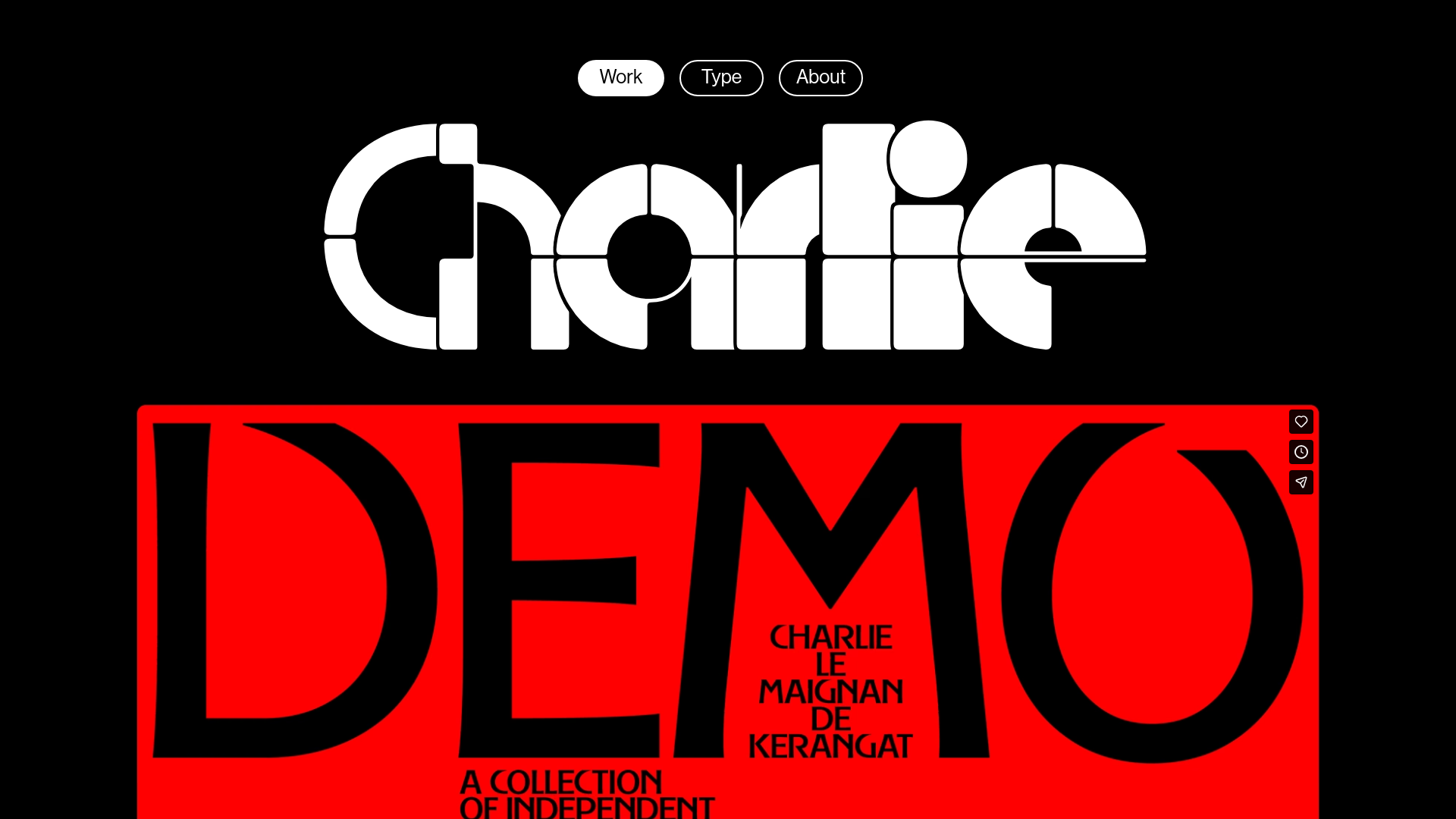
Charlie Le Maignan Portfolio Archive
A minimalist dark-mode portfolio featuring high-contrast typography, a geometric logo header, and an integrated full-width video gallery showcasing independent creative work.
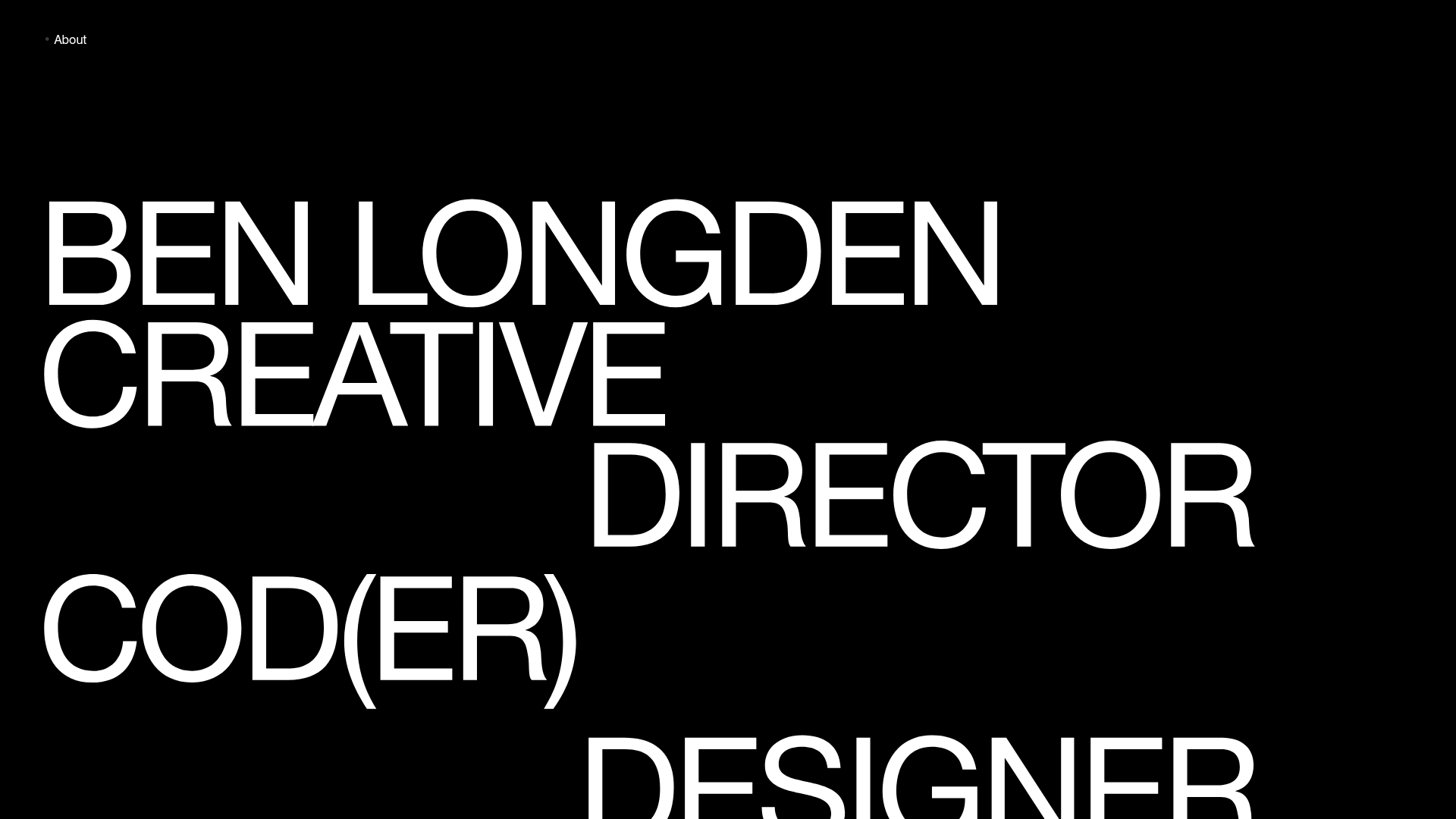
Ben Longden Minimalist Creative Portfolio
A bold typography-focused site featuring a large-scale overlapping hero section, horizontal image carousels for projects, and a scrolling text marquee footer.
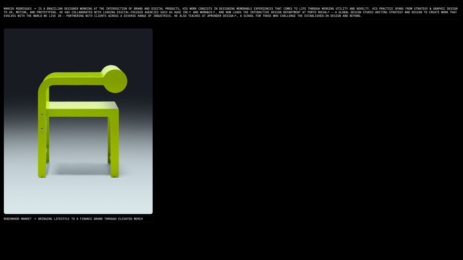
Marcos Rodriguez Minimalist Design Portfolio
A dark-themed personal site featuring a high-contrast monospaced header, a full-height centered image/video slideshow, and minimal thin-rule horizontal dividers.
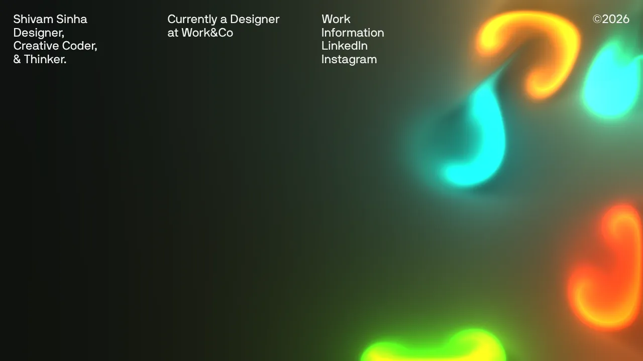
Shivam Sinha Portfolio Hero Landing
A minimalist portfolio layout featuring a full-screen interactive fluid-simulation canvas, clean typographic header, and a responsive navigation grid.

Leonid Kostetskyi Creative Portfolio Template
A high-end portfolio featuring an interactive multi-step contact form, reward tables, a project grid with WebGL image effects, and a marquee skill ticker.

Bravò Studio Creative Portfolio Gallery
A minimalist dark-themed portfolio featuring a 3D video carousel, WebGL canvas integration, and a searchable archival list layout for high-end creative work.
