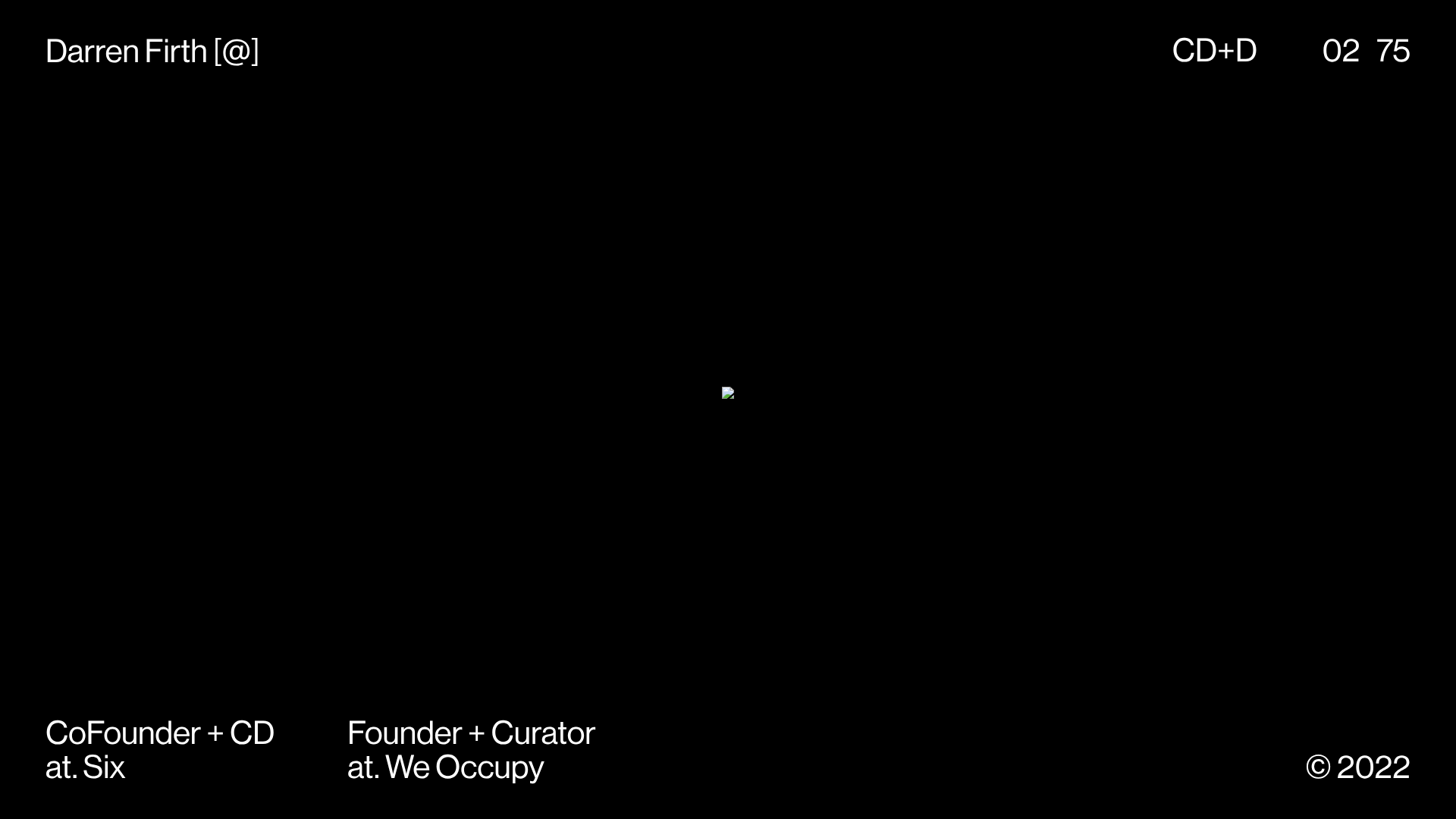
KeepsMeSane Minimalist Portfolio Slideshow
A dark, ultra-minimalist landing page featuring a full-screen image slideshow with fixed corner text labels and a subtle progress bar.
Overview
This portfolio for Darren Firth is an ultra-minimalist, dark-themed showcase centered around a continuous full-screen image slideshow. It is an excellent reference for creatives who want to highlight visual work with zero interface friction, using fixed corner labels to maintain a structured layout over dynamic content.
Design System
- Color Palette & Visual Hierarchy: The site uses a pure black (
#000000) background to make the images the focal point. Typography is strictly white, creating a high-contrast but restrained aesthetic that avoids competing with the artwork. - Typography: A clean, geometric Sans-Serif (likely Helvetica or similar) is used in a single weight and size across the layout. Hierarchy is established through spatial positioning rather than font scale.
- Page Structure: The layout relies on a fixed four-corner grid:
- Top Left: Name and social link call-to-action.
- Top Right: Page identifier (
CD+D) and a numeric slide counter (02 75). - Bottom Left: Professional titles and studio affiliations.
- Bottom Right: Copyright year.
- Reusable Components:
- Full-Screen Slideshow: The core engine, which supports both 'inset' images (padded) and 'bleed' images (full coverage).
- Loading Bar: A subtle top-aligned progress bar (
c-loading__bar) as seen in the HTML, indicating asset loading state.
- Interactions & Motion: The HTML reveals a
slideshow__slide--insetandis-visiblearchitecture, suggesting a transition-based image gallery. Large image arrays (75+ items) are handled via simple class toggles for visibility. - Implementation Clues: Built with Nuxt.js, the site uses a component-based structure where state management likely controls the slide index and the top-right counter.
Use Cases
- Who should clone this: Photographers, graphic designers, or art directors who have high-impact vertical or square imagery and want a "digital gallery" feel.
- Effective remixes:
- Lookbook: Use the bleed/inset toggle for fashion collections.
- Brand Manifestos: Replace portfolio images with bold text-on-image quotes or core mission statements.
- Practical Directions: Builders should focus on the fixed corner UI and the logic that syncs the numeric counter with the active slide. The layout can be remixed by changing the background color to a brand-specific primary or by adding a hidden side-menu that appears on hover.
- Clone Scope: A full-page clone is recommended to capture the spatial balance, but the four-corner navigation header/footer is a valuable standalone pattern for any minimal landing page.
Related Inspirations
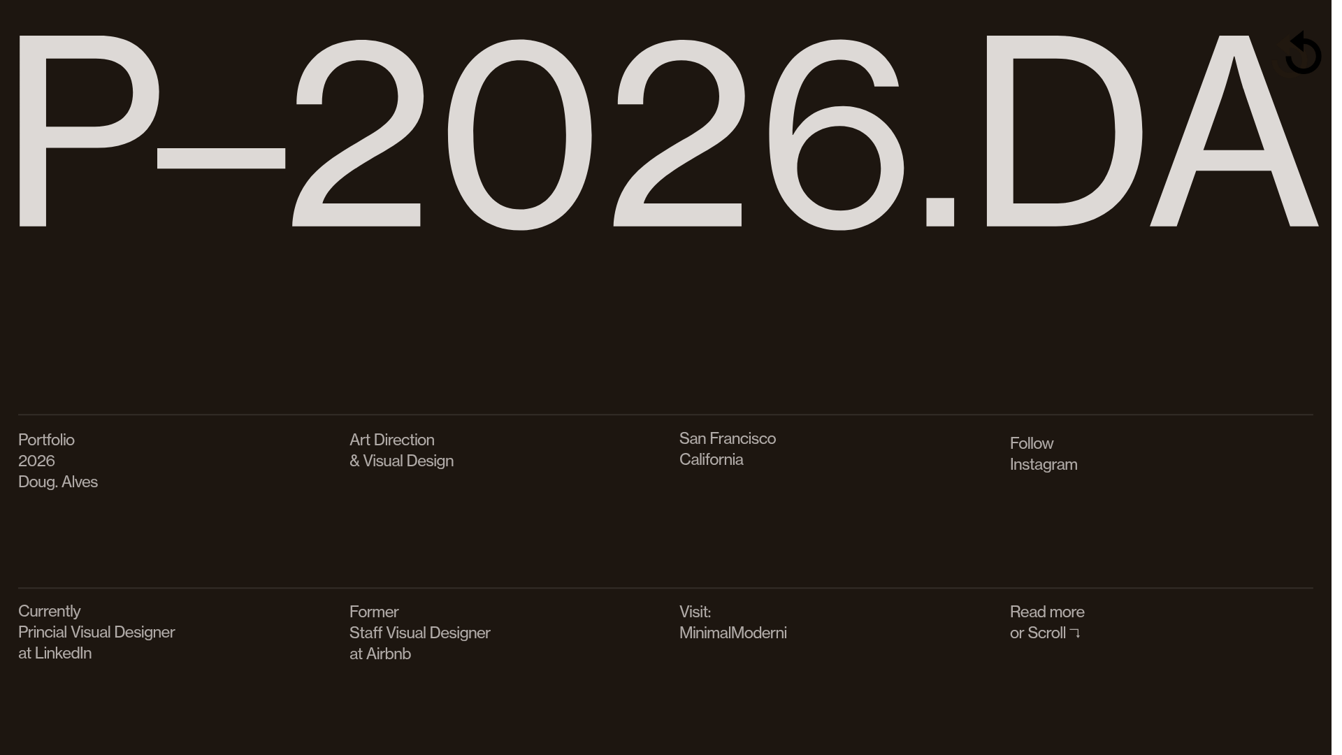
Doug Alves Visual Design Portfolio
A minimalist, high-contrast design portfolio featuring oversized typography, a sticky four-column grid footer, and a vertical scroll-triggered slide-show for project showcases.
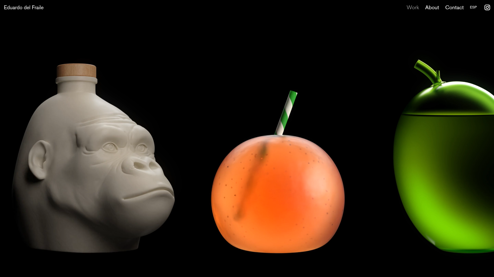
Eduardo del Fraile Horizontal Portfolio
A minimalist horizontal-scroll gallery featuring large-scale media blocks with integrated video-on-hover effects and a custom scrollbar tracker.
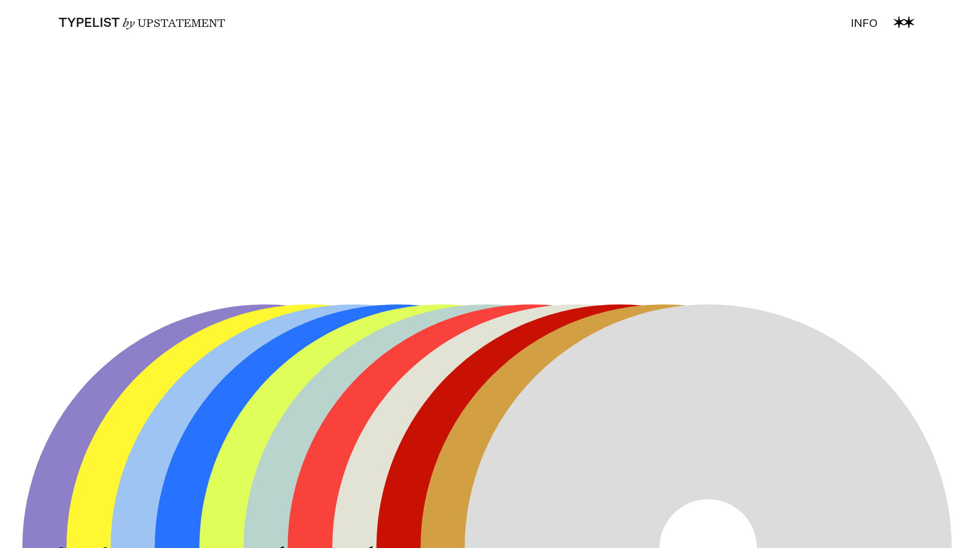
Typelist Typography Playlist Gallery
A creative curated gallery featuring a horizontal overlapping disc navigation pattern, CSS-driven theme color shifting, and smooth page transitions for showcasing design collections.

Post Familiar Minimalist Winery Storefront
An experimental e-commerce layout featuring a high-contrast age verification screen, bold typography grids, and a horizontal scrollable product showcase.
PostNew Moving Image Portfolio Gallery
A minimalist dark-themed portfolio featuring a full-screen vertical scroll layout, video-based grid sections, and blur-effect navigation components.
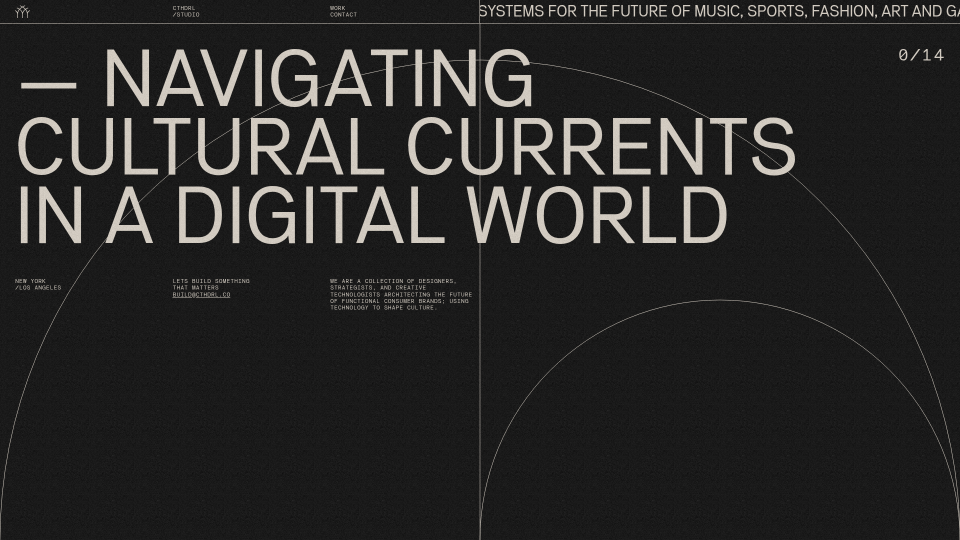
CTHDRL Digital Agency Portfolio Slider
A high-impact creative portfolio featuring a full-screen vertical navigation slider, SVG arc animations, grain-texture overlays, and a dynamic project counter.
