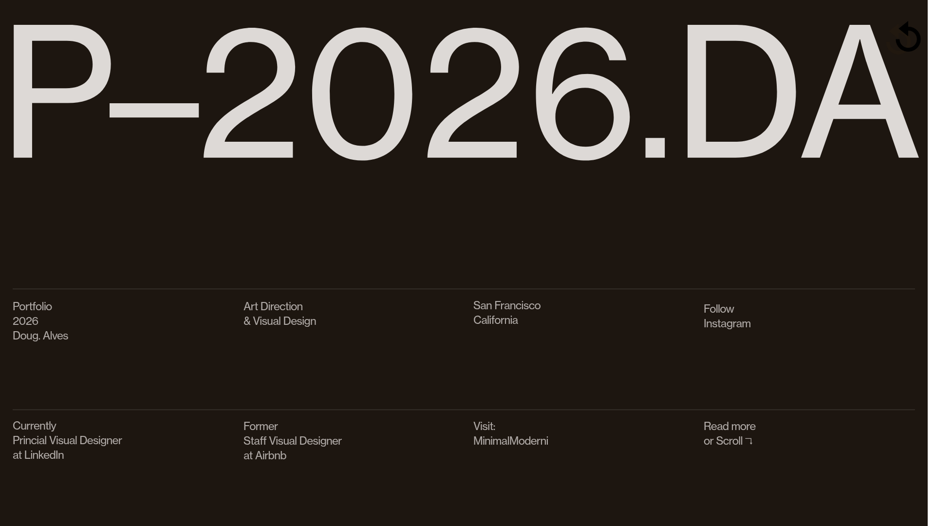
Doug Alves Visual Design Portfolio
A minimalist, high-contrast design portfolio featuring oversized typography, a sticky four-column grid footer, and a vertical scroll-triggered slide-show for project showcases.
Overview
This portfolio for visual designer Doug Alves is a masterclass in brutalist minimalism and typographic hierarchy. It serves as an excellent reference for builders because of its unconventional layout, specifically its use of a persistent four-column grid footer and a scroll-triggered slide-show for project discovery. The site prioritizes high-contrast aesthetics and motion to create a premium, editorial feel with very few assets.
Design System
- Color Palette & Visual Hierarchy: The primary theme uses a deep obsidian-brown background (
#1d1610) paired with off-white text (rgba(255, 251, 249, 0.85)). This creates a high-contrast, sophisticated look that avoids the harshness of pure black and white. The hierarchy is dominated by oversized headers that dwarf all other content, drawing immediate attention to the brand/artist name. - Typography: The system relies on a bespoke or highly stylized sans-serif (
wtqcfamily in the HTML) with ultra-tight letter spacing (-0.6pxto-6px). The scale is extreme: hero text at197pxcontrasts with functional UI text at a consistent12pxsize/16pxline-height, emphasizing data over decoration. - Page Structure: The site utilizes a vertical "sticky" slide architecture (
viewer-type-vertical-sticky). The landing view features a massive title followed by a clean horizontal rule and a two-row, four-column informational grid. Subsequent "pages" reveal project slides or oversized marquee text that scrolls horizontally while the user scrolls vertically. - Reusable Components:
- The 4-Column Footer: A rigid, absolute-positioned grid that organizes contact, location, and bio data into neat, digestible segments.
- Project Slideshow: A central
widget-slideshowcomponent designed for high-resolution imagery with hidden navigation controls, allowing the work to be the primary focus. - Dividing Rules: Thin lines across the full width of the container are used to separate logical sections without adding visual weight.
- Interaction & Motion: The UI uses "scroll-triggered transitions" where elements fade in or out based on the active slide. The HTML reveals a
fixed-position-containerthat keeps navigation icons persistent while the background content slides beneath.
Use Cases
- Who should clone this: Creative directors, visual designers, and architects who need a high-impact, low-text portfolio that feels like a premium digital lookbook.
- Effective Remixes: This pattern can be effectively remixed for luxury fashion brand lookbooks, high-end real estate listings, or boutique agency sites where visual work carries more weight than copy.
- Remix Directions: Replace the dark theme with a vibrant brand color to shift the mood from "sophisticated" to "playful." The four-column footer can be repurposed as a pricing table or a service list while maintaining the rigid minimalist layout.
- Clone Scope: For a fast win, clone the 4-column info grid section to use as a unique footer or contact area. For a complete transformation, clone the full-page vertical-slide framework to create a narrative-driven presentation.
Related Inspirations
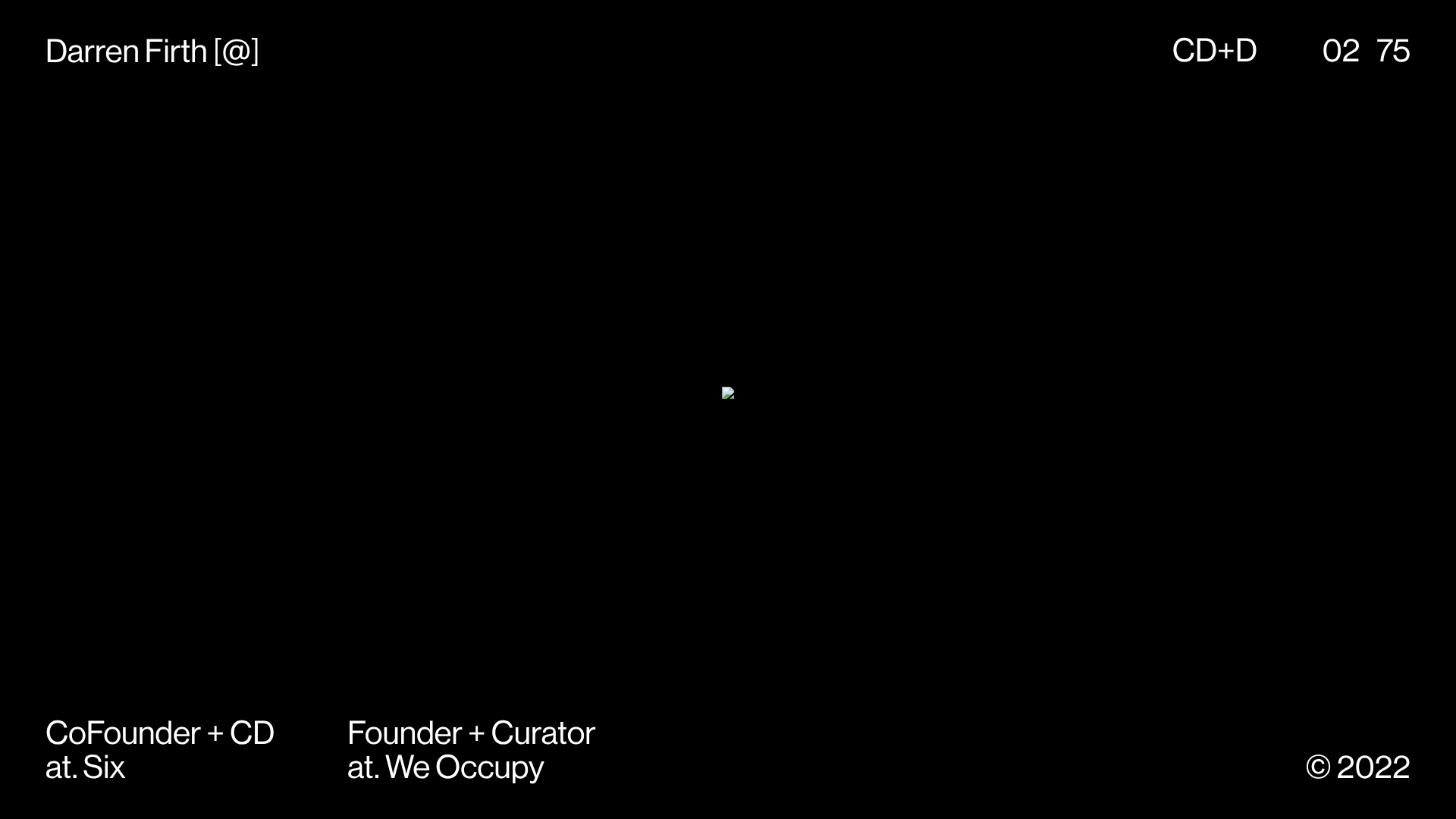
KeepsMeSane Minimalist Portfolio Slideshow
A dark, ultra-minimalist landing page featuring a full-screen image slideshow with fixed corner text labels and a subtle progress bar.

Joséphine Löchen Minimal Portfolio Gallery
A minimalist photography portfolio featuring a full-screen image slider, synchronized thumbnail navigation, and a structured multi-column about/contact section using Swiss-inspired typography.
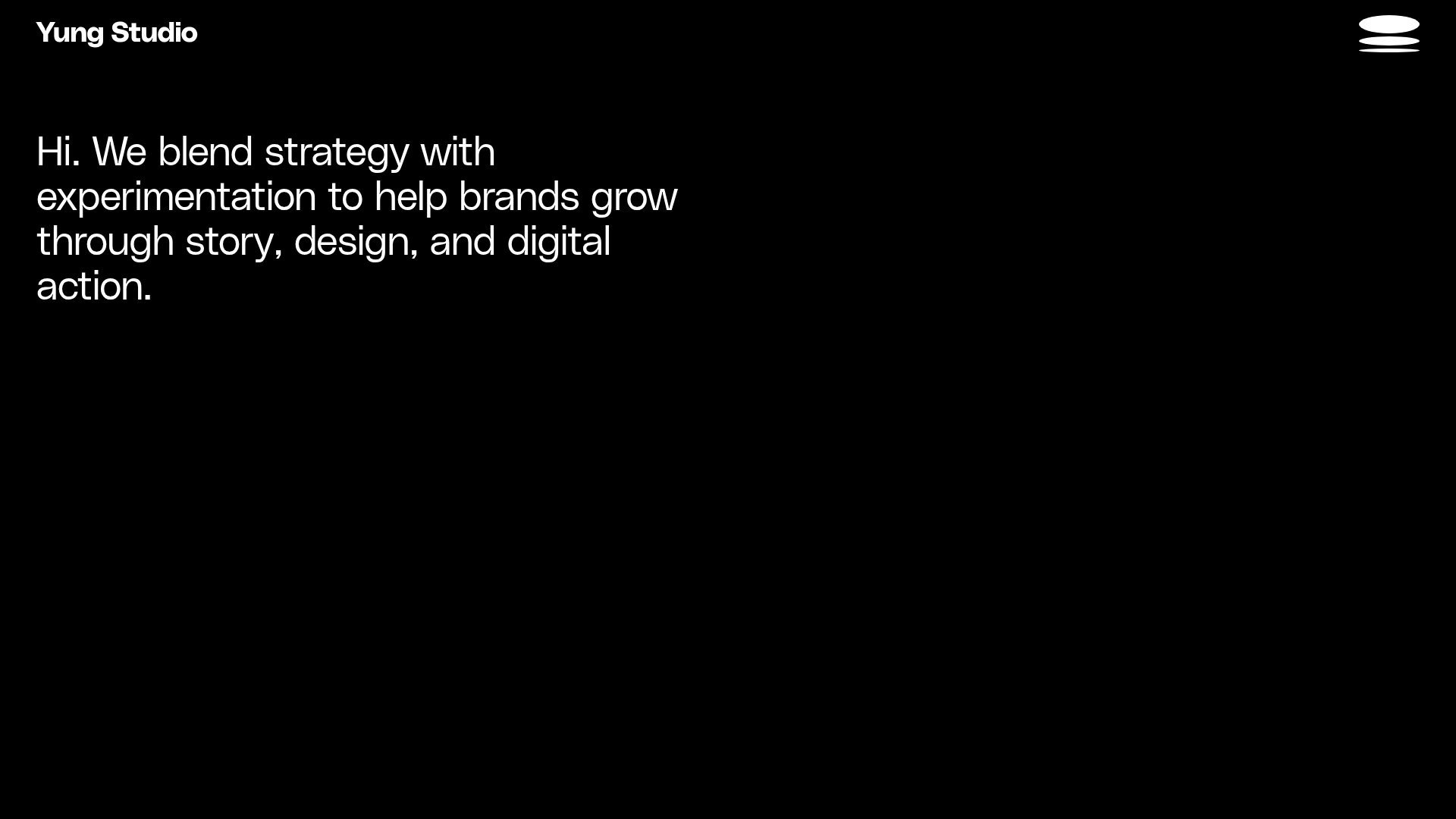
Yung Studio Creative Agency Portfolio
A minimalist dark-themed portfolio featuring large-scale typography, a logo shuffle animation, scroll-triggered fade-ins, and a grid-based featured work section.
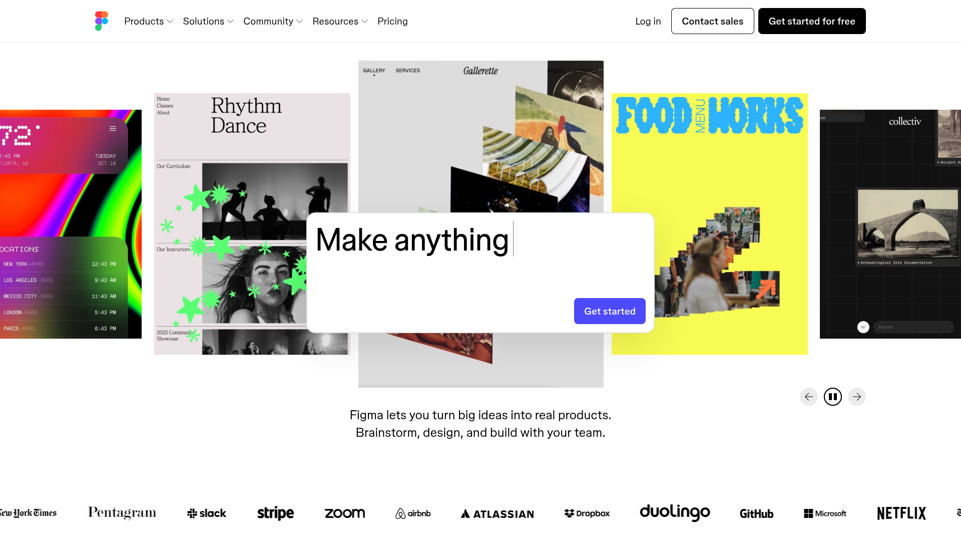
Figma Landing Page Gallery Hero
A dynamic landing page featuring a center-focused search bar hero, a horizontally-scrolling interactive video carousel, and a clean brand logo grid.

Bruno Arizio Designer Portfolio Website
A minimalist creative director portfolio featuring a clean typographic layout, side-aligned image previews, and high-contrast spacing patterns suitable for luxury or design showcases.

Niklas Rosén Designer Portfolio Index
A minimalist, responsive grid-based portfolio index featuring a clean 16-column layout, typographic list components, and a custom dark mode transition.
