Typelist Typography Playlist Gallery
A creative curated gallery featuring a horizontal overlapping disc navigation pattern, CSS-driven theme color shifting, and smooth page transitions for showcasing design collections.
Overview
Typelist is a visually striking, curated gallery of typographic collections that uses a musical "playlist" metaphor for navigation. It is a premier reference for designers wanting to implement a unique horizontal disc-stack navigation and dynamic theme-switching between content pages. Use this project to study how to create high-impact, minimalist interfaces that focus entirely on visual artifacts and color-driven storytelling.
Design System
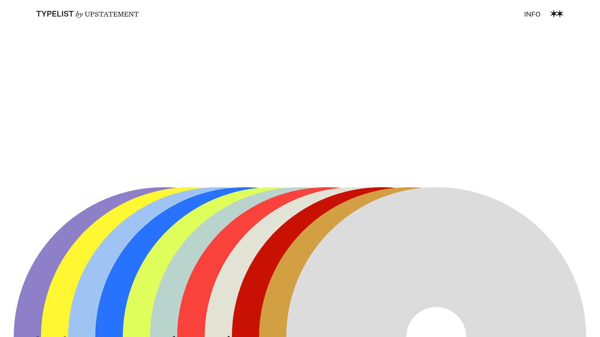
- Color Palette & Visual Hierarchy: The site uses a high-contrast foundation (white background) with a vibrant, CSS-defined multi-color palette for its navigation discs. Each disc corresponds to a specific theme (e.g.,
#8D7FC8for Tarot,#F9423Bfor Public Transit). The hierarchy is flat and centered, where color is the primary signifier of category and state. - Typography System: A bold, semi-extended sans-serif for the logo ("TYPELIST") paired with an italic serif for sub-branding ("by UPSTATEMENT"). Terminal navigation elements (INFO) are set in a clean, all-caps sans-serif, maintaining a minimalist aesthetic that doesn't compete with the content themes.
- Page Structure & Section Flow: The landing page is a single, centered viewport section (
.playlistIndex-module--playlist-index) containing a horizontal array of overlapping discs. Each disc acts as a portal to a custom-themed gallery page. - Reusable Components: The standout component is the "Playlist Button" (
.playlistButtonSelect-module--btn--select). These are styled as large circular discs with a hole in the center, overlapping via CSS positioning. The use of custom properties (e.g.,--theme-color,--darker-color) directly on the<a>tags allows for programmatic color control. - Interaction and Motion: The interface relies on smooth transitions (
.tl-wrapper-status--entered) and hover effects. The overlapping disc layout suggests a carousel-like or stacks-of-vinyl interaction where focus shifts horizontally. - Implementation Clues: The HTML confirms a React/Gatsby build system indicated by
#gatsby-focus-wrapperand class naming conventions likeindex-module--page-content-wrapper. The project utilizes CSS Modules for scoping styles and inline CSS variables for theme management.
Use Cases
- Who should clone this: Designers building portfolios, digital archivists, or brands looking for a non-traditional way to showcase a large volume of visual content without using a standard grid.
- Effective Remixes: This pattern works perfectly for "Best of Year" lists, photography portfolios, or music-related catalogs. A fashion brand could remix the discs to represent fabric swatches or seasonal collections.
- Practical Remix Directions:
- Swap Brand Style: Replace the round discs with different geometric shapes (like rectangular "cards" or tilted "books") while keeping the overlapping CSS logic.
- Adapt Info Architecture: Use the theme-switching logic to change the site’s entire background color or font family based on the active selection.
- Suggested Clone Scope: A quick section clone of the horizontal disc stack navigation is ideal for homepage hero sections, while a full-page clone is recommended for high-end digital galleries requiring seamless page transitions.
Related Inspirations
KeepsMeSane Minimalist Portfolio Slideshow
A dark, ultra-minimalist landing page featuring a full-screen image slideshow with fixed corner text labels and a subtle progress bar.
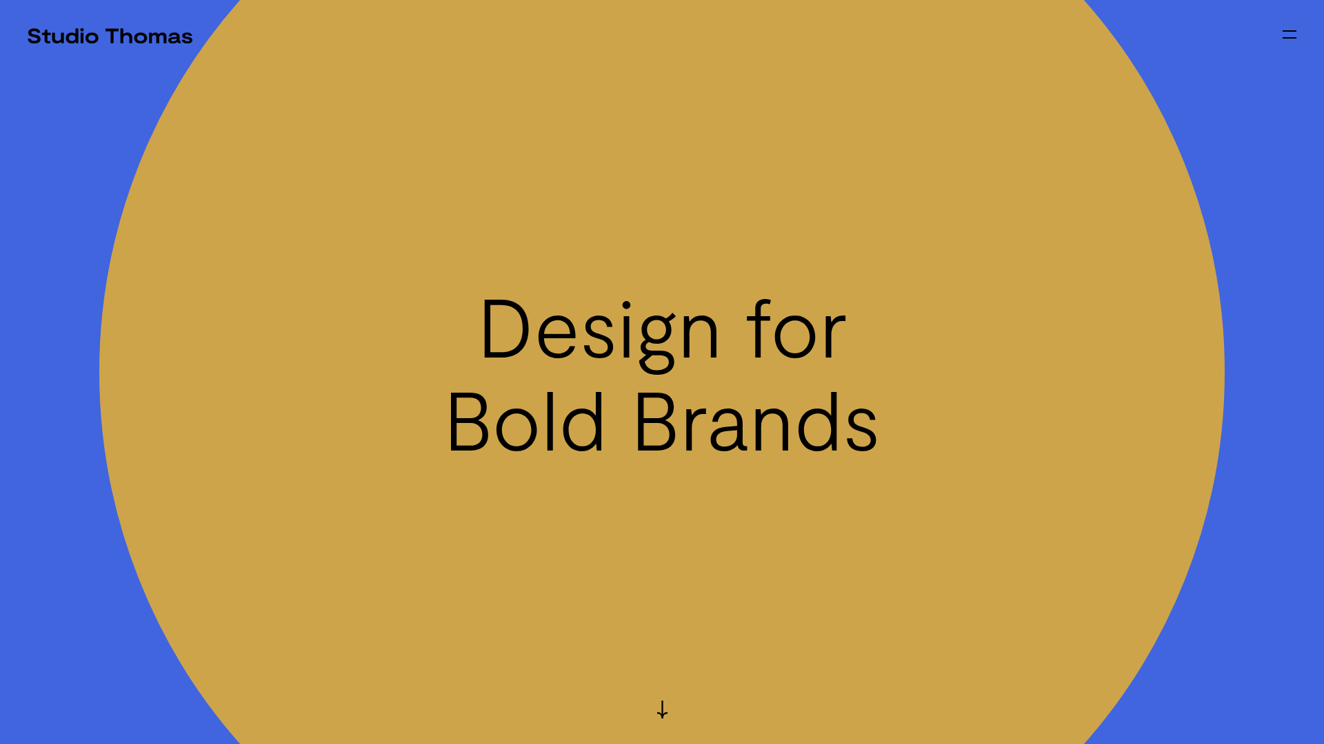
Studio Thomas Full-Screen Portfolio
A minimalist design portfolio featuring a parallax circle hero, full-screen vertical scroll snapping for case studies, and a dynamic sticky header that changes with section backgrounds.
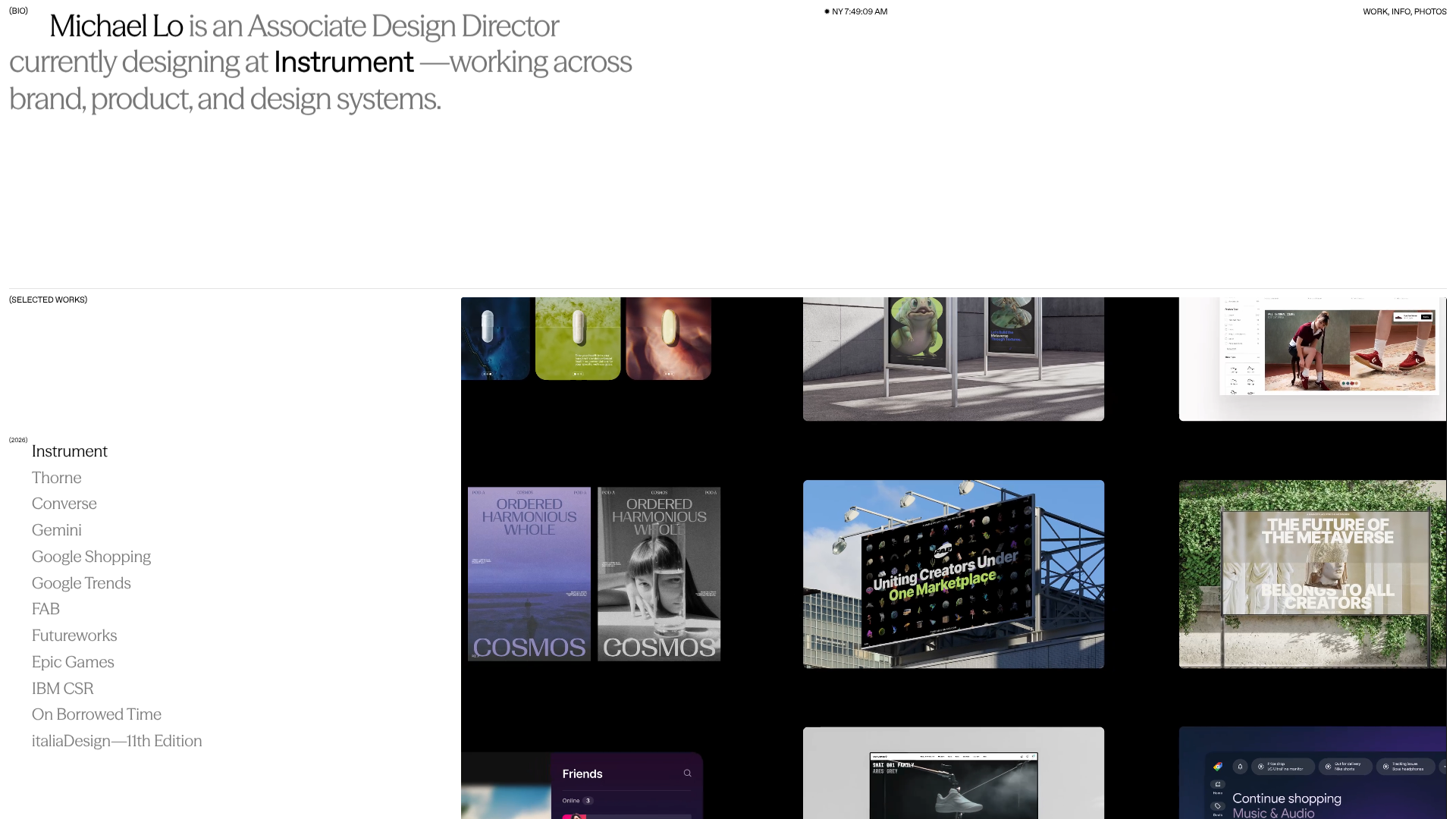
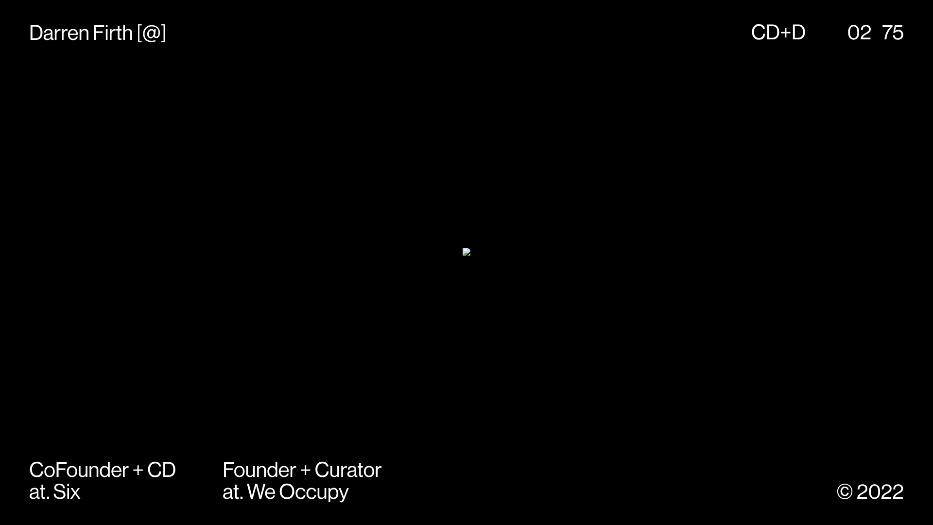
Michael Lo Interactive Portfolio
A high-end design portfolio featuring a horizontal scroll layout, dynamic typography remix controls, and a dual-view project index with sleek grid and list transitions.

Bruno Arizio Designer Portfolio Website
A minimalist creative director portfolio featuring a clean typographic layout, side-aligned image previews, and high-contrast spacing patterns suitable for luxury or design showcases.
Generative Music Visualization Portfolio Canvas
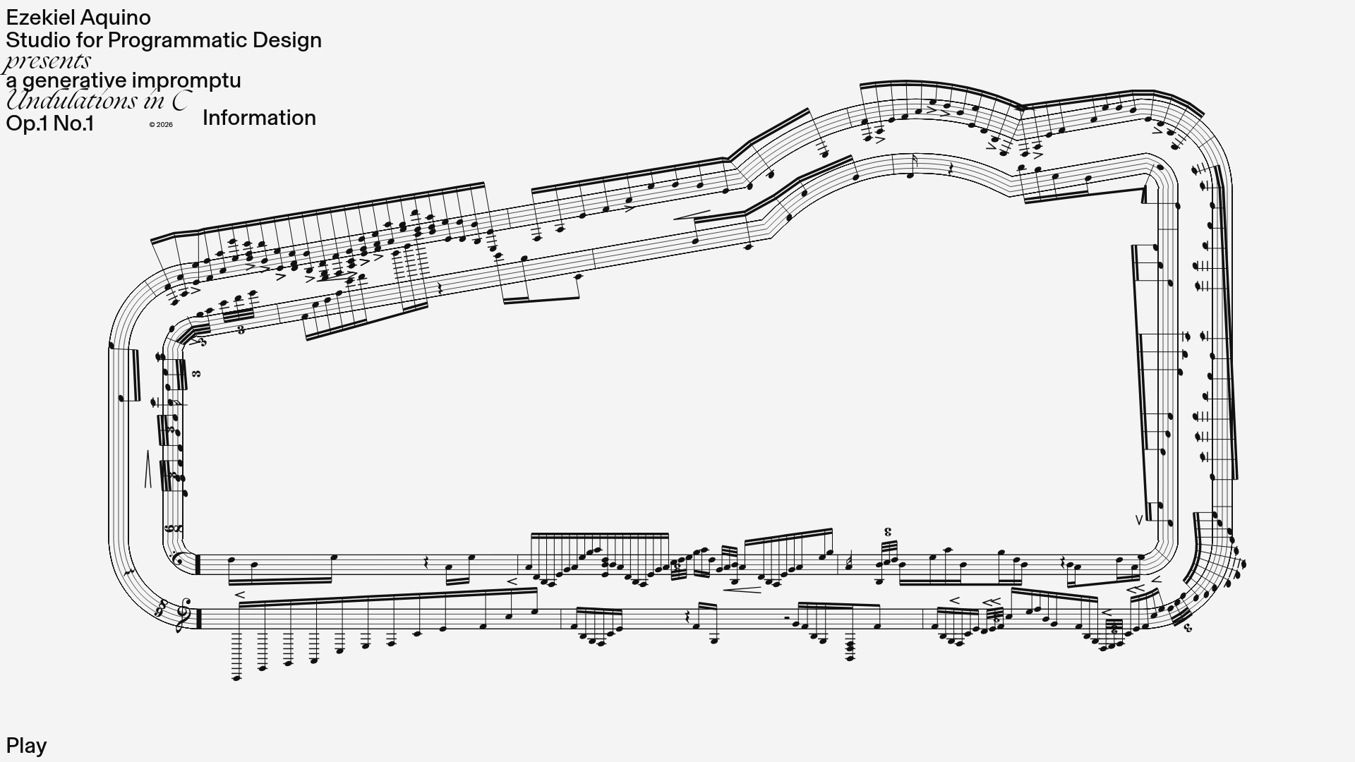
A creative coding project featuring a generative musical score on a dynamic canvas with a play/pause interaction and custom notation rendering.
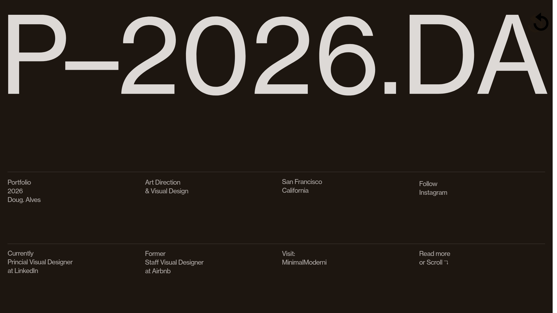
Doug Alves Visual Design Portfolio
A minimalist, high-contrast design portfolio featuring oversized typography, a sticky four-column grid footer, and a vertical scroll-triggered slide-show for project showcases.
