Cash App Families Landing Page
A financial services landing page featuring a minimalist high-contrast hero, flexible bento-style feature grids, an accordion-based FAQ, and a clean three-column card layout.
Overview
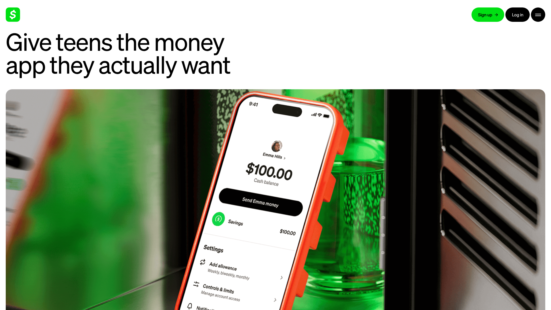
This landing page is a masterclass in high-contrast, minimalist financial services design, moving away from traditional corporate aesthetics toward a bold, social-first look. It uses a clean white-and-light-gray color palette accented by the brand's signature vibrant green, making it a strong reference for fintech apps targeting younger demographics.
Design System
- Color Palette & Visual Hierarchy: The design relies on high-contrast black text on white backgrounds, with
#00D632(Cash App Green) used for primary CTAs and brand identifiers. A subtle#F6F6F6light gray is used to differentiate sections (e.g., the FDIC and 'Explore More' blocks) without breaking the clean flow. - Typography System: The site uses a bold, sans-serif typeface with tight letter-spacing. Visual hierarchy is established through extreme scale—the H1 in the hero section is exceptionally large, while H2 and H4 headings provide structure for feature sub-sections.
- Page Structure & Flow: The layout follows a logical trust-building sequence: a high-impact Hero with mobile UI visualization, followed by 'Quick Hits' (icon-based USP list), detailed three-column feature grids, interactive 'Deep Dive' content blocks with alternating image placement, and ending with a robust FAQ accordion and supplementary article feed.
- Reusable Components:
- Bento-style Three-Card Section: A versatile layout used for features, tutorials, and secondary CTAs.
- Iconic Quick Hits: Minimalist svg-icon + text blocks for rapid benefit scanning.
- Deep Dive Blocks: Large-scale image-and-text pairings that alternate (Image Left/Image Right).
- FAQ Accordion: A clean, bottom-border separated list with
+expansion icons.
- Interaction & Motion: The presence of
<video>tags in card layouts suggests the use of autoplaying loopy-animations to demonstrate app features (like card locking or real-time alerts). There is a persistent floating "Download" button to maintain conversion focus during scroll. - Implementation Clues: Built with Next.js and Contentful (evidenced by
data-contentful-entry-idand__nextID), suggesting a modular, component-based architecture where sections are treatable as independent blocks.
Use Cases
- Who should clone this: Fintech startups, educational platforms for teens, or any SaaS product looking to simplify complex services into approachable, visually-driven benefits.
- Effective Remixes: Swap the signature green for a different neon accent (e.g., electric blue or purple) to immediately pivot for a different brand identity while keeping the professional layout structure.
- Remix Directions: Adapt the 'How to invite your teen' three-card section for onboarding tutorials or 'How it works' steps. The article feed at the bottom can be repurposed for a 'Latest News' or 'Case Studies' section.
- Clone Scope: A quick section clone of the 'Three-Card Section' is ideal for landing page modules, while a full-page clone is best for comprehensive service overviews that require high trust and clarity.
Related Inspirations
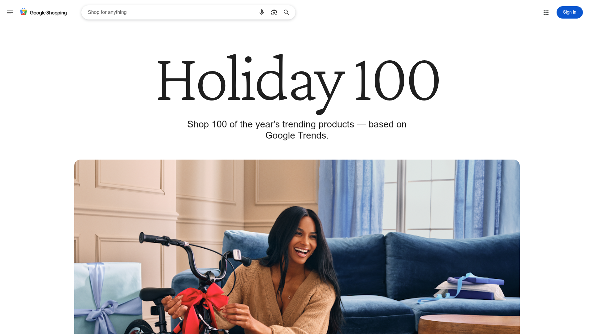
Google Holiday 100 Curator Landing Page
A minimalist e-commerce showcase featuring a wide hero section, clean search integration, and a bold typography-driven header designed for trending product collections.
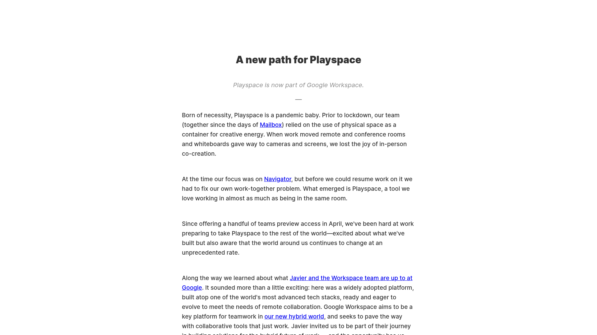
Playspace Acquisition Announcement Minimalist Layout
A clean, center-aligned announcement template featuring a vertical stack of rich text content and linked text elements on a neutral background.
Hourly App Landing Page
A minimalist iOS app landing page featuring a bold typographic hero, responsive grid-based screenshot displays, and custom SVG illustrations with CSS animations.
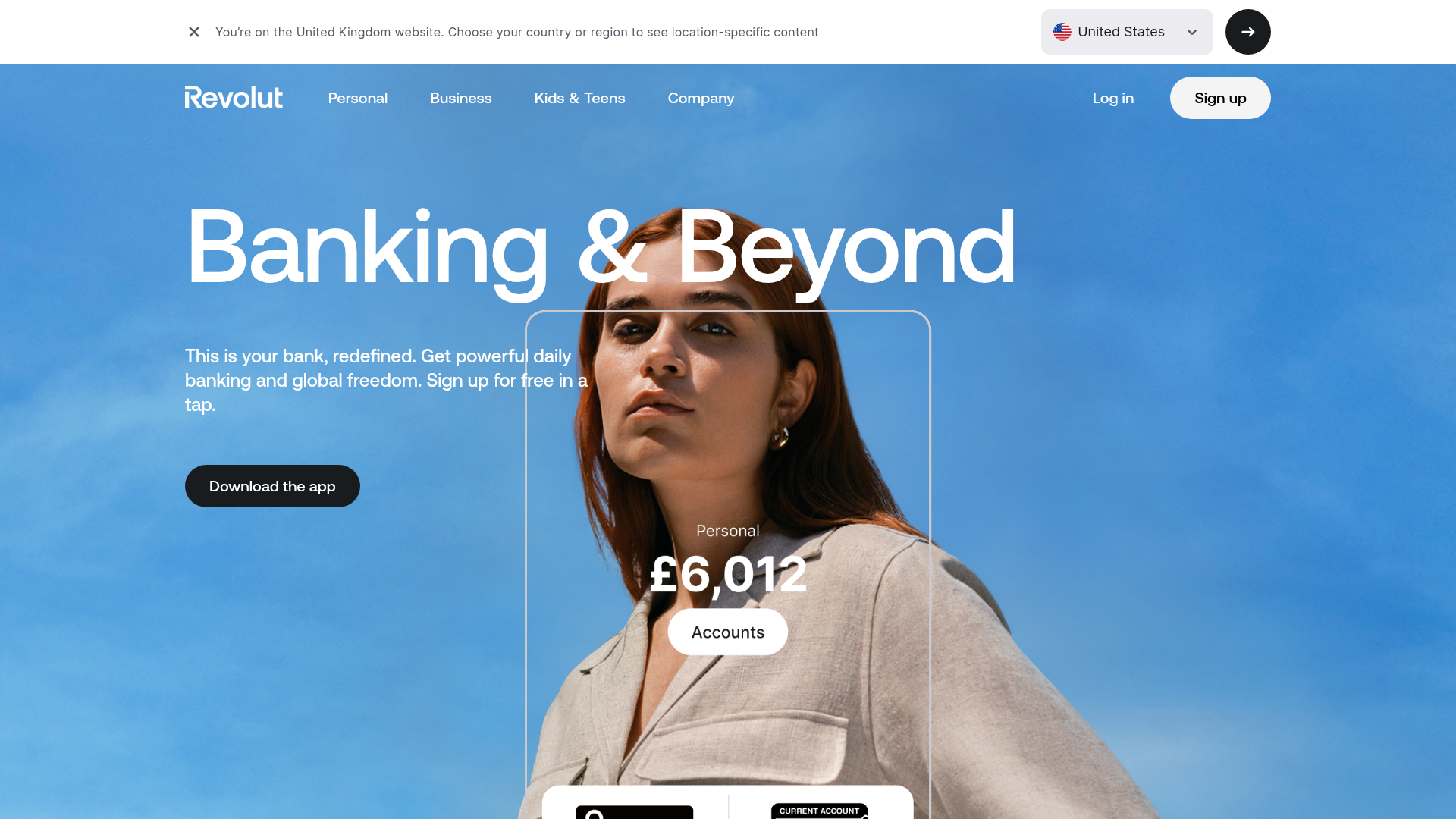
Revolut Banking Hero Landing Page
A high-impact landing page featuring an animated hero with layered image silhouettes, custom currency displays, and a tabbed interactive product showcase.
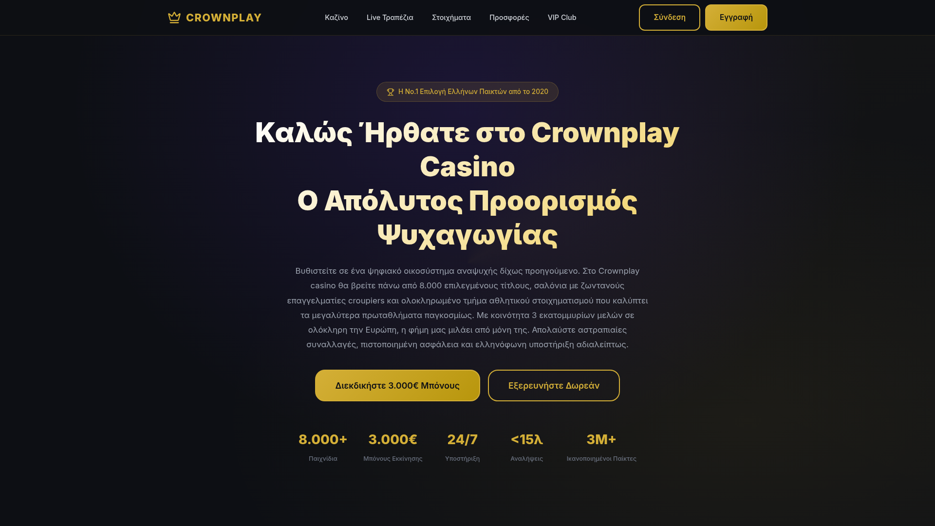
Crownplay Casino Landing Page
A luxury-themed dark mode landing page featuring a center-aligned hero section, value proposition counters, and a high-contrast call-to-action button layout.
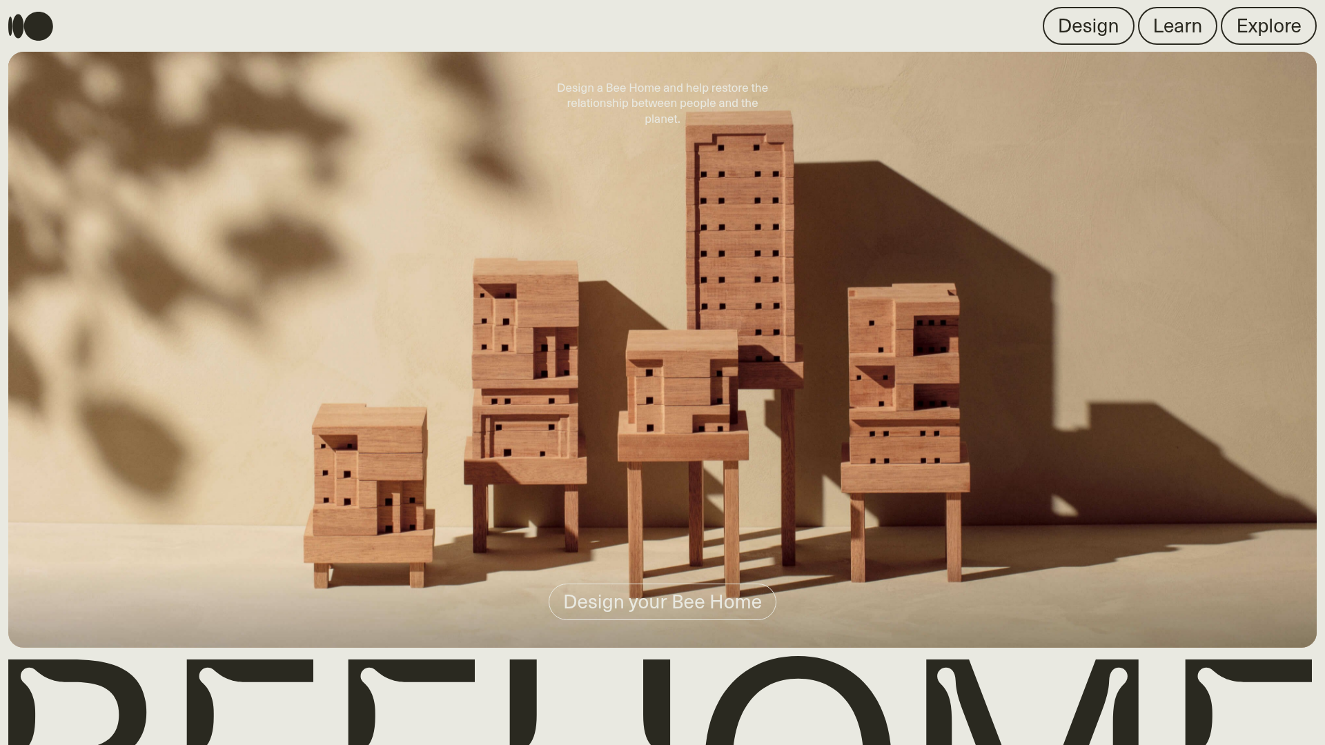
Bee Home Modular Design Landing Page
A minimalist landing page featuring an animated hero section, custom typography, and a modular component architecture built with Gatsby and Emotion CSS.
