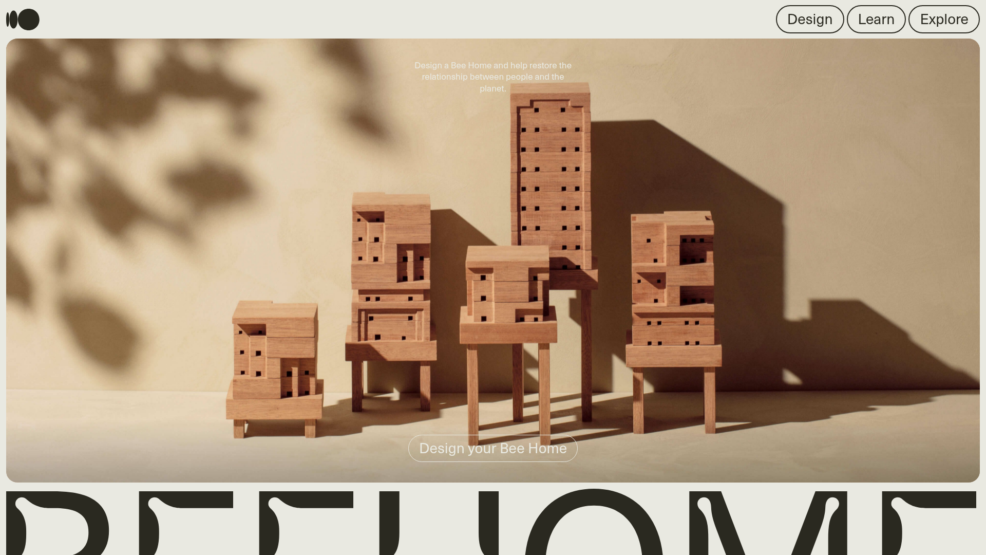
Bee Home Modular Design Landing Page
A minimalist landing page featuring an animated hero section, custom typography, and a modular component architecture built with Gatsby and Emotion CSS.
Overview
This landing page is a masterclass in minimalist, high-impact design for eco-conscious or physical product launches. It effectively balances serene, high-quality photography with bold, custom typography to tell a story of sustainability and modularity, making it an excellent reference for builders wanting to create a premium, atmospheric brand presence.
Design System
- Color Palette & Visual Hierarchy: The design uses a sophisticated, earthy palette featuring bone whites (
#E9E9E1), muted tans, and deep charcoal blacks. The hierarchy is driven by contrast; the light hero image transitions into a heavy, dark footer/section area with massive typography to ground the experience. - Typography: The system pairs a clean, modern sans-serif for navigation and body text with a highly stylized, expressive serif/display font for the main brand title ("BEE HOME"). The display type is oversized and cropped, turning text into a core visual element.
- Page Structure: The layout follows a vertical scroll strategy: a full-screen hero section with centered CTA, followed by secondary navigation blocks and a large-scale branding section. The footer area includes distinct sections for "About," "Community," and "Design."
- Reusable Components:
- Interactive Pills: Rounded pill-style navigation buttons in the top-right header.
- Glost-style CTAs: The "Design your Bee Home" button uses a transparent container with white borders, ideal for overlaying on complex background images.
- Full-Screen Modals: The HTML structure reveals a series of hidden
divwrappers for areas like "Privacy," "Terms," and "About," suggesting a single-page application (SPA) approach to content delivery.
- Implementation Clues: Built with Gatsby and Emotion CSS, the site utilizes a component-based architecture where sections like
e1xsv99n3are modular. The use ofgatsby-focus-wrapperindicates a focus on accessibility and fast, client-side routing.
Use Cases
- Who should clone this: Brands in the sustainable architecture, high-end furniture, or environmental non-profit space who want to evoke a sense of calm and precision.
- Product Remixes: This pattern works effectively for modular product configurators, digital portfolios for architectural firms, or high-concept lifestyle brands.
- Practical Remix Directions:
- Swap Brand Style: Replace the wooden modular homes with digital assets or 3D product renders while maintaining the muted color palette.
- Adapt Info Architecture: Reuse the full-screen navigation modal structure for documentation or FAQ sections to keep the landing page clean.
- Scope: Builders should focus on cloning the Header + Hero Section for a quick high-impact landing page, or the Typography-weighted Footer for a bold brand statement.
Related Inspirations
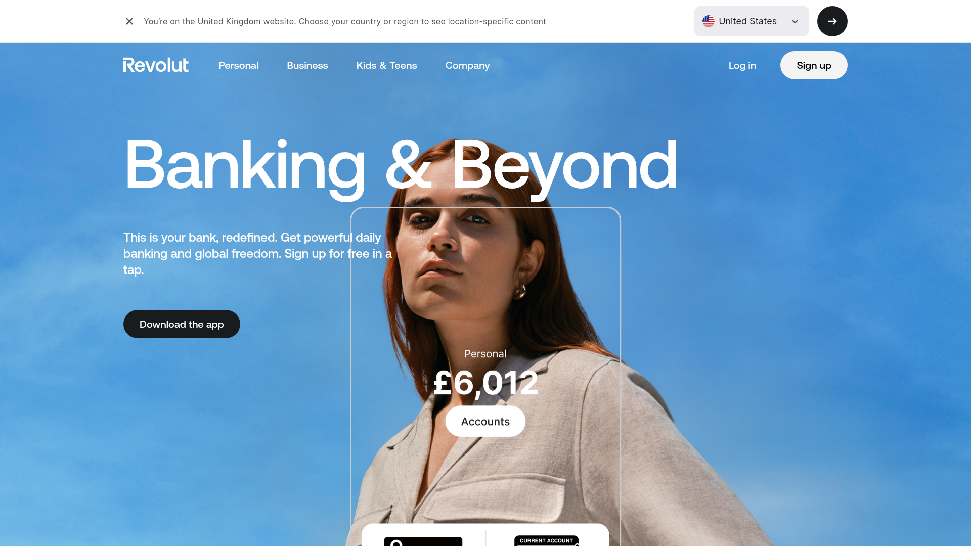
Revolut Banking Hero Landing Page
A high-impact landing page featuring an animated hero with layered image silhouettes, custom currency displays, and a tabbed interactive product showcase.
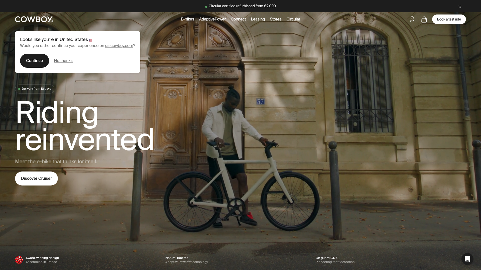
Cowboy E-bikes Landing Page
A minimalist e-commerce showcase featuring a full-screen hero image, integrated notification banners, navigation for test rides, and a technical feature footer.
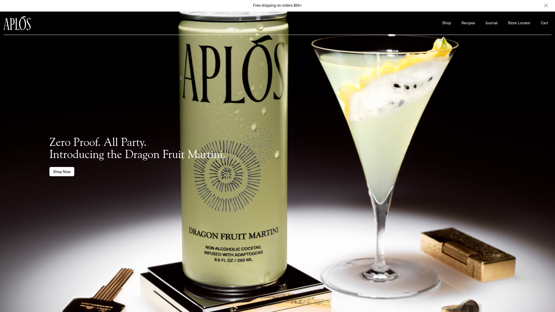
Aplós E-commerce Product Landing Page
A high-fidelity landing page featuring multiple full-height sticky hero sections, horizontal scroll sliders for reviews and lifestyle stories, and transparent product cards.
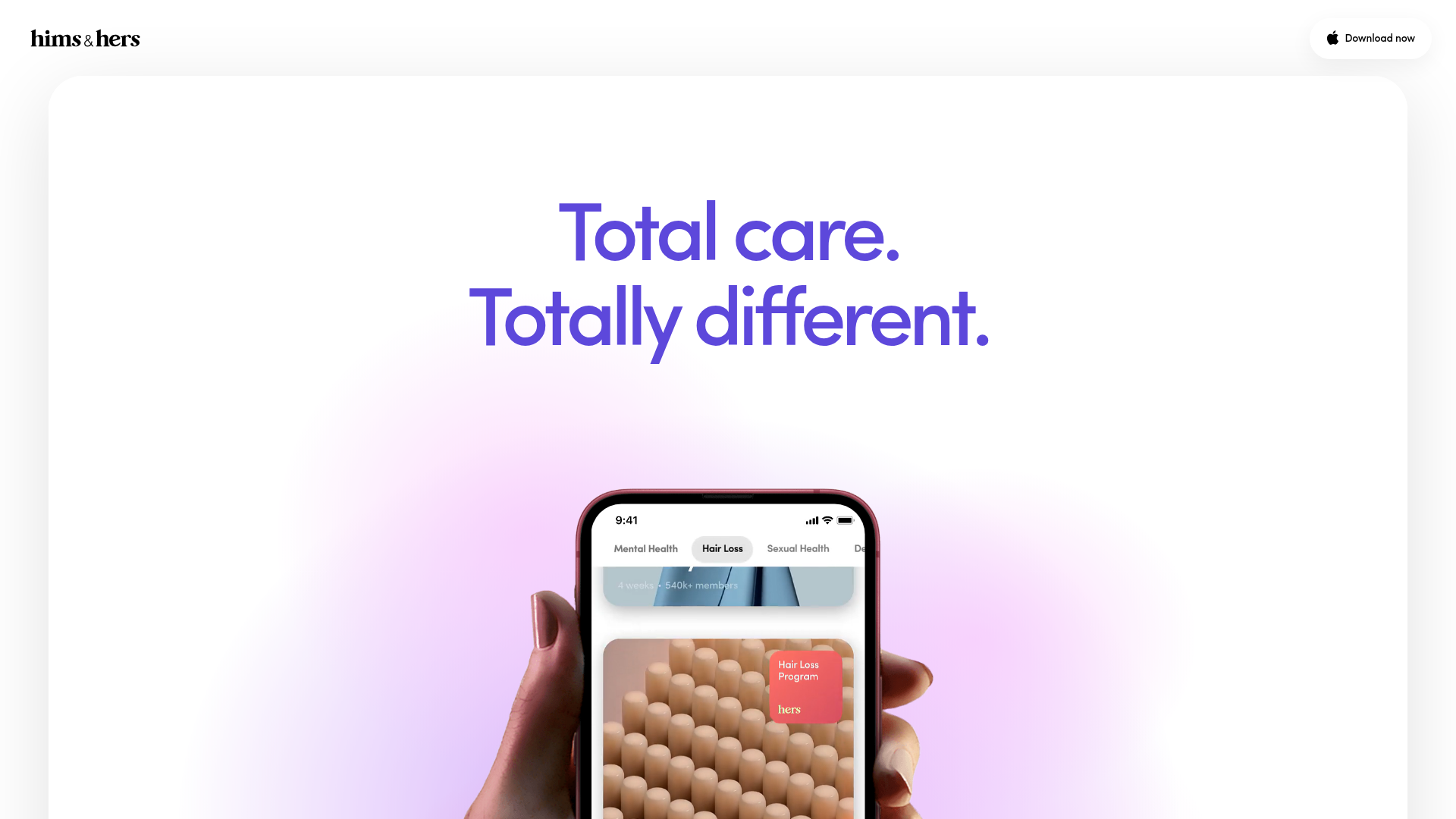
Hims & Hers App Landing Page
A clean health-tech landing page featuring high-contrast typography, sticky phone mockups with scroll-triggered animations, and sleek card-based content sections.
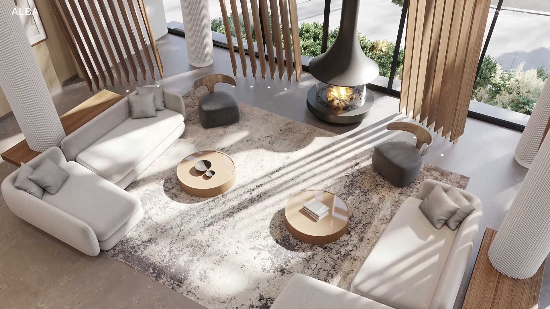
Alba Condos Real Estate Landing Page
A luxury property showcase featuring a full-bleed video hero, smooth scroll animations, and a time-stamped visual grid utilizing autoplaying video cards and hover-activated buttons.
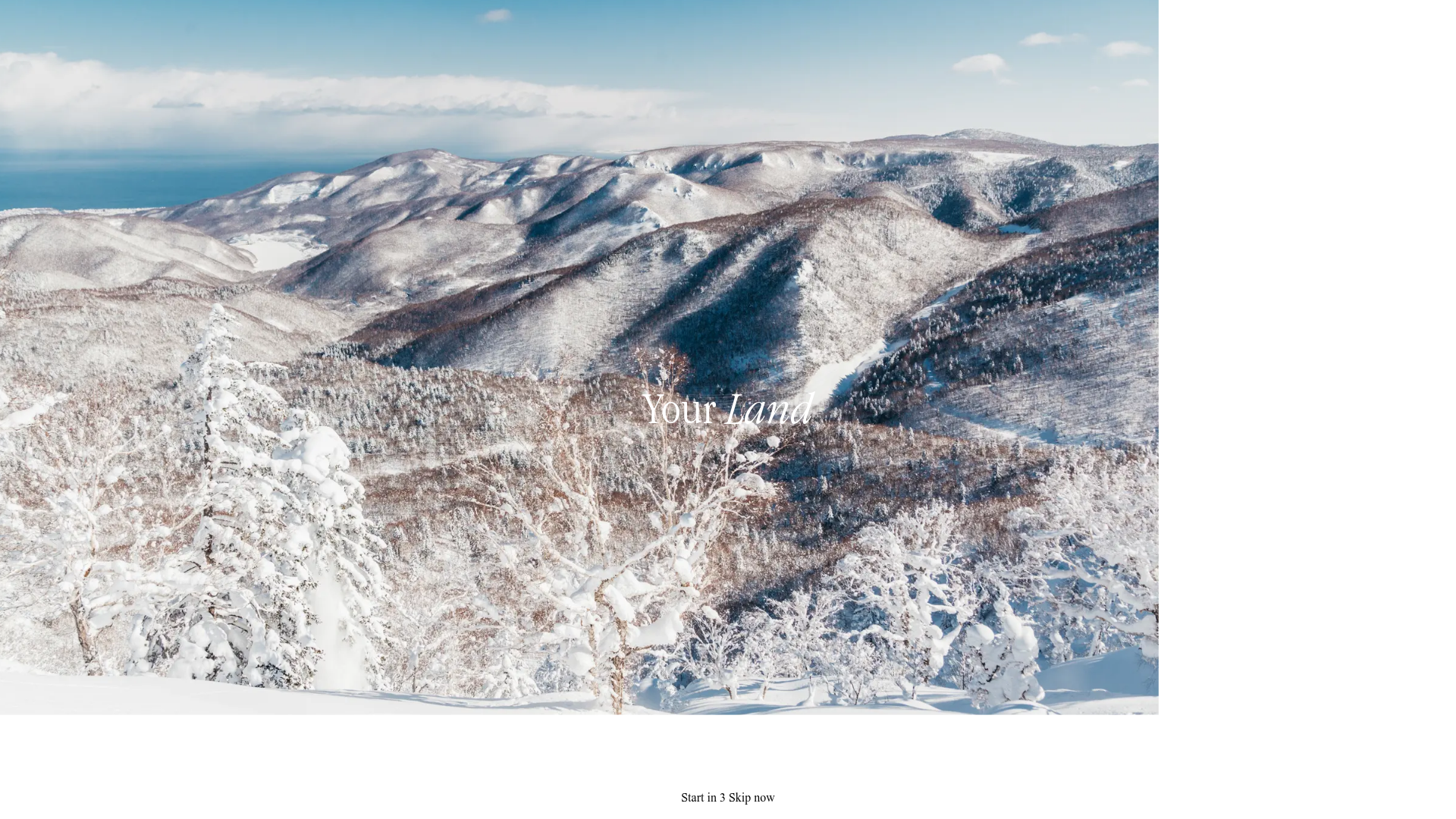
Your Land Cinematic Intro Page
A minimalist full-screen video background splash page featuring a centered typography overlay, a skip timer component, and immersive landscape visuals.
