Revolut Banking Hero Landing Page
A high-impact landing page featuring an animated hero with layered image silhouettes, custom currency displays, and a tabbed interactive product showcase.
Overview
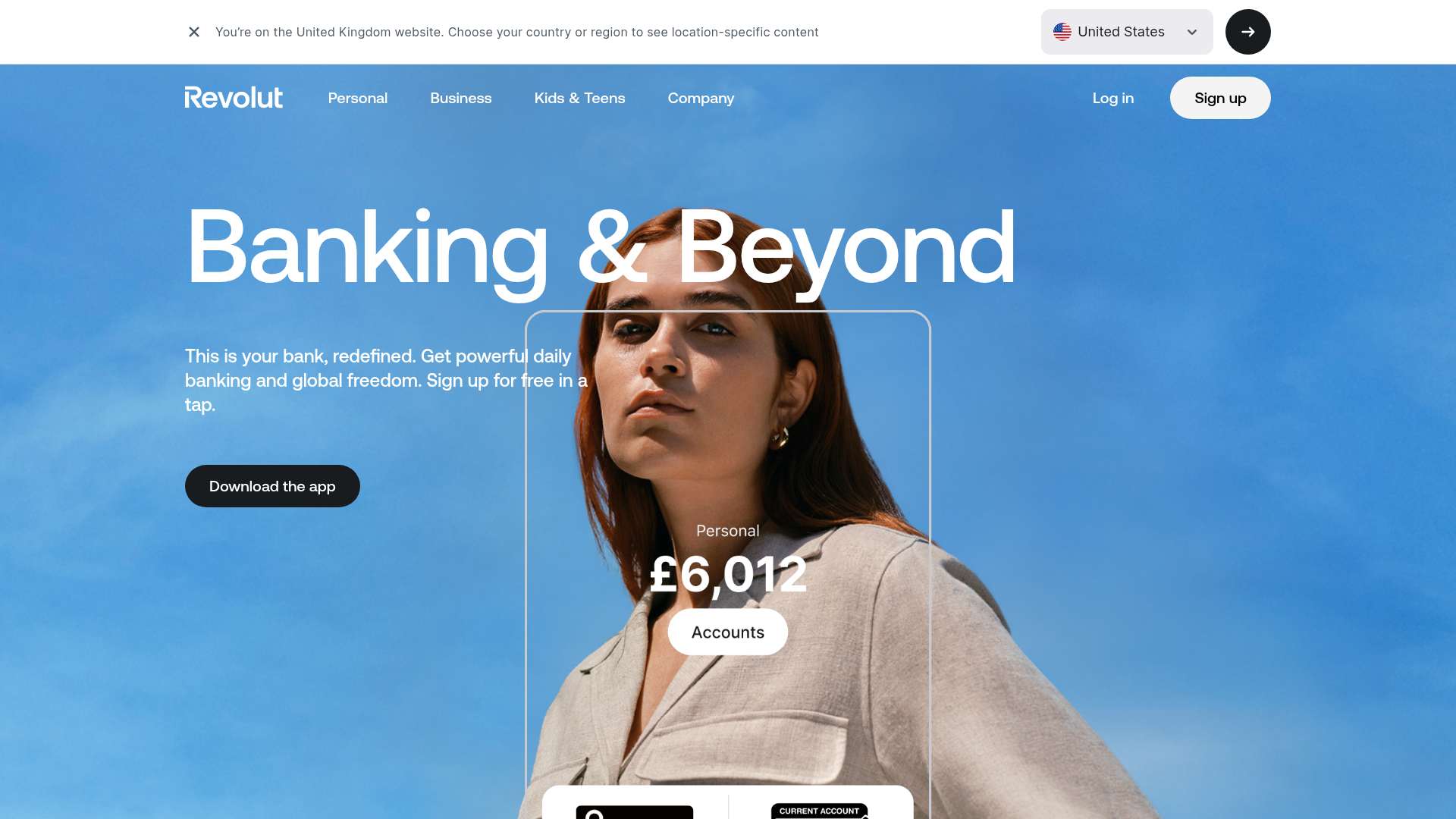
Revolut’s hero landing page is an exemplary model of the "fintech aesthetic," combining large-scale typography, layered photographic silhouettes, and interactive product showcases. It is a strong reference for cloning due to its sophisticated use of Z-axis layering and dynamic carousel-style product snapshots that create a sense of depth and modernity.
Design System
- Color Palette & Visual Hierarchy: The design utilizes a high-contrast foundation of pure white and deep charcoal/black (
#000000), accented by a vibrant sky-blue skybox as the primary hero background. A secondary "Dark Mode" theme is used for specific product feature sections later in the flow to differentiate offerings (e.g., card services and stocks). - Typography: The site features a bold sans-serif font family. The hierarchy is dominated by a massive
h1("Banking & Beyond") that uses tight letter-spacing and fluid scaling. Fine print (AER/T&Cs) is handled in a monochromatic grey-tone scale to maintain focus on the value propositions. - Page Structure & Section Flow: The flow starts with a high-impact animated hero using image layers that change on scroll/click. This is followed by social proof (awards/Trustpilot scores) in a horizontal grid, transitioning into feature-specific "deep-dive" sections (Cards, Savings, Safety, Stocks) that alternate between light and dark themes.
- Reusable Components:
- Pill Buttons: Rounded
ButtonBasecomponents with a distinct "state-layer" for hover feedback. - Tabbed Video/Image Switchers: Interactive
tablistcomponents that swap between physical and virtual card visualizations. - Floating Currency Cards: Layered UI elements (e.g., the £6,012 balance card) that float over the photo subject using absolute positioning.
- Pill Buttons: Rounded
- Interaction & Motion: The HTML indicates extensive use of
cubic-beziertransitions fortransformandopacityproperties. Key interactions include the carousel scaling (0.9x to 1x) as items move into focus and subtle vertical translations on scroll. - Clues from HTML: The site is built with Next.js and utilizes Styled Components (seen in hashed classes like
Box-rui__sc-1g1k12l-0). It uses a specific Design System library (referred to as "rui" in the codebase) focused on flexible, atomic Grid and Flex components.
Use Cases
- Who should clone this: This pattern is ideal for SaaS platforms, modern financial tools, or lifestyle consumer apps that need to balance professional trust with a cutting-edge feel.
- Remixing effectively: Digital banking alternatives can remix the photo subjects and currency markers. Travel apps could swap the banking cards for destination itineraries while keeping the layered silhouette hero layout.
- Practical directions: Consider adapting the "Dark Theme" feature sections as standalone landing pages for specific product tiers. The social proof section (awards and partner logos) can be easily detached and reused as a trust-building block in any footer or mid-page section.
- Clone Scope: For a fast implementation, focus on cloning the Hero Section and the Tabbed Feature Showcase. Replicating the full page is recommended for projects requiring a complete narrative arc from value proposition to legal footnotes.
Related Inspirations
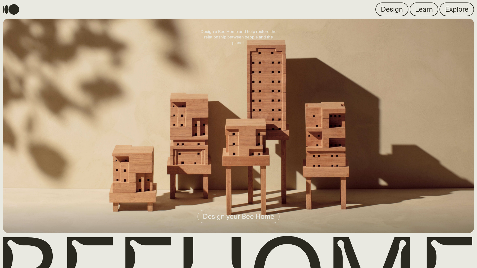
Bee Home Modular Design Landing Page
A minimalist landing page featuring an animated hero section, custom typography, and a modular component architecture built with Gatsby and Emotion CSS.
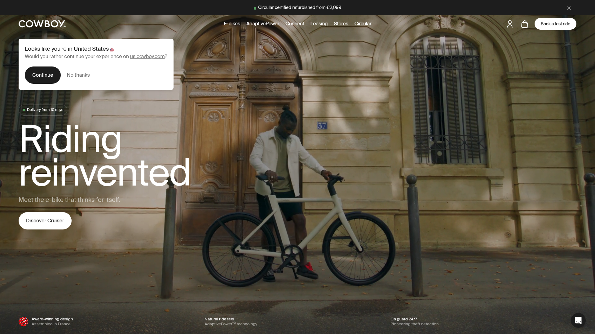
Cowboy E-bikes Landing Page
A minimalist e-commerce showcase featuring a full-screen hero image, integrated notification banners, navigation for test rides, and a technical feature footer.
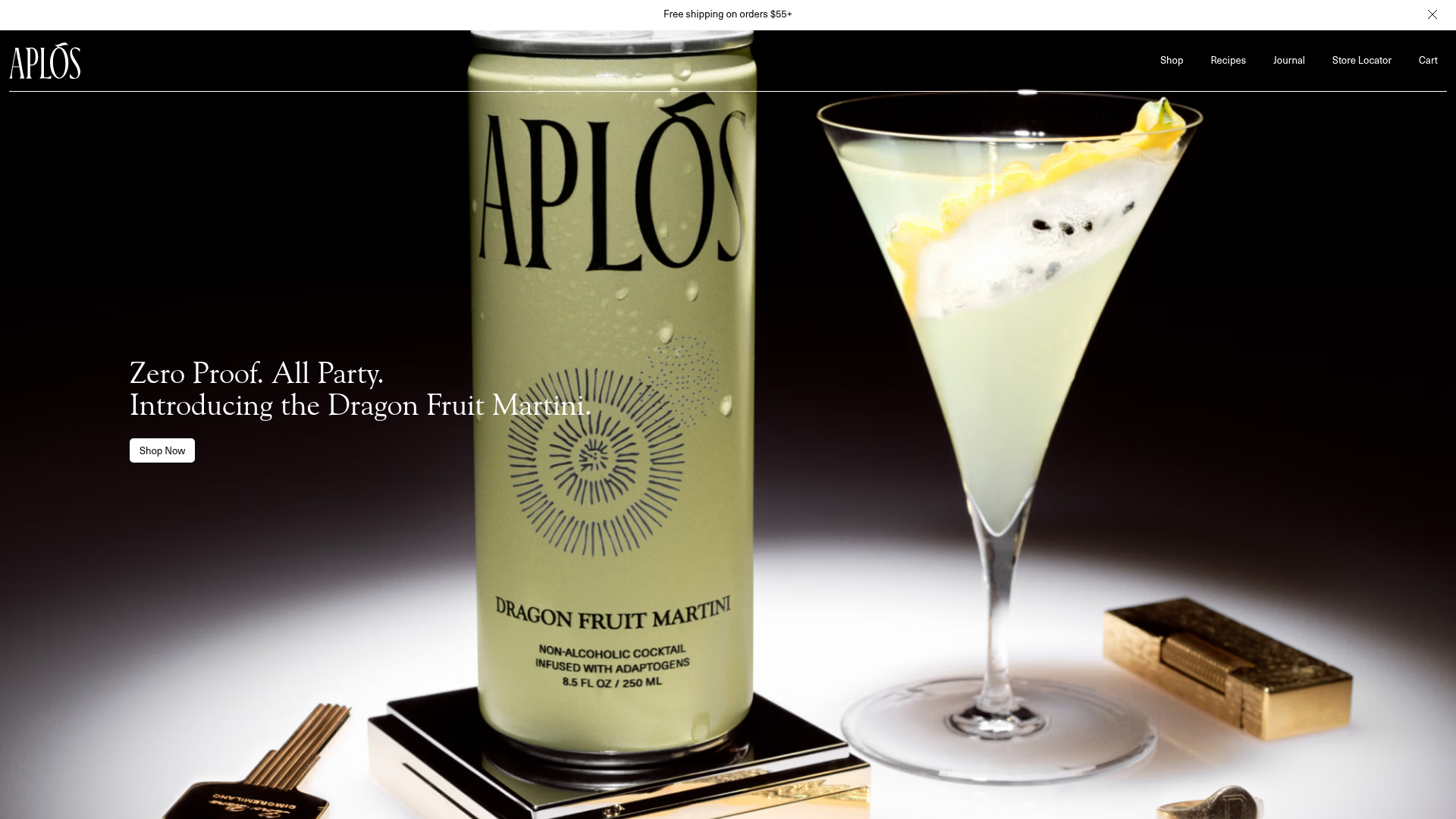
Aplós E-commerce Product Landing Page
A high-fidelity landing page featuring multiple full-height sticky hero sections, horizontal scroll sliders for reviews and lifestyle stories, and transparent product cards.
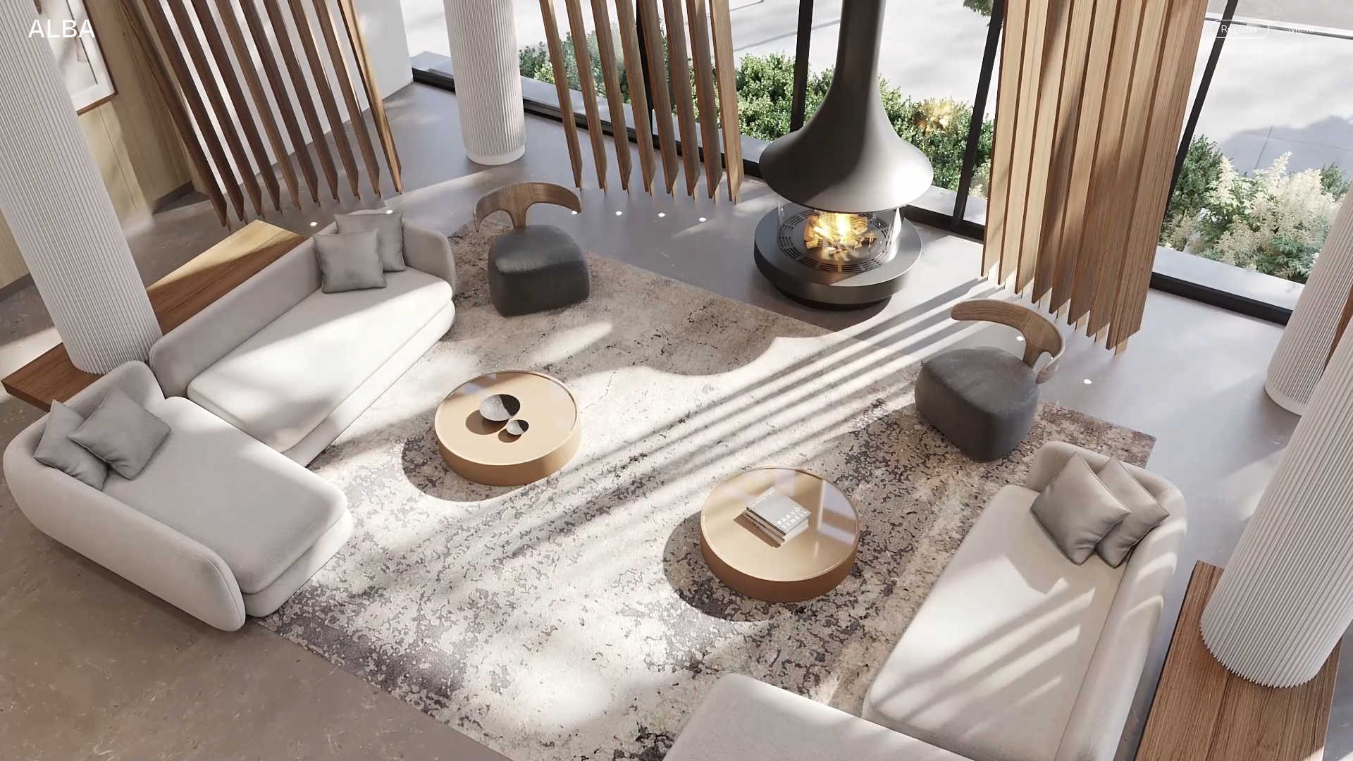
Alba Condos Real Estate Landing Page
A luxury property showcase featuring a full-bleed video hero, smooth scroll animations, and a time-stamped visual grid utilizing autoplaying video cards and hover-activated buttons.
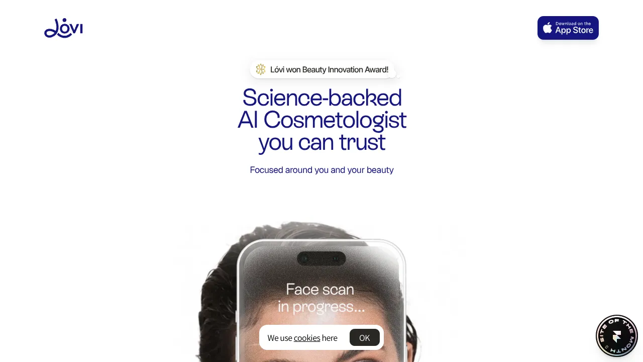
Lóvi AI Skin Care Landing Page
A clean, minimalist landing page featuring a centered hero section, animated iPhone mockups with video overlays, and a floating badge for award recognition.
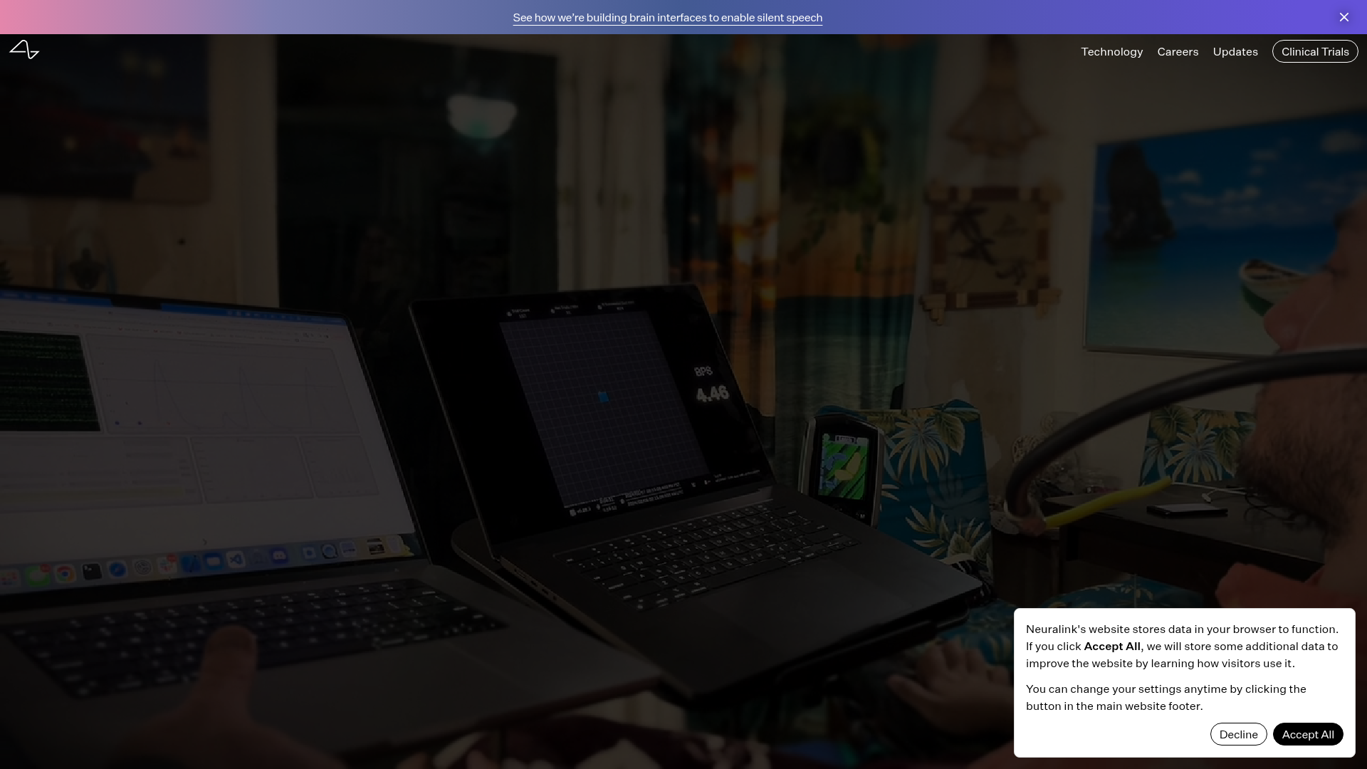
Neuralink Brain Technology Landing Page
A high-tech medical landing page featuring an immersive video hero section, typewriter animation effects, and a custom swiper carousel with integrated video testimonials.
