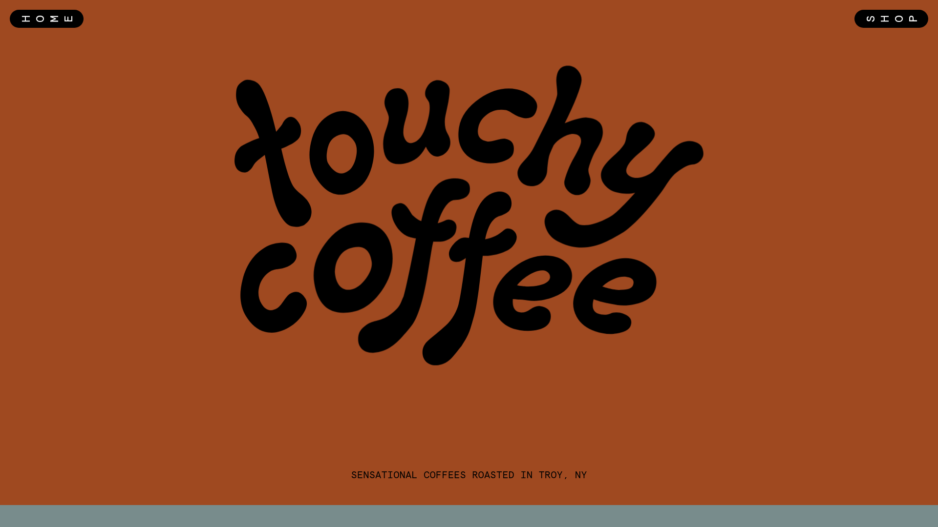
Touchy Coffee Specialty Roaster E-commerce
A quirky Shopify landing page featuring decorative horizontal product carousels, vertical side-text labels, and an interactive 'seed-to-cup' marquee scroll component.
Overview
Touchy Coffee is a bold, specialty roaster e-commerce site that breaks standard retail conventions with a graphic, high-contrast aesthetic. It serves as an excellent clone reference for brands wanting to transition from a generic store layout to a high-personality, interactive experience using decorative carousels and unconventional typography.
Design System
- Color Palette & Visual Hierarchy: The primary palette uses a warm terracotta orange (
#ae5229) with deep charcoal text and slate-blue accents. Large-scale, organic letterforms dominate the hierarchy, creating a brand-first rather than product-first initial impression. - Typography: The system utilizes 'Apercu Mono' for functional UI (tags, pricing, quantity selectors) to contrast against the custom, fluid, script-like logo and display headings. This mix of "hard" technical mono fonts and "soft" decorative fonts creates a modern, quirky balance.
- Page Structure: The site flows from a massive brand hero section into unique horizontal scrolling product carousels labeled with vertical side-text (e.g., "IN OUR SHOP"). A kinetic "Seed to Cup" marquee and an interactive "In Our Minds" text-and-image hover section follow before the footer.
- Reusable Components:
- Pill-shaped UI: Navigation buttons ("MENU," "SHOP," "HOME") are enclosed in high-contrast capsules with a distinctive "turn" animation on hover.
- Interactive Carousels: Custom product cards within a
scrollbar-innerwrapper that include embedded quantity selectors and variant dropdowns directly on the scrollable surface. - Pop-up Newsletter: A vertical side-tab trigger for a newsletter form with blinking button states.
- Interaction & Motion: The site uses substantial hover triggers, specifically
image-hoverclasses that reveal photos behind text. The newsletter and quantity buttons utilize a technical "blinker" class for high-visibility state changes. - Responsive Behavior: The HTML reveals a persistent "Rotate your phone" card for mobile users, indicating a design optimized for wide-aspect horizontal scrolling rather than traditional vertical stacking.
Use Cases
- Who should clone this: Specialty craft producers (coffee, wine, small-batch pantry items) who want to emphasize the "maker" story through unconventional UI.
- Remix Directions: Replace the terracotta background with neon or pastel tones to shift from "earthy" to "vibrant"; adapt the vertical labels for different categories like "New Arrivals" or "Merch."
- Clone Scope: The horizontal product carousel is the most valuable modular section to clone for existing Shopify stores looking to break up vertical scrolling fatigue. For a full brand overhaul, the interactive marquee and side-text layout provide a comprehensive template for high-end boutique retail.
Related Inspirations
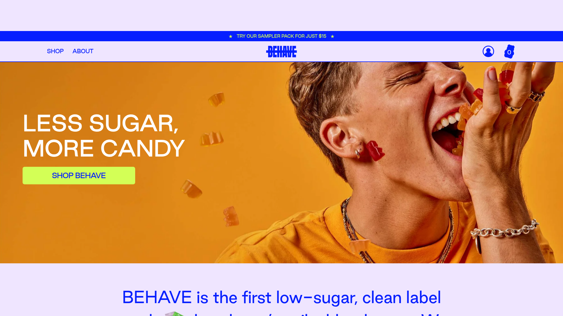
BEHAVE Low-Sugar Candy E-commerce Store
A vibrant Shopify storefront featuring a bold image-led hero section, animated typography, circular nutrition stat badges, and a hover-triggered product carousel.
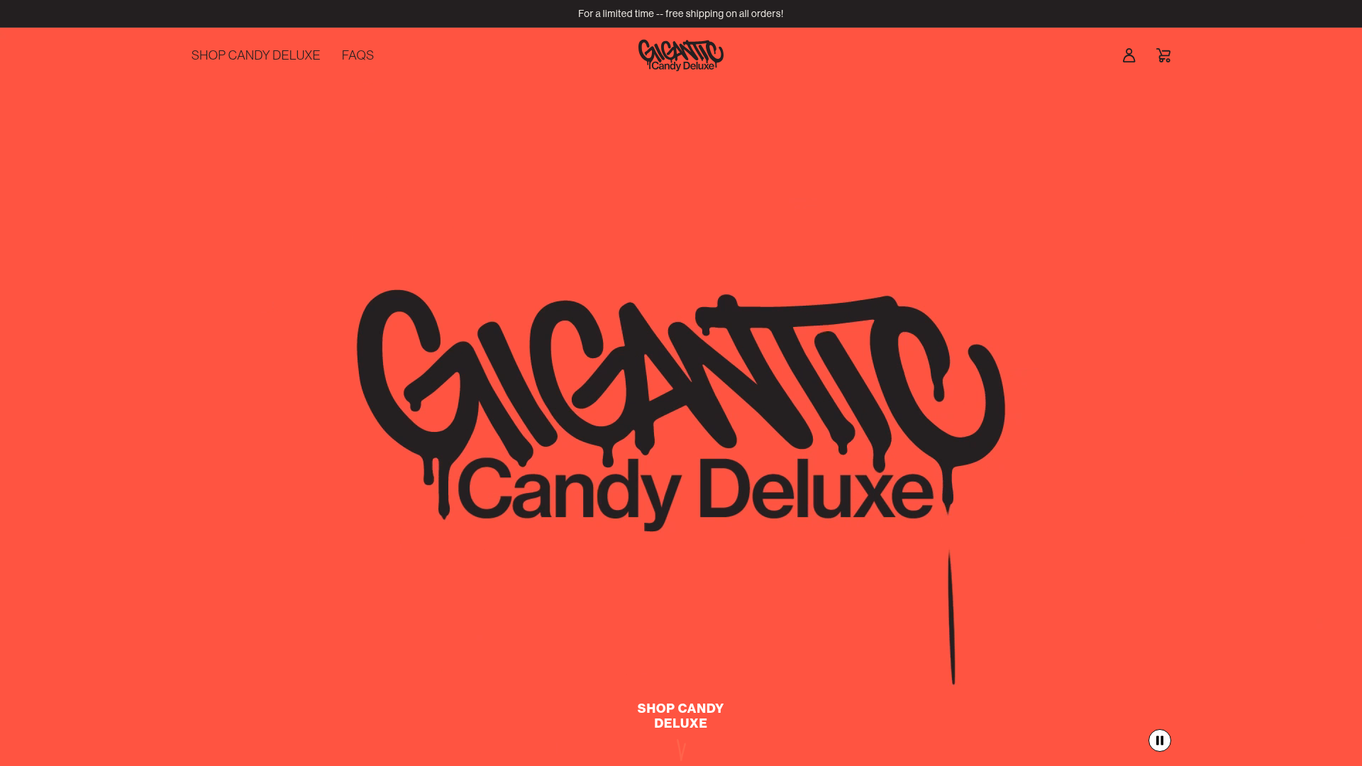
Gigantic Candy E-commerce Landing Page
A high-impact Shopify storefront featuring a full-screen video hero, marquee scrolling text, and animated product hover effects in a bold streetwear-inspired aesthetic.
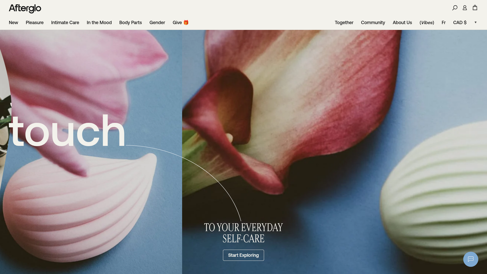
Afterglo Sensual Self-Care Storefront
An elegant e-commerce landing page featuring a split-screen horizontal scrolling hero, kinetic typography with 'vibrating' text animations, and a customized product carousel.

Post Familiar Minimalist Winery Storefront
An experimental e-commerce layout featuring a high-contrast age verification screen, bold typography grids, and a horizontal scrollable product showcase.
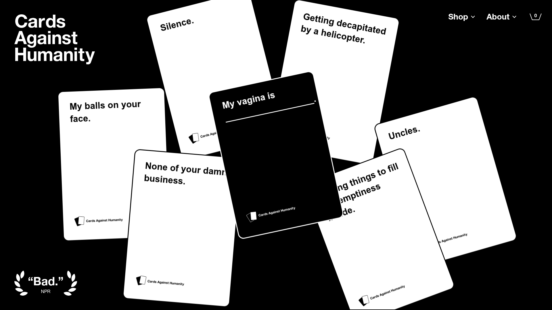
Cards Against Humanity Landing Page
A high-impact landing page featuring a CSS-transformed 3D card hero, color-blocked sections, product carousels, and an accordion-style FAQ with a bold, minimalist aesthetic.
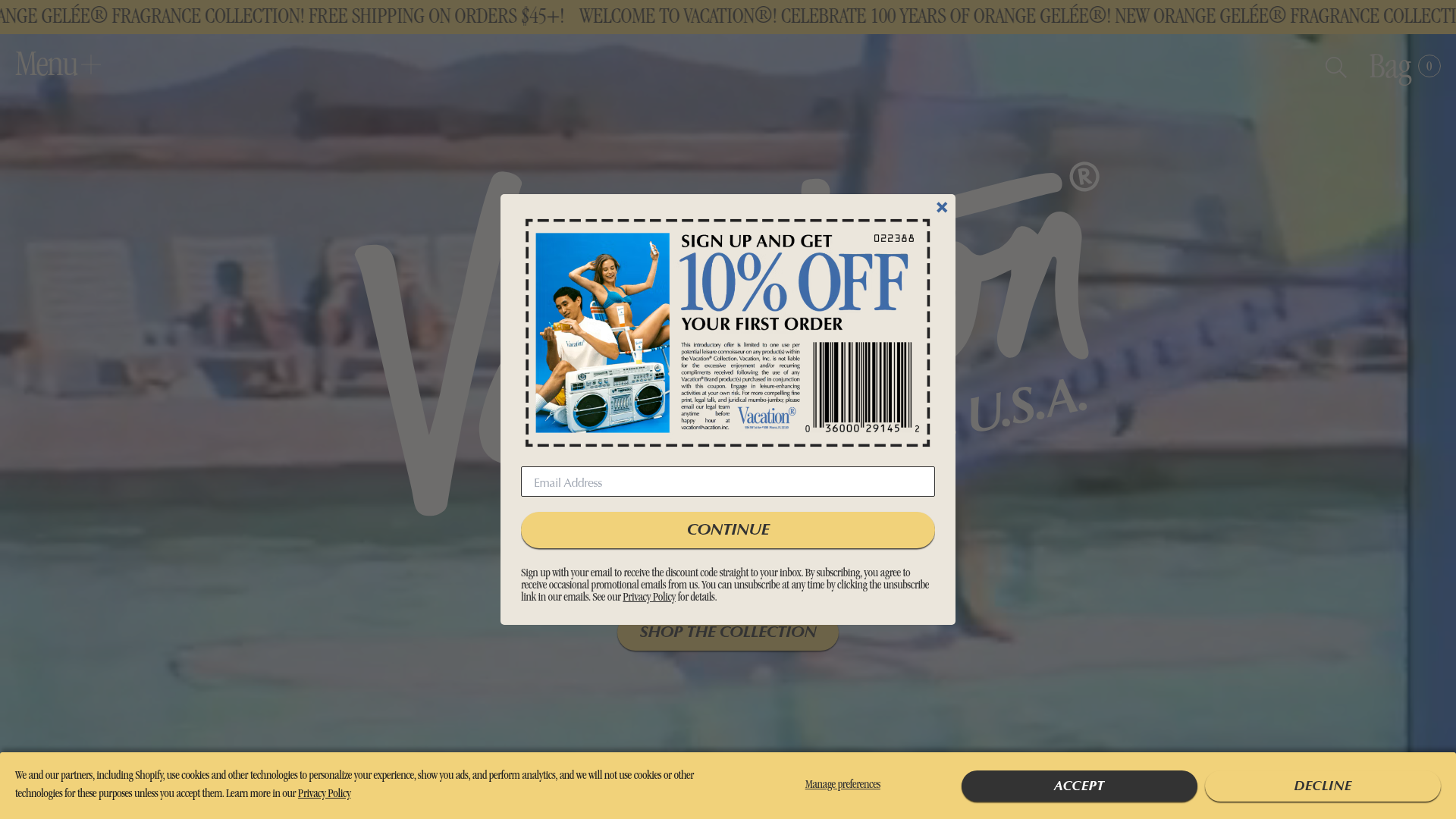
Vacation Retro Skincare E-commerce Landing
A high-impact retro aesthetic featuring coupon popups, interactive staff card generators, stylized product tiers, and a horizontal scrolling image gallery for brand storytelling.
