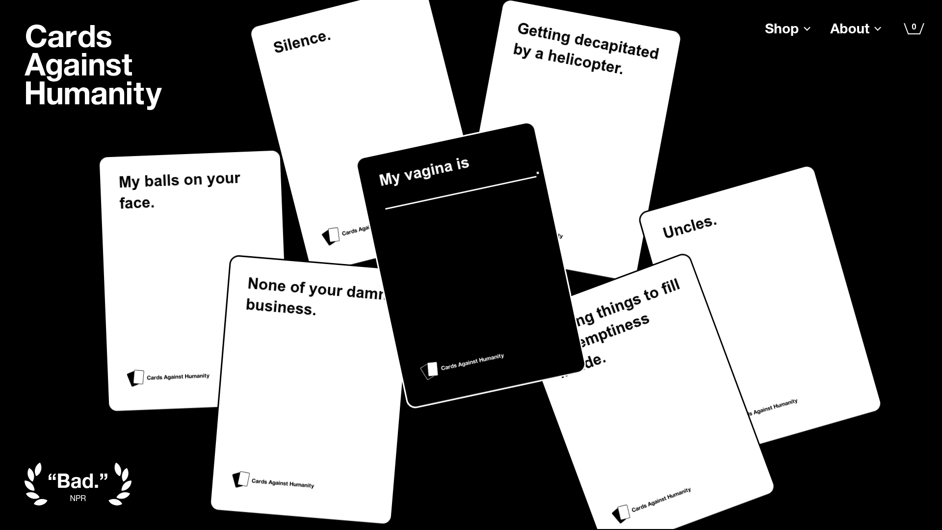
Cards Against Humanity Landing Page
A high-impact landing page featuring a CSS-transformed 3D card hero, color-blocked sections, product carousels, and an accordion-style FAQ with a bold, minimalist aesthetic.
Overview
This landing page is a masterclass in high-contrast, minimalist branding that uses 3D CSS transforms to create a physical sense of product depth. It features a bold black-and-white aesthetic interrupted by high-saturation color blocking, making it an excellent reference for builders wanting to create a brand-forward e-commerce experience that feels both edgy and professional.
Design System
- Color Palette & Visual Hierarchy: The base palette is strictly monochromatic (Black
#000000, White#FFFFFF). Impact is achieved through high-contrast section toggling (dark mode vs. light mode) and vivid accent colors in product tiles, such as baby blue, yellow, pink, and bright green. - Typography: The site uses a heavy-weight Sans-Serif system (Helvetica Neue/Arial). The hierarchy is flat but aggressive;
h2elements usefont-weight: 800with large scales (up to80pxon desktop) to command attention. Emphasis is consistently achieved through bolding rather than italics or color shifts. - Page Structure:
- Hero: A
card-stack-herocontaining 3D-rotated card elements (transform-style: preserve-3d). - Narrative Section: Centered rich text with floating SVGs for texture.
- Product Carousel: A
keen-sliderimplementation with varied-color product tiles. - Call-to-Action: A dedicated "Steal the game" section for downloads with illustrative badge overlays.
- Social Proof/Stunts: A grid of color-blocked cards showcasing historical brand activities.
- Newsletter & FAQ: A minimalist email capture and a heavy-border accordion FAQ.
- Hero: A
- Reusable Components: The standard button style uses a thick black border (
button--black-border) or inverse coloring with rounded corners. The FAQ accordion uses a simple height-transition pattern (transition: height 400ms) with heavy horizontal rule dividers. - Interaction & Motion: The primary motion is the 3D card stack in the hero which uses
perspectiveandrotatetransforms. Product carousels use dot navigation and horizontal slides. Badges and icons use subtle CSS rotations (rotate(20deg)) to feel like physical stickers. - Implementation Clues: The site is built with Next.js (indicated by
id="__next") and uses a utility-first CSS approach (classes likedffor display flex,aicfor align-items-center,pafor position absolute).
Use Cases
- Who should clone this: Designers and developers for indie board games, streetwear brands, or bold SaaS products that want to move away from generic "corporate" layouts.
- Remix Directions: Swap the card stack for 3D device mockups (if SaaS) or clothing items (if e-commerce). The color-blocked product carousel provides a great template for high-skew products where each item needs a unique personality through background color.
- Suggested Scope: For a quick win, clone the Hero Section to master 3D stacking or the FAQ Accordion for a brutalist UI element. A full-page clone is ideal for brands that rely on a "personality-first" marketing strategy where the copy and bold typography do the heavy lifting.
Related Inspirations
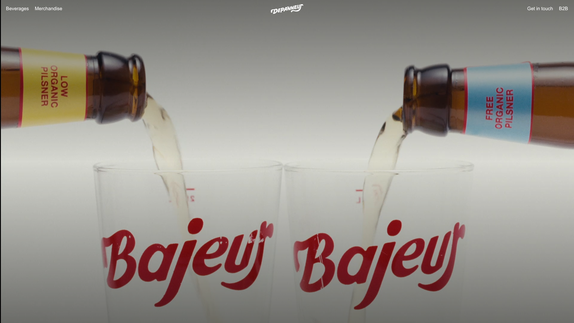
Depanneur Beverage E-commerce Hero
A minimalist Shopify storefront featuring a full-screen background video hero, sticky translucent navigation, and integrated mobile menu components.
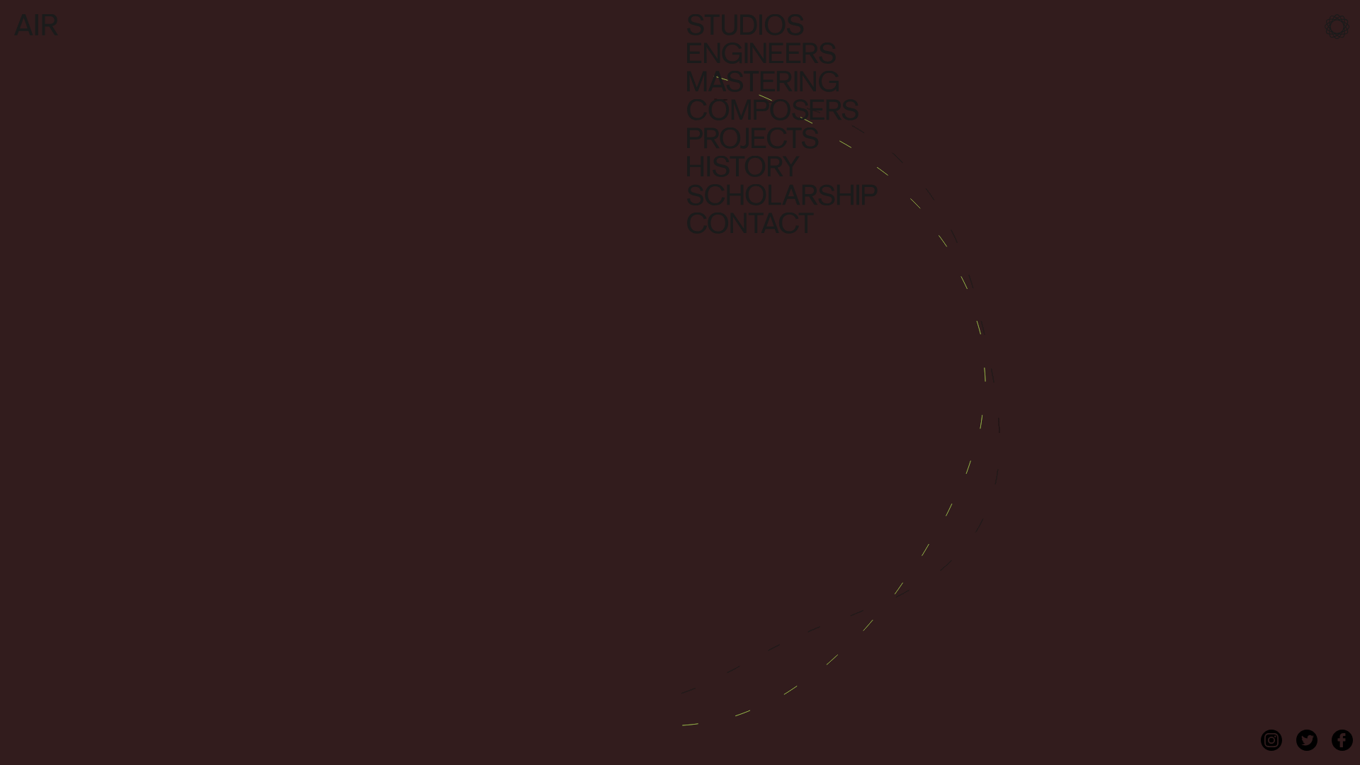
AIR Studios Minimalist Navigation Landing
A dark, minimalist layout featuring a vertical text-based navigation menu, a full-screen background video wrapper, and a dynamic canvas-based interactive drawing layer.
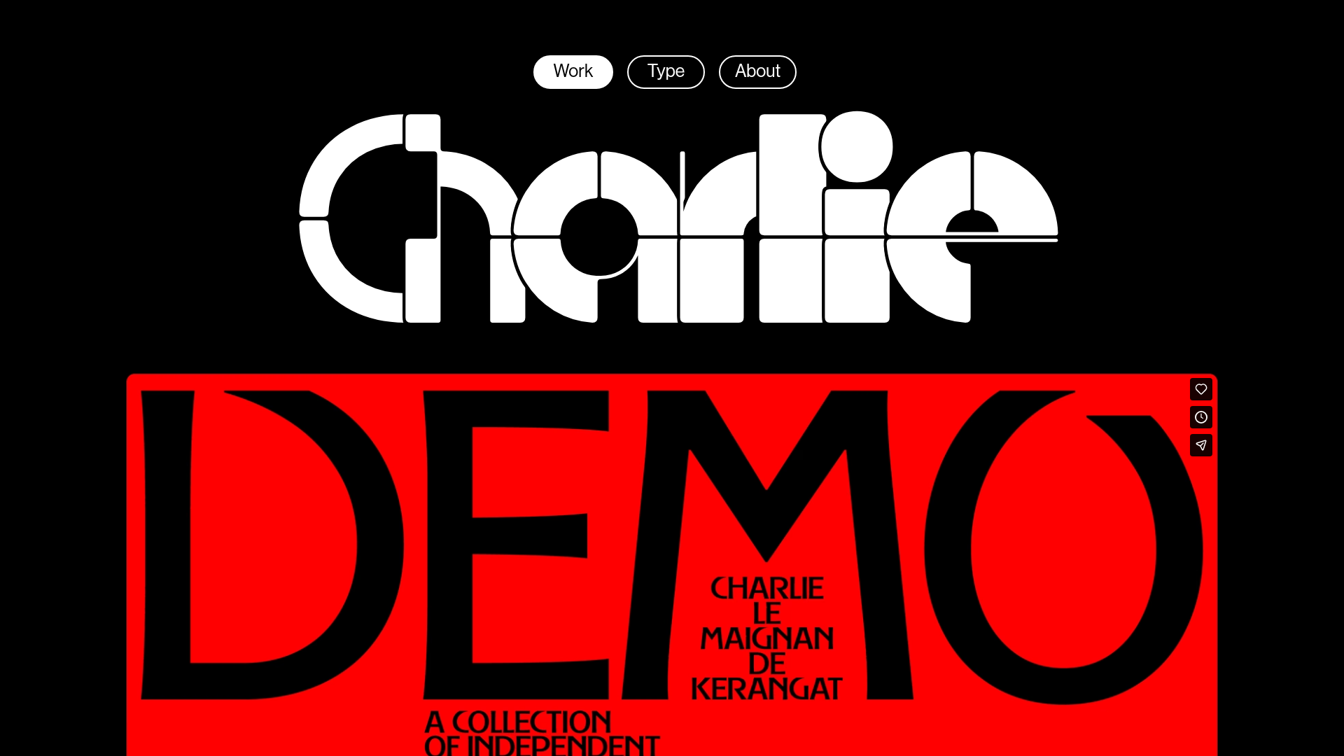
Charlie Le Maignan Portfolio Archive
A minimalist dark-mode portfolio featuring high-contrast typography, a geometric logo header, and an integrated full-width video gallery showcasing independent creative work.
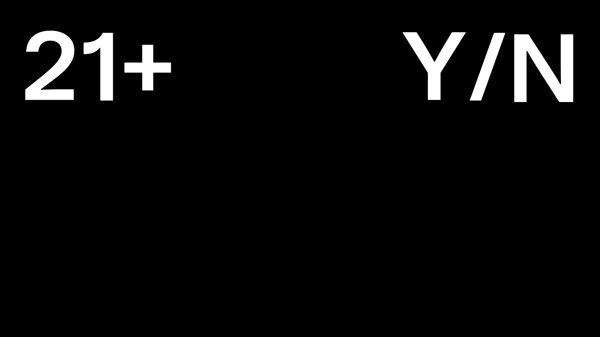
Post Familiar Minimalist Winery Storefront
An experimental e-commerce layout featuring a high-contrast age verification screen, bold typography grids, and a horizontal scrollable product showcase.
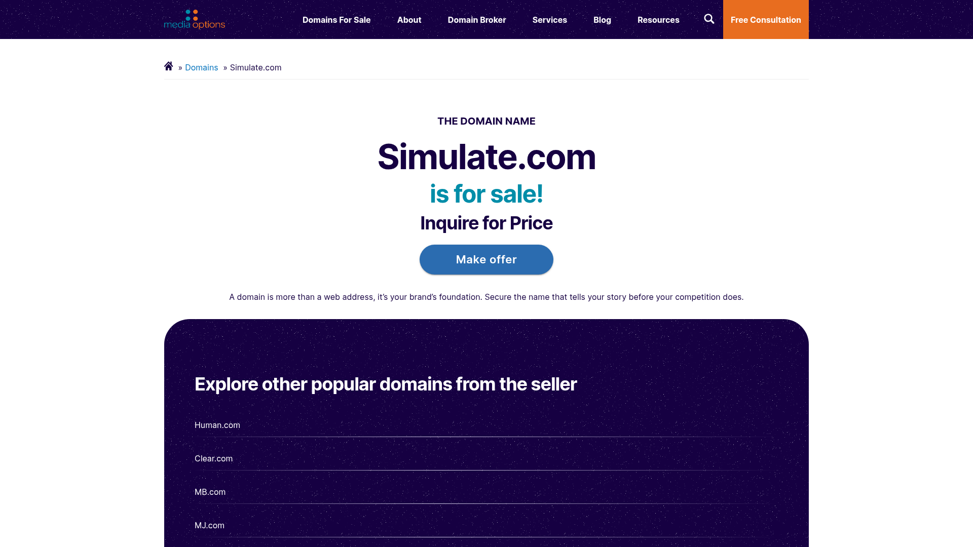
Domain For Sale Landing Page
A clean, centered landing page layout featuring a hero section for asset sales, a prominent CTA button, and a list-based showcase of related items.
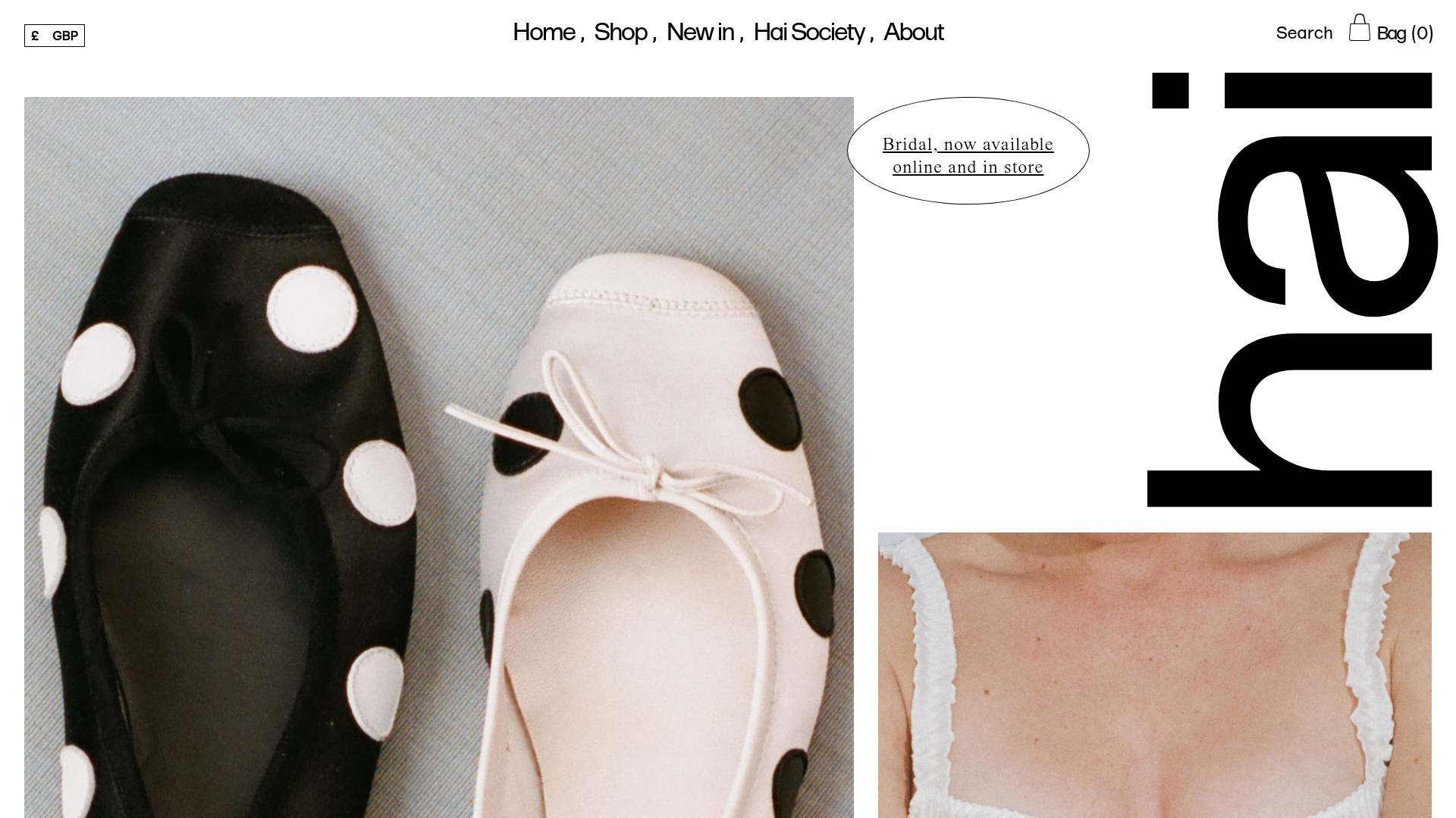
Hai Fashion E-commerce Product Grid
Minimalist boutique layout featuring asymmetrical product imagery, specialized typography, a floating circular call-to-action, and a clean grid for showcasing apparel and accessories.
