Vacation Retro Skincare E-commerce Landing
A high-impact retro aesthetic featuring coupon popups, interactive staff card generators, stylized product tiers, and a horizontal scrolling image gallery for brand storytelling.
Overview
Vacation.inc is a masterclass in nostalgic branding, using a mid-century, 1980s-inspired "leisure" aesthetic to sell modern skincare. It is an exceptional clone reference because it successfully blends heavy retro stylings—like vintage coupon popups and serif-heavy typography—with high-conversion e-commerce patterns like sticky CTA banners and product grids.
Design System
- Color Palette & Visual Hierarchy: A warm, high-contrast palette featuring a creamy off-white background (
bg-cream), sunny yellow interactive elements (bg-yellow), and deep salmon, blue, and teal accents. Hierarchy is defined by bold borders (bs4andbs2utility classes) and distinct block-coloring to separate narrative content from shopping blocks. - Typography: Heavily features Adobe Garamond (serif) for a literate, upscale retro feel, paired with Optima (humanist sans-serif) for functional UI and subheadings. The scale ranges from massive display quotes (
fs100--800) to high-density tabular data for product lists. - Page Structure:
- Hero: Full-bleed background image with a centered, high-contrast logo and floating "Shop" CTA.
- Horizontal Gallery: A smooth scroll-triggered image track using overlapping borders to mimic physical polaroids or postcards.
- Featured Products: A split-screen layout where a static legend (A, B, C, D) describes products shown in a large image container.
- Press Slider: A continuous horizontal logo marquee for social proof.
- Narrative Blocks: Asymmetric columns using rounded image masks and serif text for brand storytelling.
- Interactive Meta-Game: A "Staff Card" generator section designed for social sharing and lead capture.
- Reusable Components:
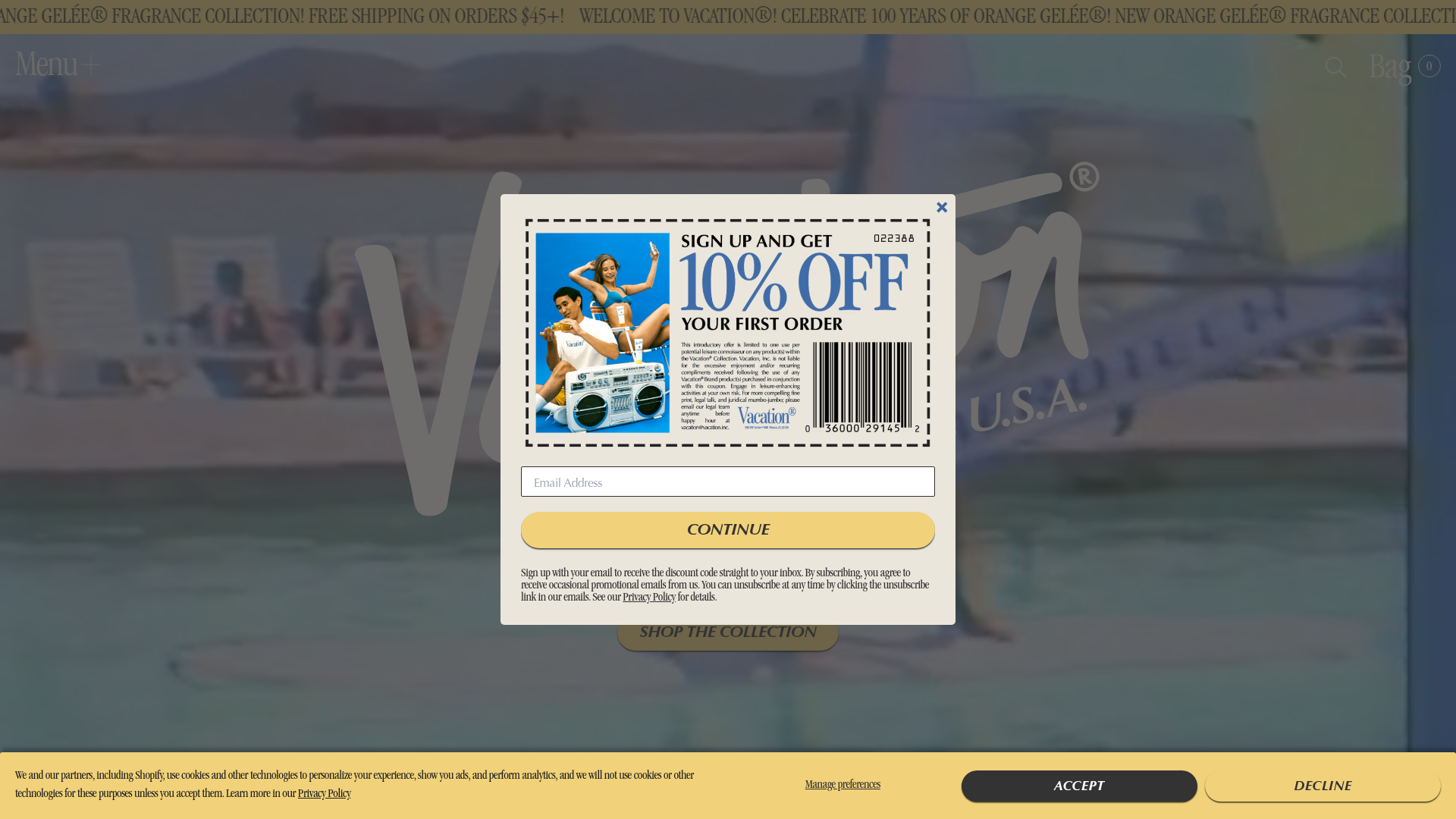
- The Coupon Popup: A high-fidelity mimic of a physical newspaper clipping with dashed borders and a barcode.
- Legend Table: A clean, numbered list component for multi-product shots.
- Banner Notification: A persistent footer bar for cookie consent that uses themed yellow and charcoal buttons.
- Interaction Patterns: Extensive use of hover-triggered "lifts" (shadow changes) and smooth entry animations for logos and text. The gallery uses horizontal translation based on scroll position.
- Implementation Clues: Built on Shopify with custom Next.js/Sanity integration. Layouts use a custom grid system (
grid-container,col,c12) and atomic utilities similar to Tailwind for specific spacing and font sizes.
Use Cases
- Who should clone this: Brands looking to break the "clean/minimalist" D2C fatigue by adopting a high-personality, period-specific visual identity.
- Effective remixes: Luxury travel goods, vintage-inspired lifestyle brands, or niche beauty lines that rely on sensory storytelling (scent, texture, memory).
- Remix Directions:
- Full-page: Use the complete flow for a brand launch that requires high emotional engagement.
- Section-only: Extract the "Legend Table" and "Product Index" for a landing page that needs to explain complex bundles or collections in a compact space.
- The "Staff Card" Trick: Modify the business card generator as a lead magnet for service-based businesses or community-driven platforms.
Related Inspirations
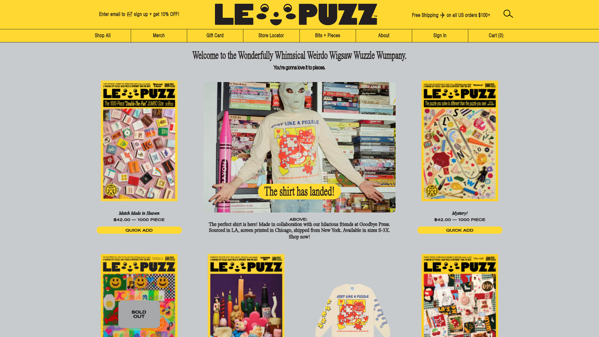
Le Puzz E-commerce Grid Gallery
A playful Shopify-based storefront featuring a responsive product grid with interactive 3D box-flipping hover effects and integrated lifestyle banners.
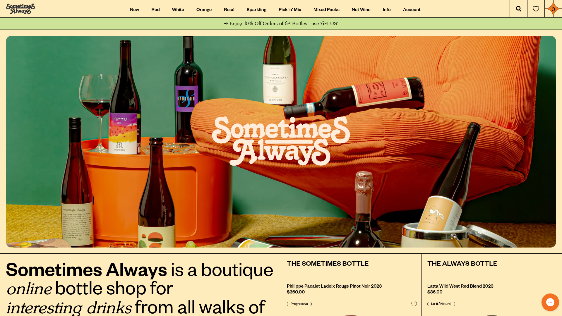
Sometimes Always Boutique Wine Shop
A high-fashion e-commerce layout featuring a serif-heavy typography system, bold overlapping image hero, and a two-column product spotlight grid with wishlist integration.

Context Gallery High-End Furniture Landing Page
A minimal editorial layout featuring a multi-column product carousel, designer biographies with image-text pairings, and a magazine-style content grid for curated design stories.

Glein Minimalistic Bento Grid eCommerce
A clean, modular layout using a bento-style responsive grid of text teasers and large-scale product imagery for lookbooks and collection browsing.
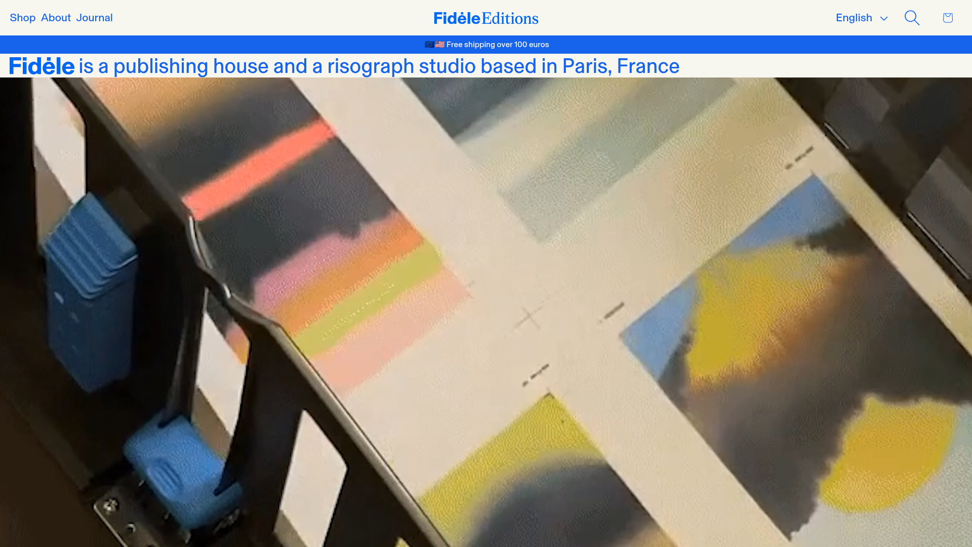
Fidèle Editions Art Studio Store
A minimalist e-commerce layout featuring a high-impact video hero, horizontal product carousels with hover-triggered image swaps, and a clean editorial-style blog section.
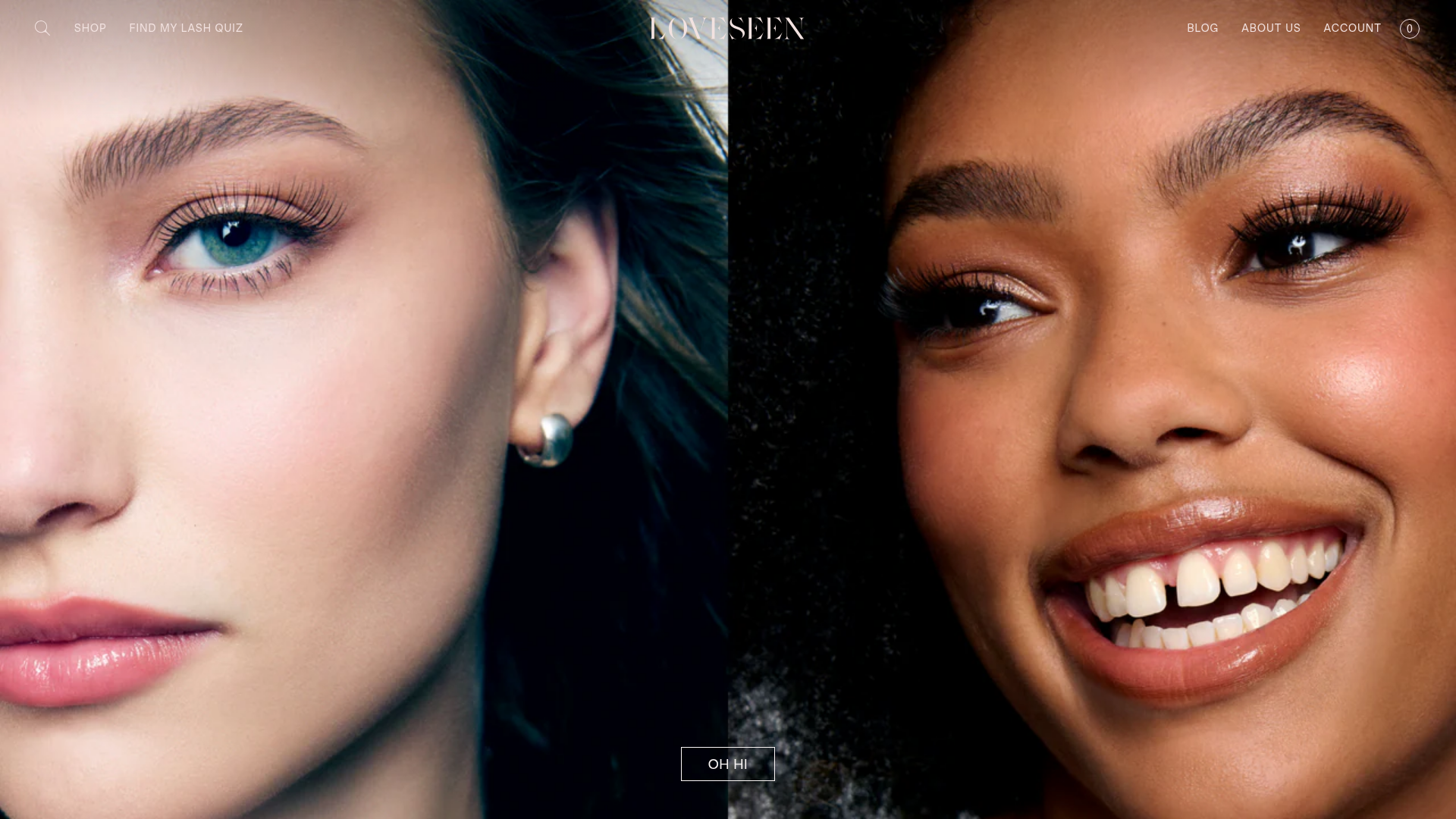
LoveSeen Beauty E-commerce Landing Page
A high-impact beauty retail site featuring a split-screen full-bleed hero image, minimalist navigation, and a horizontally scrolling user-generated content (UGC) Instagram slider.
