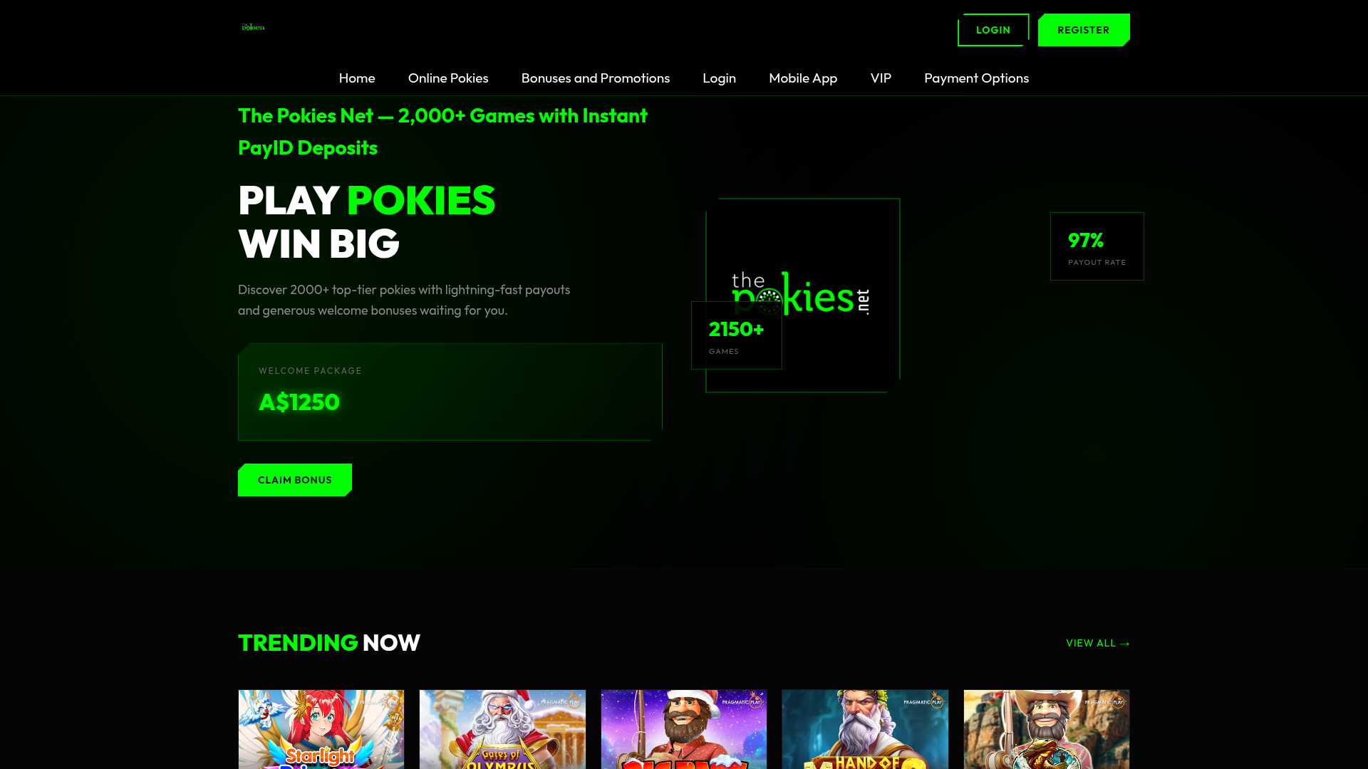
The Pokies Net Gaming Landing Page
A high-contrast dark mode landing page featuring a neon-accented hero section, game card grids with hover effects, and detailed statistical data tables.
Overview
This landing page is a high-impact, dark-mode gaming portal designed for maximum conversion through aggressive neon accents and clear value propositions. It serves as an excellent reference for cloning high-contrast layouts that require blending dense statistical data with vibrant, image-heavy gambling or entertainment content.
Design System
- Color Palette & Visual Hierarchy: The site uses a deep black (#000000) background to make the "Electric Green" (#00FF00) accents pop. This green is used strategically for primary calls to action (CTAs), headings, and numerical highlights (like the A$1250 bonus), creating a clear path for the user's eye from the hero offer to the game grid.
- Typography: The system relies on bold, sans-serif typefaces. The hero section features oversized uppercase headers with span-colored highlights. The hierarchy is maintained through massive scale for the main hook ("PLAY POKIES"), medium weight for subheadings, and smaller, low-contrast grey text for secondary descriptions.
- Page Structure: The flow follows a standard conversion funnel: 1. Hero with immediate CTA and bonus box, 2. Secondary statistical badges (97% payout rate), 3. Horizontal game grid ("Trending Now"), 4. Multi-column statistical data bar (Payout Rate, Game Count), and 5. Dense SEO/Informational content with data tables.
- Reusable Components:
- Hero Bonus Box: A bordered container featuring
neon-glowandneon-textclasses for high visibility. - Game Cards: Rectangular image containers with a
.game-overlaythat reveals a "Play" button on hover. - Data Tables: Clean, high-contrast tables using
<th>for categories and<td>for data, ideal for technical specs or comparison features. - Navigation: A minimal top-bar with transparent login and solid-fill register buttons using the
.btn-fillclass.
- Hero Bonus Box: A bordered container featuring
- Interaction Patterns: The design utilizes hover-state transitions on buttons and game tiles. The "Claim Bonus" and "Register" buttons use high-saturation green fills that provide immediate feedback against the dark background.
- Implementation Clues: The HTML reveals a container-based grid system (
hero-grid,games-grid,stats-grid) optimized for rapid content injection. The use of specific utility classes likeneon-glowsuggests a CSS-heavy approach to styling rather than complex JavaScript animations.
Use Cases
- Who should clone this: Developers building affiliate marketing sites, online casinos, crypto-betting platforms, or esports tournament hubs where "win-centric" branding is essential.
- Product Remixing: This layout can be effectively adapted for SaaS dashboards that require high-contrast data visualization or product launch pages for “pro” gear (e.g., gaming peripherals, software dev tools) by swapping the green for brand-specific neon colors like cyan or magenta.
- Remix Directions:
- Quick Section Clone: Port the
stats-barandhero-bonus-boxto existing sites to highlight key performance indicators or pricing tiers. - Full-Page Clone: Use the entire structure for a high-traffic landing page where SEO text needs to live below the fold without distracting from the primary visual CTAs.
- Quick Section Clone: Port the
- Scope: A full-page clone is recommended to maintain the psychological impact of the high-contrast "dark-to-light" hierarchy.
Related Inspirations
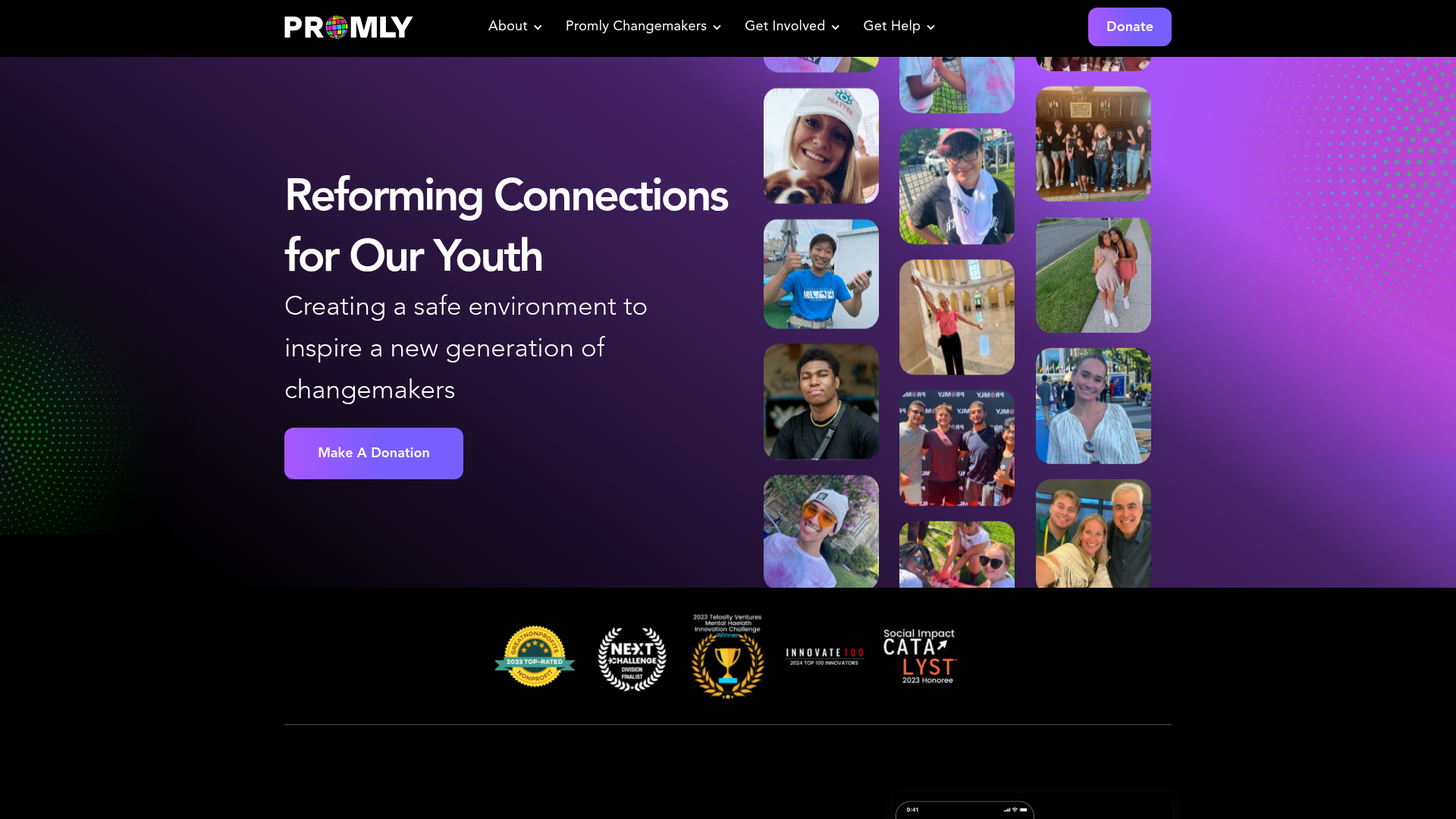
Promly Youth Platform Landing Page
A vibrant dark-mode layout featuring a vertical image marquee, bento-style reward cards, and a press-worthy horizontal slider for community-focused organizations.
Gambling Landing Page with Promotional Banners
A dark-themed landing page featuring structured promotional banners, a grid of payment provider logos, and a basic e-commerce product layout with quantity selection and checkout buttons.
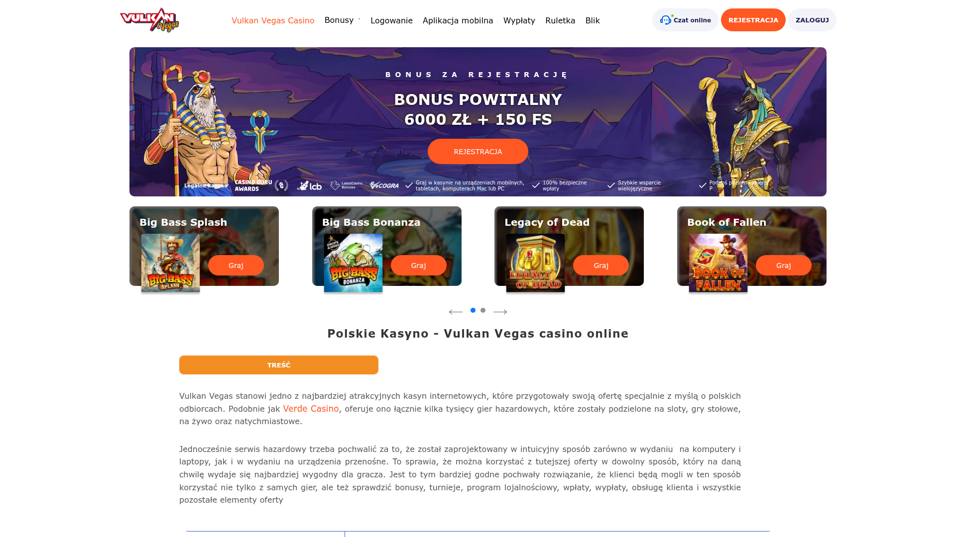
Vulkan Vegas Casino Landing Page
A gaming-focused landing page featuring a central hero carousel, a tabbed slot game preview grid, detailed data tables, and an accordion-style FAQ section for high-content layouts.
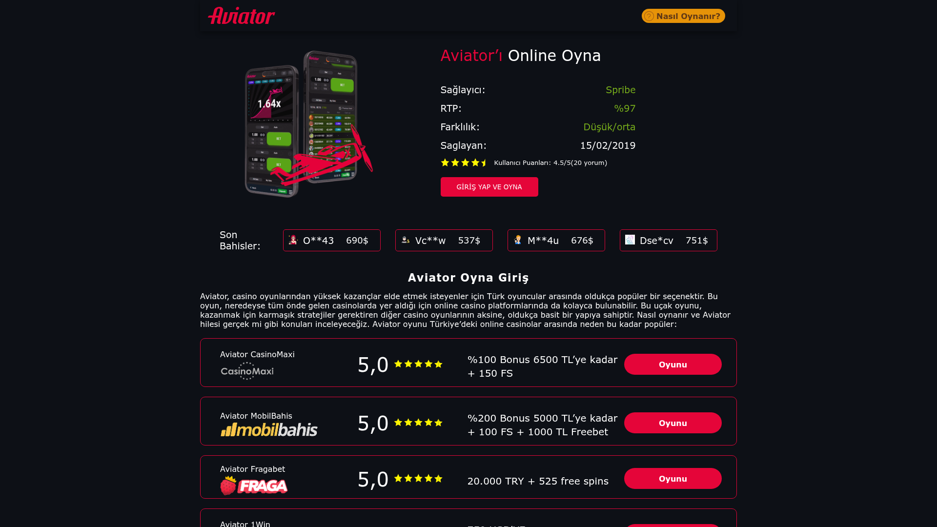
Aviator Gaming Promo Landing Page
A dark-themed gambling affiliate site featuring a statistical hero section, live-looking bet tickers, and a structured list of platform comparison cards with ratings.
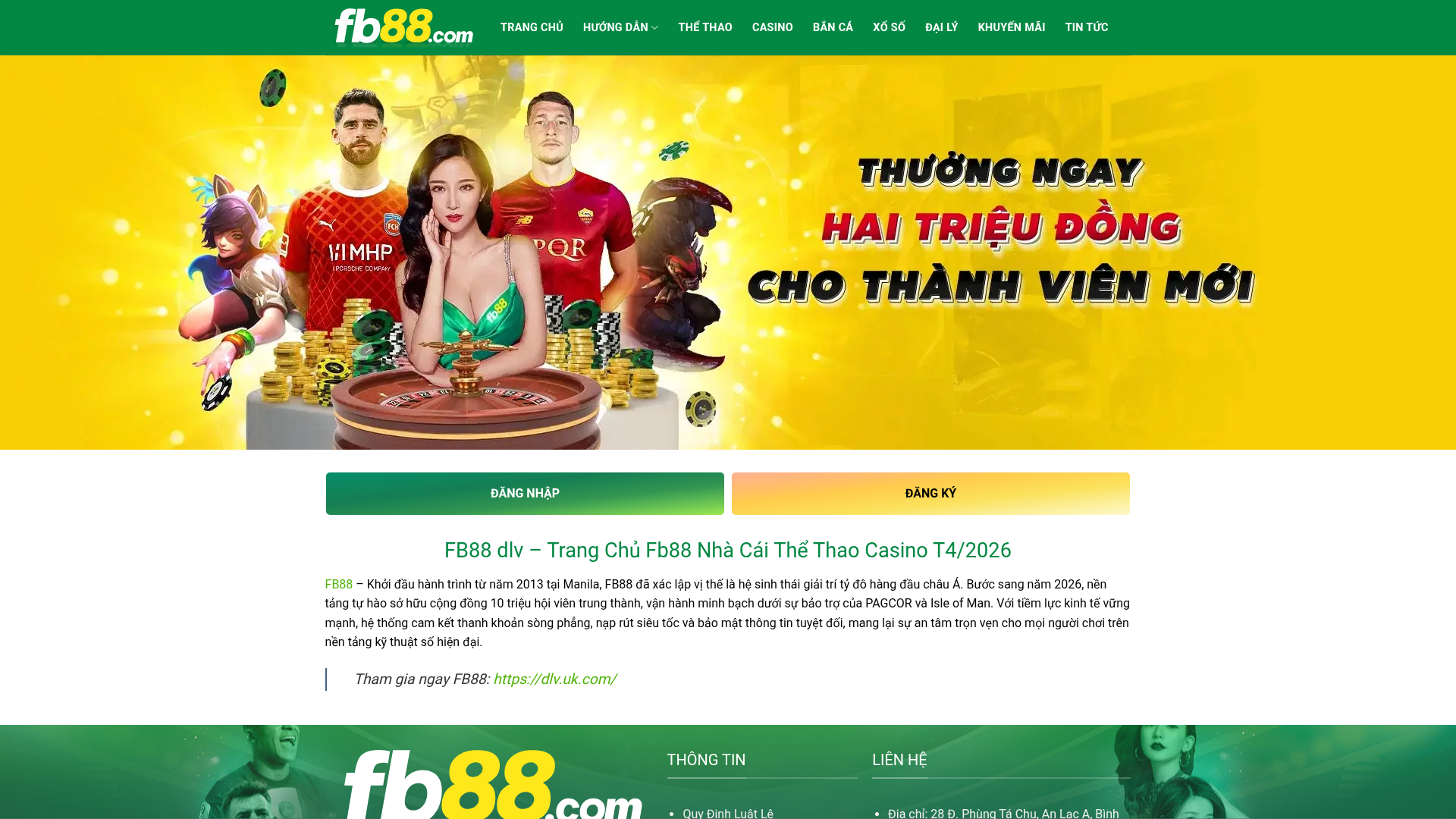
FB88 Betting Portal Homepage
A gaming-focused layout featuring an high-impact hero slider, dual-action CTAs, a structured SEO content section with data tables, and an accordion-style FAQ.
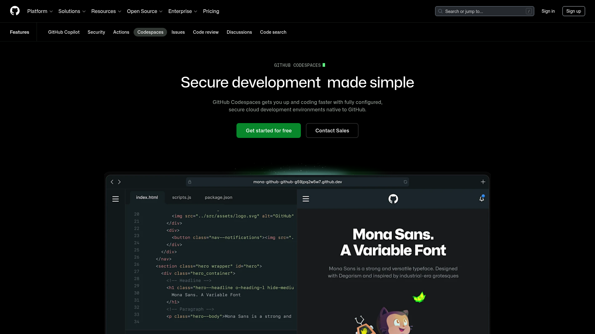
GitHub Codespaces Feature Landing Page
A dark-themed product page featuring a terminal-inspired hero section, cursor animations, staggered feature 'rivers' with media, and a breakout wide-image component for dashboards.
