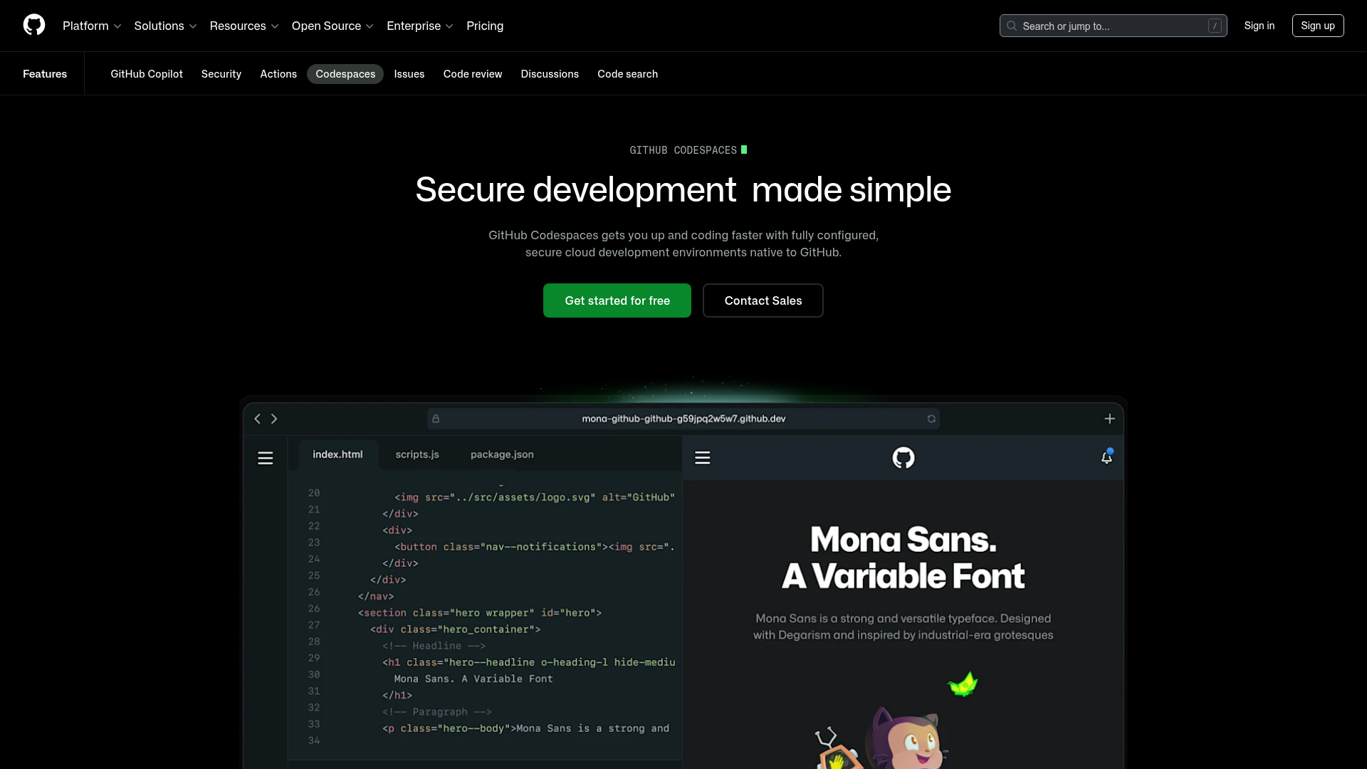
GitHub Codespaces Feature Landing Page
A dark-themed product page featuring a terminal-inspired hero section, cursor animations, staggered feature 'rivers' with media, and a breakout wide-image component for dashboards.
Overview
This is a high-impact product landing page for GitHub Codespaces, designed to showcase developer tools through a dark-themed, immersive interface. It is a premier reference for cloning because it masterfully balances technical documentation aesthetics with modern marketing components, such as terminal-inspired hero sections and 'river' layouts.
Design System
- Color Palette & Visual Hierarchy: The page uses a deep black background (
--brand-color-canvas-default) to create a high-contrast environment. Primary actions use a vibrant 'GitHub Green' (#238636), while secondary actions and secondary text use muted grays to maintain focus on the main content. This hierarchy emphasizes the "Get started" call-to-action above all else. - Typography: The design features Mona Sans, a versatile industrial-era grotesque typeface. The scale is hierarchical, using large display headings for value propositions and monospace fonts for technical labels and terminal-style animations to evoke a coding environment.
- Page Structure: The flow begins with a centralized Hero section, followed by alternating 'River' sections (text paired with imagery) that explain core features, and a 'River Breakout' wide-image component that displays a full-width dashboard interface to provide social proof of the tool's capability.
- Reusable Components: Key items to clone include the animated text cursor label, the primary/secondary button pair with semi-transparent borders, and the 'River' layout which uses a 50/50 grid split. The sub-navigation bar is also a critical reusable element for multi-feature platforms.
- Interaction & Motion: The page includes a typewriter/cursor animation in the hero label and likely utilizes smooth scroll transitions. Images are wrapped in rounded-corner containers with subtle gradients to soften transitions between the canvas and media.
- Implementation Clues: The HTML reveals the use of
@primer/brandcomponents, leveraging utility classes for spacing (e.g.,pb-0,tmp-px-3) and CSS variables for theming. The structure relies on<section>tags with grid-based container wrappers.
Use Cases
- Who should clone this pattern: Developers building SaaS platforms, IDE extensions, or cloud infrastructure tools that need to convey both technical power and ease of use.
- Remix Directions: Swap the GitHub Green for another brand accent color to instantly rebrand; adapt the terminal hero into a browser mockup for web-based products; or reuse the 'River Breakout' wide-image component to showcase high-fidelity dashboard views.
- Suggested Clone Scope: A quick section clone of the Hero and the first 'River' feature block is ideal for a landing page MVP. For a comprehensive product launch, a full-page clone provides a robust framework for storytelling and feature deep-dives.
Related Inspirations
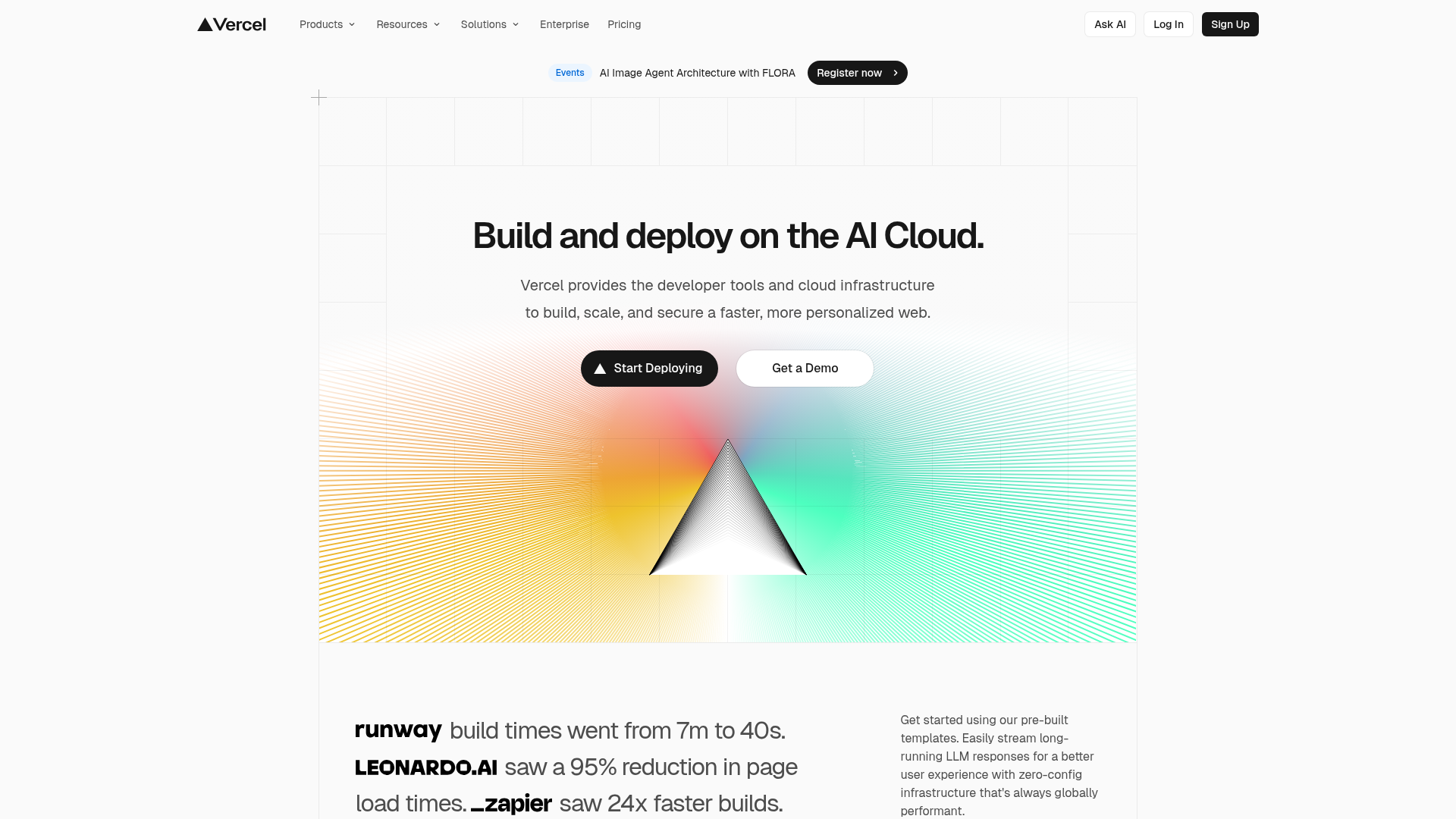
Vercel AI Cloud Landing Page
A modern landing page featuring a minimalist dark-themed navbar, a grid-overlay hero section with radial color gradients, and high-contrast typography for customer success stories.
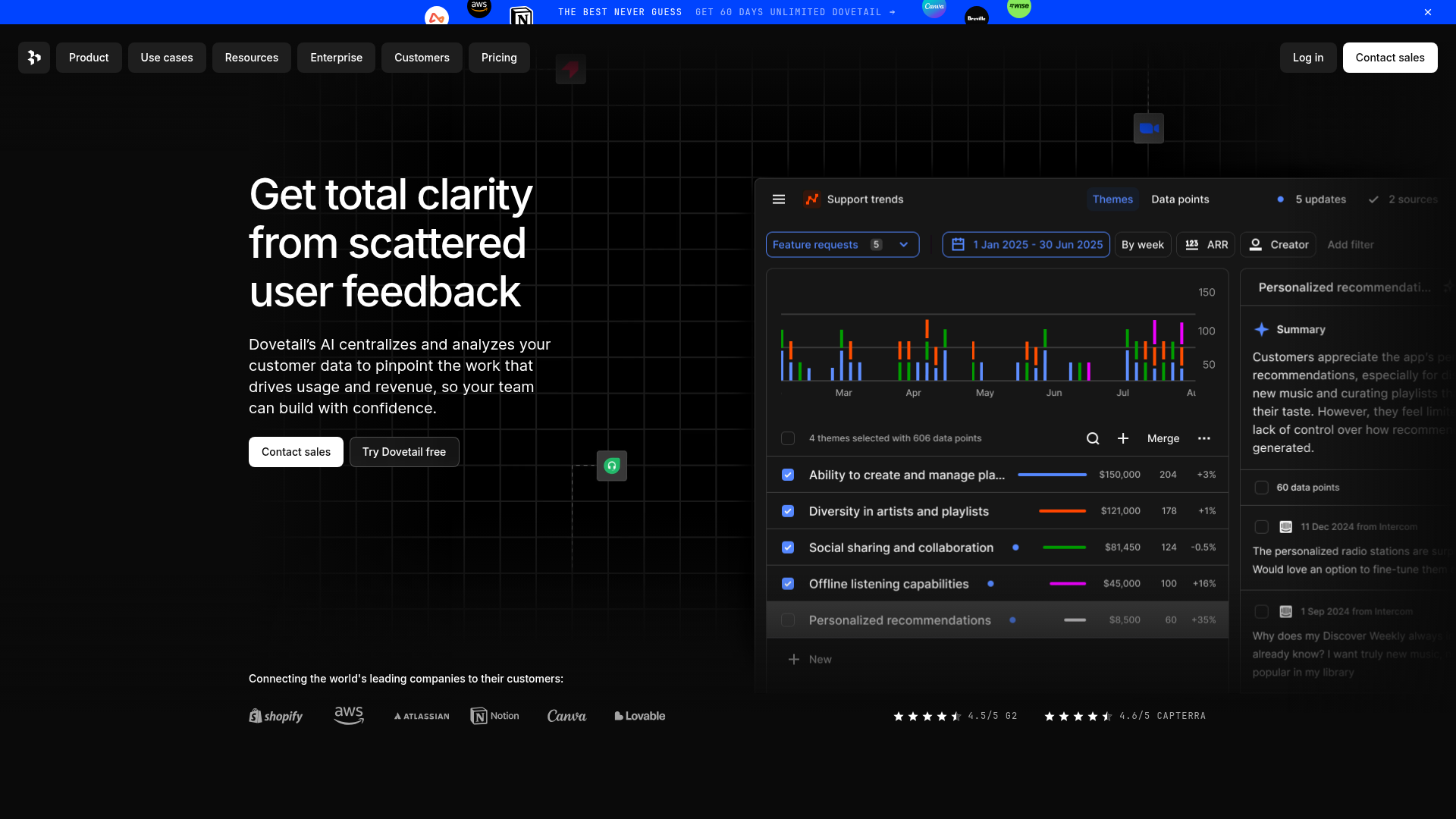
Dovetail AI SaaS Landing Page
A dark-themed landing page featuring a grid-pattern hero, layered product dashboard previews, feature walkthroughs with sticky scrolling, and integrated logo carousels.
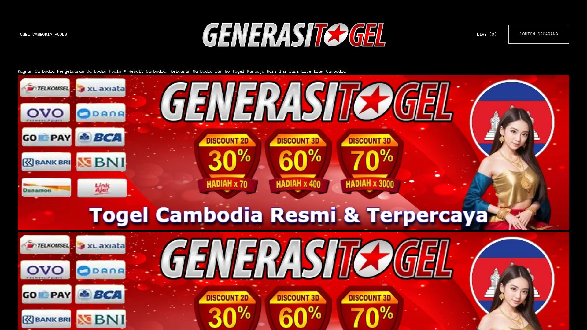
Gambling Landing Page with Promotional Banners
A dark-themed landing page featuring structured promotional banners, a grid of payment provider logos, and a basic e-commerce product layout with quantity selection and checkout buttons.
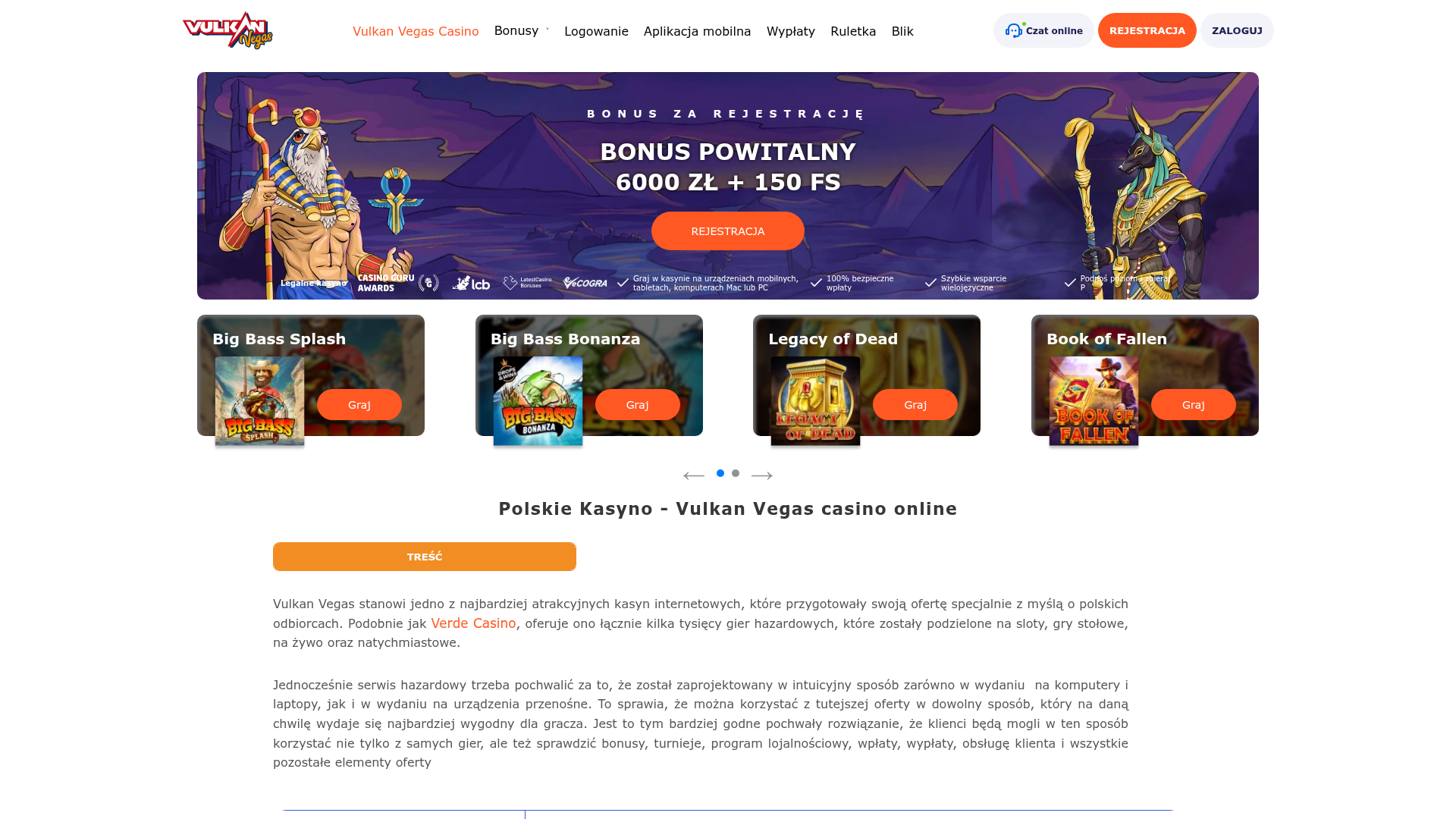
Vulkan Vegas Casino Landing Page
A gaming-focused landing page featuring a central hero carousel, a tabbed slot game preview grid, detailed data tables, and an accordion-style FAQ section for high-content layouts.
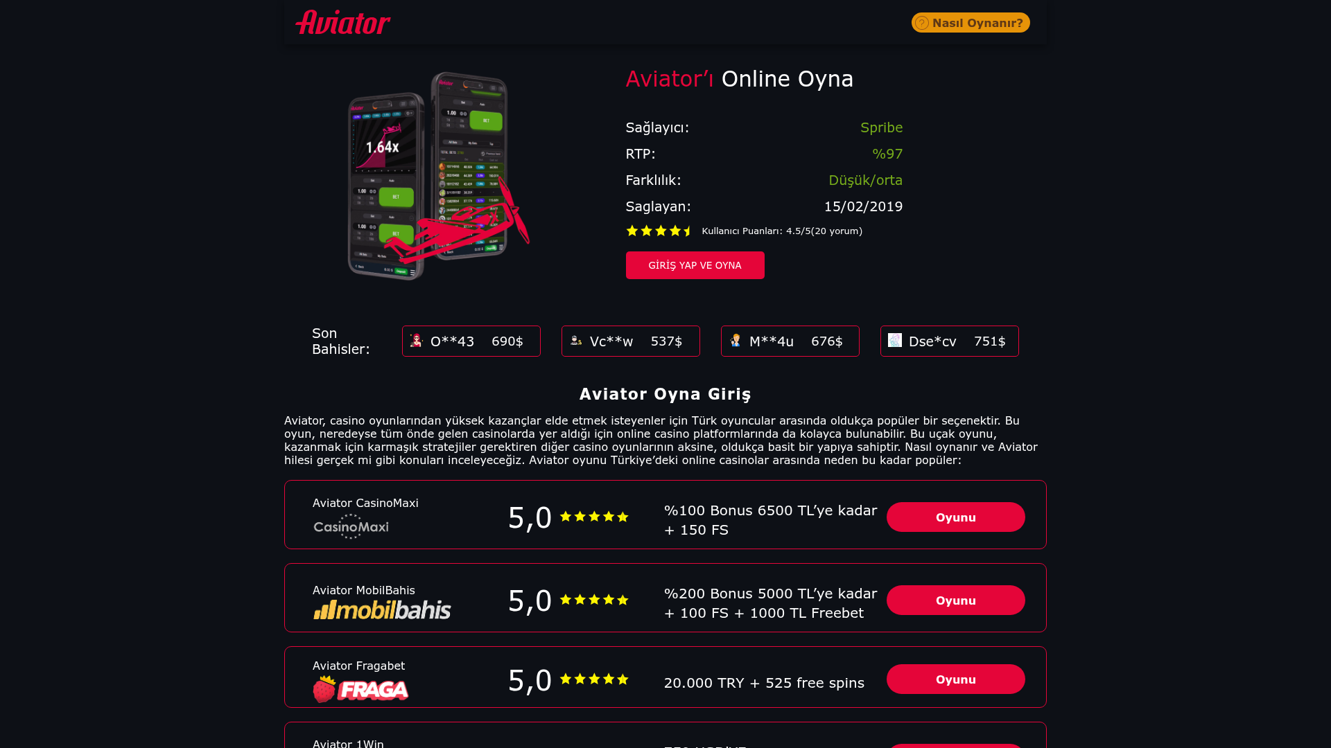
Aviator Gaming Promo Landing Page
A dark-themed gambling affiliate site featuring a statistical hero section, live-looking bet tickers, and a structured list of platform comparison cards with ratings.
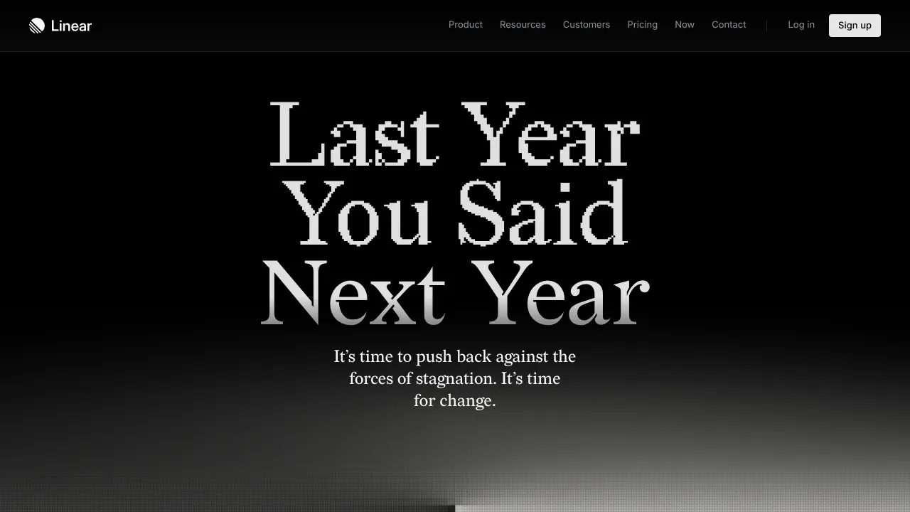
Linear Campaign Landing Page Mockup
A high-contrast dark mode hero section featuring pixelated serif typography, a minimalist navigation header, and a subtle monochrome gradient background.
