Minimal Dark Redirect and 404 Page
A clean, centered landing page layout on a solid dark background featuring a minimal redirection card with typography and a call-to-action button.
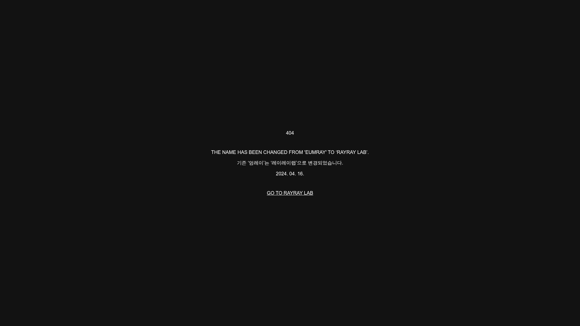
Overview
This is a minimalist re-branding and 404 redirection page that uses a high-contrast dark theme to communicate site changes. It serves as an excellent reference for builders looking to implement clean, typography-focused utility pages that prioritize information hierarchy and clear user action over visual clutter.
Design System
- Color Palette & Visual Hierarchy: The design uses a monochromatic "Dark Mode" aesthetic with a solid black (#000000) background and pure white text. Hierarchy is established through text weight and casing rather than color variance, keeping the emphasis on the core message.
- Typography System: The layout utilizes a sans-serif typeface. The secondary headline (404) and the primary English message are set in all-caps to denote importance, while the Korean translation and date use standard sentence case for readability.
- Page Structure: A centered vertical stack is used. The order is: Status Code (404) > Primary Message (English) > Secondary Message (Korean) > Date > Call-to-Action (CTA).
- Reusable Components: The central "btn" class button is the primary reusable element. It features a transparent background with a white underline (text-decoration), acting as an elegant, low-profile alternative to a standard solid-block button.
- Implementation Clues: The HTML reveals a simple semantic
mainwrapper with acontents_wrapclass, suggesting a flexbox or CSS grid implementation to center the content perfectly in the viewport (likely usingjustify-content: centerandalign-items: center).
Use Cases
- Who should clone this pattern: Developers needing a quick, professional placeholder for domain migrations, brand identity updates, or custom 404 error pages.
- What products can remix it effectively: Portfolio sites, design studios, or tech startups that want a "brutalist" or minimal aesthetic for their utility pages.
- Practical remix directions: Swap the black background for a deep brand color or a subtle dark gradient; replace the 404 subtitle with a logo for a landing page; or add a simple countdown timer for "Coming Soon" pages.
- Suggested clone scope: This is ideal for a full-page clone. The code footprint is minimal, making it a perfect component to drop into an existing project as a dedicated error or maintenance route.
Related Inspirations
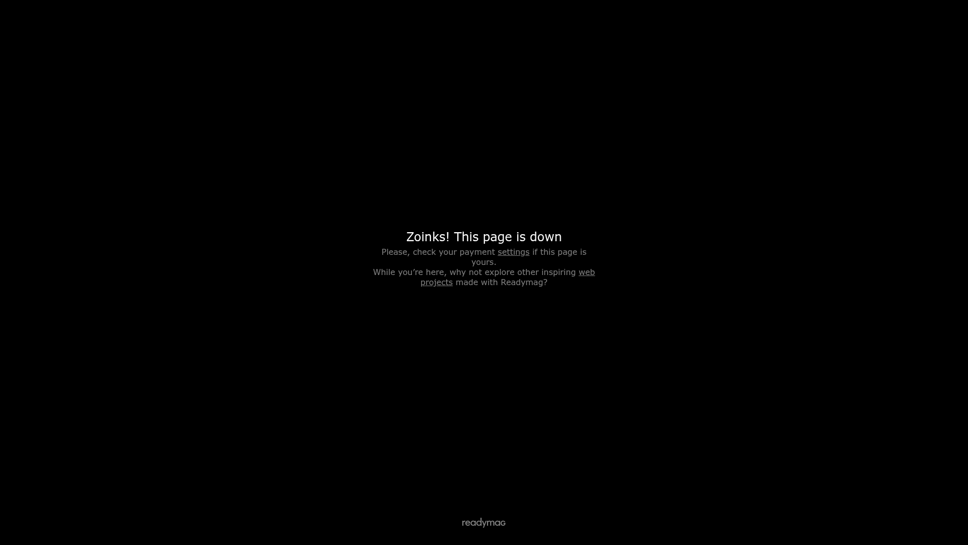
Readymag Service Interruption Page
A minimal black-and-white error screen template featuring centered typography, hyperlinks for troubleshooting, and a brand logo footer.
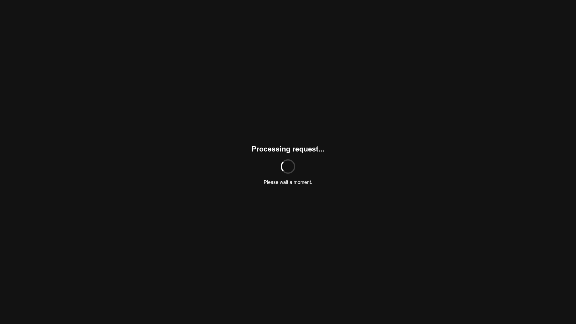
Minimalist Dark Mode Loading Screen
A clean, dark-themed redirection page featuring a centered typography layout and a CSS circular loading spinner for asynchronous processing states.

Google Holiday 100 Curator Landing Page
A minimalist e-commerce showcase featuring a wide hero section, clean search integration, and a bold typography-driven header designed for trending product collections.

Finn Pet Supplements Landing Page
An e-commerce landing page featuring high-contrast typography, a sticky brand logo banner, parallax scroll effects on product headers, and a clean product grid.

GoCardless Payments Platform Landing Page
A dark-themed fintech landing page featuring a split-screen video hero, bento-style feature cards, a horizontal logo slider, and step-by-step accordion guides.
Playspace Acquisition Announcement Minimalist Layout
A clean, center-aligned announcement template featuring a vertical stack of rich text content and linked text elements on a neutral background.
