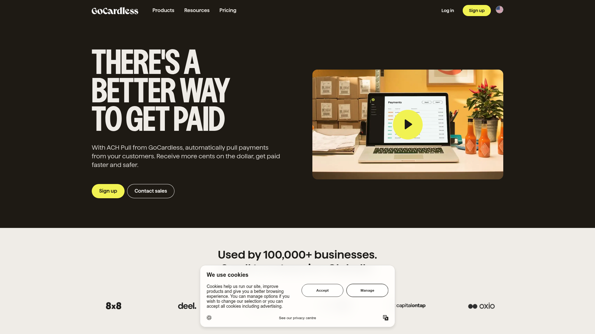
GoCardless Payments Platform Landing Page
A dark-themed fintech landing page featuring a split-screen video hero, bento-style feature cards, a horizontal logo slider, and step-by-step accordion guides.
Overview
This landing page for GoCardless is a premier example of high-contrast, professional fintech design. It balances a bold, dark-themed aesthetic with a clean, structured content hierarchy, making it an excellent reference for cloning high-conversion B2B service pages. Key features include a split-screen video hero, a trust-building logo carousel, and sophisticated bento-style feature grids.
Design System
- Color Palette & Visual Hierarchy: The design primarily uses a deep "Off-Black" (#1a1917) background contrasted with a vibrant "Acid Lime" (#f1f252) used for primary CTAs and accents. Secondary sections shift to a soft "Off-White" (#faf9f7) to create a clear visual distinction between value propositions and social proof.
- Typography: The system utilizes a bold, all-caps sans-serif for H1 headers to convey authority, paired with a highly legible, medium-weight sans-serif for body copy. Size scales are dramatic, emphasizing large-scale benefit statements over supporting text.
- Page Structure: The flow follows a proven conversion sequence: High-impact hero with video -> Logo slider (trust) -> Multi-column feature highlights -> Grid-based service cards ("Everything your business needs") -> Customer testimonial (social proof) -> Step-by-step accordion guide -> Final CTA.
- Reusable Components:
- Hybrid Buttons: Rounded pill-shaped buttons include a solid "Acid Lime" primary style and a transparent "Contact Sales" outline style.
- Bento Cards: Content blocks with generous internal padding and rounded corners (24px) for modern feature showcasing.
- Step-by-Step Accordion: A numbered vertical list that reveals detailed content and contextual images on click.
- Implementation Clues: The HTML reveal a Gatsby-based architecture using CSS-in-JS (emotion/styled-components) with a focus on 'slices' (modular sections) that facilitate easy component reuse across different templates.
Use Cases
- Who should clone this: SaaS startups, payment processors, and professional service firms looking to project both modern innovation and enterprise-grade reliability.
- Remix Directions: Replace the high-contrast dark theme with a brand-specific primary color while keeping the bento-grid layout. The "Start collecting payments now" step-by-step accordion is particularly effective for onboarding-heavy products and can be isolated for use on 'How it Works' pages.
- Clone Scope: Builders can effectively clone specific 'slices' like the logo wall or the feature grid for immediate impact, though the full-page flow is ideal for a comprehensive product launch site.
Related Inspirations
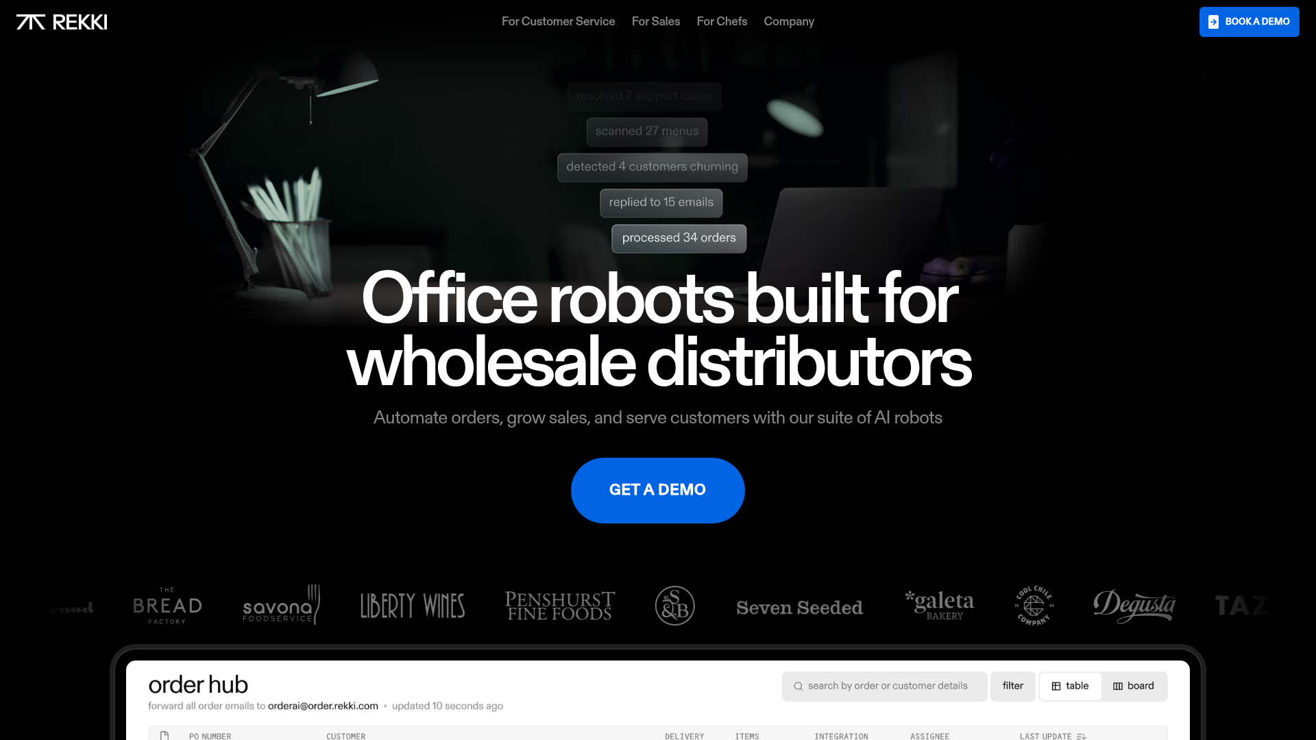
REKKI AI Automation SaaS Landing Page
A high-impact dark-mode landing page featuring a floating label hero section, marquee brand logos, an interactive dashboard UI preview, and card-based testimonial grids.
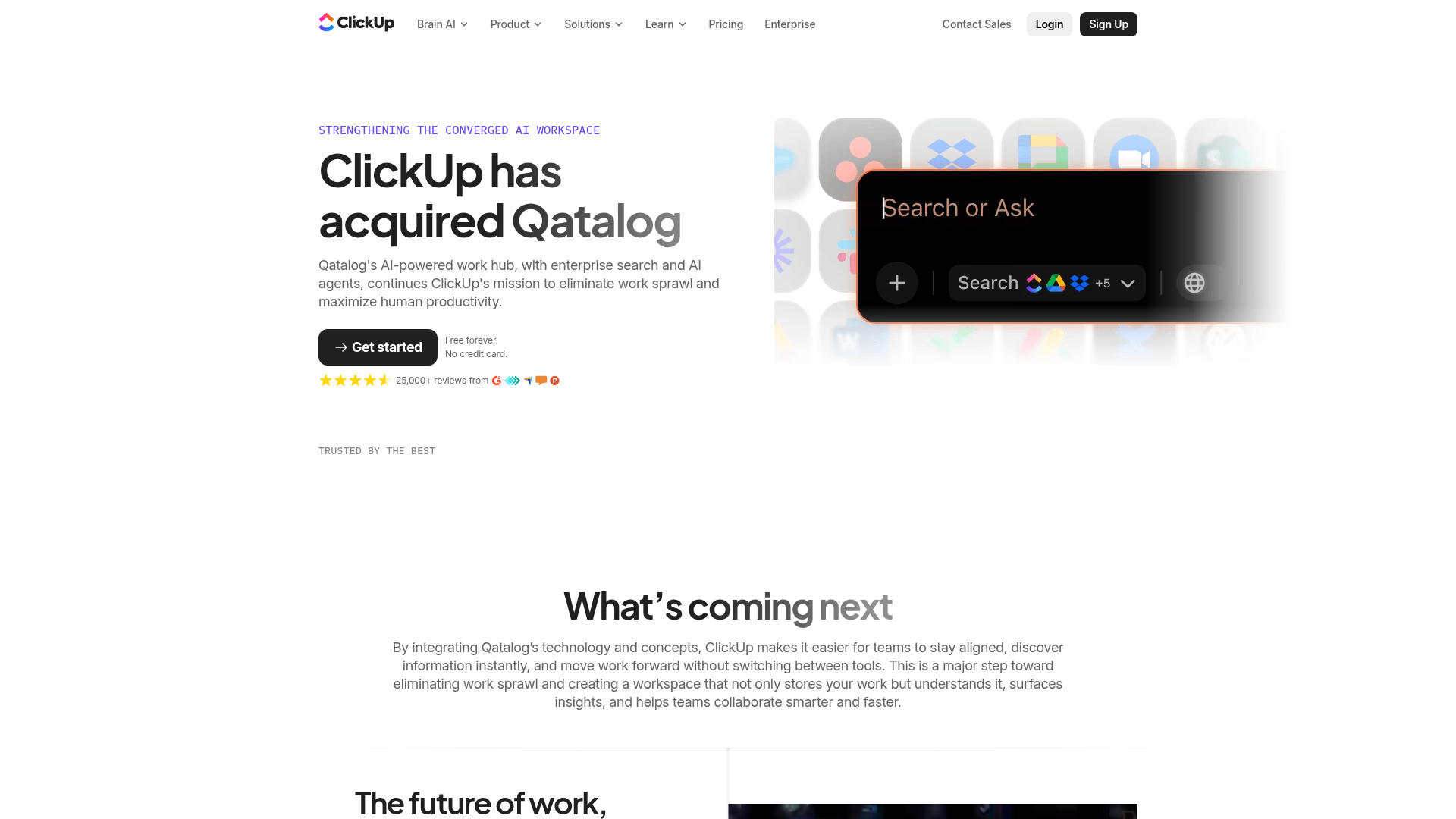
ClickUp Acquisition Hero Landing Page
Features a modern dark-themed hero section with a search UI graphic, bento-style feature grid, and a high-contrast CTA section with decorative gradients.
Dynadot Domain Parking Page
A minimalist domain registration placeholder featuring a branded sticky header banner and a full-height dark background layout.
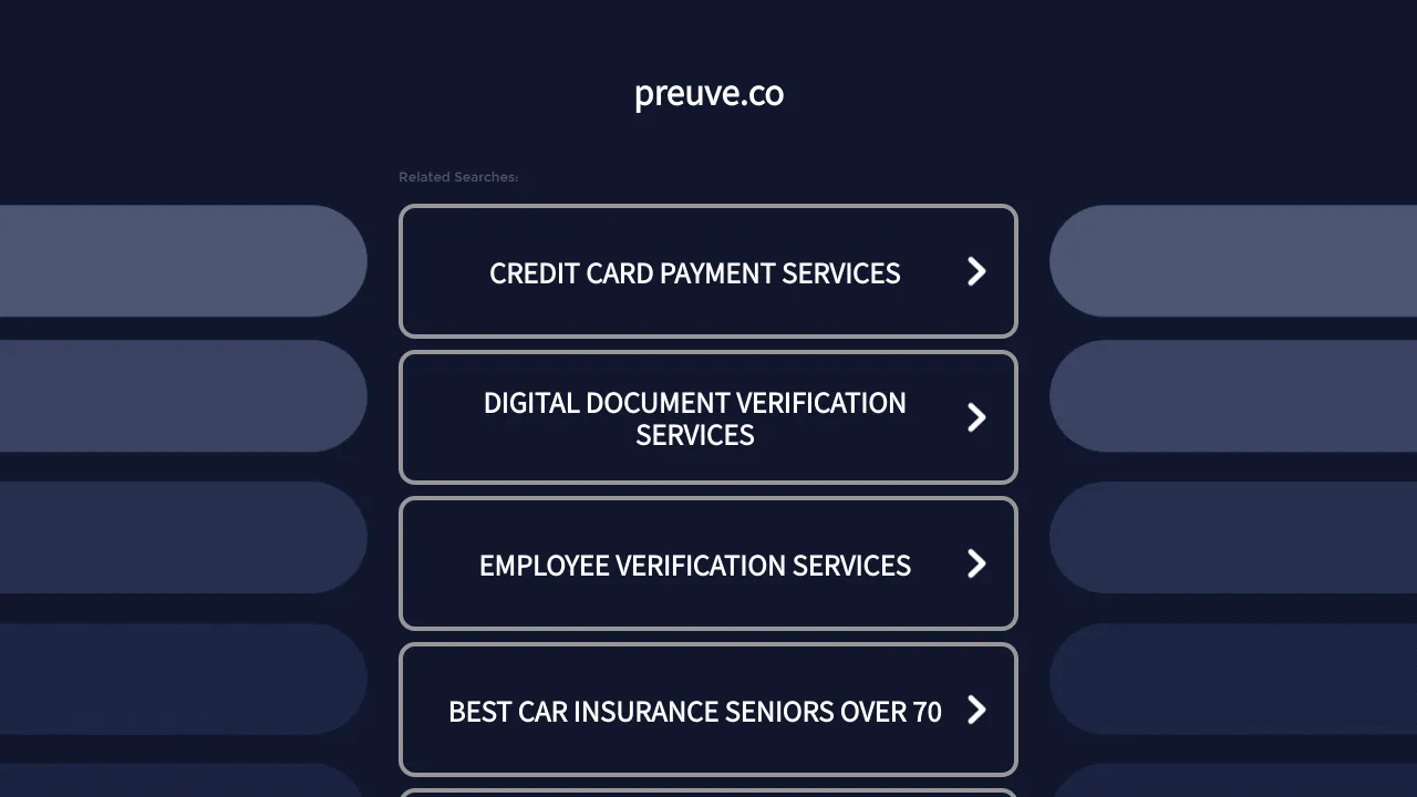
Preuve.co Search Index Landing Page
A dark-themed search directory layout featuring a centered brand header and vertically stacked rectangular navigation cards with chevron icons and hover effects.
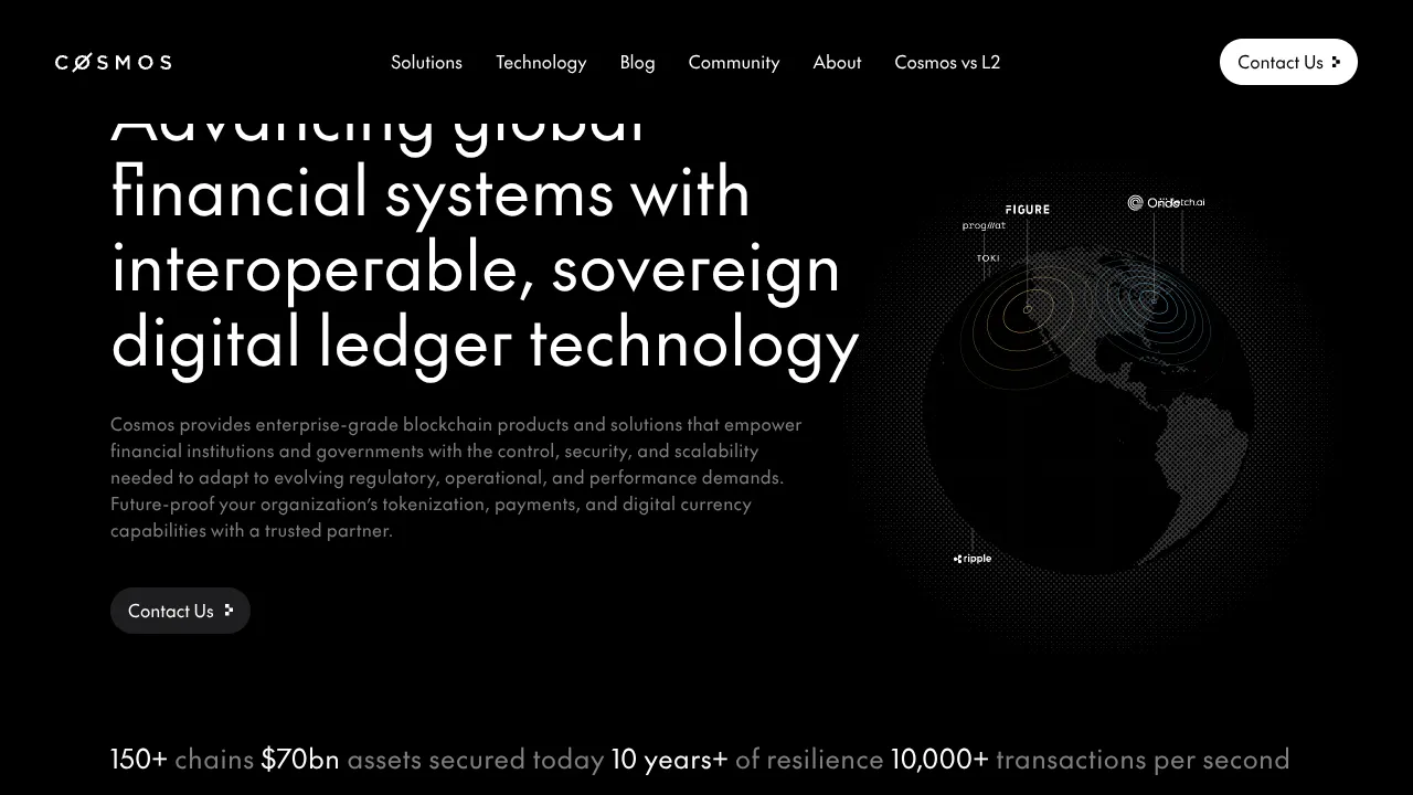
Cosmos Network Enterprise Landing Page
A dark-themed blockchain hero section featuring a minimalist navigation header, high-contrast typography, a stylized digital globe graphic, and a statistics-based footer ribbon.
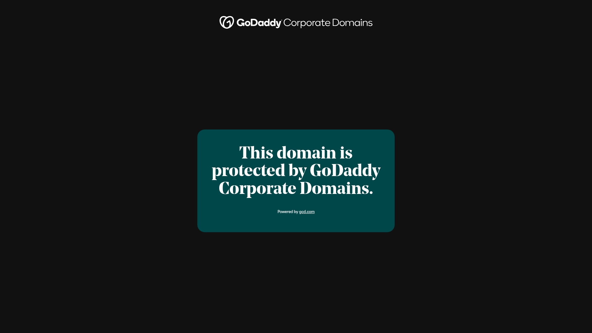
GoDaddy Corporate Domain Protection Page
A minimalist domain verification layout featuring a centered card, large serif typography, and a logo header on a dark background.
