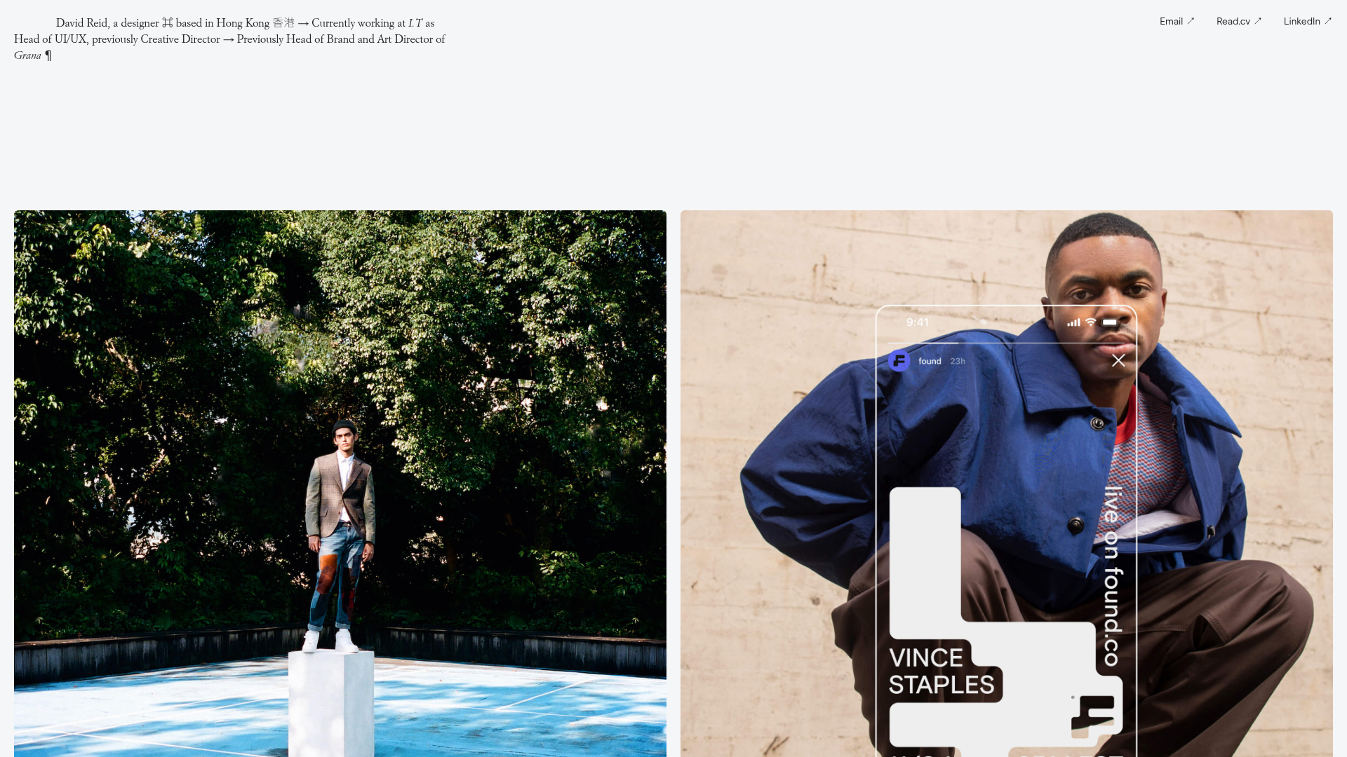
Davis Reid Minimalist Portfolio Grid
A clean designer portfolio featuring a typography-focused header, a fluid multi-column image grid for case studies, and a structured text-based experience footer.
Overview
This portfolio is a masterclass in minimalist editorial design, using heavy typographic contrast and a flexible CSS grid to showcase high-end fashion and digital product work. It is an excellent reference for builders who want to create a high-signal, low-noise site that prioritizes large-scale imagery and clean information architecture.
Design System
- Color Palette & Visual Hierarchy: The site uses a high-contrast monochromatic base (black and white) with a light grey background (#F3F3F3) to ensure that the vibrant, full-bleed photography remains the focal point. Visual hierarchy is established through extreme shifts in font weight and style rather than color.
- Typography System: A sophisticated pairing of a serif font (Garamond-style) for the narrative intro and "Experience" headers, and a clean sans-serif (Modernbody) for project titles and descriptions. The scale is kept consistent across the footer grid to create a structured, resume-like feel.
- Page Structure & Section Flow: The layout begins with a fixed-width typographic header containing a bio and navigation links. This is followed by a
w-layout-griddisplaying project case studies in a multi-column format. The site concludes with a "Gridfooter" section that divides experience and a detailed bio into distinct columns, followed by a final legal/social footer. - Reusable Components: The
homearticlegridis the primary reusable block; it consists of a link-wrapped image with a two-column caption row (w-col-6) underneath for the title and summary. Thenavbar is also a clean, minimal container that usesdiv-blockspacers for horizontal alignment. - Interaction & Motion: The HTML indicates a
loaderdiv and ahome-image-link-block, suggesting subtle fade-in transitions. Hover states on project images typically involve slight opacity shifts or scaling, while links include a decorative arrow icon (↗) that serves as a consistent call-to-action. - Responsive Behavior: The use of
w-col-stackin the columns indicates that the project captions stack vertically on tablet and mobile, ensuring readability as the screen width narrows. - Implementation Clues: Built with Webflow, the site utilizes
w-layout-gridfor structural alignment andw-inline-blockfor project cards, allowing for easy replication of the grid gaps and image aspect ratios.
Use Cases
- Who should clone this: Independent designers, art directors, and photographers who want a "digital resume" that feels like a premium print magazine.
- Effective Remixes: This pattern works exceptionally well for luxury brand lookbooks, architectural portfolios, or curated digital archives where the visual asset is the primary lead.
- Practical Directions: Builders should clone the
gridfooterto organize dense text-based information like services or awards. One could effectively remix the design by swapping the light grey background for a dark mode aesthetic or replacing the serif font with a bold grotesque sans for a more tech-forward look. - Clone Scope: A full-page clone is recommended to maintain the specific balance between the airy header and the dense image grid, though the project card component (
homearticlegrid) is a perfect standalone block for any feed-style layout.
Related Inspirations

Clase Agency Branding Portfolio
A minimalist design agency portfolio featuring a typographic hero section, full-width image articles, sticky title bars, and integrated scrolling text marquees for a clean editorial layout.

Ayaka B. Ito Creative Portfolio
A minimalist design portfolio featuring an immersive full-screen hero image, clean typographic navigation, and a structured layout for showcasing branding and editorial projects.

Lundqvist & Dallyn Studio Portfolio
Minimalist design studio portfolio featuring a custom video loader, world clock navigation, and a fluid masonry-style grid for high-quality photography and type design showcases.
Minimalist Dark Designer Portfolio Grid
A clean, dark-themed portfolio featuring a bold typography hero section and a staggered two-column image grid with subtle entrance animations.

AcolorBright Design Agency Portfolio
Minimalist bento-style portfolio layout featuring numerical section headers, horizontally scrolling project teasers, and a clean grayscale client logo grid.
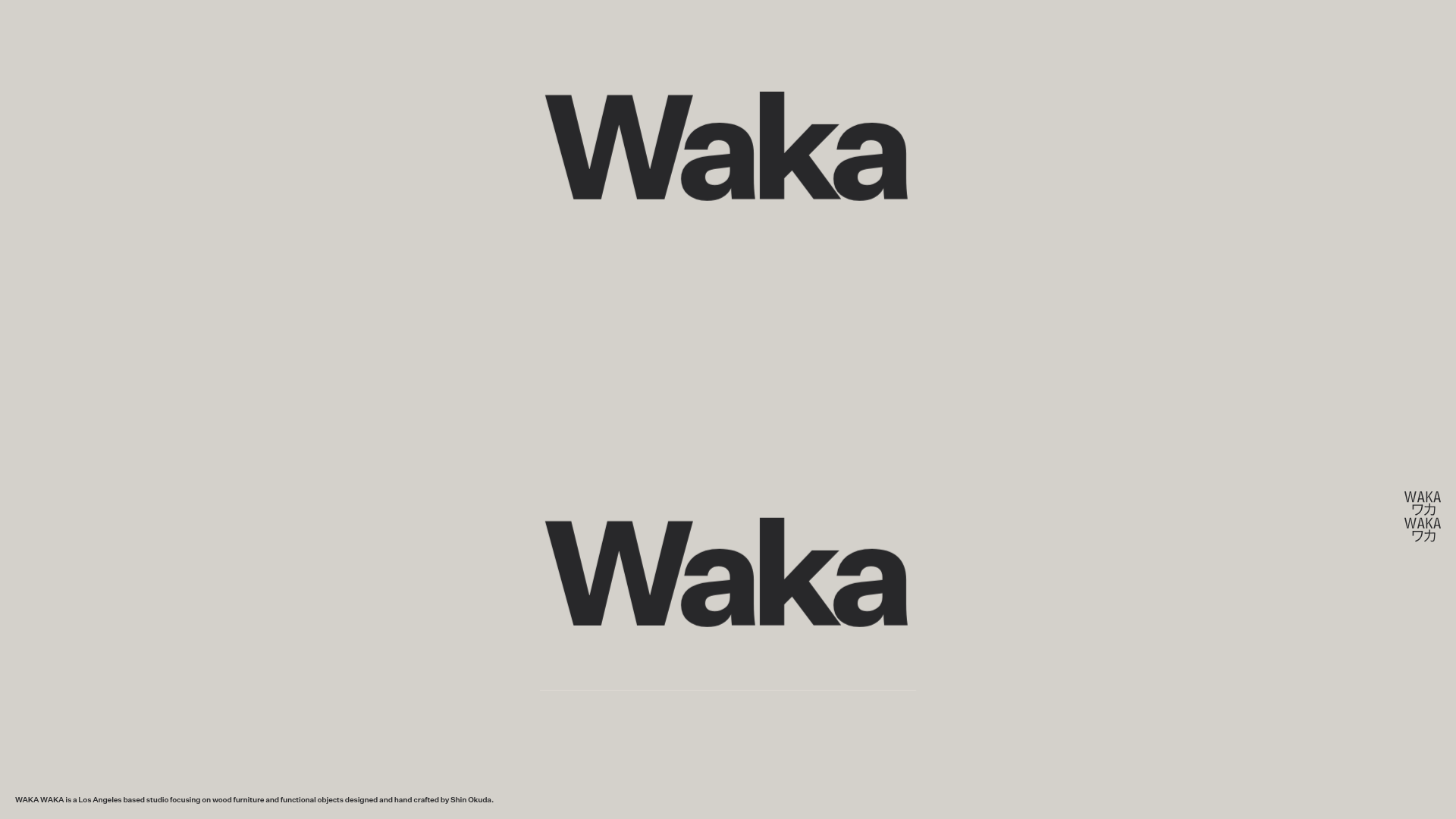
Waka Waka Furniture Portfolio
A minimalist design showcase featuring a custom cursor, parallax scroll effects, and a vertical image grid layout for high-end product displays.
