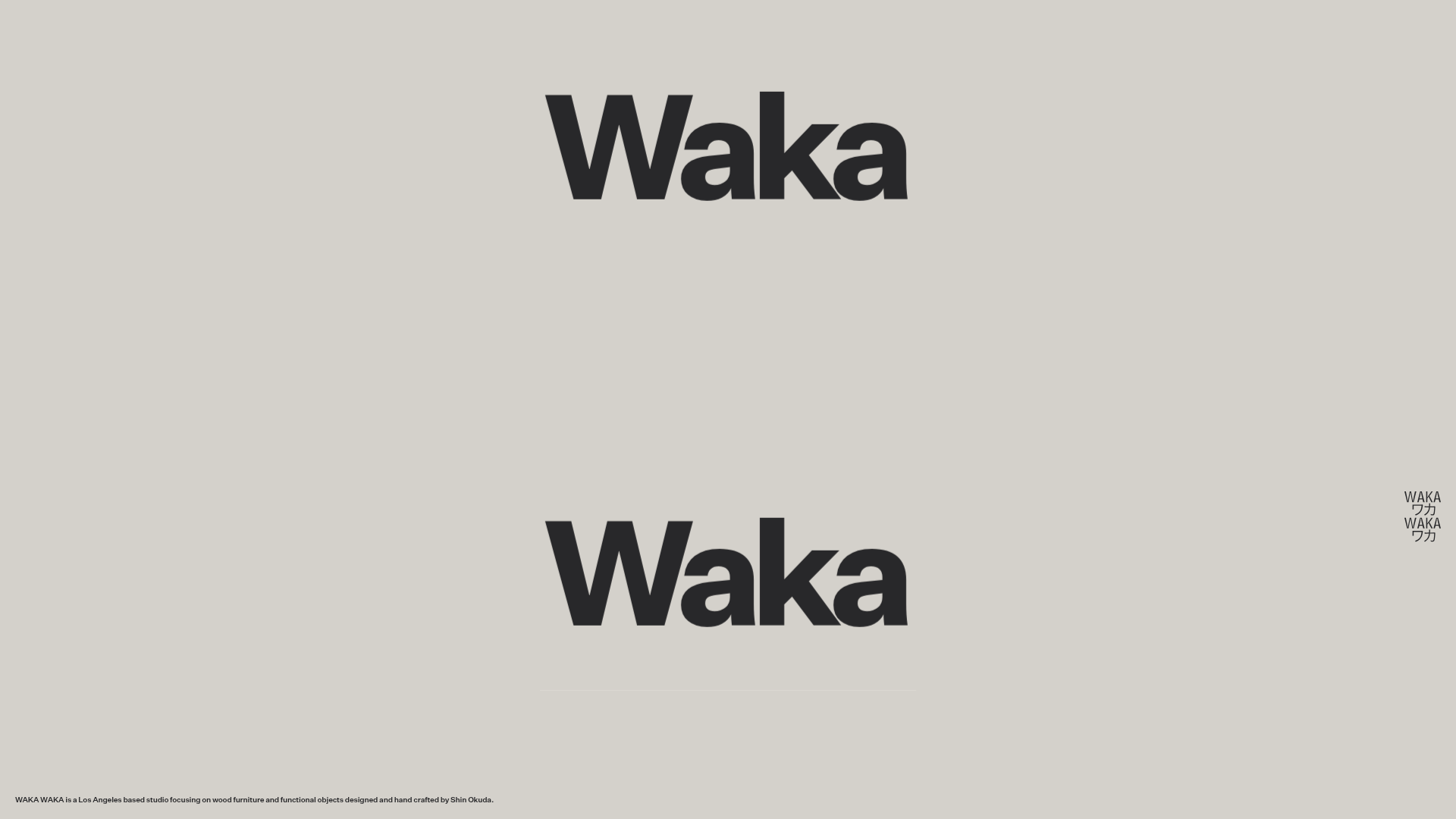
Waka Waka Furniture Portfolio
A minimalist design showcase featuring a custom cursor, parallax scroll effects, and a vertical image grid layout for high-end product displays.
Overview
This site is the portfolio for Waka Waka, a Los Angeles-based furniture studio. It serves as a premier example of high-end minimalism, utilizing expansive negative space, vertical parallax scrolling, and a custom interactive cursor to elevate product presentation. Builders should reference this for its sophisticated use of scroll-driven animations and clean, image-focused informational architecture.
Design System
- Color Palette & Visual Hierarchy: The palette is grounded in a warm, neutral gray-beige (
#d6d4ce) background that mimics gallery walls. Hierarchy is achieved through massive scale contrast—large, bold typography for the brand name vs. tiny, high-contrast black text for studio descriptions. - Typography System: Uses a bold, grotesque sans-serif for the hero "Waka" anchors and small-scale, high-density sans-serif for metadata. Text is often placed in ultra-minimal footers or floating globally to avoid distracting from visual content.
- Page Structure: The site uses a vertical "scroll wrapper" where a central grid of furniture objects moves independently of the background. Large-scale typography serves as bookends at the top and bottom of the scroll sequence.
- Reusable Components:
- Dynamic Grid Item: A two-column responsive image component (
grid__item--featuredandgrid__item--side) designed for high-resolution product photography. - Global Utility Bar: A footer-style text bar that stays fixed or persistent as a global label.
- Interactive Cursor: A
global-cursorwrapper that displays the specific product name (e.g., "Double Cylinder Back") when hovering over visual elements.
- Dynamic Grid Item: A two-column responsive image component (
- Interaction & Motion: The core experience is driven by 3D transforms (
translate3d). Images uselazyloading with placeholder background colors (e.g.,#b58556) to maintain the layout during load. Parallax effects shift the entiregrid__animation-wrapperrelative to the user's scroll depth. - Implementation Clues: The site is built with a custom stack using Sanity.io as a headless CMS for images. It relies heavily on inline styles for real-time scroll position tracking and 3D positioning, indicating a JavaScript-heavy animation library (like GSAP or a custom Raf loop).
Use Cases
- Who should clone this: Designers and independent makers looking to present limited-run physical products or artistic portfolios where the "vibe" of the brand is as important as the specs.
- Remixing effectively: This pattern is perfect for high-fashion lookbooks, architectural portfolios, or boutique lifestyle brands.
- Practical directions: Remix the typography from sans-serif to a high-contrast serif to shift from industrial-cool to luxury-classic. The vertical parallax grid can be extracted to showcase single projects on long-form landing pages.
- Clone scope: Start by cloning the
global-cursorlogic and the centeredgridcontainer for a quick, high-impact aesthetic upgrade to an existing portfolio. A full-page clone is recommended for users wanting to replicate the specific spatial experience of the vertical parallax.
Related Inspirations
Unknown Untitled Design Portfolio Screensaver
A minimalist, experimental design agency website featuring an automated image-layout screensaver and oversized typography overlays.
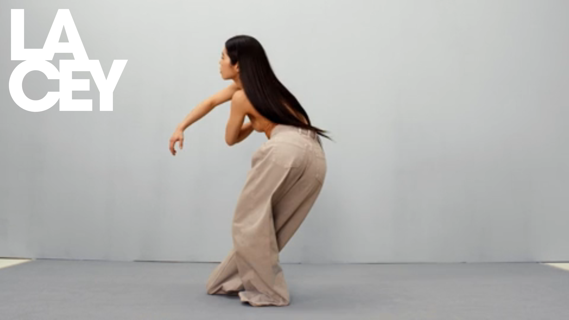
Lacey Studio Creative Portfolio Portfolio
A minimalist director's portfolio featuring a full-screen video hero, masonry-style grid with auto-playing video previews, and a sophisticated overlay navigation system.
Linus Rogge Portfolio Work Gallery
A minimal, full-bleed case study grid featuring sticky typography, mix-blend-mode text effects, and integrated Mux video layers for high-impact project showcases.

Clase Agency Branding Portfolio
A minimalist design agency portfolio featuring a typographic hero section, full-width image articles, sticky title bars, and integrated scrolling text marquees for a clean editorial layout.

Ayaka B. Ito Creative Portfolio
A minimalist design portfolio featuring an immersive full-screen hero image, clean typographic navigation, and a structured layout for showcasing branding and editorial projects.
David Fiz Visual Design Portfolio
A minimalist portfolio featuring a fixed sidebar navigation paired with an immersive, full-screen media showcase and interactive project-specific image carousels.
