Minimalist Dark Designer Portfolio Grid
A clean, dark-themed portfolio featuring a bold typography hero section and a staggered two-column image grid with subtle entrance animations.
Overview
This portfolio is a masterclass in minimalist, dark-mode design, focusing on high-contrast typography and large-scale imagery. It serves as an excellent clone reference for creatives seeking a high-signal, low-noise layout that emphasizes project quality through a staggered asymmetrical grid.
Design System
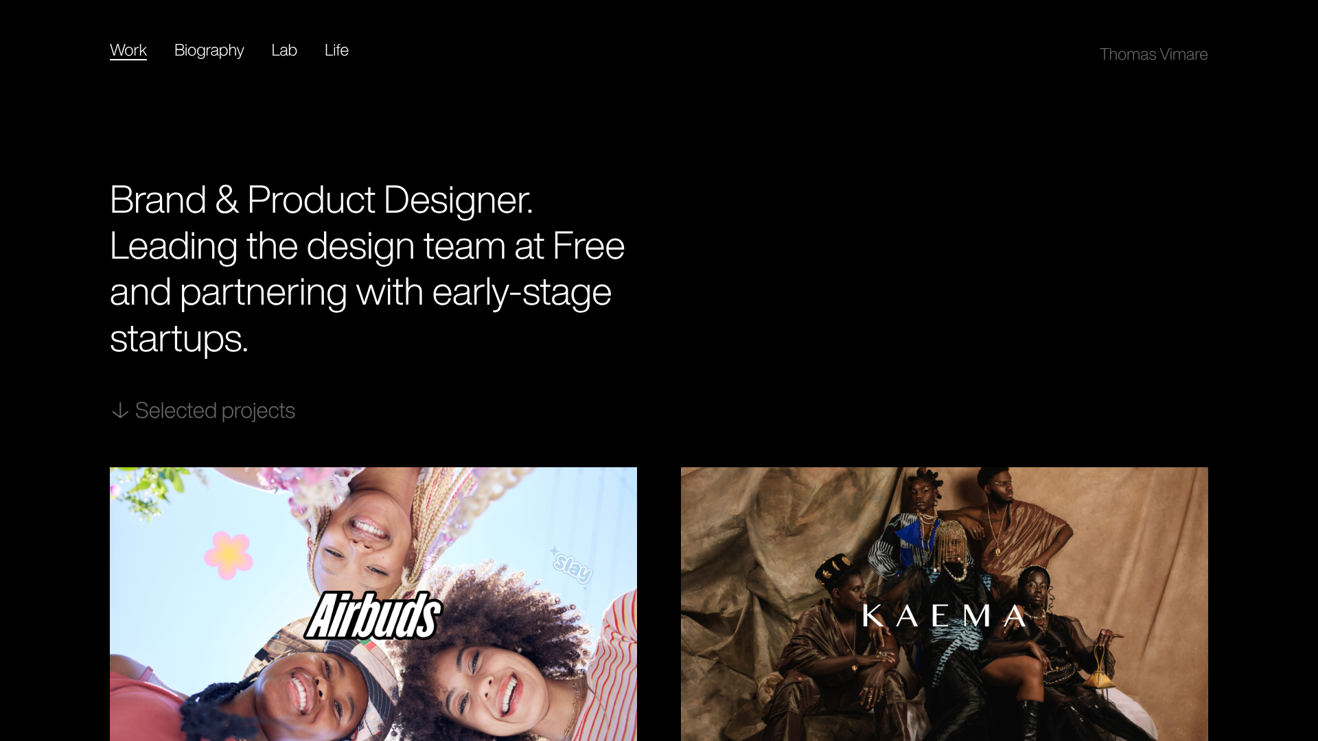
- Color Palette & Visual Hierarchy: The system utilizes a pure black background (#000000) with off-white and gray text to create a deep, immersive aesthetic. Hierarchy is established through size and weight rather than color, with primary headers being bold and secondary metadata using lower-opacity text.
- Typography: The site uses a clean, sans-serif font family. The hero section features a large
h1with tight leading, while the navigation uses smaller, capitalized, and lightweight styles. Selected projects are identified withh3titles andh4subheaders for clear informational threading. - Structure & Flow: The sequence begins with a minimalist top-aligned navigation and a right-aligned brand name. This is followed by a high-impact typography hero, a "Selected projects" indicator, and finally a two-column staggered grid (alternating
liclasses of.leftand.right) for project cards. - Reusable Components: The most valuable component to clone is the
.projectslist item. Each card combines a large<a>tag wrapper for images with atransitionclass, followed by a semantic heading stack (h3for name,h4for description). - Interaction & Motion: The HTML reveals an implementation of
fadeInDownanimations with staggered delays (e.g.,delay2,delay3), suggesting a sequenced entrance for the header and the grid. Image anchors use a.transitionclass, likely triggering subtle opacity or scale shifts on hover. - Implementation Clues: The project uses a semantic
<ul>structure for the grid. The layout relies on a wrapper class and specific floating/positioning classes (.left,.right,.clear) to create the vertical stagger effect instead of a strictly uniform grid.
Use Cases
- Who Should Clone: Individual designers, photographers, or architects who want a "less is more" approach that prioritizes visual assets over marketing copy.
- Effective Remixes: Agency landing pages can remix this by swapping the hero text for service offerings while keeping the staggered project feed for case studies. It is also highly effective for brand lookbooks.
- Practical Directions: Adapt the info architecture by replacing the bio/lab links with "Services" or "Contact." The stagger effect can be remixed into a single-column layout for a more editorial, long-form scroll experience.
- Clone Scope: A full-page clone is recommended to capture the spatial balance, but cloning just the
.projectsgrid is useful for developers needing an asymmetrical image gallery that handles different aspect ratios gracefully.
Related Inspirations

Niklas Rosén Designer Portfolio Index
A minimalist, responsive grid-based portfolio index featuring a clean 16-column layout, typographic list components, and a custom dark mode transition.

Clase Agency Branding Portfolio
A minimalist design agency portfolio featuring a typographic hero section, full-width image articles, sticky title bars, and integrated scrolling text marquees for a clean editorial layout.

Ayaka B. Ito Creative Portfolio
A minimalist design portfolio featuring an immersive full-screen hero image, clean typographic navigation, and a structured layout for showcasing branding and editorial projects.

Lundqvist & Dallyn Studio Portfolio
Minimalist design studio portfolio featuring a custom video loader, world clock navigation, and a fluid masonry-style grid for high-quality photography and type design showcases.

Jakub Reis Portfolio Case Study Gallery
A dark-themed designer portfolio featuring a typography-focused loading animation and a staggered masonry grid for project case studies.

AcolorBright Design Agency Portfolio
Minimalist bento-style portfolio layout featuring numerical section headers, horizontally scrolling project teasers, and a clean grayscale client logo grid.
