Clase Agency Branding Portfolio
A minimalist design agency portfolio featuring a typographic hero section, full-width image articles, sticky title bars, and integrated scrolling text marquees for a clean editorial layout.
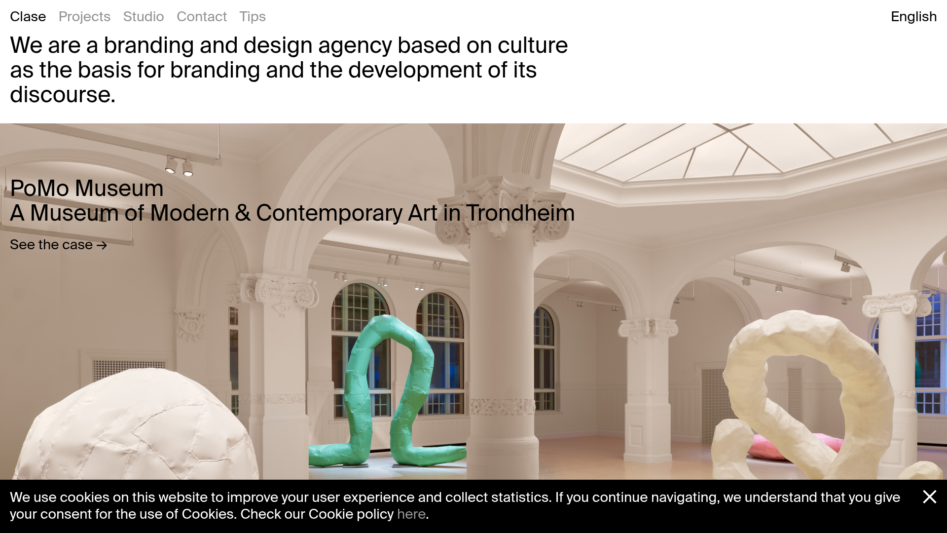
Overview
This website is a sophisticated portfolio for Clase, a branding and design agency, that uses an editorial, typography-first approach to showcase creative work. It is an excellent clone reference for its masterclass in whitespace, high-contrast black-on-white layouts, and the use of sticky headers to maintain context during long-form scrolling.
Design System
- Color Palette & Visual Hierarchy: A stark monochrome foundation (Black
#000000, White#FFFFFF) relies on image-heavy content to provide color. Hierarchy is established through extreme font weight and size differences rather than color variation. - Typography System: San-serif typography (appearing to be a custom or premium grotesque like Helvetica or Akzidenz) is used with heavy weights and tight leading. The hero text is oversized and left-aligned, while secondary labels like "See the case" use smaller, medium-weight styles with subtle arrows.
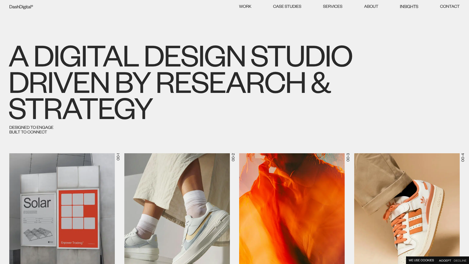
- Page Structure: A linear vertical flow: Top-left navigation menu → Large typographic mission statement → Full-width "Featured Project" hero image with overlaid text → Continuous feed of image-and-video project cards → Horizontal marquee breaks → Footer secondary links.
- Reusable Components:
- Sticky Title Bars: The
.selectedBandclass acts as a sticky navigation marker that stays at the top of the viewport when scrolling through project list sections. - Marquee Barriers: Integrated scrolling text (
.js-marquee-wrapper) used to break up long feeds and highlight newsletter subscriptions or archives. - Project Articles: Each project is wrapped in an
<article>tag containing a.work-header(text overlay) and a.work-videoor image background, creating a unified block for portfolio items.
- Sticky Title Bars: The
- Interaction & Motion: The layout uses "sticky" positioning for section titles. Video background tracks are set to
autoplay,muted, andloop, providing ambient motion without user interaction. Transitions are managed with the.transitionclass, suggesting CSS-based opacity or height shifts upon loading or navigation. - Responsive Behavior: The menu scales to a simple
mobile-openbutton. The 1:1 or vertical aspect ratios of project images (image-v) suggest a mobile-first philosophy that translates well to single-column desktop scrolling.
Use Cases
- Who should clone this: Independent designers, creative agencies, or architecture firms looking for a "less is more" aesthetic that emphasizes high-quality visuals over dense copy.
- Effective Remixes: High-end furniture brands or fashion lookbooks can remix the full-width image articles to create a digital magazine feel. The sticky headers are particularly useful for long-form case studies where section titles help with navigation.
- Practical Directions: Builders should clone the
.selectedBandsticky header behavior and the responsive marquee. For a remix, one could swap the monochrome palette for a high-energy duo-tone (e.g., Electric Blue/White) while keeping the bold typographic scale. - Suggested Scope: A full-page clone is best for those with premium high-resolution assets; otherwise, the sticky section titles and the typographic hero section can be cloned individually to clean up a cluttered existing landing page.
Related Inspirations

Lundqvist & Dallyn Studio Portfolio
Minimalist design studio portfolio featuring a custom video loader, world clock navigation, and a fluid masonry-style grid for high-quality photography and type design showcases.

AcolorBright Design Agency Portfolio
Minimalist bento-style portfolio layout featuring numerical section headers, horizontally scrolling project teasers, and a clean grayscale client logo grid.
Manna Architects Minimalist Portfolio Grid
A clean, single-page architecture portfolio featuring a centered intro, a varied multi-column image gallery with captions, and a detailed project service breakdown.
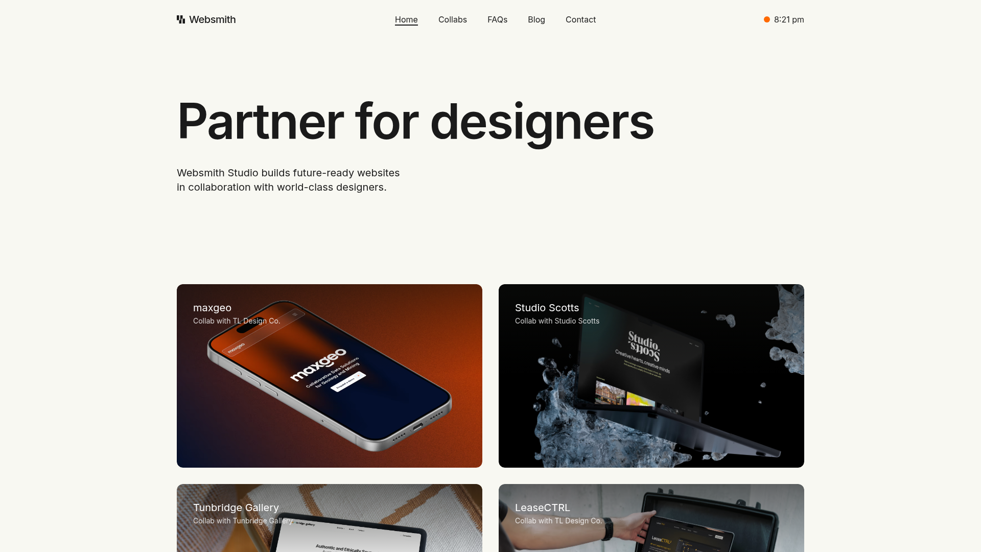
Websmith Studio Portfolio Site Template
A clean studio portfolio featuring a responsive bento-style project grid, interactive process cards, and a split-screen testimonial section built with Tailwind CSS.
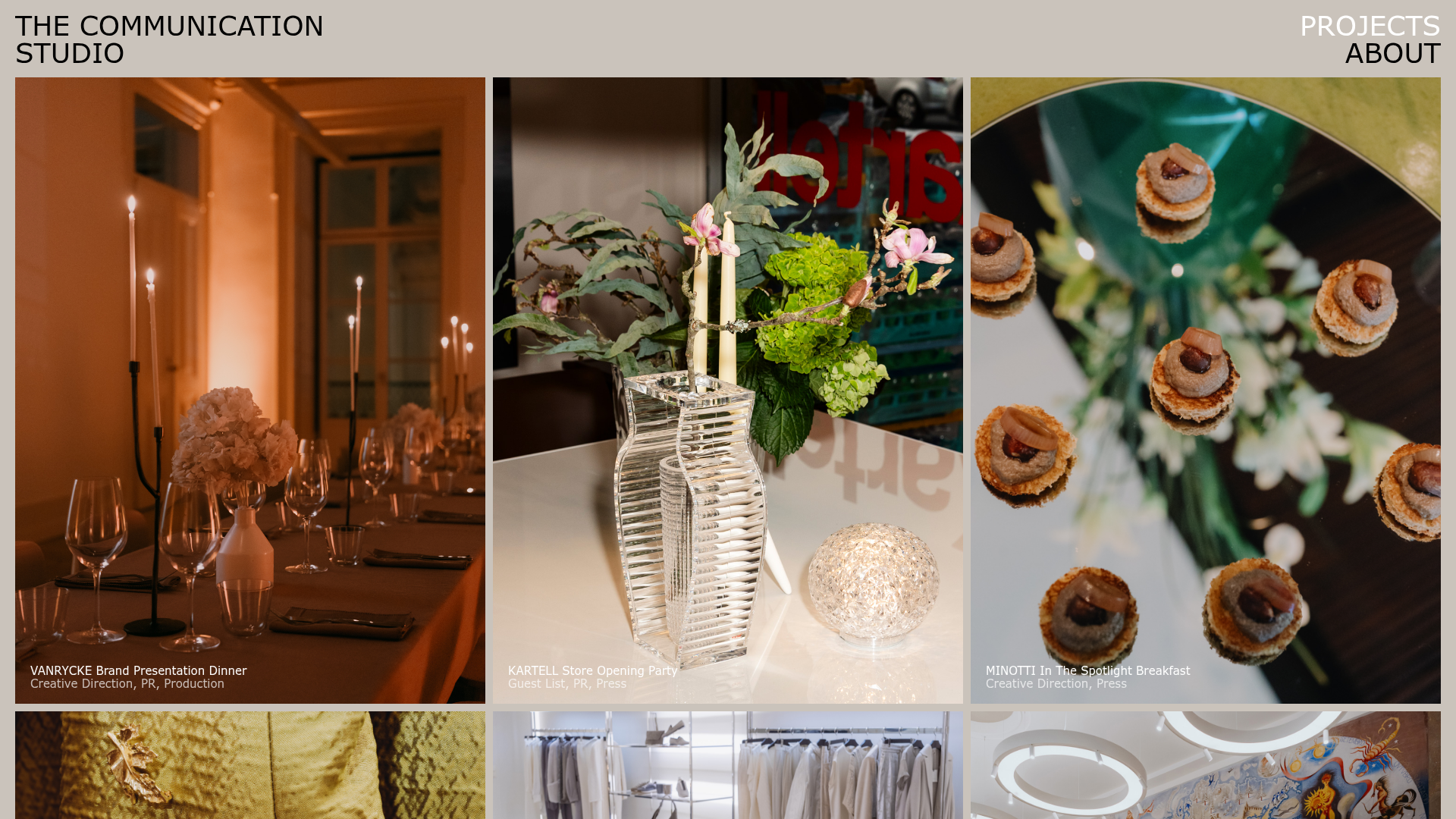
The Communication Studio Portfolio Grid
A minimalist creative agency portfolio featuring a gapless image grid with image-swap hover effects and Tailwind-based reveal animations.
DashDigital Branding Agency Portfolio Landing
A high-end design portfolio featuring a typographic hero section, interactive client list accordion, horizontal drag-slider, and refined micro-interactions for buttons and images.
