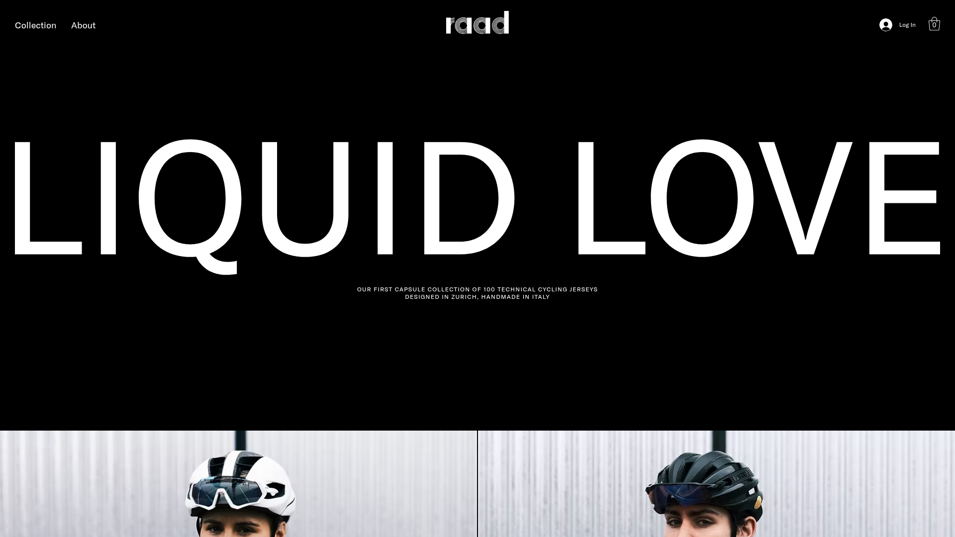
RAAD Cycling Apparel Storefront
A minimalist e-commerce layout featuring large-scale typography, high-contrast black backgrounds, and alternating image-text sections for a premium brand feeling.
Overview
RAAD is a high-end technical cycling apparel storefront that utilizes a ultra-minimalist, black-ink aesthetic to create a sense of exclusivity and premium performance. It is a powerful reference for builders looking to master cinematic, typography-driven layouts that rely on high-contrast visuals and generous negative space rather than complex UI widgets.
Design System
- Color Palette & Visual Hierarchy: The system is anchored by a deep binary contrast—solid #000000 black backgrounds and #FFFFFF white text. Visual hierarchy is established through extreme scale shifts, where the product name ("LIQUID LOVE") dominates the viewport to create an immediate brand impression.
- Typography System: The site uses clean, geometric sans-serif type. Headers use a large-scale, thin-to-medium weight font with wide tracking in the logo and hero area. Body text and subheadings (e.g., class
font_7andfont_4) are kept extremely small and centered to maintain a minimalist footprint. - Page Structure & Section Flow: The layout follows a vertical modular stack:
- Cinematic Hero: Large typography and a centered mission statement.
- Alternating Split Sections: Feature sections (e.g.,
comp-kmue7tj0) alternate between full-width imagery and centered text boxes to explain technical details. - Product Selection Grids: Two-column grids with large scale images and simple "DISCOVER" buttons.
- Featured Product Banners: Full-width lifestyle imagery ending with specific product call-outs.
- Reusable Components:
- Typography Hero: An easy-to-clone header block using SVG or large text elements for maximum impact.
- Ghost Buttons: Simple rectangular buttons (class
wixui-button) with high-contrast text and no border for 1:1 brand imitation. - Image-Text Modules: Reusable sections that pair a high-resolution
wow-imagewith a centered text box (inner-box wixui-box).
- Implementation Clues: Built on Wix Studio, the layout utilizes absolute positioning within relative containers (
xuzjBY) and lazy-loading responsive images. The structure relies heavily on section IDs and container boxes to manage content alignment.
Use Cases
- Who Should Clone: Luxury boutiques, limited-edition streetwear brands, and high-performance technical gear startups seeking a "gallery" feel for their e-commerce experience.
- Product Remixing: While designed for cycling jerseys, this layout effectively showcases any product with strong visual patterns or unique textures (apparel, furniture, architectural hardware).
- Practical Remix Directions:
- Invert the palette: Swap to a white background with black text for a cleaner, editorial "Vogue" look.
- Information Architecture: Adapt the centered text sections into left-aligned blocks for better readability if the brand has more technical copy.
- Modular Approach: Builders should focus on cloning the alternating image-text blocks to create a compelling "storytelling" page rather than a traditional dense product grid.
- Clone Scope: A full-page clone is recommended to maintain the rhythmic flow of imagery and space, though the individual "Two-Column Product Card" section (from
comp-kmug07h5) is a perfect snippet for any minimalist catalog.
Related Inspirations
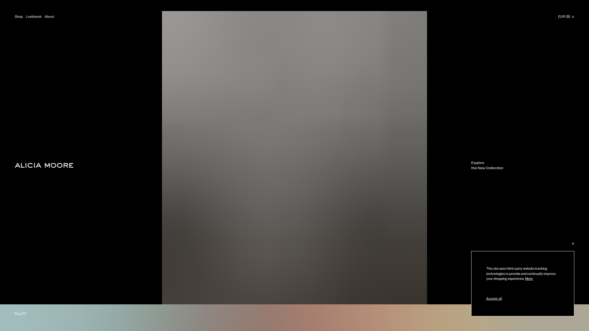
Alicia Moore Fashion Portfolio
A high-end editorial layout featuring vertical scroll-triggered image galleries, a centered hero canvas, and sleek typography for luxury e-commerce or brand lookbooks.
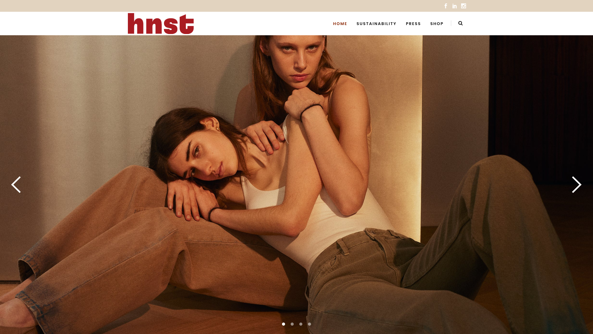
HNST Circular Fashion eCommerce Gallery
A minimalist apparel site featuring a full-screen image slider with parallax effects, grid-based product sections, and a clean typography-focused header for sustainable brand storytelling.
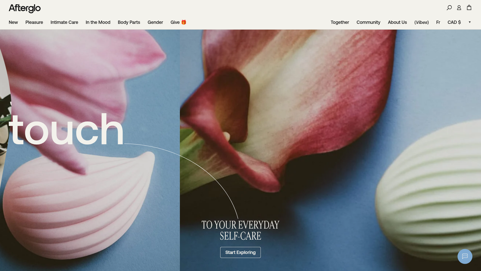
Afterglo Sensual Self-Care Storefront
An elegant e-commerce landing page featuring a split-screen horizontal scrolling hero, kinetic typography with 'vibrating' text animations, and a customized product carousel.

Palazzo Monti Minimalist Artist Residency Portfolio
A high-end editorial layout featuring scroll-triggered text animations, smooth preloader transitions, image-reveal hover effects on list items, and a draggable bubble-based press section.
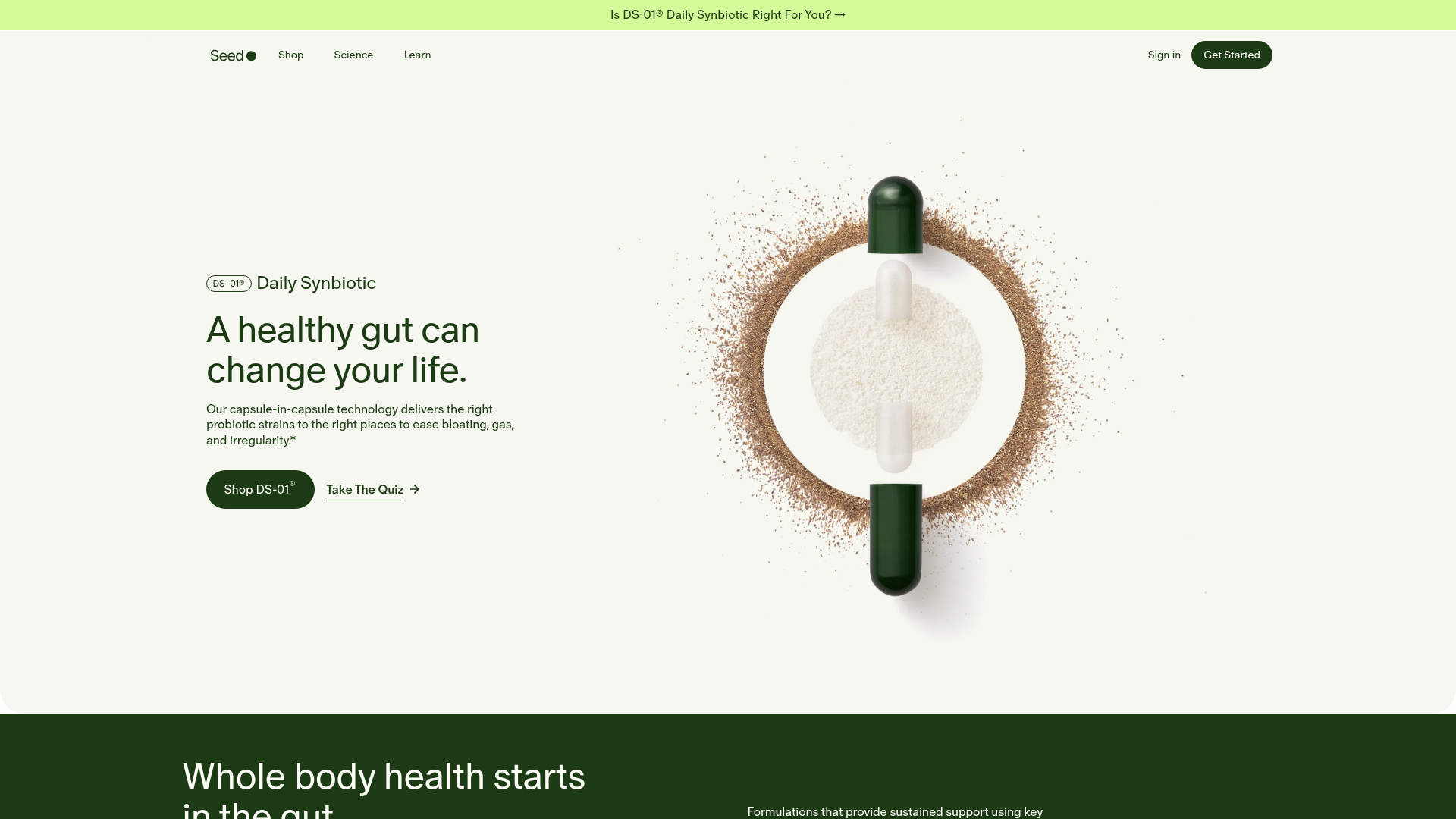
Seed Health Landing Page
An elegant wellness landing page featuring a full-viewport parallax hero, vertical swiper transitions, an interactive product carousel, and a custom video gallery for customer stories.
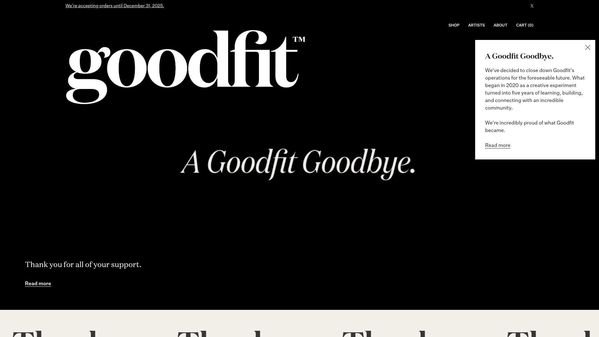
Goodfit E-commerce Puzzle Landing Page
A dark-themed Shopify storefront featuring a bold serif hero, scrolling marquee, tabbed product grids, and asymmetrical rich text blocks with image-led storytelling.
