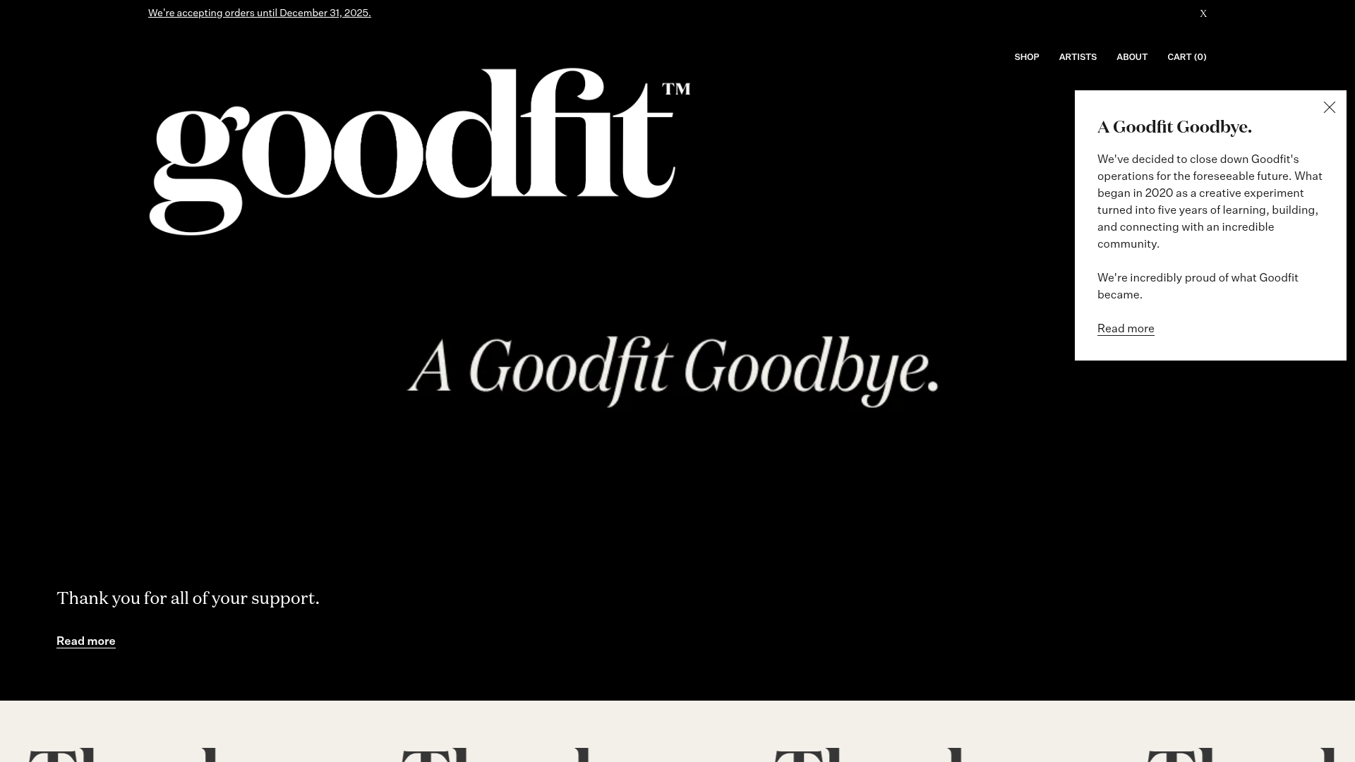
Goodfit E-commerce Puzzle Landing Page
A dark-themed Shopify storefront featuring a bold serif hero, scrolling marquee, tabbed product grids, and asymmetrical rich text blocks with image-led storytelling.
Overview
Goodfit is a premium e-commerce landing page for a puzzle brand, characterized by a sophisticated, editorial-style layout. It is a strong reference for high-end retail brands looking to blend storytelling with a catalog interface through bold typography and asymmetrical content blocks.
Design System
- Color Palette & Visual Hierarchy: The site uses a high-contrast foundation with a deep black (
#000000) hero section transitioning into a warm, creamy off-white (#f3efe9) for the body. Sub-sections use muted, earthy tones (purples, greens, and oranges) as background accents to differentiate product categories. - Typography: A heavy, high-contrast serif typeface is used for branding and major headings, creating a luxury feel. Secondary headings and body copy utilize a clean, legible sans-serif. The hierarchy is established through extreme scale—the logo and hero title dominate the viewport, while functional links are small and underlined.
- Page Structure: The flow begins with an immersive full-screen hero slideshow, followed by a high-energy scrolling marquee. It then alternates between horizontal product grids and vertical 'Rich Text' sections where images and copy are swapped left-to-right to create a rhythmic, asymmetrical visual flow.
- Reusable Components:
- Hero Slideshow: A flickity-powered carousel with bottom-right positioned price tags.
- Scrolling Marquee: A simple text ticker for urgent announcements or brand mantras.
- Storytelling Blocks: Paired image and text containers with underlined text-link CTAs instead of traditional buttons.
- Testimonial Slider: A clean carousel featuring press logos as navigation anchors.
- Interaction Patterns: The design relies on subtle motion, including a sticky 'Announcement Bar' and fade-in transitions for images (
Image--lazyLoad). Product cards utilize a 'zoom-out' hover effect on background images to add depth. - Responsive Behavior: On mobile, the multi-column product grids collapse to two-up displays, and the asymmetrical rich text blocks stack vertically, ensuring the image-led storytelling remains the focus.
- Implementation Clues: Built on Shopify, the site uses standard utility classes for spacing (e.g.,
pb2,u-p2) and the Flickity library for all slider and carousel functionalities.
Use Cases
- Who should clone this: Designers building for niche lifestyle brands, art-focused startups, or 'slow-fashion' e-commerce stores that need to justify a premium price point through aesthetics.
- Remix Directions: Swap the black/cream base for a vibrant/pastel palette to adapt for children's toys or beauty products. The 'Rich Text' section is highly adaptable; builders can reuse these blocks for 'About Us' pages or technical feature explainers.
- Clone Scope: For a fast win, clone the hero and the marquee section to create a high-impact arrival experience. For a total brand overhaul, the entire page provides a comprehensive blueprint for a story-driven storefront.
Related Inspirations
099 Supply Minimalist Bento Asset Gallery
A dark-themed asset store featuring a bento grid layout, video-on-hover card interactions, and category filters for digital products and Photoshop mockups.

Context Gallery High-End Furniture Landing Page
A minimal editorial layout featuring a multi-column product carousel, designer biographies with image-text pairings, and a magazine-style content grid for curated design stories.

Glein Minimalistic Bento Grid eCommerce
A clean, modular layout using a bento-style responsive grid of text teasers and large-scale product imagery for lookbooks and collection browsing.

Isla Beauty Skincare E-commerce Store
A clean Shopify-based storefront featuring a split-hero landing page, a step-by-step product system carousel, and a split-screen testimonial section with localized product image sidebars.

Stojo Collapsible E-commerce Storefront
A Shopify layout featuring a prominent discount modal, mosaic grid hero sections, and clean product cards with integrated color swatches and quick-buy functionality.

Basic.Space E-commerce Gallery Clone
A minimalist product marketplace featuring a clean sticky navigation bar, nested flyout menus, and a horizontally scrollable product carousel with hover-state image switching.
